|This post can alternatively be read as a Cascade story map|
You can wield the mighty mighty powers of the Digital Elevation Model (DEM) to create all sorts of practical, and impractical, or just fun, topographic effects.
Why? Making interesting looking maps is awesome and we cartographers don’t always feel terribly practical. But that’s where some sort of magic can happen.
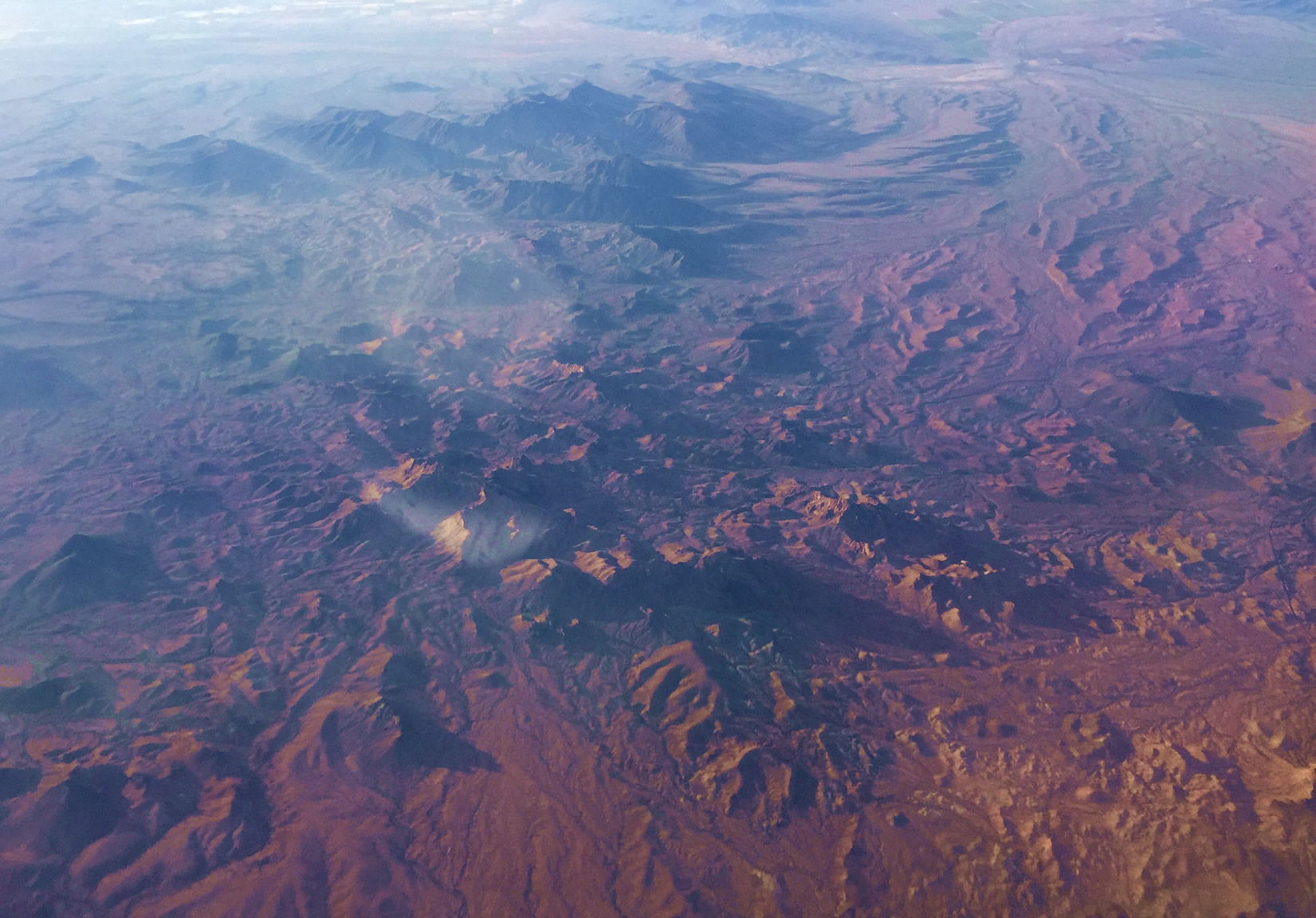
A little while ago, Allen Carroll sent me this photo he snapped, while participating in the miracle of human flight, sitting in a chair hurtling through the sky at hundreds of miles per hour over the southwestern United States. He wondered if it would be fun to try to replicate the look of dawn sunlight painting mountainsides a blazing orange and casting long misty shadows over purple inter-mountain plains.
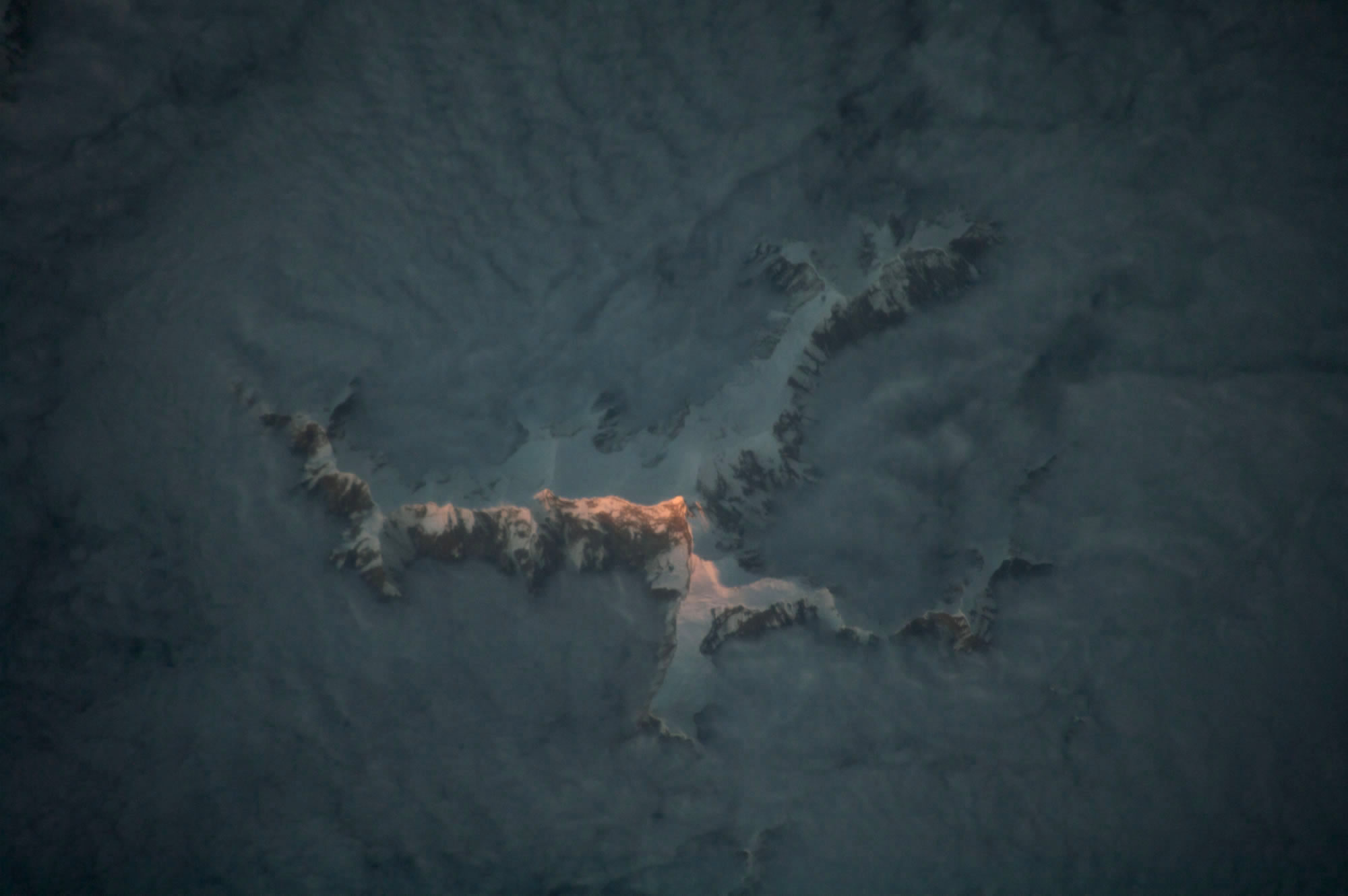
Soon thereafter, I saw this photograph of alpenglow, taken from a substantially higher altitude by an astronaut in the International Space Station.
So what about these images gives then an atmospheric alpenglow quality? I notice three qualities in images like this…
Hillshade Hue
Light at the shorter end of the visible spectrum, like blues and greens, are more readily caught up in our thick atmosphere and scattered every which way (why the sky is blue). Longer wavelengths, like orange and red, can better power through haze so that eventually those are the only colors left to paint the world after sunlight’s long shallow trip through our atmosphere (why a sunset is red). This will inform me in picking hues for the reflective and shaded sides of a hillshade layer.
Darkness
When the sun is at a low angle, lower elevation areas are just generally darker. Since blues and greens are more prone to scatter, the darkened shadows are a deep, nearly black, aqua. Only the abrupt higher elevations benefit from the rare illumination of direct light. I’ll use this notion to apply an increasingly-opaque darkness to lower elevations.
Mist
We swim in a thin blanket of water vapor. Landscapes at a distance appear hazier and de-saturated because the light that eventually lands in our eyeballs has had to push through miles of atmosphere. Renaissance painters knew this, and employed it as one of their dynamite hacks of our visual system. The addition of a misty elevation tint flowing through valleys and clinging to low ground gives a scene a realistic sense of depth that we associate with sunrise and sunset.
Let’s see what we can do in ArcGIS Pro, with nothing more than an imagery basemap and a DEM…
In ArcGIS Pro, I’ve set my basemap to Aerial and navigated to an especially topographically interesting part of the United States around Moab, Utah.
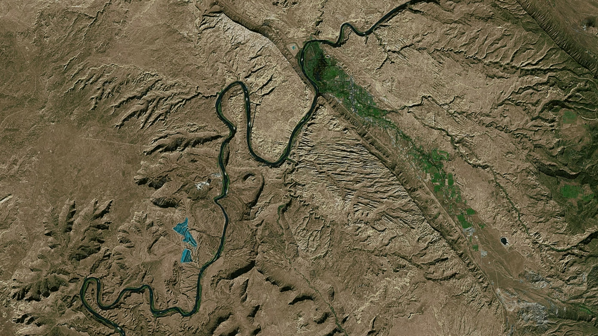
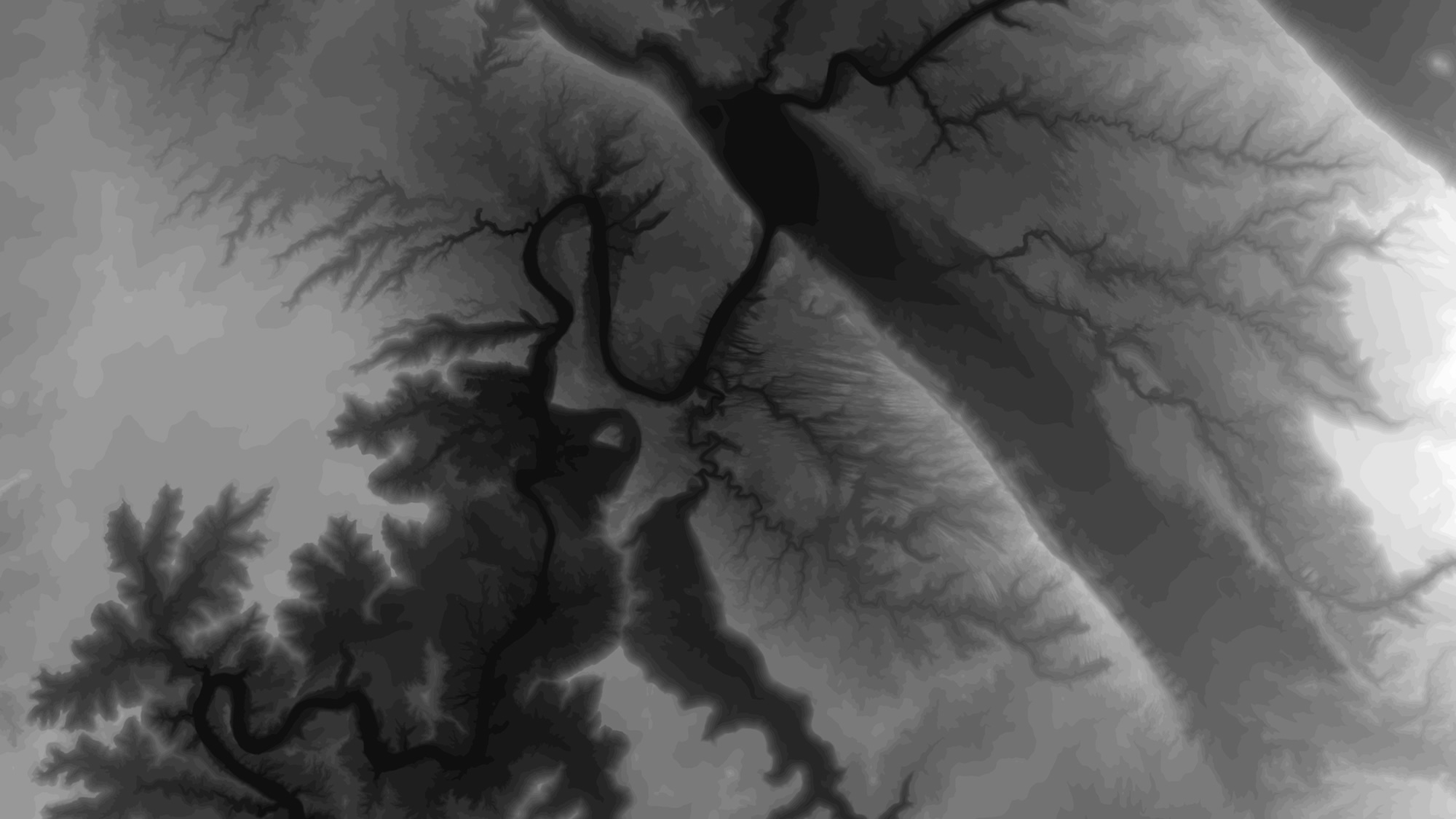
Next, I pull in a DEM layer from the Living Atlas. There are lots of options, but I happen to be using “Terrain: Ellipsoidal Height.” The default symbology of a DEM is generally white (high elevation) to black (low elevation).
This is the only layer I’ll be monkeying with to try to approximate the lighting effects, similar to that of Allen’s sunrise photo, and the alpenglow image from the International Space Station. It will be used once to create a hillshade layer, and then two more times to re-create darkness and fog. Let’s do this!
Hillshade Hue
In ArcGIS Pro, from the “Imagery” tab, I select “Raster Functions.” In this menu there are a host of interesting options to hammer on the DEM. Within the “Surface” category of raster functions is “Hillshade.”
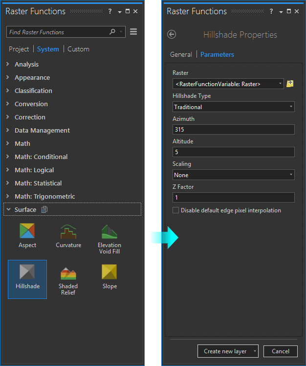
In the Hillshade menu (psst, did you notice the dark Pro theme? It is a beautiful new feature of 1.4), you can set a couple sun-angle preferences. The first is the origin of the light source. I leave it at the default, which is from the northwest. Even though this is pretty much the opposite of the real life light source in the Northern Hemisphere, it’s what our brains generally want to see (otherwise our visual systems tend to invert it, making valleys look like mountains, etc.). The important bit is the “Altitude.” This replicates how high the sun is above the horizon. The default is 45 degrees, but I want to replicate a sun that is barely skirting over the horizon, so I set mine to just 5 degrees.
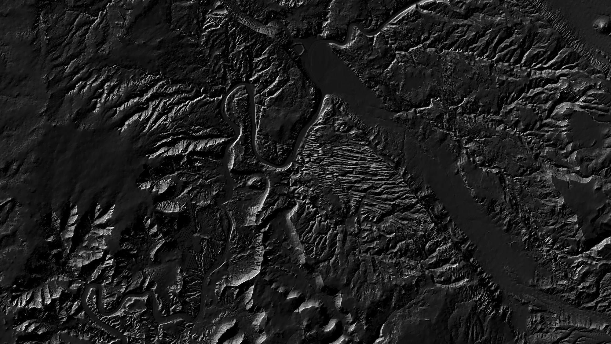
The result is still an amazing thing to me. The previously flat gradient blobs now look like peaks and troughs -like something I could touch. Seeing a hillshade paint in is one of those frequent opportunities to marvel at how awesome it is to be a cartographer.
It’s pretty dark looking because of the low sun angle I gave it. But there’s no reason you need to stick to the default color gradient used to paint in these pixels. My absolute favorite feature of ArcGIS Pro is the ability to include a transparency within color gradients. It opens up so many amazing cartographic options.
Today the cartographic option I want to exploit is defining a color (and transparency) gradient that somewhat resembles the beautiful golden hues in Allen’s photo. So, I opened up the symbology menu and dragged colors (and transparencies) around until I got something that seemed passable (if you’ve read other posts of mine you may recognize some of the other gradients in the droplist).
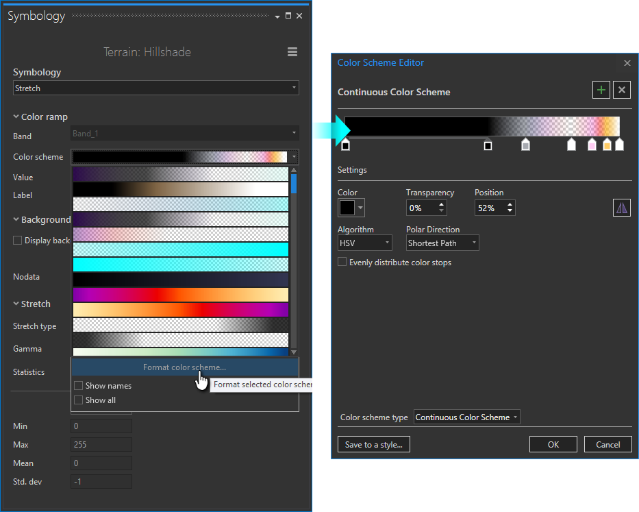
Here, I’ve settled on a gradient that is full black all through the shadows, transitioning into a transparent slate blue in the mid ranges (areas of flat topography). Then the transparent slate blue transitions to the magentas and golds on the steepest sunrise-facing slopes, right into full white. The resulting hillshade layer, when drawn on top of the aerial imagery, looks like this…
That is a really big difference from the raw aerial imagery we were looking at a moment ago. Now, the hillshade layer is painting in the long deep blue shadows and splashing the vibrant golds of sunrise against the steep sunny-side faces of the terrain. I like it.
But I could like it more.
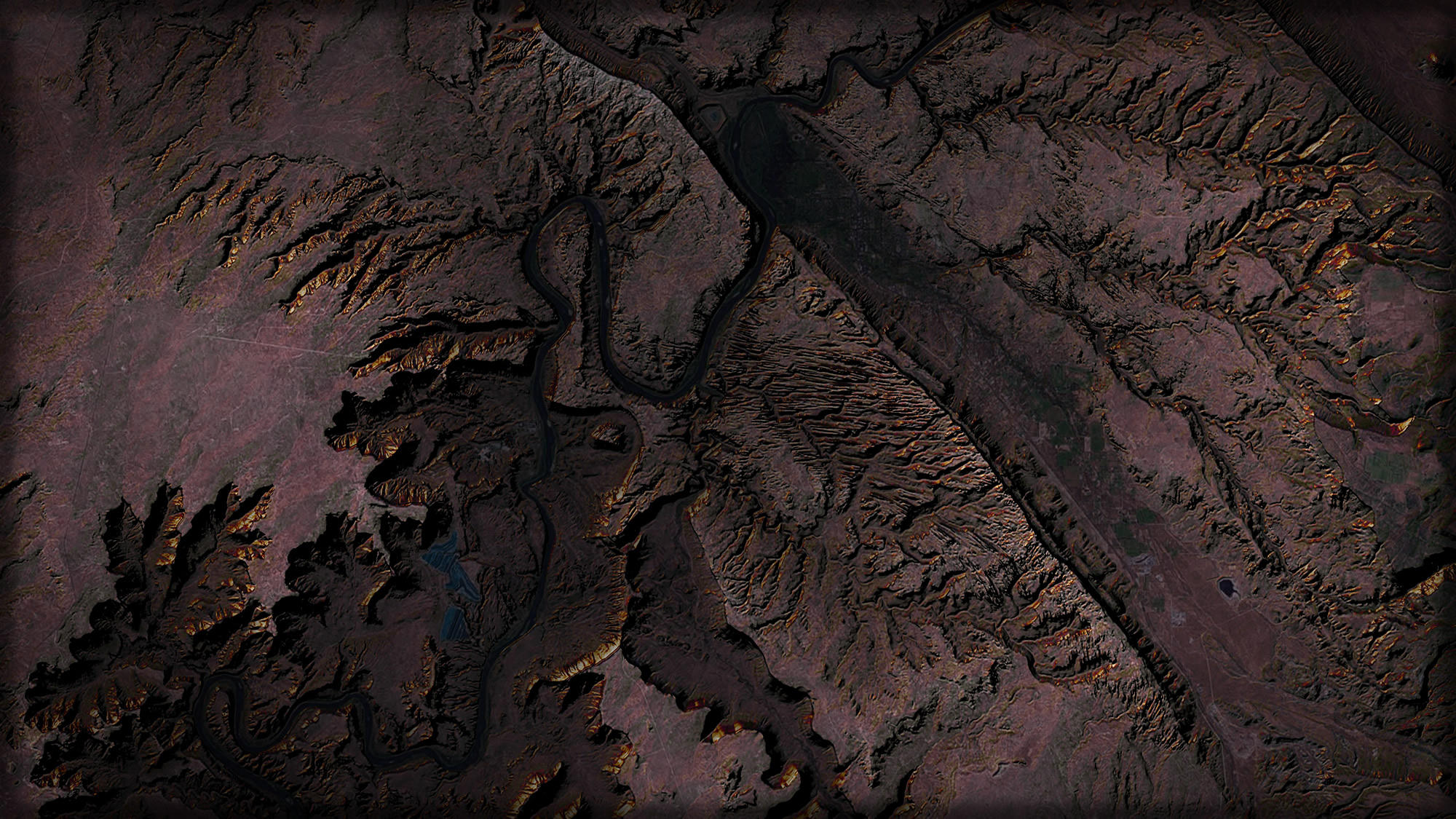
Darkness
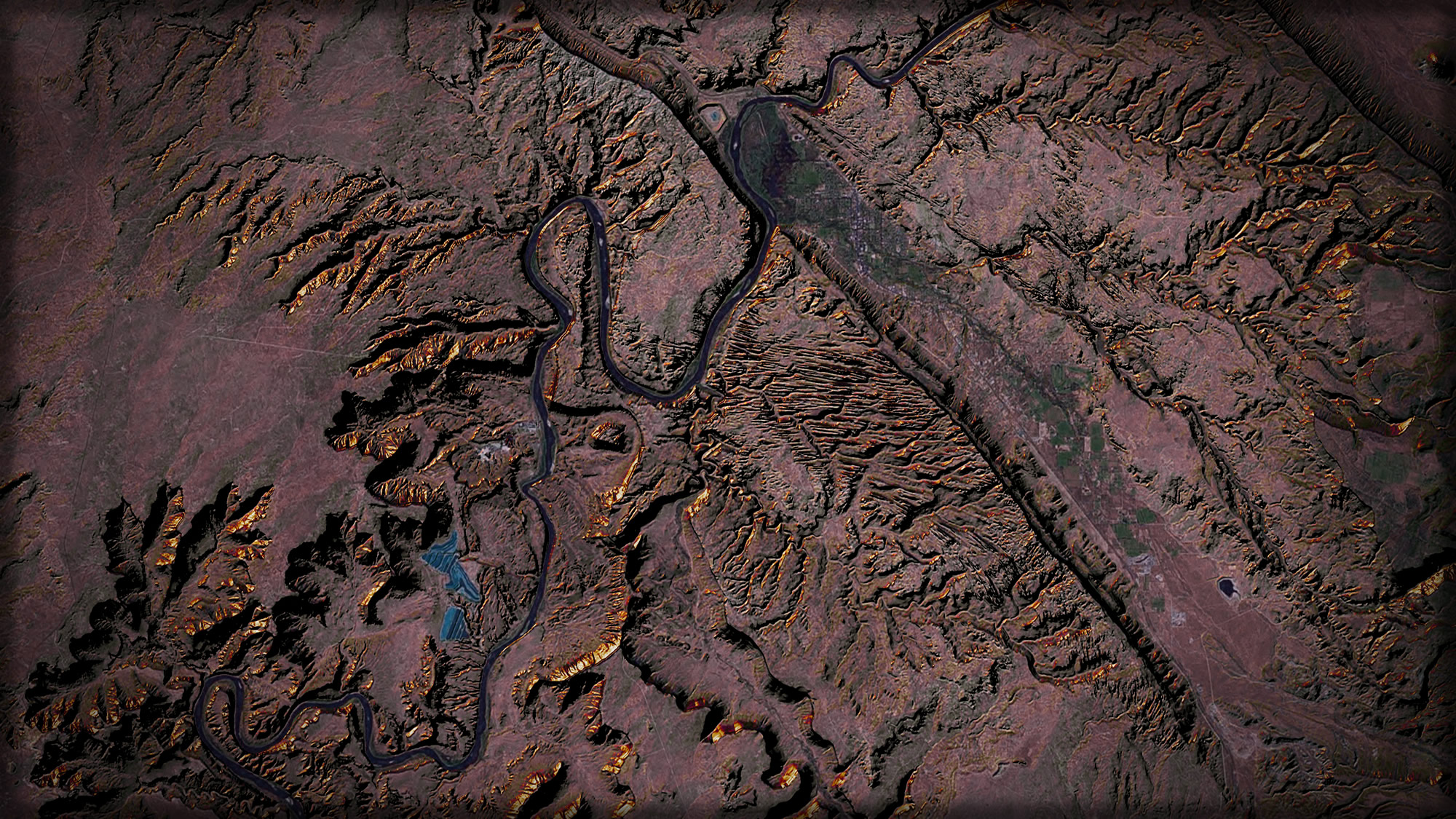
When perched in a plane, looking down, I notice that the lower elevations tend to get less overall light. Makes sense. So next I’ll add the raw DEM layer again, with the goal of tweaking the color gradient to full black at the lowest elevations of the area, and fade up to fully transparent near the highest elevations. And then I’ll draw it on top of the hillshade layer -since the bright reflective surfaces of sunrise illumination don’t actually happen in basins and valleys.
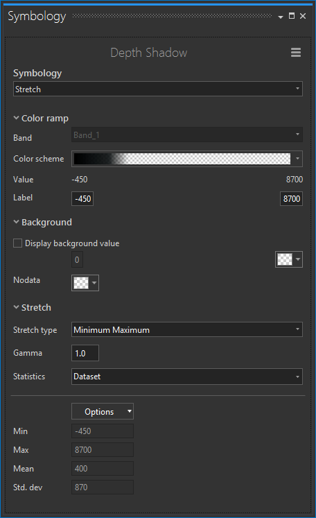
The result, when drawn on top of the hillshade and aerial imagery, adds a sense of depth to the relief, giving the mountains greater dimensionality and realism.
We’re almost there. It would be easy to stop now, but then we’d be missing out on the sneakiest hack of this process…
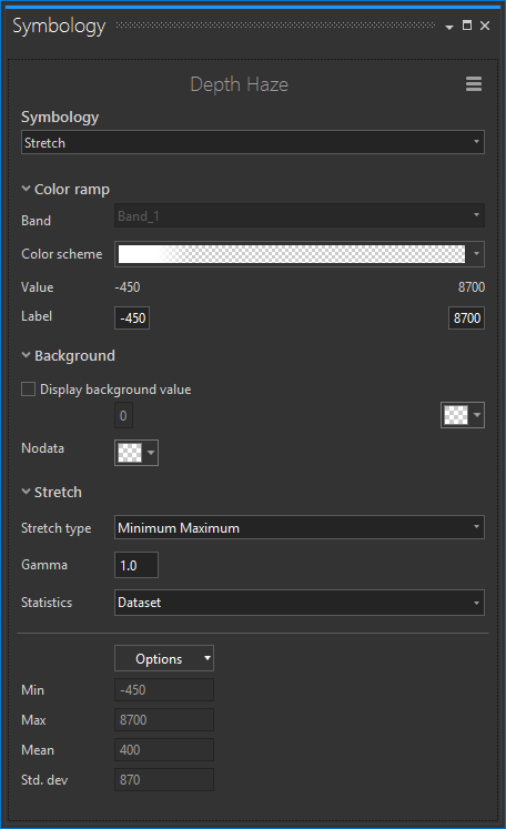
Mist
Yes! Mist makes stuff look ethereal, vaporous, morning-ish, and generally awesome.
Pulling in the trusty DEM a third time, I set the symbology gradient to a wispy white at the very lowest crevices of the landscape.
Now, this addition of mist on top of the darkness layer, the hillshade layer, and the aerial imagery, gives the view an atmospheric sense of a landscape in an early morning inversion.
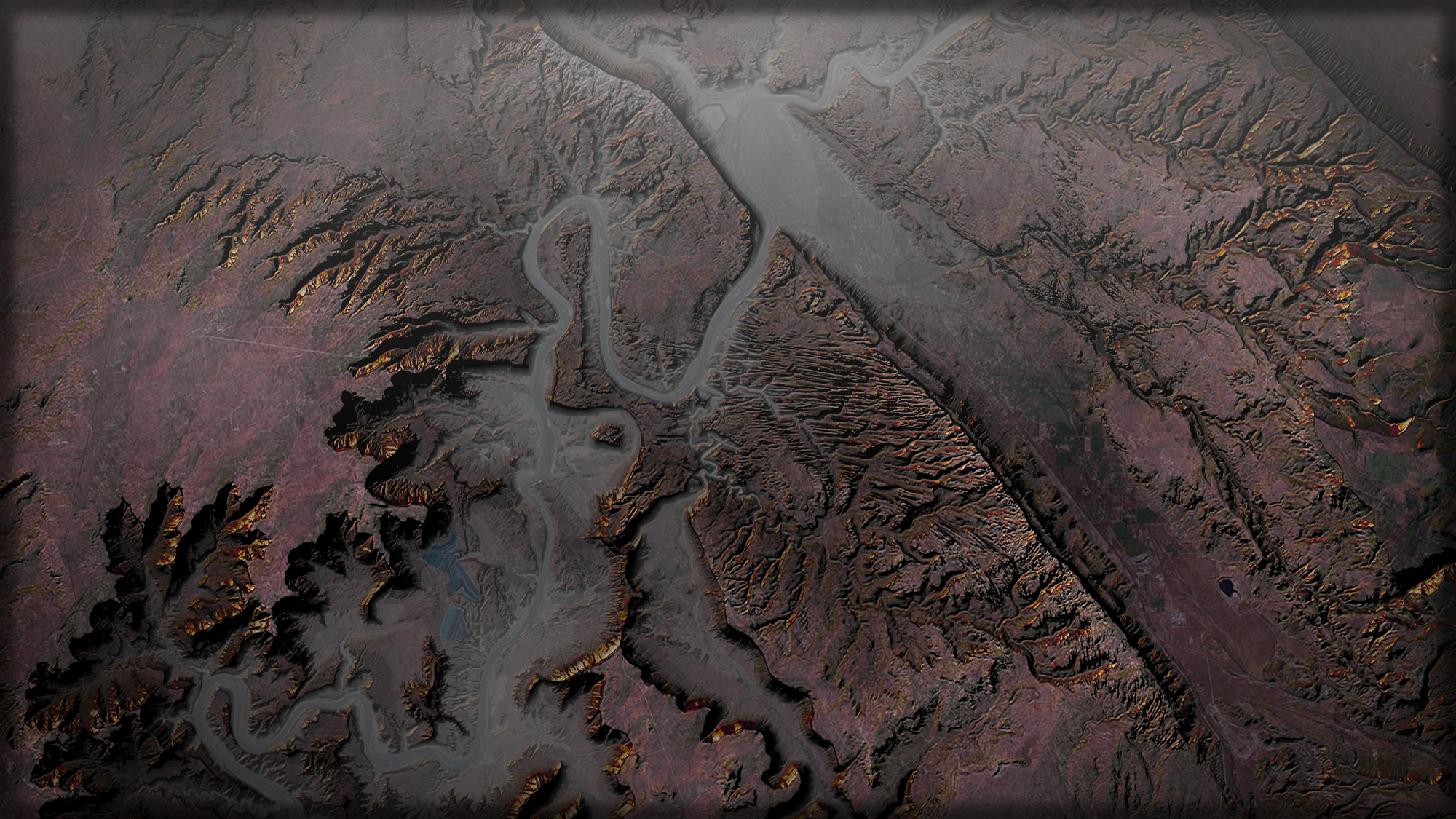 Click to embiggen…
There it is. Hacking a sunrise using only an aerial basemap and a DEM layer rendered in three different ways.
Here it is in fast forward…

Want to try it out in other places? I did. All it takes is some fine-tuning of the color gradients to suit landscapes at different elevations. Here are a few examples…
Some Other Places
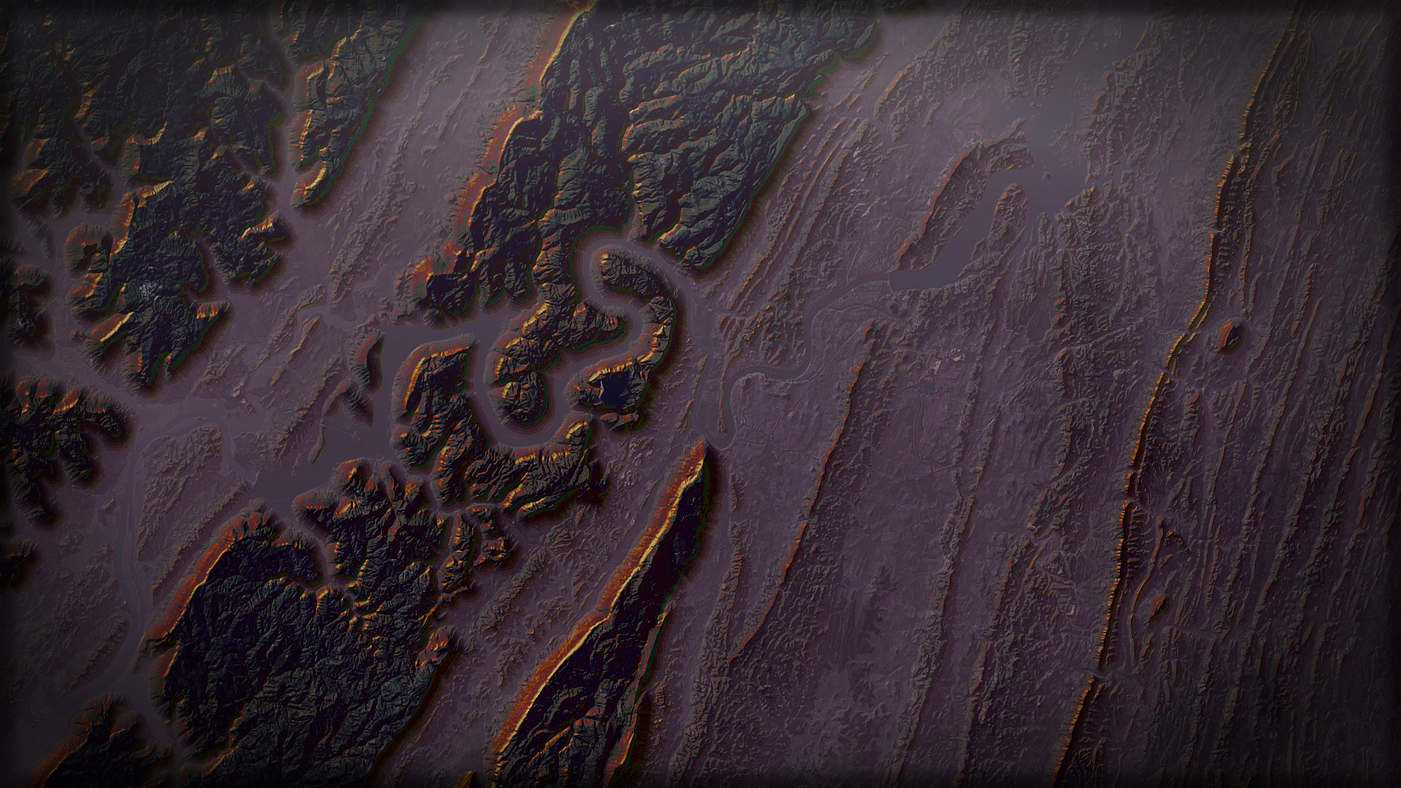
Here’s a stretch of the Appalachian Mountains from above…
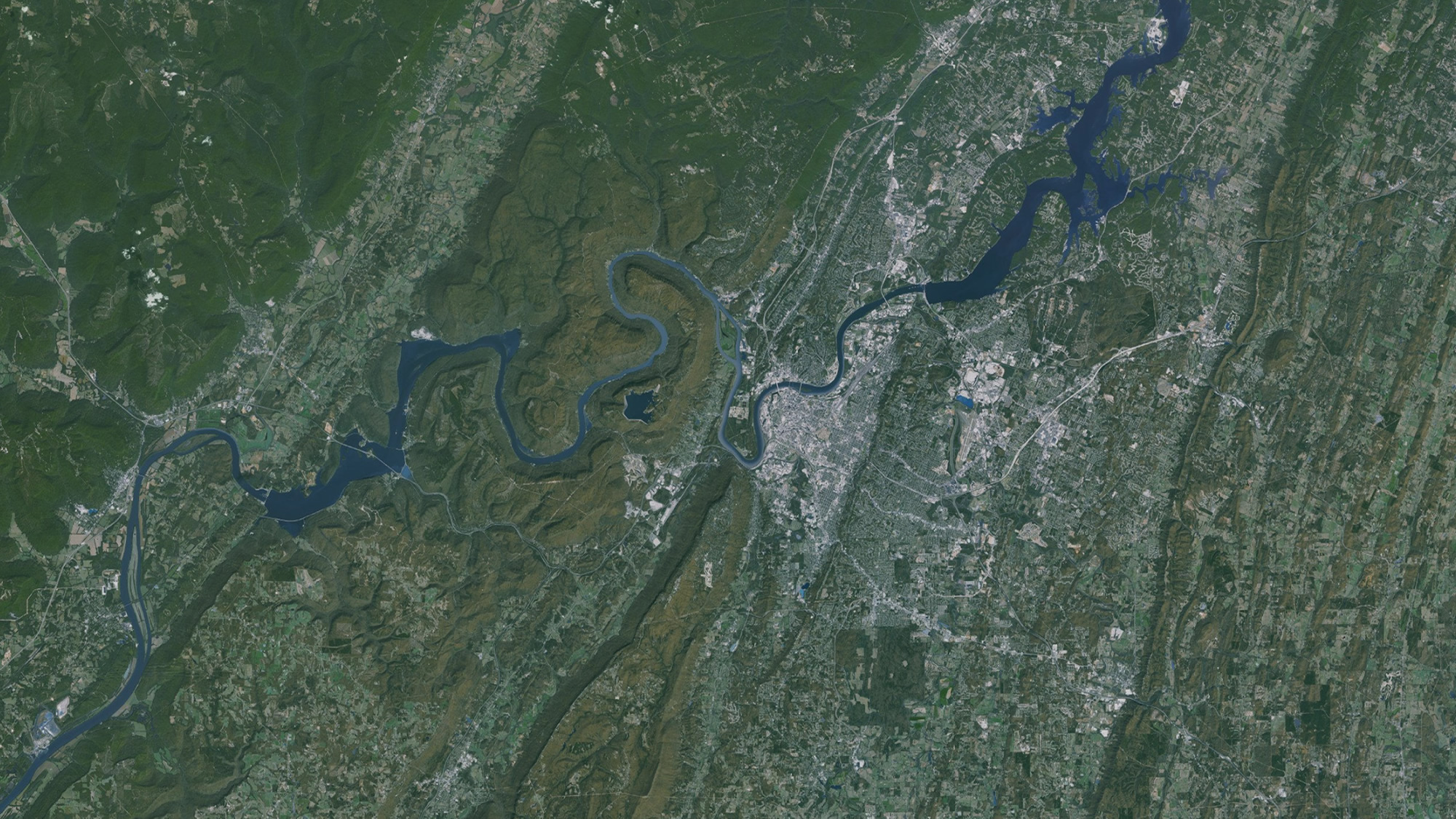
And here it is with a hacked sunrise…
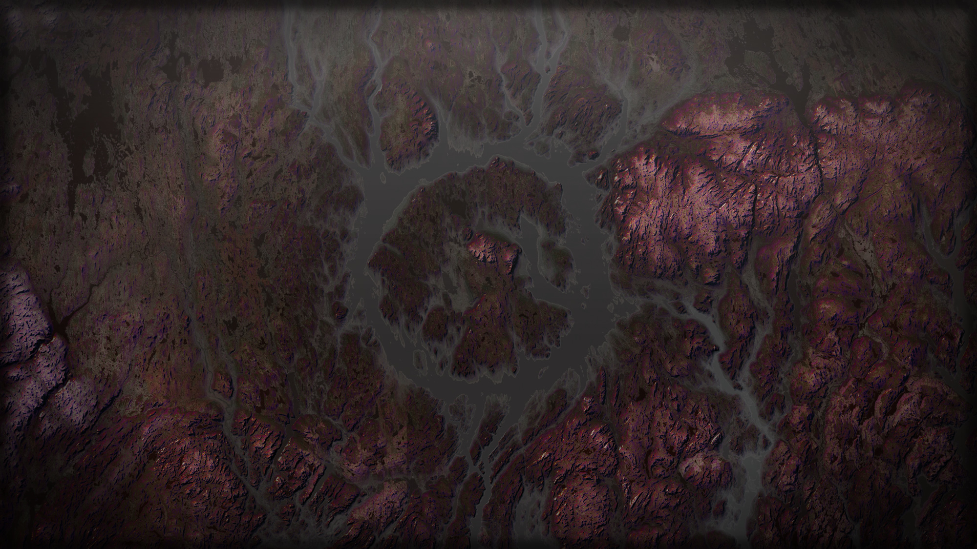
This is the already-amazing Manicouagan crater in Quebec, Canada…
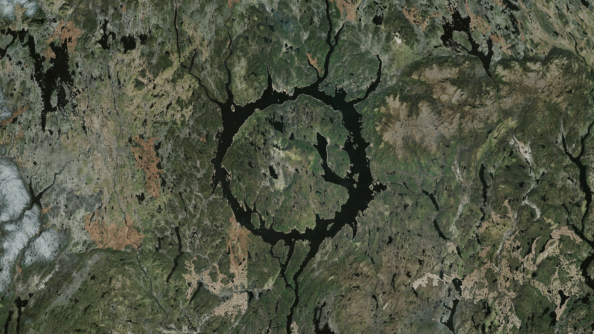
And here is what it might look like from your window seat on an early morning flight…
So there it is! I hope you try it out and share your results.
Happy Mapping! John


Article Discussion: