By Mark Harrower
We are living in an exciting age for GIS and cartography, with maps being used in new ways, to solve new kinds of problems, and across the technology spectrum. To celebrate the ubiquitous nature of maps, Esri User Conference (Esri UC) attendees are invited each year to share their work in GIS and cartography. Hundreds of Esri users display their very best mapping efforts in the Map Gallery at the Esri UC during the week and it represents a remarkable collection of work.
This year, nearly 700 maps were submitted for the Map Gallery. A select number of qualified Esri judges are privileged to evaluate and assess these entries each year.
Map Contest Winners at the 2016 Esri UC
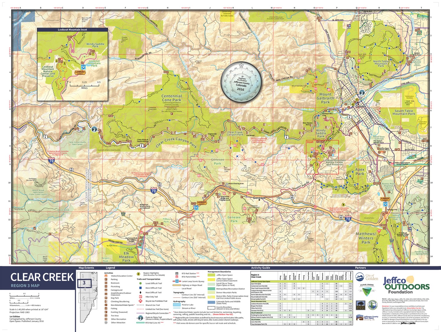
Best Map Series or Atlas was awarded to Jefferson County Open Space for Jeffco Outdoor Map Series for their strong, clear graphic design that pulls the reader in and an overall user experience with many thoughtful design touches. This box set of maps is a collection that makes us want to visit and explore these landscapes.
Most Unique was awarded to Southern California Association of Governments for their Visualization Tool – Scenario Planning and Enhanced 3D GIS. Rather than place supporting information around the edges, important features, call-outs and infographics are placed directly into the 3D scene itself. This map is a great example of how 3D presentations can truly enhance the map reading experience.
The University of Maryland Interactive Campus Map received the award for Using an API in a Map because of its ability to leverage many of the powerful capabilities of the ArcGIS platform through the API. This map has a clean interface and a wealth of information available on-demand.
This year had a fantastic collection of student map entries that left a strong impression on the judges. These maps did more than simply plot data, they used analysis to generate understanding, explored the power of the ArcGIS platform, and communicated their insights clearly and convincingly. Samantha Hmelovsky won the Student Map Under Age 13 category for her poster on The Effect of Dissolved Oxygen and Nitrate Levels on Organisms in the Carmans River. The best Student Map Age 13-18 was awarded to Caitlin Gormley for her map Geospatial Analysis of Hydrofracturing Activities Related to Human Health Outcomes in the Marcellus Shale Region. Michael Clementz was awarded Best Student Map Postgrad for his Air Operations Planning Map Series.


Best Analytic Presentation went to Florida Atlantic University for their poster Correcting Imagery for Accurate Surface Water Salinity Models using GIS and Remote Sensing. They showed a novel process for greater accuracy in analysis, in a well formatted layout, with a resulting model that can be utilized in future analysis for real world needs.
The Best of Show for the Map Gallery this year was captured by Southern California Association of Governments for their Visualization Tool – Scenario Planning and Enhanced 3D GIS. This articulate and information-rich map of a city planning scenario renders an eye-catching urban area with clear thematic cartography in three dimensions, within a thoughtfully muted city texture for context and balance. All elements, whether they are before/after map comparisons, business graphics, or annotated workflow stages, are integrated directly within the three-dimensional perspective while maintaining a balanced composition. Aesthetic choices, such as a semi-futuristic font, faint but crisp reference callouts, and color palette, are perfectly suited to the overall nature of the topic and an effective driver of a tone that implies precision, urgency, and intelligence.
The Cartography Special Interest Group (CartoSIG) is a group of ArcGIS users that meet to discuss mapping best practices. The group also gets together every year to judge the entries in the Map Gallery independently of the Esri’s awards for the purpose of identifying maps that they think characterize excellence in the mapping sciences. They don’t rank these awards but rather present them as maps that can inspire the rest of us. Three of the winners this year were:
Tracy Arms-Ford Terror and Chuck River Wilderness Map by the USDA Forest Service. A well-designed map, with excellent balance, subtle contour lines and glacier contours, and great integration of text and map.
Narrowboat on the Llangollen Canal by Doug Cain which portrays a 18th century working canal. With a long and narrow layout, like the canal itself, this map is clear and readable and makes it easy to locate oneself in the landscape.
The Arctic: A GEOINT Perspective by the National Geospatial-Intelligence Agency (NGA) is a relatively small map, tidy and well-balanced, with great use of the polar projections to tell a story of change over time.
The People’s Choice Award was won by The Republic of Turkey’s General Directorate of Highways for their poster GIS Based Investment Management Systems. This winner is voted on by conference goers themselves and is always a nice achievement for any author.
Members of the International Cartographic Association (ICA) and International Map Industry Association (IMIA) also evaluated the Map Gallery submissions this year. The purpose of the ICA and IMIA at UC Award is to promote and recognize excellence in map design and advancement in cartography. This portion of the competition was open to all mapmakers with registered entries (in any category) within the Map Gallery. Noted cartographers, who have shared their work in the ICA and/or IMIA, judged the entries.
The Impact of Climate Change on Children by UNICEF was recognized by the judges for it’s powerful, stark design on a relevant, topical subject. This work delivered a high impact, strong message with clarity and effective simplicity.
Surficial Geology of Morris County, Kansas created by Kansas Geological Survey showed good connectivity between the elements of the map entry with strong use of color and excellent composition. The richly detailed map was enhanced by the geologic cross section diagrams and the details-on-demand nature of the layout.
The User Application Fair allows members of our community to recognize the latest, emerging technology which moves the state of GIS forward. The award was given to the Unidad de Planificación Rural Agropecuaria (UPRA) for their Script for Grouping Polygons through Accumulated Magnitudes.
Lastly, we have the GeoNet MVPs who are the members of Esri’s Geonet community that have had a major impact in the past year. This award recognizes the most active members of our online community who bring an energy and spirit that makes the community a better for the rest of us. The winners this year are Robert Scheitlin (1st place), Dan Patterson (2nd place), and Rebecca Strauch (3rd place).
insider