Charts are a very important part of analyzing data, but it can sometimes be hard to figure out how to use them. I’m going to use this blog series to walk you through some of the basics of the charts I am the most familiar with: Bar charts, box plots, histograms, and scatter plots. I will be using charts made in Insights for ArcGIS in my examples, but the concepts will be applicable to charts made in other applications as well.
Glossary
Before we start, I want to make sure we are on the same page about the vocabulary I will be using. Here are some of the terms I will use and their definitions:
Categorical data – Data values that are descriptive in nature. Also called qualitative data. In ArcGIS, these data types would often be stored in string fields. Categorical data are often words, but can also be discrete numbers, such as integers. For example, age is a number that can be treated as a category.
Numerical data – Data values that show measurements. Also called quantitative data. In ArcGIS, these data types are stored in number fields, such as double or float. Because the numbers are measurements, they will often be continuous, rather than discrete.
Axis – All of the charts I’m talking about have an x- and y-axis. The x-axis is horizontal along the bottom of the chart and the y-axis is vertical on the left side of the chart. In the four chart types I will be discussing, the x- and y-axis are distinct from each other and perform different functions, meaning it is important that you put the correct data type on the correct axis. The exception is with bar and column charts; you can switch between these two chart types by switching the functions of the axes.
Which chart do I make?
This is the first question you should be asking yourself when you decide to make a chart. Different charts serve different purposes and use different types of data, even if they look similar. For instance, a bar chart and a histogram resemble each other, but they cannot be used interchangeably. Here is a brief overview of the four chart types I will be talking about:
Bar chart – Displays a single number value for each categorical value. The number is often a count, but can also be a sum or average of a numerical field.
Box plot– Displays the distribution of numerical values. There can either be one box plot for an entire dataset, or individual box plots based on categorical values.
Histogram – Displays frequencies of numerical data.
Scatter plot – Displays the relationship or correlation between two numerical values.
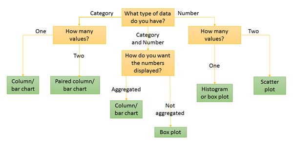
I know it’s a lot to take in, so I also made this handy flow chart that you can use to determine which type of chart is best for you to use:
I want to know more!
This blog was a brief overview of some chart types. Stay tuned for a more in-depth discussion on each of the chart types, where I will provide a closer look at the data being used and the types of questions being answered, as well as interpretations of example charts.
Bar charts – Three statisticians walk into a bar
Box plots – Even Schrodinger thinks this blog is alive
Histograms – A normal chart used with a lot of frequency
Scatter plots – Coming soon!
Resources
- Insights for ArcGIS Help – Create charts
- ArcGIS Pro Help – Make a chart


Article Discussion: