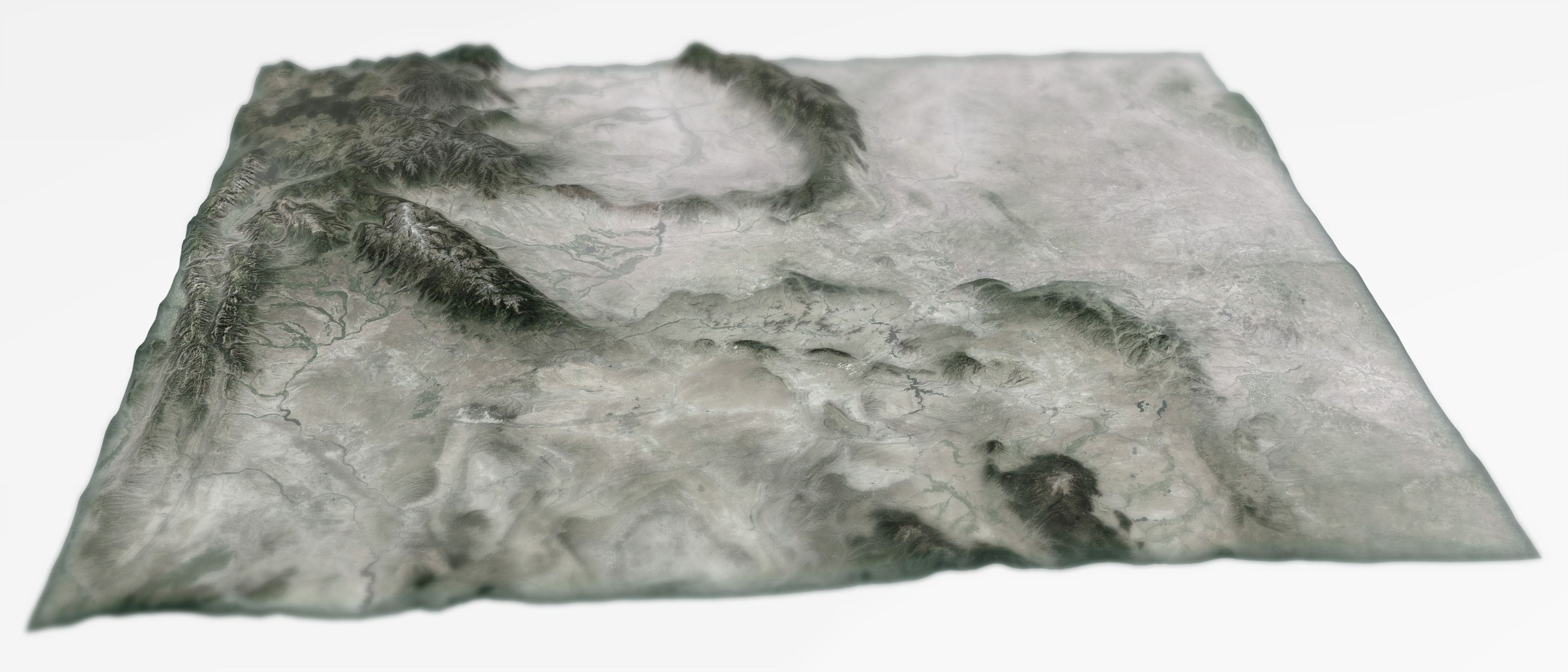
This is a physical map of the beautiful US state of Wyoming.
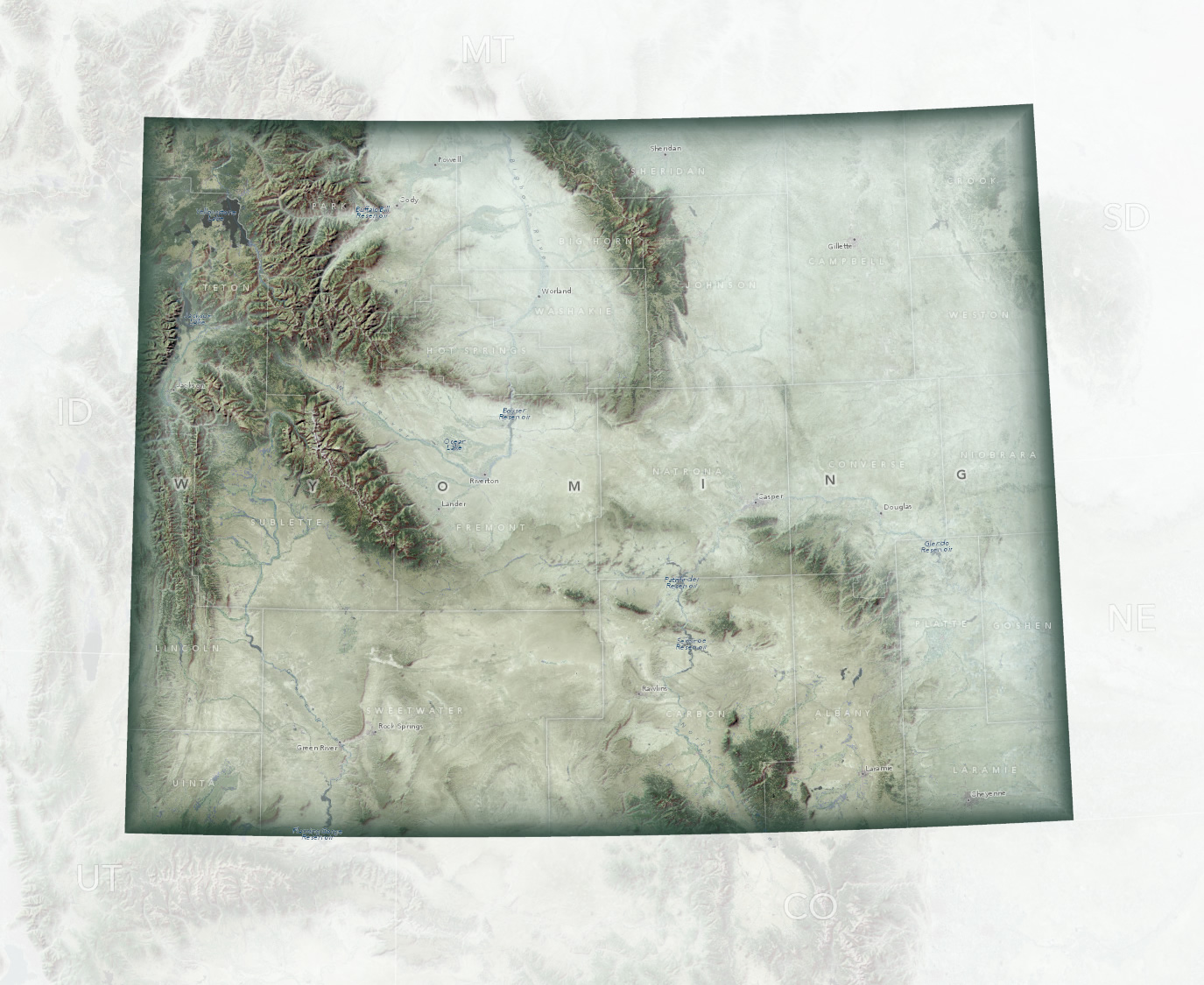
And here is a quick cheat sheet of its elements:
And here is this blog post in fast-forward:
Let’s take a closer look at this cartographic process in ArcGIS Pro, shalllllllll weeeeeee…
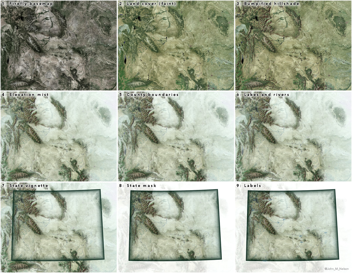
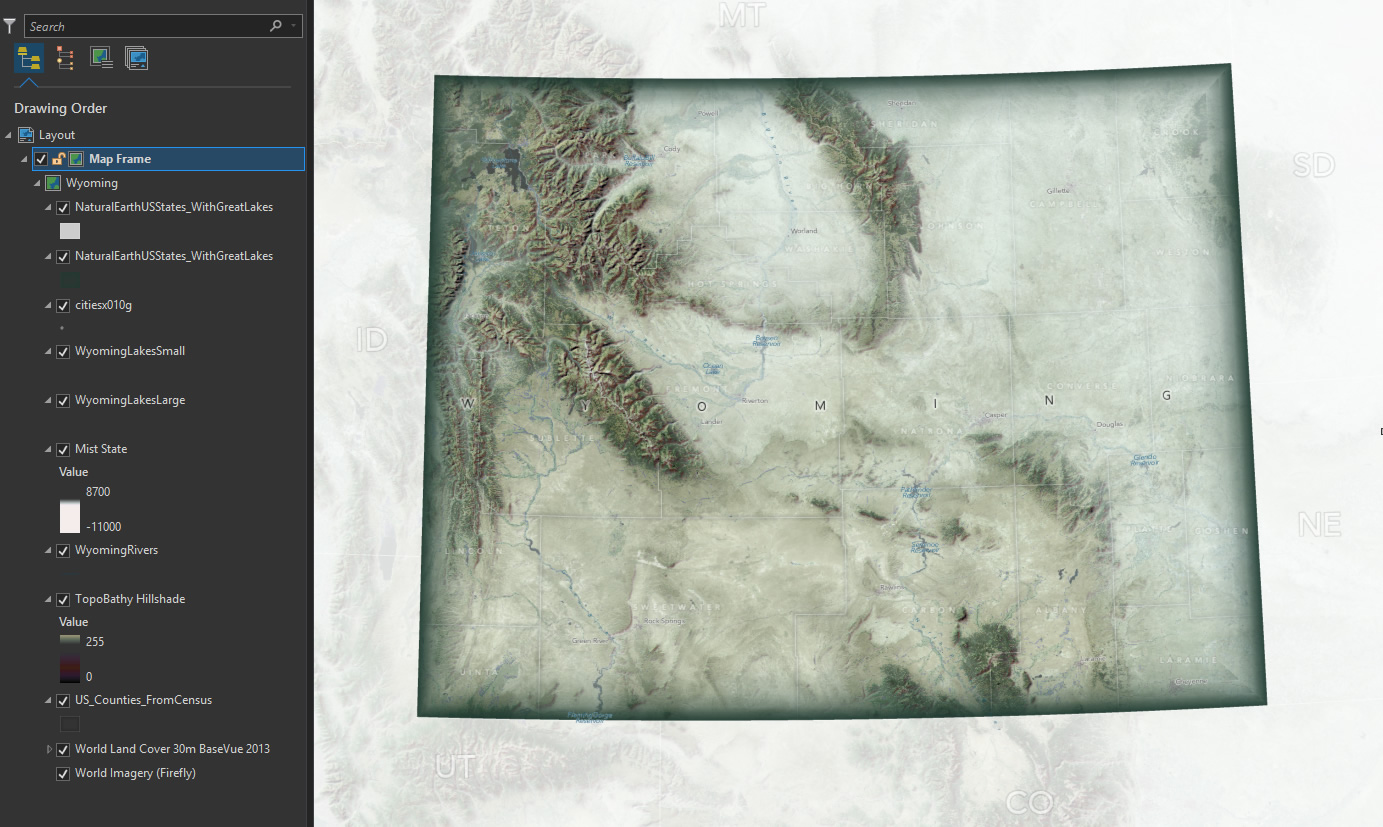
Imagery Layers
Just like an onion. The more layers there are, the more they’ll cry. Why are they crying, and who are they? We don’t have time to delve into the unknowably complex workings of the human heart. But we (I, anyway) definitely have time to delve into the knowably simple workings of this map.
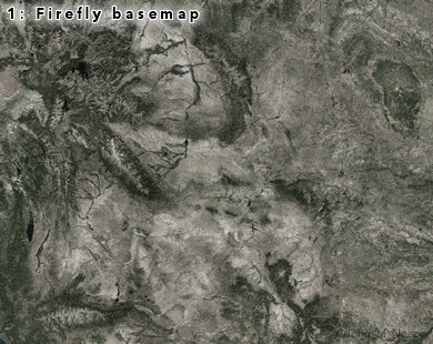
This map begins, as do many of my weird concoctions, with a Firefly Imagery basemap. Just the basemap, though, no glowing stuff this time around. The Firefly Imagery basemap provides us with rich, desaturated, surface texture without all that bothersome hue. Great context.
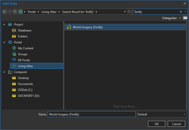
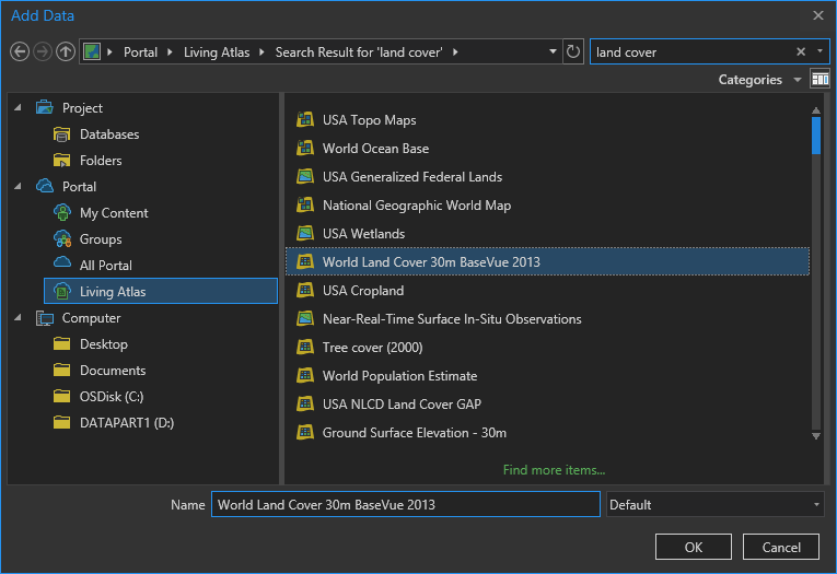
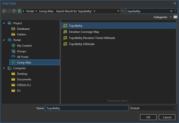
In the Add Data dialog, there are lots of ways to bring content into your project. I suggest you explore what is available in the Living Atlas, a curated warehouse of great, hosted, content. I’ll make lavish use of it in this map. By choosing the Living Atlas source and searching for “Firefly” I find and add the Firefly Imagery service.
I love it.
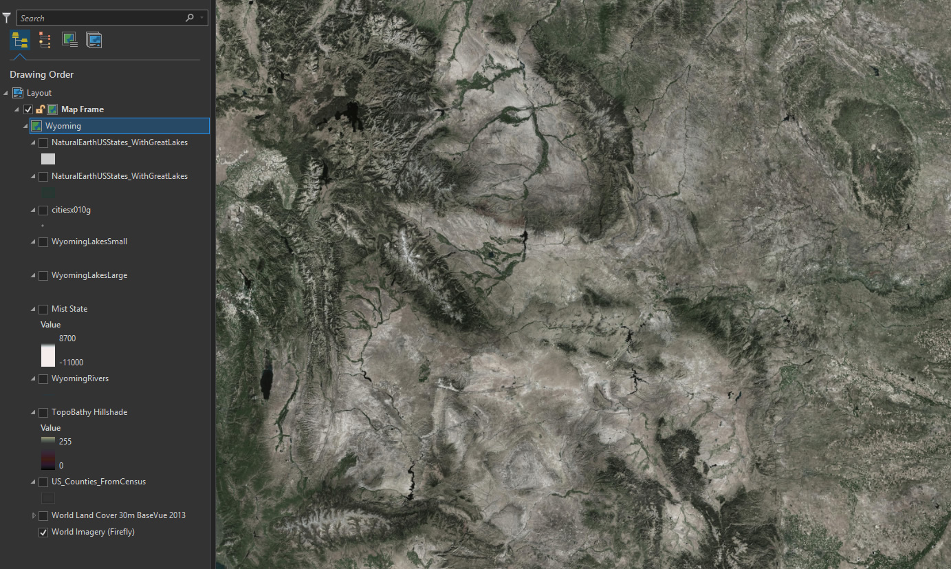
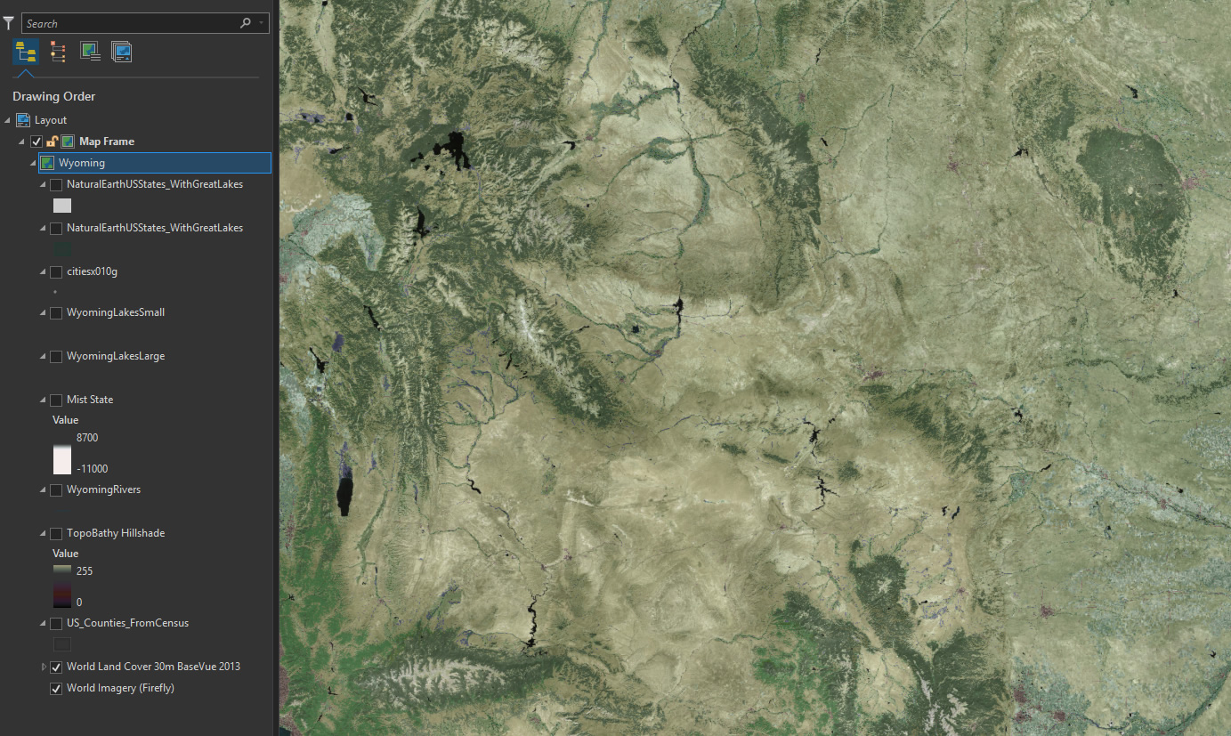
But this is going to be a physical map, so while the Firefly Imagery provides a good textured tonal base, I want to add a cartographic Land Cover layer to paint back in some contrived hues.
When I give this layer a transparency of 65%, I get a merging of the Land Cover chroma with the Firefly texture.
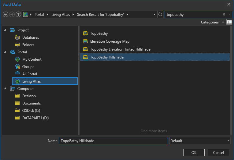
The topographic relief of Wyoming is magnificent. I want to call attention to the beautiful, and variable, ruggedness of the state. So I pulled in a hillshade layer from the TopBathy set…
But the default grayscale appearance is of little use to me, so I play with colors and opacities in the Color Scheme Editor and get a color ramp that has fully transparent mid-tones so the underlying map doesn’t looked washed out; rather, it has been bumpified. More on that here.
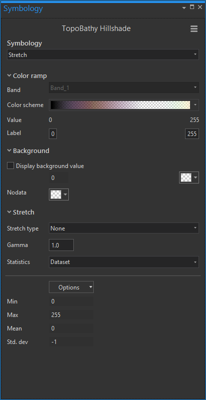
Now it looks like this:
Yowza, those mountains are coming right at us! Now this looks like a map I could run my hand over. The bumpification hack is great, and it pairs especially well with the mist hack. Let’s pull in a simple Digital Elevation Model, also from the TopoBathy family of elevation data…
By default, it looks like the typical DEM ramp of black to white. But you can perform all sorts of color/opacity shenanigans to make it paint in a misty white only at the lowest elevations.
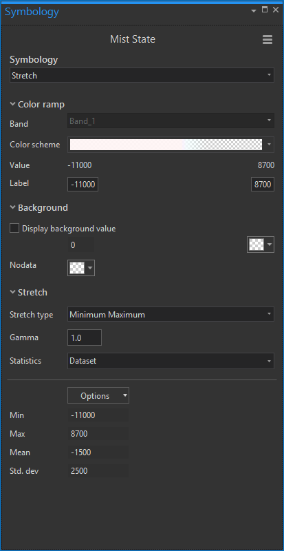
The result is an elevation layer that replicates a ghost-like mist that clings to lowlands and meanders up and through mountain valleys. High elevation mountains are revealed in crisp clarity as they rise above the wispy plains. This gives the map a painterly sense of forced reality. Find more self-indulgent examples here.

Vector Layers
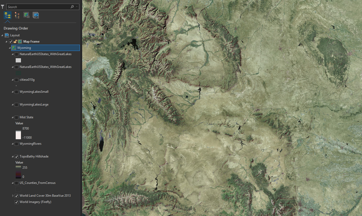
Pretty fun right? Who’s got it better than us, seriously. So far this map is made up only of a Firefly Imagery basemap, and two deviously symbolized TopoBathy image services. Time to get all vectory on this map though.
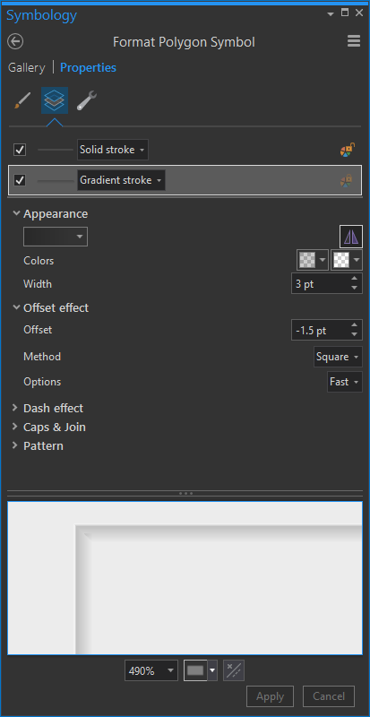
I downloaded US Counties from the Census Bureau, and symbolized them with a thin white stroke and and underlying black gradient stroke to give a slight dropshadow effect. This inherent contrast helps them remain visible, albeit faint, over lighter and darker terrains. Plus I think it looks kind of nice. Learn more about using Symbol Layers to stack up visual layers in an item’s symbology here.
Resulting in this appropriately muted counties overlay…

Then I added lakes and rivers from the super helpful Natural Earth. Since the lakes are visible in the imagery and land cover, I gave them a null style (but still checked on) as a foothold for labels, later. Rivers are thin semitransparent blue strokes. Barely visible, really. Towns, also quite small and mostly added as a label foothold, came from a US DOT Open Data portal.
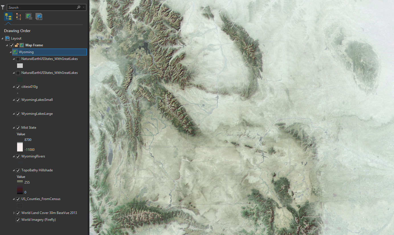
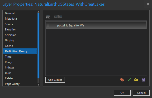
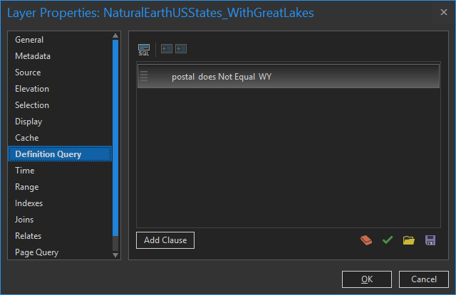
Next I added a states layer, also from Natural Earth. But in this case I only wanted to show the state of Wyoming, to set a visual focus for the map. How can you only show one state from within the states layer? A definition query! The visual query builder made it easy, even for a stooge like me. Definition queries quickly became a tireless ally of mine in this project. For what it’s worth, I also used them to show only larger-population towns in the step above.
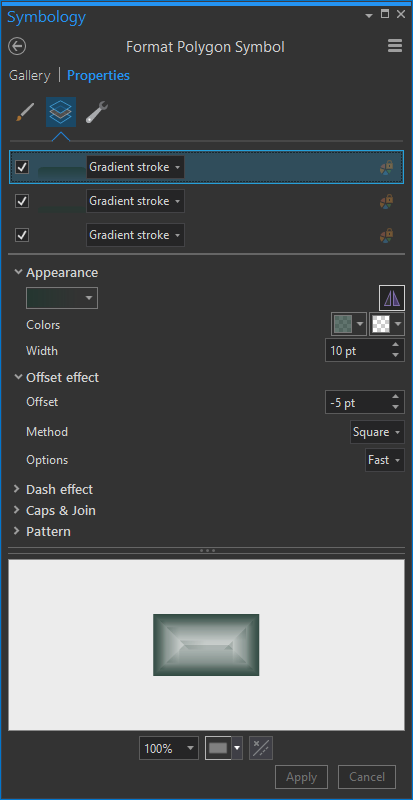
The visual goal of this is to make the border of Wyoming look like a cool vignette, wrapping around the state and mega-framing the theme and content. I gave the symbology a few gradient strokes (make sure you give them negative offsets of half the line width, so they render inside the state (positive offset if you wanted them to render outside the state, like a dropshadow).
Ah, there’s Wyoming!
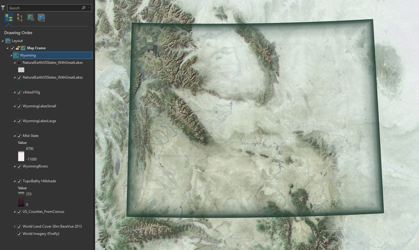
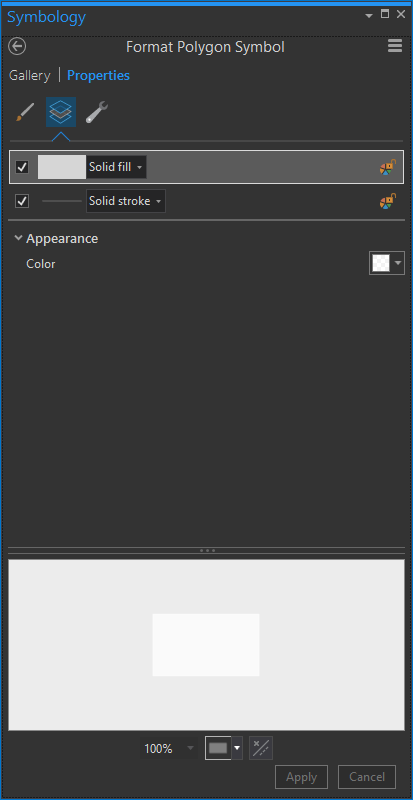
To further this goal of highlighting Wyoming, I added a second version of that states layer to serve as a sort of visual masking effect. But rather than showing only Wyoming in this case I chose to hide only Wyoming.
I gave these not-Wyoming states a semitransparent white symbology.
Which looks like this:
Now there can be no doubt. Wyoming, clearly the star of the show.
For what it’s worth, this trick looks pretty cool in 3D.
Labels
Adding labels to each of these layers is a blog post in itself. But I’ll just breeze through it with a couple of tips.
- Embrace transparency. I’ve made all text semitransparent and their halo colors even more transparent. If a layer is less important, like counties, transparency can help reinforce that.
- Contrast font color with halo color. I either used semitransparent gray fonts with semitransparent white halos or a semitransparent white font with a semitransparent black halo.
- Use letter spacing with abandon. If you have crowded low-priority features, like towns, push the letter spacing tighter together. So long as they are readable, it’s cool. If you have a tier one feature, like the state name of Wyoming, go bonkers with letter spacing (and force all caps). In this example WYOMING has an eye-popping letter spacing of 1,600%.
- Orient labels to curve along the graticule. It seems to give the labels a sense of belonging in the geographic context.
Well, there you have it. The steps of how to make this map. Maybe you don’t even want to make a map like this! But even still I think there are some helpful tidbits in here for all flavors of mapping adventures.
Show And Tell
I’ve heard Daniel Huffman describe much more eloquently the creative, and technical, empowerment that comes with watching another map maker pull back the veil and show their process. But I have to rely on analogy. I am often fascinated by, and frankly intimidated by, many Vader-caliber maps that I see out in the wild, just swinging that lightsaber and breathing through a respirator like an unknowable machine. But when I’ve had the opportunity to chat with that maker, or watch them give a how-to talk, or read their blog post, I realize that any map is just a series of usually-doable steps, and underneath the helmet is a redeemed old gray dude with burned off eyebrows. The magic was in thinking the steps up and putting them together just so. Anybody can do it.
Happy Mapping! John


Commenting is not enabled for this article.