Note: This blog covers the classic Esri Story Maps, but many of the concepts and ideas also apply to the new ArcGIS StoryMaps. Story authors are encouraged to use ArcGIS StoryMaps to create stories; however, Esri will continue to maintain the classic templates for your use. For more information, see the Product road map.
Story Map Cascade and Story Map Series received several key enhancements related to accessibility in June 2018, and prior to that Story Map Journal received similar enhancements in December 2017. Most of these enhancements, like keyboard navigation and improved semantic structure, just work for all stories new and old. But the ability to add alternative text to media is a feature that requires action from the story map author. So read on to learn how to improve the accessibility of your story maps using this feature.
***
What is accessibility?
If something is accessible it means that people with disabilities can use it. Just like a public building can be made accessible by the installation of an entrance ramp, web content, such as a story map, can also be made accessible by the addition of some key pieces of infrastructure.
Most organizations have accessibility guidelines for web content, and many are required by law to adhere to certain accessibility requirements. For example, web content published by US federal government agencies is subject to Section 508 standards. The World Wide Web Consortium (W3C) also publishes guidelines for web accessibility known as the Web Content Accessibility Guidelines (WCAG).
***
What is alternative text?
Alternative text, or “alt text” as it is often called, provides a textual alternative to visual web content such as images, videos, and maps. Alt text serves several functions, but the one most pertinent to story map authors is that alt text is read by screen reader software in place of a media item allowing its content and function to be accessible to those with visual or cognitive disabilities.
The idea behind alt text is that software (web browsers and screen readers) cannot effectively discern the meaning of visual media for your readers. As an author, alt text lets you provide a description of the content and function of media items in your story map so this information can be successfully communicated to readers using assistive technologies.
More background information about alt text can be found in the links at the end of this post.
***
How do I add alternative text to my story?
You can use the Cascade, Map Series, and Map Journal builders to attach alt text to media in a story. This includes media in the main stage and narrative panel as well as media that appears in the main stage via a story action. You can add alt text to new stories as you create them, and you can go back and add alt text to stories you’ve already made.
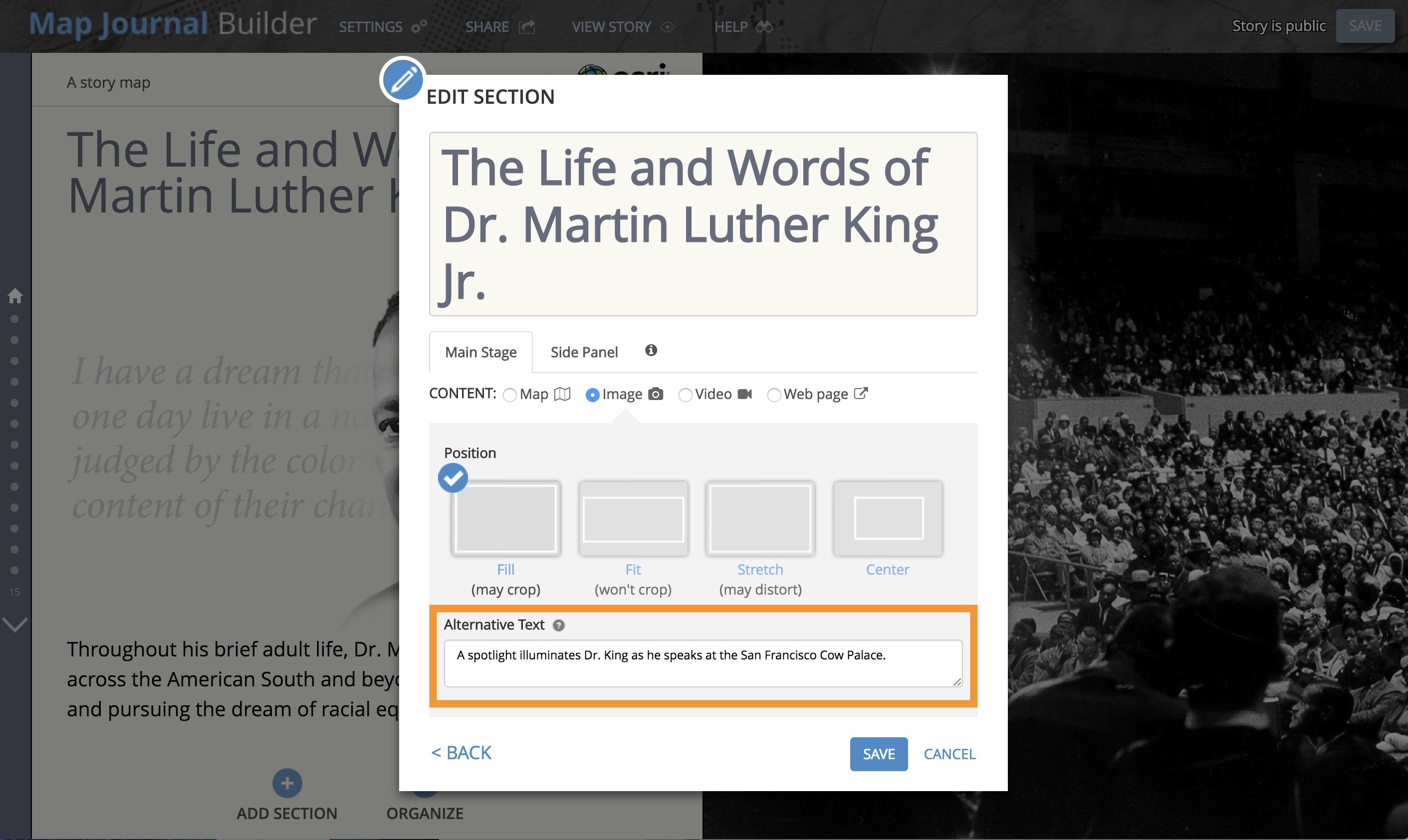
In the builders, wherever you add media to a story, there is a place for you to add alternative text. For example, when you configure content to appear in the main stage of a section of a Journal or Series story you’ll see the Alternative Text box, as shown below (click an image to expand it). The box is expandable by dragging the lower right corner if you need more space.
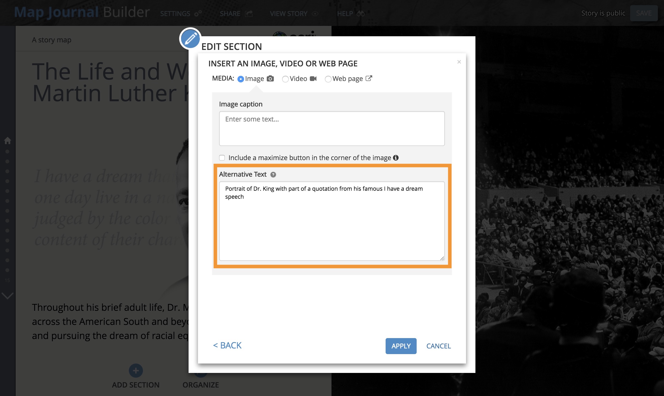
When you insert media in the narrative panel you’ll see a similar alt text entry box…
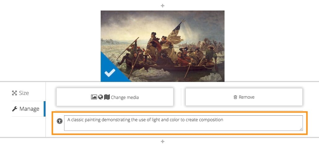
In Cascade Builder, the alternative text field is on the Manage tab of the media configuration panel.
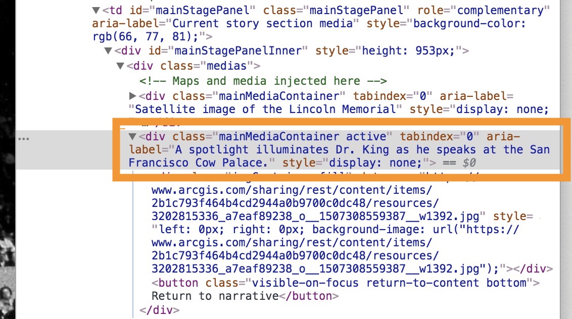
When you add alt text to a story, it won’t be visible anywhere in the finished story so sighted readers won’t see the alt text. To get technical for a moment, the story map template attaches the alt text you enter to the aria-label tag of the media container <div> element in the story map’s HTML code. Screen reader apps know how to find text attached to aria-label tags and speak it when the corresponding media has focus.
***
How do I write good alternative text?
Now that you know how to add alt text to your story map, it’d be good to know how to write effective alt text. There are many articles about this on the web, and everyone has their own opinion about what makes for good alt text. It is worth reviewing some of the detailed resources provided at the end of this post to see specific examples of good and bad alt text, but in general there are a few simple guidelines you can follow:
Be concise. Alt text should be brief and free of filler words and phrases. Remember, alt text will be read aloud by screen reader software, so you don’t want to waste the time of readers using assistive technologies with wordy text. Don’t begin alt text with phrases like “This is an image of….” Assistive technologies announce what type of element has focus, so it’s not necessary to add this to the alt text. Also, alt text does not always have to be a complete sentence.
Don’t be repetitive. Don’t reuse a caption or descriptive information in the main narrative for alt text. Assistive technologies will read everything, so reusing text leads to unwanted repetition. Instead, think about how the narrative, caption, and alt text work together to provide a complete picture for both sighted and disabled readers. Media that already have a full description in the caption may only require very simple alt text (for example, “map” for a map or “flowers” for an image of flowers). Photo or map data credits should go in the caption (and not in the alt text) so that information is available to all readers.
Consider context. Alt text used for a particular media item depends on the topic of your story and the context in which the media appears. Remember to consider the media item’s content and function — which are both context-dependent — when writing alt text.
Include text that appears in an image. If an image contains text that is important to the story — such as a photo of a protester holding a sign — that text should be included in the alt text. Otherwise this important information will not be communicated to users of assistive technologies. If words in a photo are not directly related to the story they can be omitted from the alt text.
For maps, communicate the purpose of the map, not what’s in the map. Remember, alt text should be used to inform the reader about the content and function of media in your story. Resist the urge to give a list of layers or features in a map; instead, use alt text to communicate the map’s purpose and how the information in the map should be interpreted to support your story.
Alt text isn’t needed for decorative images. Decorative images, such as a fancy line graphic serving as a section break or a stock photo that doesn’t directly support your narrative, don’t need alt text. Simply leave the alt text blank for these images.
***
OK, how about an example?
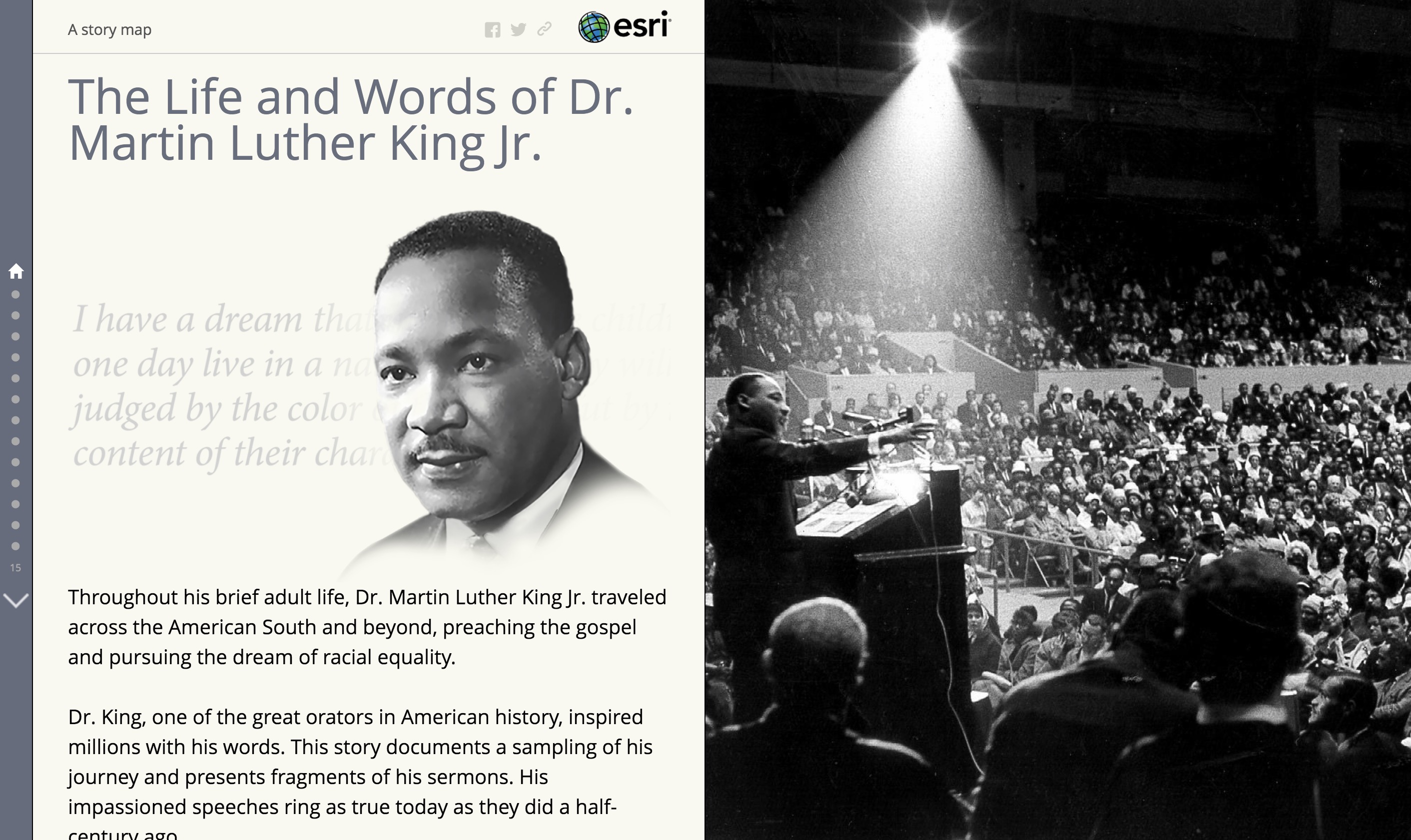
Recently, Esri’s Story Maps team published a story about Dr. Martin Luther King Jr.
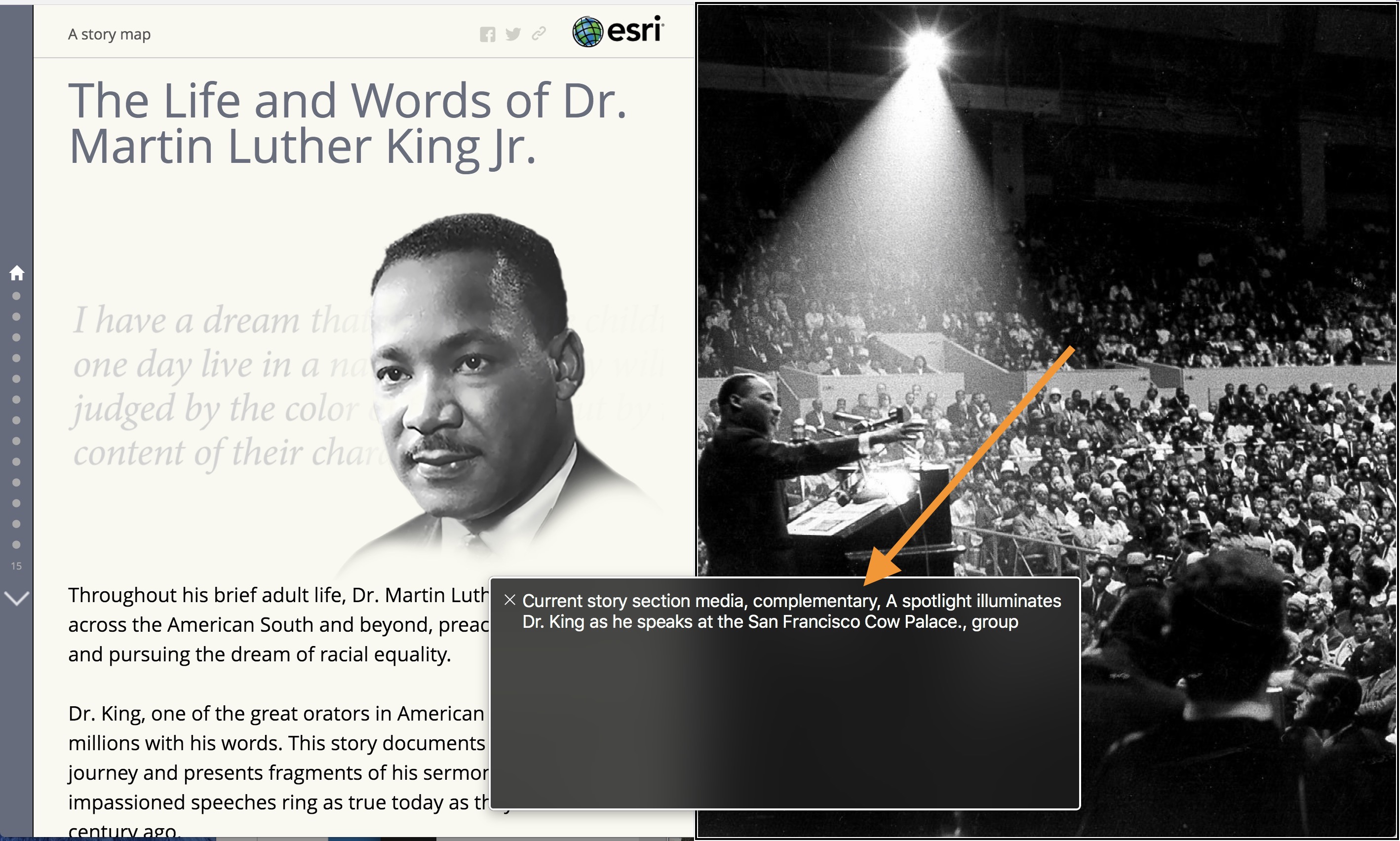
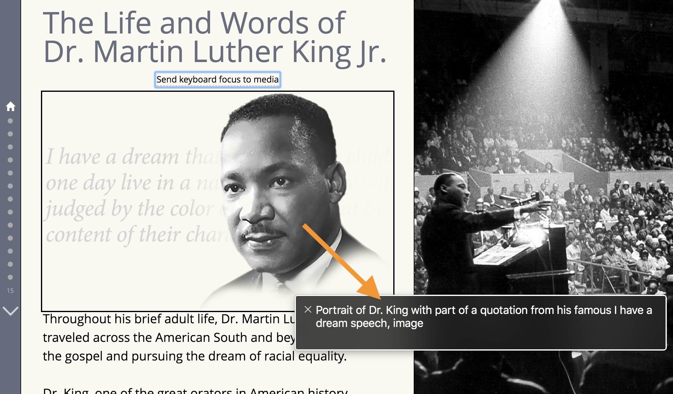
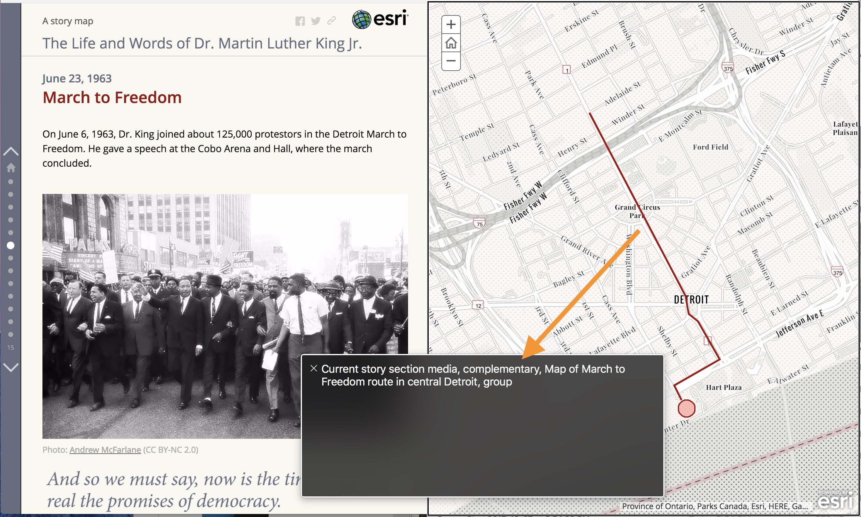
This story has been updated to include alt text and we’ll use it to walk through a few examples. Each screenshot below (click an image to expand it) has a black outline around part of the story and a black box at the bottom of the screen. This is the user interface for VoiceOver, the native screen reader software on Macs. The outline indicates the active story element, and the text in the black box is what is read by the screen reader. This typically includes alt text and other informational text about the active element.
You saw the alt text entered for the image in the home section’s main stage in a previous section. The text in the black box in the screenshot below is what VoiceOver would read. Notice the landmark role of the content is also announced. We shared information about landmarks and how they work in a previous blog post.
And the image in the side panel of the home section…
Of course this story map contains several maps. Here’s an example of alt text for one of those.
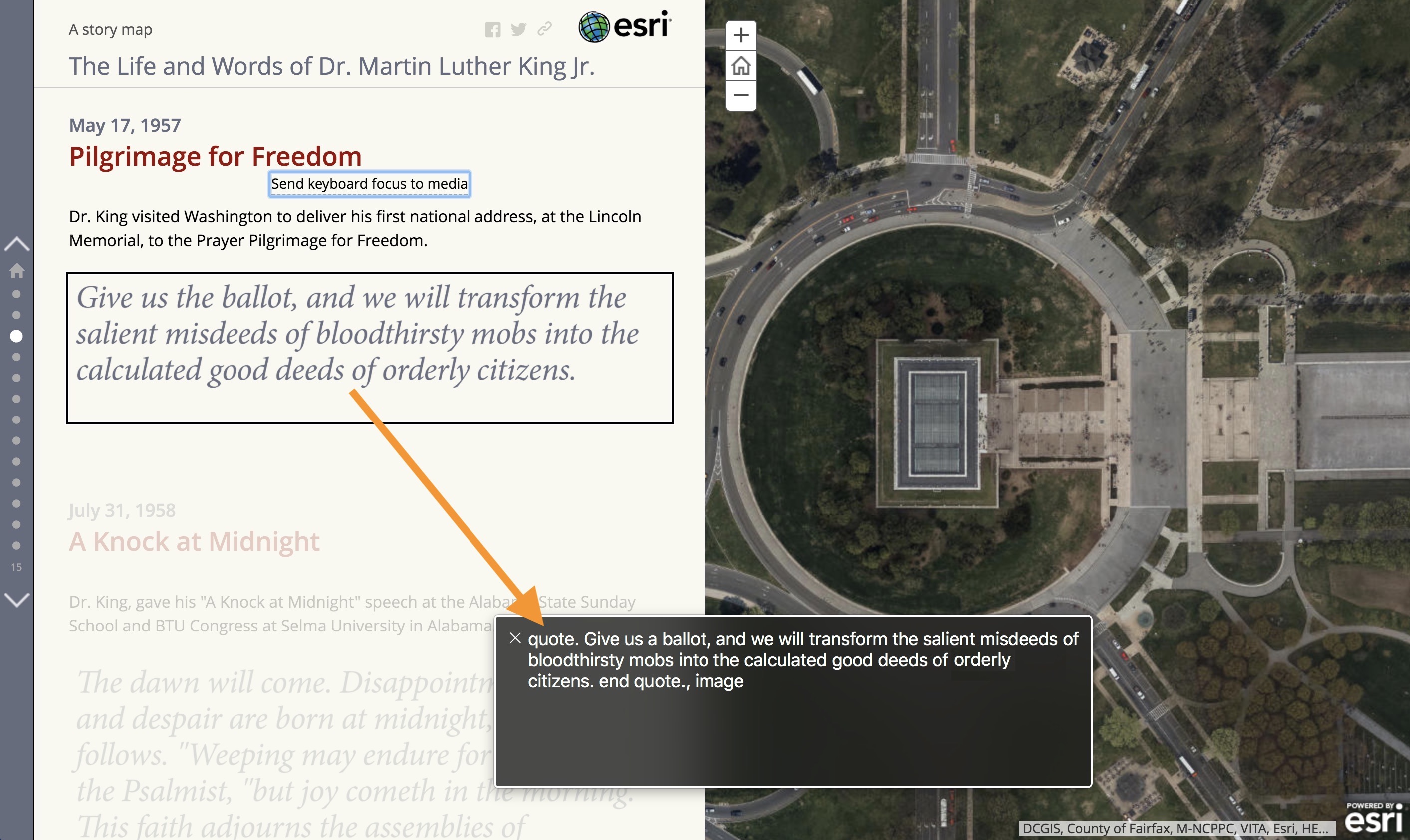
In addition to the usual maps and photos, this story contains images of stylized text showing quotes from Dr. King’s speeches. Before the December 2017 update (that is, before alt text) these quotes were not accessible to visually impaired readers. Now the quotes are spoken to screen reader users because they have alt text.
We included the words “quote” and “end quote” at the beginning and end of each quotation to indicate to users of screen readers that these are the words of Dr. King, not of the author. This is an example of using the context to tailor alt text for a particular situation.
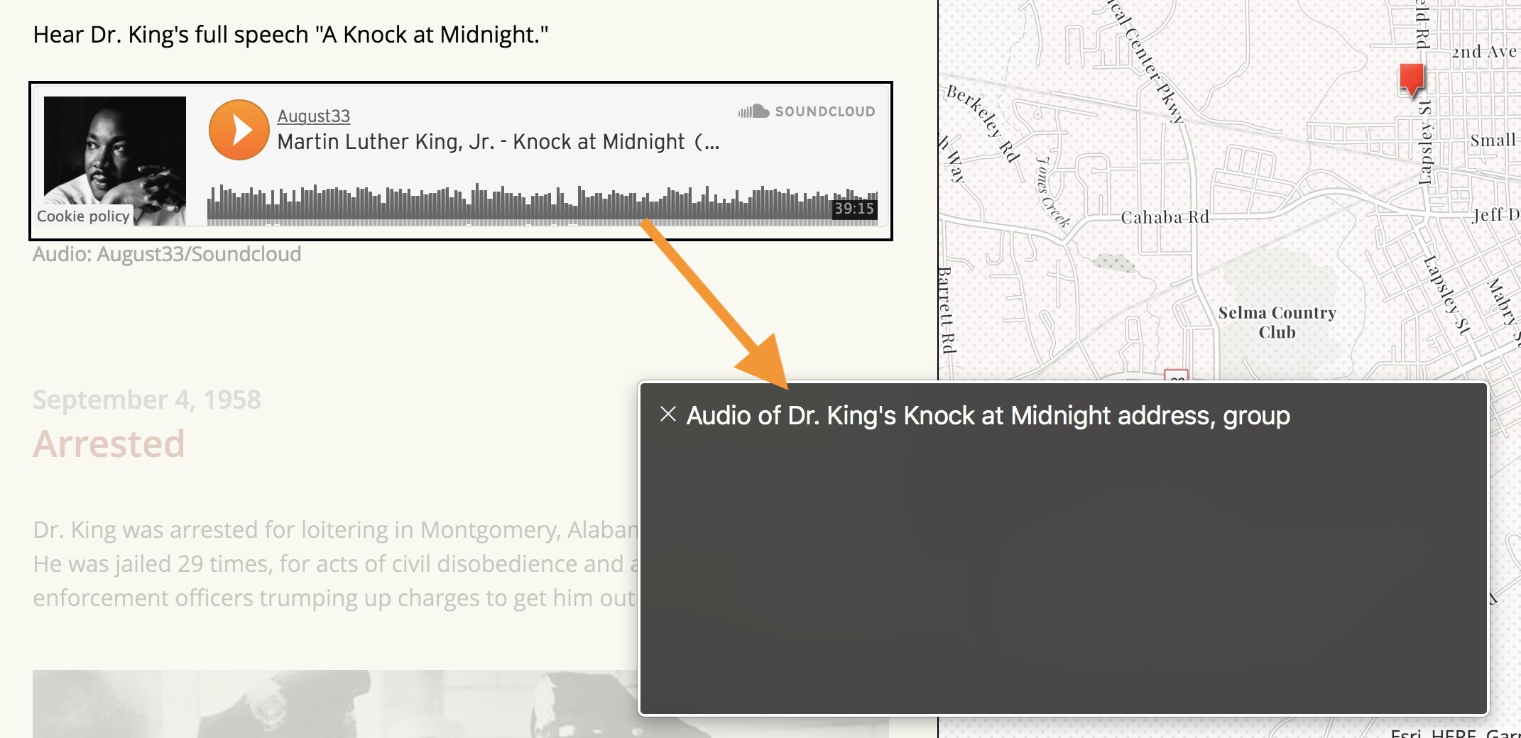
The MLK story also has several audio clips with excerpts of Dr. King’s speeches. The alt text for the audio clip (which is added as web content in the Map Journal builder) was written so that it informs the reader about the type of media.
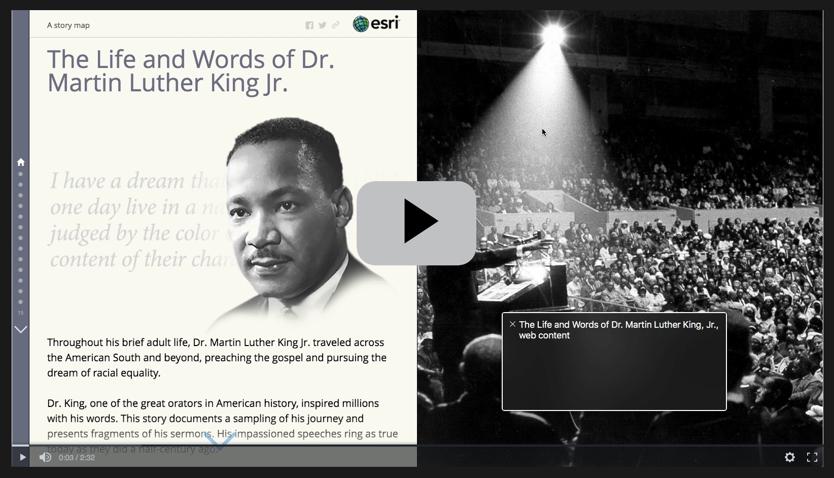
Finally, here’s a short video of what it looks and sounds like navigating through the MLK story using a screen reader like VoiceOver.
***
Summary
This post covered how to write good alt text and how to add it to your story maps. Now that you’re armed with this knowledge, we encourage you to use alt text in your next story and consider adding it to stories you’ve already created and shared publicly.
***
For more information
Here are some additional resources on alternative text with more examples.
- https://webaim.org/techniques/alttext/
- http://4syllables.com.au/articles/text-alternatives-images-examples/
- http://4syllables.com.au/articles/text-alternatives-images-captions/
Also see this post for more information on other accessibility features of story maps.
This post was originally published in December 2017 and was updated in June 2018.



Commenting is not enabled for this article.