Since the earliest recorded human history, maps have served to preserve and transmit geographic data by means of a visual representation. As such, they appeal to both the creative and logical aspects of our thinking; they’re artistic but also logically organized around location.
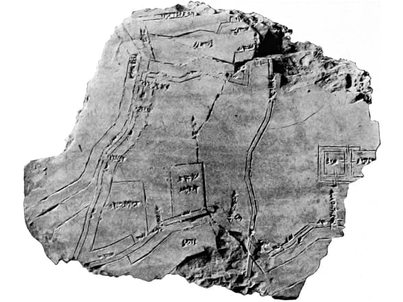
This 2,500-year-old Babylonian clay map shows a plot of land in a river valley between two hills. Inscriptions record the owner of the 12-hectare parcel as a person named Azala.
The best maps unlock the full potential of the underlying data. Although the makers of the examples on this page weren’t likely thinking about their knowledge of landownership or safe harbors as data, this information was valuable enough to commit to capturing in their respective maps. Although this book is primarily about modern digital interactive maps, it’s practical and inspiring to recognize that good maps utilize information design principles that have been evolving for centuries.
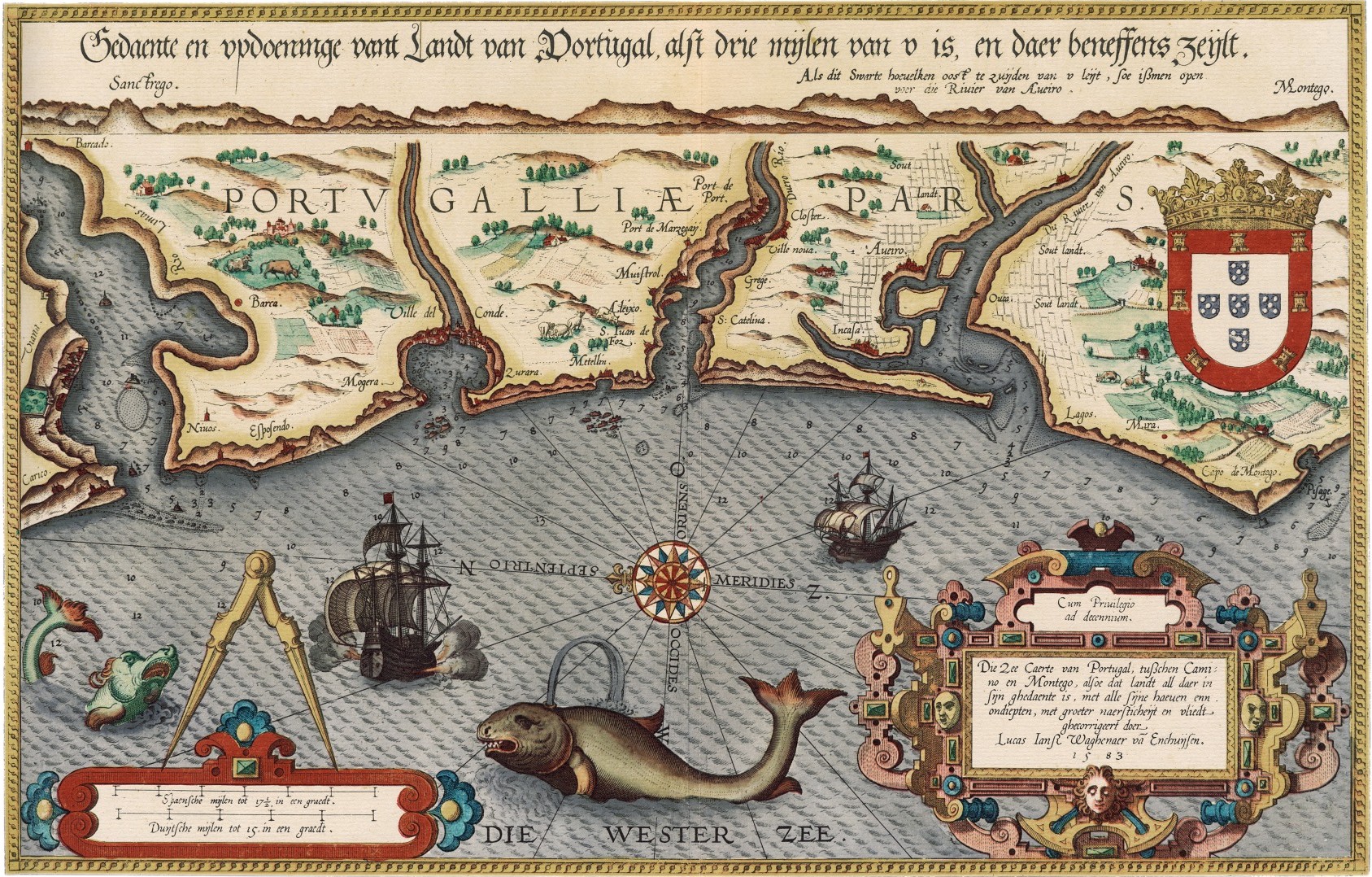 This 1584 map of the waters off coastal Portugal contains a wealth of invaluable geographic information for mariners (such as sailing directions and the locations of harbors). The nautical atlas where it first appeared was the first of its kind, and an immediate commercial success. Modern sailors, while equipped with more accurate (and up-to-date) depictions, can still appreciate the critical value of the information, as well as the aesthetic beauty of its presentation.
Online maps can also provide the same powerful emotional and visual appeal of the great, printed maps. The age-old idea of information arranged spatially and thoughtfully presented for an intended audience will always be the guiding philosophy behind the work of geographic storytellers.
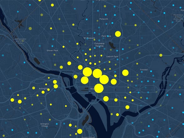 This map of daytime population patterns is effective because (A) it simply conveys several related datasets (predominance of workforce versus home daytime population), (B) it is multiscale with total US coverage, (C) it is interactive and can be “clicked through” to uncover more detailed information, and (D) it makes effective use of bright spot colors displayed on a muted but still readable basemap.
Successful maps work because they present some piece of geographic information in ways that illuminate, elevate, distinguish, intrigue, inspire, and promote fresh perspectives or points of view.
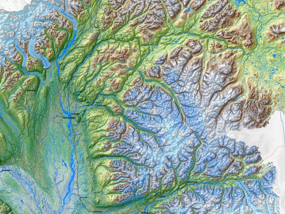
The Matanuska-Susitna Basin has a complex geography and dense hydrologic network of streams, rivers, and lakes. This map works by employing important techniques to present a striking view of the entire area.
—–
This post is excerpted from The ArcGIS Book, Second Edition: 10 Big Ideas about Applying The Science of Where, by Christian Harder and Clint Brown. The twin goals of this book are to open your eyes to what is now possible with Web GIS, and then spur you into action by putting the technology and deep data resources in your hands. The book is available through Amazon.com and other booksellers, and is also available at TheArcGISBook.com for free.

Commenting is not enabled for this article.