I knew I’d found my next story map topic when I came across the press release for Mastercard’s Global Destination Cities Index. Travel, data, new discoveries, exciting places—with so many fun things rolled into one topic, I just couldn’t pass it up. But getting from an idea to a completed story is itself a bit of a journey, with many “stops” for creative decisions made along the way. Here’s a quick look at the process behind creating a story map on the biggest global destinations of 2017.
Setting the mood
My first order of business was to settle on design elements—like colors and typography—that would give my story the right vibe. I wanted something that spoke to the playfulness of the topic, emphasizing the notions of fun and adventure that are inspired by thoughts of travel.
Since color has such a strong influence on a reader’s reaction to content, I started by selecting my color palette: orange to evoke a sense of optimism and confidence, purple to add a bit of luxuriousness to the mix, with a some yellows and pinks to round out a groovy spectrum of hot tones.

A dark background provided great contrast for such a bright palette, so I used the dark theme in Cascade and then tweaked the story’s color scheme slightly until it had the exact shades I wanted. (You can learn more about customizing the colors and fonts in your Cascade story maps with this handy Developers Corner post.)
Last but not least, I had to choose my type. A nice, clean san serif would help keep things feeling modern and light, so I stuck with Open Sans from the built-in list of font options in Cascade for both my heading and body copy.
Building the experience
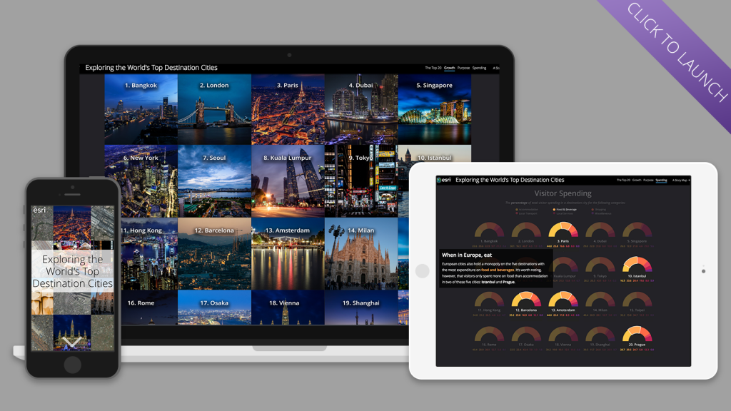
With my design decisions in hand, it was time to think about how I wanted to actually present the ins and outs of the Destination Cities Index to my audience. Inspiration struck, as it usually does, while I was out on a walk (to the grocery store, in this instance). Why not lead the reader through the data in the same way a tour guide might introduce a visitor to a new city? The idea seemed promising; I could lay out all the data, call special attention to some of the more interesting bits, and leave the rest for the reader to meander through at their leisure.
The Cascade app made the realization of this idea a breeze, thanks in large part to its immersive section and transition capabilities. Slow fade transitions were key for illustrating the change in top 20 destinations depending on the metric being considered, letting the circles from one map seemingly shrink or grow as the reader scrolled to the next. (If you like this effect and want to know more, there’s no better guide than this comprehensive explainer on the subject.)

I relied on the same technique to bring each series of charts to life. By laying out the visualizations as a series of small multiples, I could ensure all 20 were visible on the screen at once, locked in place as the background of an immersive section. Then, I created several iterations of the same 20-chart layout, placing a semi-transparent rectangle on top of each one. For each iteration, I moved a selection of charts—ones I wanted to specifically note—above the rectangle, creating a masked effect.
Once I loaded the series of small multiples into an immersive section (set with no crop, a manually selected background color, and the slow fade transition), I could scroll through and watch as some charts popped forward and demanded my attention, while others receded into the background. At first pass, however, the change was a bit too subtle—bumping up the opacity of the masking rectangle created the more dramatic shift I was after.
Crafting each component
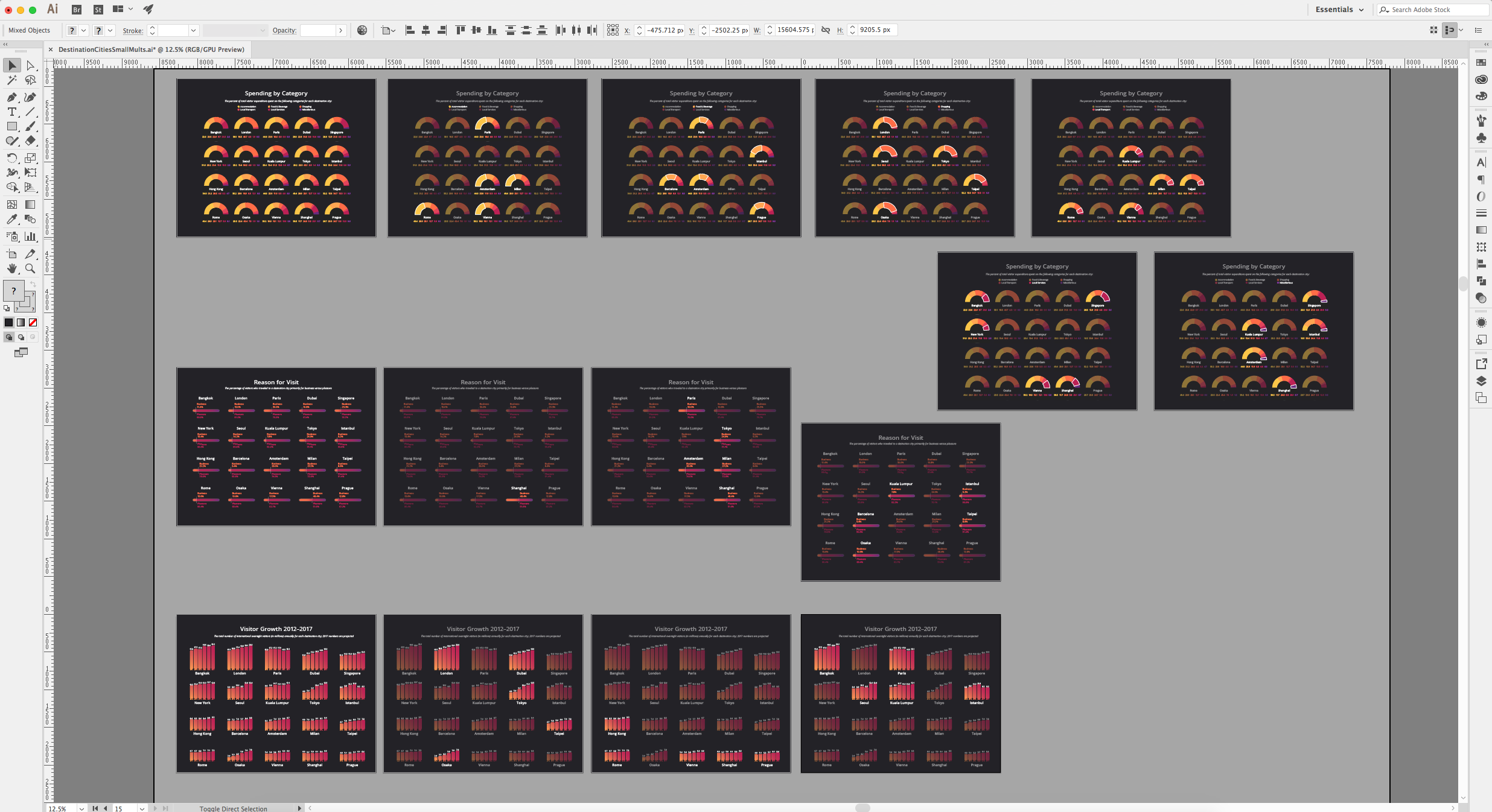
I spent the bulk of my time on this piece creating the different visual elements that would eventually come together into a story map. Initially I dabbled in Infogram—a free dataviz tool—for inspiration, but eventually built out all my charts in Adobe Illustrator through liberal use of both its chart and gradient tools.
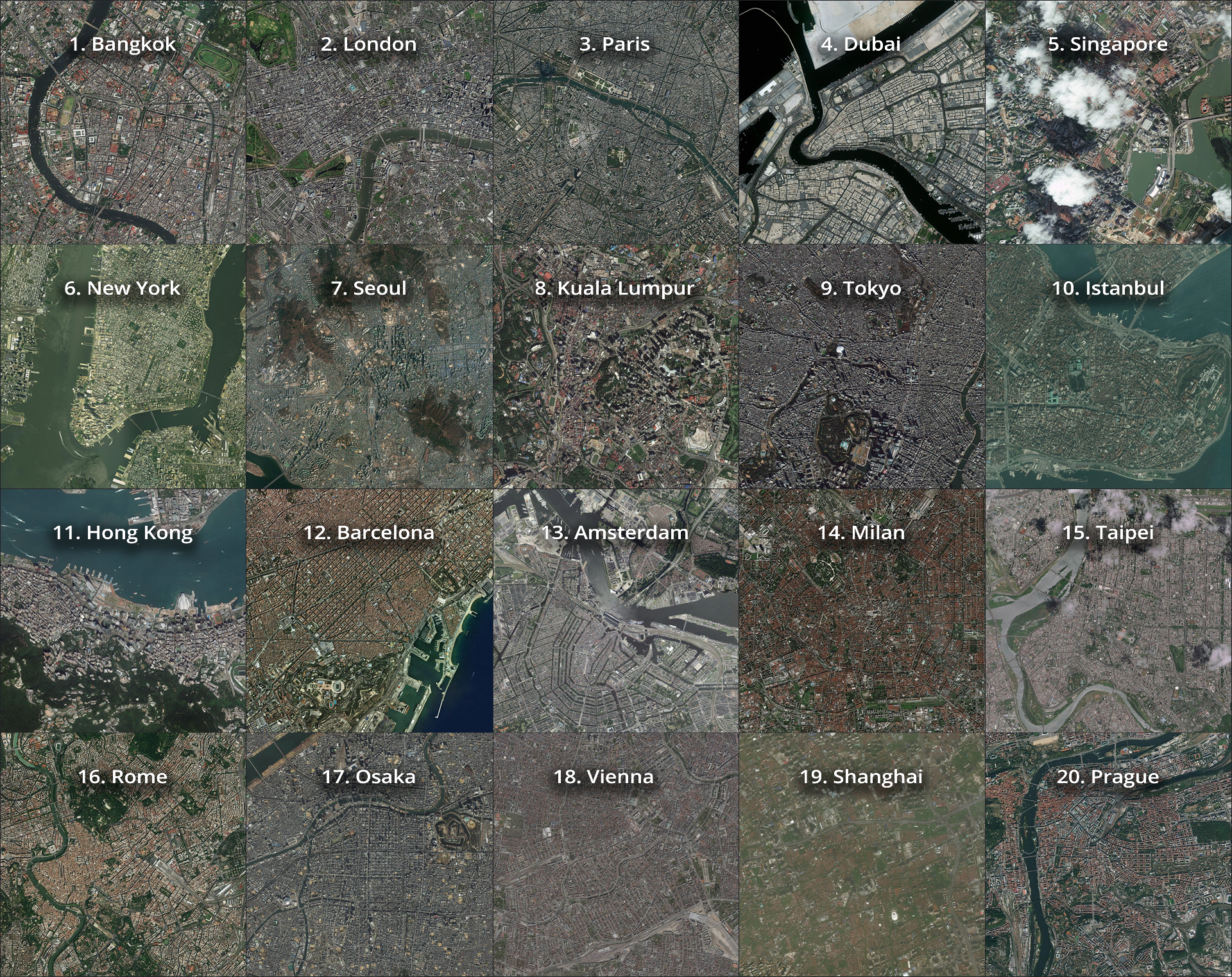
For the maps, I started using ArcGIS Pro, where I did a simple plot of the XY coordinates with proportional symbols for each of the top 20 lists, and also created a set of offset custom labels for each list. I then moved to ArcGIS Online to finish up with symbology and to configure each map’s pop-ups. A series of duplicated layers with varying strokes helped to create the glowing effect for each city circle (a la firefly cartography), while a very subtle fill layer established some necessary contrast between the circles and the dark basemap.
I also used Esri’s World Imagery basemap to pull aerial views of each city and its airports. While it’s not the most common perspective, looking at these places from above can often provide a fresh new take on each destination, especially when laid out side by side. It was interesting, for example, to see the prevalence of water in the top 20 cities, or the strong geometric feel of the European destinations on the list.
Pixabay was an indispensable source of photography for my remaining visuals. The free library of Creative Commons CC0 material provided all the images I needed to evoke a sense of each destination’s ethos, from stunning cityscapes to intimate details of daily life.
Like any good tour guide, I wanted to provide the viewer with all the high points, but not be so overbearing as to distract them from exploring their own points of curiosity. To that end, I decided to keep the text in the story as straightforward and concise as possible, using color and bolded font to call out any essential information. The light copy provides just enough context for the accompanying visuals, but lets the reader focus on the trends that emerge the more they stare at the data.

Assembled in Cascade, the maps, charts and copy all come together to create a fun, easy read that informs while it entertains, and maybe inspires a little wanderlust too.
Want to read more story maps about travel and recreation? Explore the topic in our gallery.


Commenting is not enabled for this article.