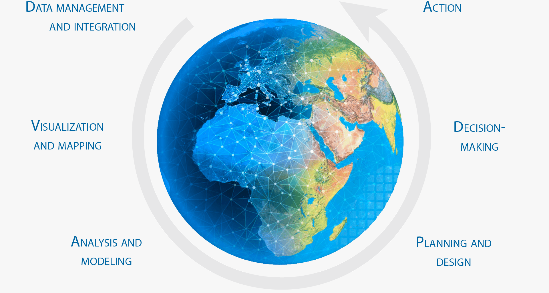
GIS Provides a Framework and Process
The Internet of Things is becoming real. We’re learning how to measure virtually everything that moves and changes on the planet with a web of connected instruments that are gauging water flows, documenting changes in climates, and pinpointing where people and things exist. And this lattice of information is becoming available through the Internet, basically instrumenting our planet with GIS. Location mapping and GIS is becoming an essential framework or language to help us keep track of what’s going on.
When fully realized, this framework allows a sort of virtuous cycle. GIS users, working in their localities—each contributing their small piece of the larger geographic puzzle—repeatedly apply the science of our world to collect and organize their geographic information into effective representations. They use maps along with interactive charts and graphs to visualize, portray, and share their results. With GIS, users go even further and ask deeper, more probing questions to model and test different scenarios. These GIS practitioners apply The Science of Where to inform the way that people make decisions and take action. Think about GIS users repeating this cycle over and over in hundreds of situations and locations worldwide—it adds up to science in action.
It All Begins with a Map
Web GIS revolves around the map. It’s the framework for your data and the primary geographic container that gets shared and embedded in your apps. In ArcGIS it is called a “web map.” The purpose of the web map below is simple enough: to show the last 120 days of earthquakes everywhere on Earth. (By the way, if you’re reading the print edition, make sure you access the book on your computer as well to get the full, up-to-date experience.)
There are several points of interest right here on this map. First of all, it’s navigable, which means you can pan and zoom. The map has many zoom levels built in, each one revealing more detail the closer you get. Click on any earthquake symbol to learn the magnitude and date of each event.
These little windows of information are called “pop-ups,” and by the time you finish this chapter, you’ll know how to configure them.
The map also has scaled symbols, showing the relative magnitude of each earthquake. The background map is symbolized as well, in this case in muted dark tones that set off the bright earthquake symbols.
This data, organized with this combination of symbology, reveals an interesting pattern: the well-known Ring of Fire. This map could be easily embedded on any web page or in an app. But where did it originate? It began life as a web map in the ArcGIS map viewer.
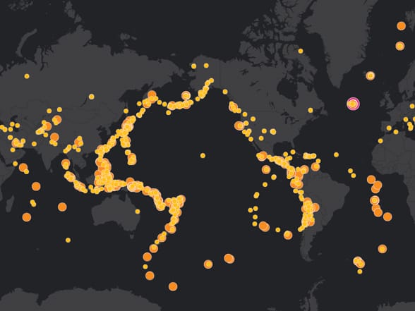
This simple live map shows earthquakes that occurred over the previous 120 days.
—–
This post is excerpted from The ArcGIS Book, Second Edition: 10 Big Ideas about Applying The Science of Where, by Christian Harder and Clint Brown. The twin goals of this book are to open your eyes to what is now possible with Web GIS, and then spur you into action by putting the technology and deep data resources in your hands. The book is available through Amazon.com and other booksellers, and is also available at TheArcGISBook.com for free.
Commenting is not enabled for this article.