Public interest in North Korea is at an all-time high (or, to borrow a term from the ballistic missile lexicon, apogee), thanks in large part to the continuous flow of colorful, but frightfully bellicose, taunts from Donald Trump and Kim Jong-un. While these exchanges no doubt make for catchy headlines, they fail to capture the full scope, and complexity, of the simmering conflict on the Korean Peninsula—and specifically, how the diverging trajectories of North and South Korea have fueled present-day antagonism.
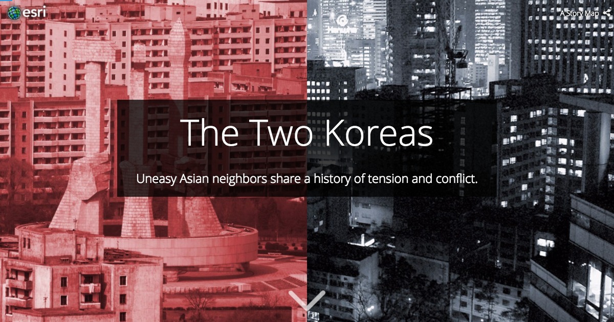
The Story Maps team was keen to address this gap in coverage, and so last week, we published “The Two Koreas,” a graphics-heavy piece that attempts to peer beyond the headlines to expose the ever-widening political, economic, and cultural gulfs separating North and South Korea.
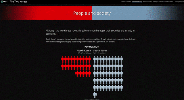
The story map begins with a concise historical overview of the two countries, beginning with the post-World War II partition of the Korean Peninsula, the devastating war that ensued, and finally the tenuous armistice that has endured ever since. It then dives into a series of statistical comparisons between North and South Korea, highlighting the magnitude of difference in everyday life. It concludes with a brief glance at North Korea’s military ambitions and capabilities.

One of our primary objectives was to keep the piece short and punchy, and to allow the graphics and images to do the heavy lifting. (After all, internetizens are not known for their long attention spans, and human brains are wired to process visuals much quicker than text.)
To reinforce the real-world division between the two countries, we placed all charts and graphics relating to North Korea on the left side of the screen, and tinted them shades of red; conversely, we placed visuals of South Korea on the right, and used shades of blue-gray. By establishing consistent visual conventions up front—the cover page itself uses this treatment—we hoped to enable time-pressed readers to quickly extract valuable nuggets of information without having to read the full text. The charts were prepared in Adobe Illustrator and Photoshop, but could be replicated in any design program (shout out to Microsoft Paint—never go away, please).
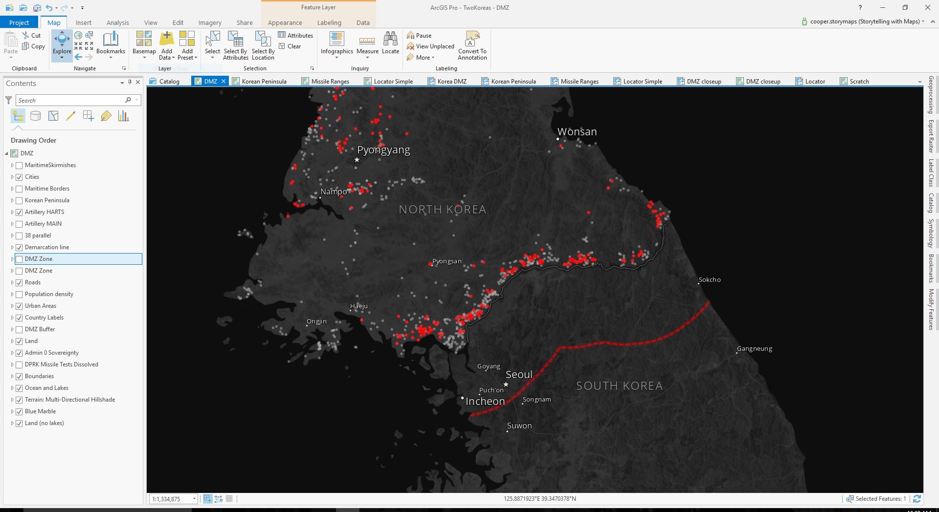
All of the maps were designed in ArcGIS Pro. We wanted them feel severe and ever-so-slightly apocalyptic, but also appropriately news-y, not overly stylized. We also to match the colors of the dark Cascade theme. To these ends, we ultimately pursued a dark map style with relatively sparse labels. Designing dark maps can be tricky, as the range of high-visibility colors is somewhat restricted. Fortunately, our established palette of reds and blues, combined with dashes of yellow as necessary, afforded us enough latitude (pun intended) to make things work.

Although their thematic overlays vary, the maps all share a common basemap, comprised of a few complementary elements: satellite imagery from NASA Visible Earth, which is heavily desaturated, using a simple hack documented by Esri’s cartographer extraordinaire John Nelson; the Multi-Directional Hillshade layer from the Living Atlas, which provides some texture; and a grab bag of vector layers for land, water, boundaries, graticules, and populated places. Some of these reference layers came from the Living Atlas, while others came from Natural Earth.
Truth be told, we could’ve just used an existing basemap from ArcGIS Online. In fact, in our initial design discussions, we briefly entertained the idea of creating a custom vector basemap just for the project. But we ultimately wanted to exercise greater control over the map’s visual style, and especially its labels, than an ArcGIS Online basemap layer would allow. (For example, we wished to label small cities in the two Korean countries, but to omit these labels in other countries.) We also knew that our basemap would have to accommodate some custom projections, and while ArcGIS Pro can reproject AGO basemaps on-the-fly, it was faster, and easier, to simply project our data from the start.
The large-scale maps use an Albers equal-area projection centered on the Korean Peninsula, while the missile range map uses an azimuthal equidistant projection, centered on North Korea, in order to preserve distances. (We’ve seen a number of publications calculate missile distances using improper projections, yielding disastrously inaccurate results. We were keen to avoid the same mistake.) Where necessary, we added annotations to provide a bit more context or information about specific features or events.
This story map was a highly collaborative effort, with all members of the content team pitching contributing to its production: Allen Carroll pitched the idea and created most of the comparison graphics, Cooper Thomas and David Asbury tackled the cartography, Greyson Harris conducted historical research and designed the political timeline, and Hannah Wilber created the missile test graphic and drafted much of the text.
Collaborating on story maps can be difficult, but it doesn’t have to be; good communication, clearly defined roles and responsibilities, and an honest review process can streamline the process. For more tips on collaborating on story maps, check out this blog post. And as always, be sure to follow us on Twitter to see the latest story maps, news updates, and tips and tricks.


Commenting is not enabled for this article.