One of the most popular and powerful features of Business Analyst Web App (BA Web) is infographic summaries. I frequently use custom infographics in BA Web to create compelling visual presentations and comparisons of data that is often hard to fully understand or interpret when shown in table form.
This blog explains how to build custom infographic templates such as the one shown in my sample gallery at bottom left.
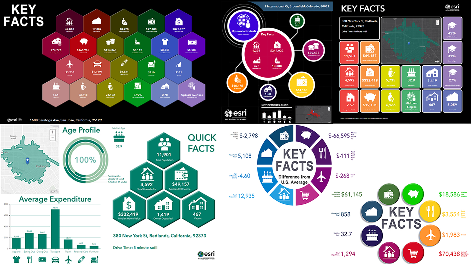
Custom infographics offer near unlimited opportunities to create designs that reflect any organization’s brand and create topic specific graphics and charts. I often used the, to summarize key attributes for different property types like office, healthcare and multi-family, or delivery a highly focused set of insights quickly and simply.
Planning Your Infographic Strategy
The latest BA Web update added new infographic templates that can be run without any customization. These shared templates cover a range of scenarios from property fliers to population demographics. Importantly, they contain example infographic panels, charts and tables which can also be easily incorporated into your own custom designs.
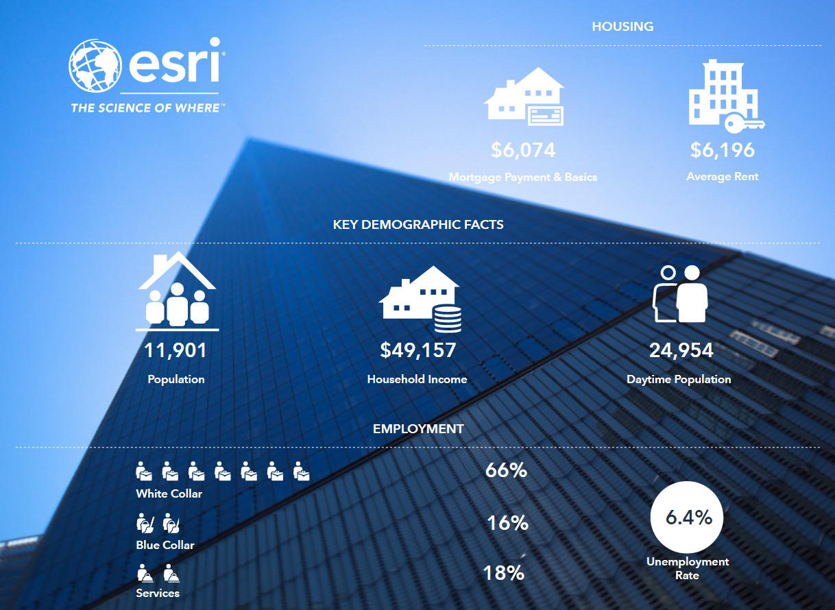
One of my favorite Esri Templates is the Skyscraper design. I often use the housing and employment panels in my own designs. These templates are a great resource to explore so feel free to mix and match Esri panels with your own.
Five Steps to Success
I’ve found that a few simple tricks and an organized workflow will dramatically improve the quality of the infographics and reduce the time taken to create them. The 5 key steps I use are:
- Sketch it out – take the time to draw the final design on paper or on a whiteboard
- Grid it and Chop it up – Convert your design to a set of individual grids and merged larger boxes which represent each major component of the infographic
- Use backgrounds images as you build – Using background images will help improve the layout process
- Remove complexity – Simplify and rework so that it’s easy to build every part
- Think library – Make every infographic object a reusable element
Sketch it out
Before you start to create an infographic, you should have a clear idea of what you want it to look like. Charts look much better than tables and they are usually key attributes you will want to highlight or group together. I always try to organize data into themes (age, housing stats, expenditure, etc.) so I can then decide on the best approach to laying it out on paper.
Each part of the infographic will appear on an infographic panel. Panels consist of maps, charts, tables, text boxes and images as well as infographics themselves. Time spent planning what you will use where, and how to showcase information will pay off immensely when you are constructing the final infographic.
A BA Web infographic is simply a grid of base elements whose size is defined within a template. The minimum size of a base element is 200×150 pixels, so you are designing your entire infographic using this grid of elements. Every infographics panel will be resized to fit within these base elements. Elements can be merged and combined so everything starts with this basic grid.

In the design above I have 5 major infographic components – a map, bar chart, ring chart, text box and hexagonal cluster of key attributes. The infographic can be split into a left and right-hand sections, comprising two or three subsections each. Understanding this allows me to create an initial grid on how to organize my layout of base elements.
Grid it and Chop it up
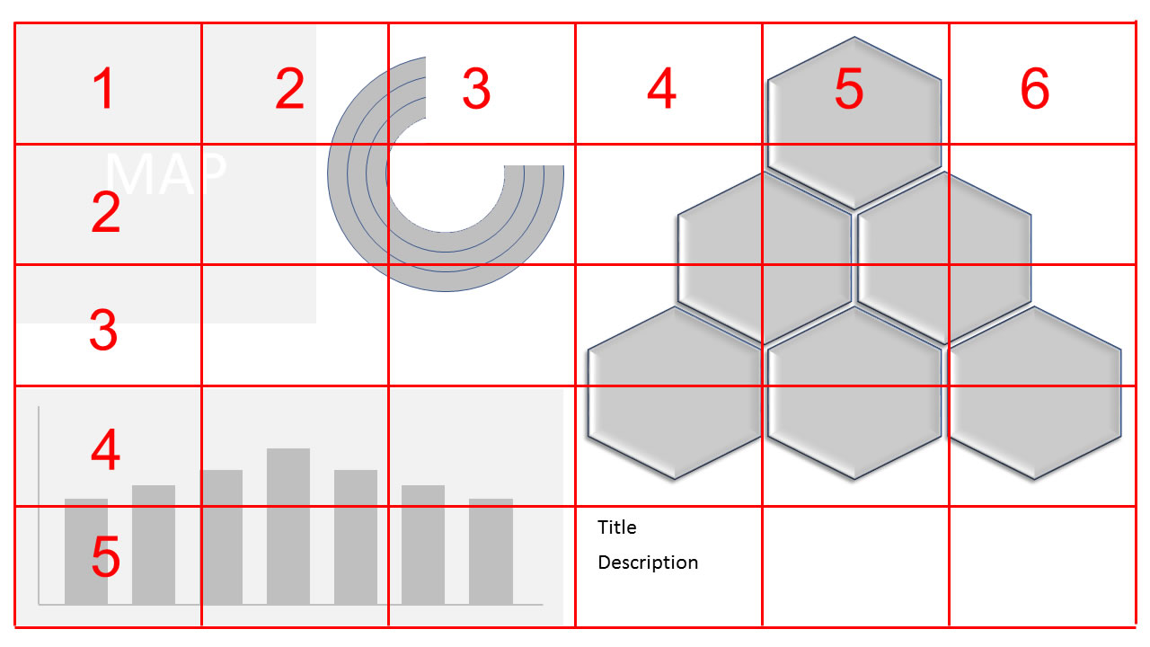
Because the design is equally spaced left and right, I will need to have an even number of horizontal elements. The hexagonal cluster requires 3 sub elements so to ensure the graphic is balanced I need 6 horizontal base elements in total.
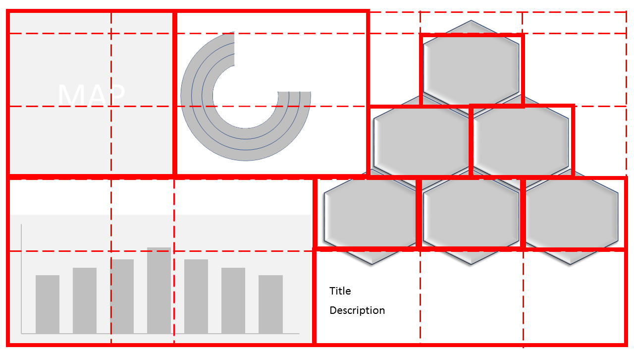
Vertically the infographic requires 5 base elements to accommodate the title box, 3 rows of hexagons and a space at the top of the page. The left-hand side of the chart can be created by merging base elements. In the diagram above the thick lines represent the major components of the infographic and the dashed lines individual base elements.
The finished infographic will consequently require a 6×5 grid of base elements which are landscape format. Many base elements will need to be resized or merged to fit the final design.
Use backgrounds images as you build
I always use a background image to help me build the final infographic. The background image shows the final position of all the edges of the elements and which are to be merged. The first diagram in the “Chop it up” section above is the design guide used for the final infographic.
To create a background design template, you need to calculate the size of your infographic in pixels. In the example above I have a 6×5 of base elements of size 200×150 pixels so the background graphic needs to be 1200×750 pixels. You therefore create an image of that size using your favorite design tool.
BA Web will display the graphic using 96 dpi resolution so you can also calculate the size in inches of the infographic. In the above example, it will be 12.5 x 7.8125 inches. Calculating the final graphic size in inches is important because the infographic template that you build has a specific paper size AND margins. Calculating the size of the infographic ensures your final design matches your concept.
Remove complexity
Don’t be afraid to rework and tweak the infographic design. Sometimes the design requires some of the components to be moved, resized or omitted completely. Aligning individual parts of an infographics will make it much easier to divide into individual elements. Removing rows or columns will cause the whole infographic to be resized or rescaled, often with unexpected consequences. Additionally, there is a limit to how small the individual base elements can be rearranged and stacked. When you encounter these barriers, it may be worth reworking the design or rethinking how to assemble the base elements.
Background images are a very powerful way to simplify the design while highlighting key parts of the infographic, adding corporate logos or brand elements and making the graphic feel more cohesive and consistent. Each of the examples shown in the first section of this blog use background graphics to frame key components and simplify the design while improving the visual presentation.
Think library
Infographic panels can be copied from other infographics including the Esri Templates or other infographics you have created. Every custom infographic panel is stored in a library and can be repurposed for subsequent use. Any edits, like color, layout or size only apply to the infographic template you are working with and do not impact the infographic panels in your library unless you edit them.
In the final working design shown below, I have taken key components from other infographic templates and customized them for this design. The group of 6 hexagons contain key facts that can be laid into any rectangular base element. The chart has been edited to change the color scheme of this infographic and the ring chart extended to add other annotation and key facts.
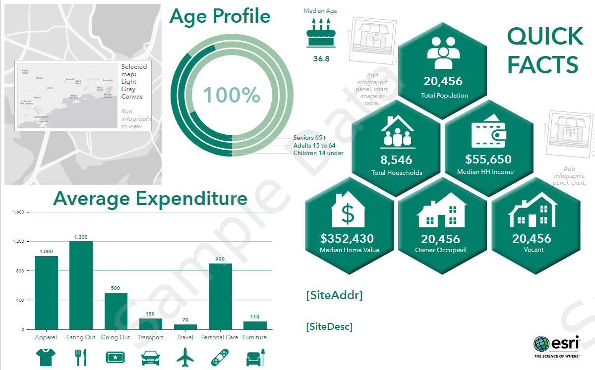
The description panel below the hexagon group of quick facts, is a small 2 row table which uses the variables names for the site address and description to automatically create a title for each site under review.
Putting it all together
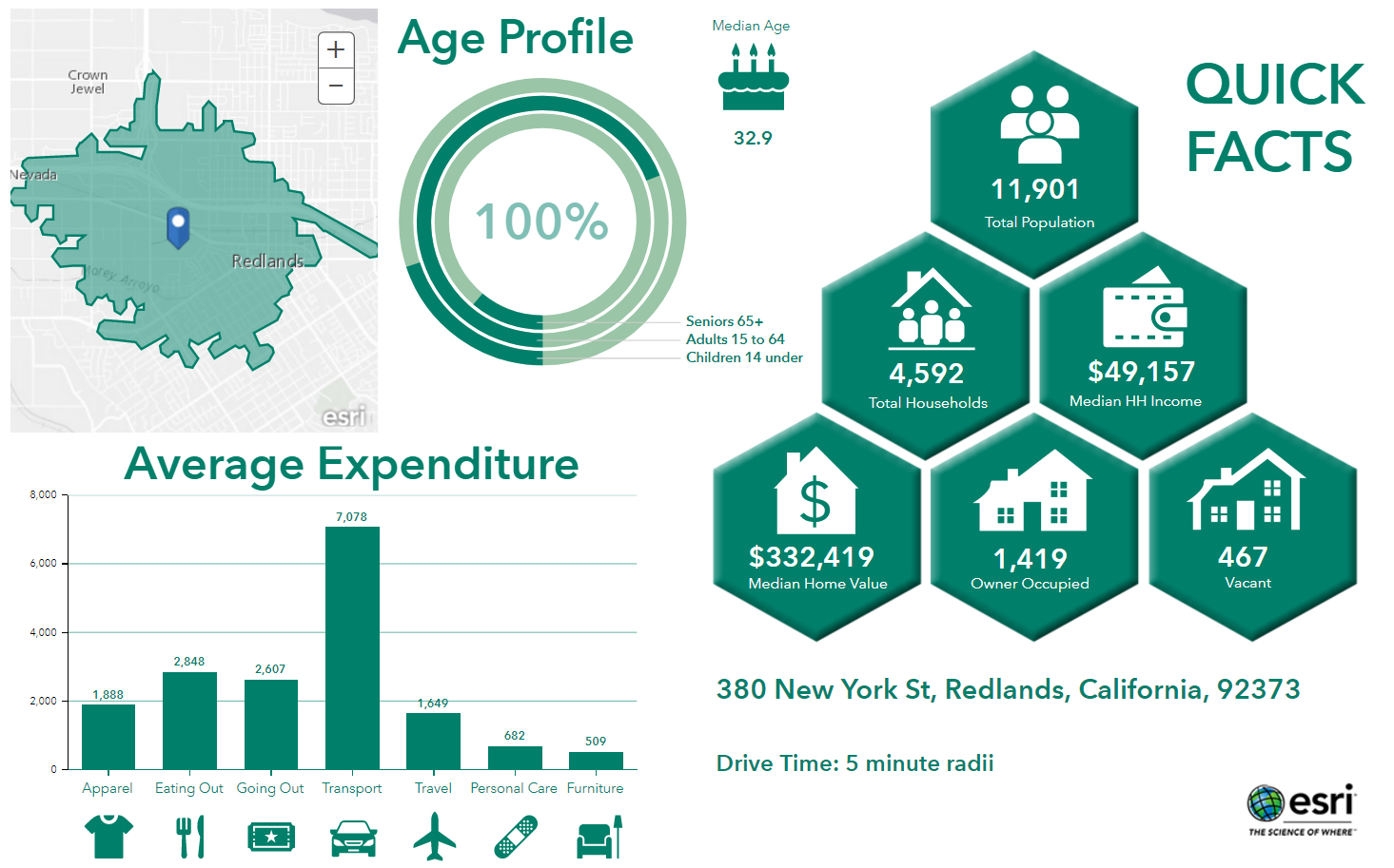
The final steps should be to remove any borders from the design and replace the layout background with the final background graphic. In 5 simple steps, you’ve gone from boring tables to communicative infographics that will turn heads.
And don’t forget to share your handiwork with others in your organization so they can benefit from your design prowess and great work.

Article Discussion: