Data is just maps waiting to be made. And the making of maps is such a fun ride that often there are a bunch of really cool maps that we just blow right through in the map-making process. At the end of all this I should have a map that I then craft a legend for and export at high resolution. But look how much fun we get to have in the meantime!
I’m generally much more interested in someone’s creative process than I am with the finished product. At least I have a better appreciation for the product when I see the underlying thinking, anyway.
Here is a cartographic stream of conscious with some great data from the Esri Demographics team. It contains the coordinates and sales volumes of all the Starbucks and Dunkin’ Donuts locations in the US.
They look like this.
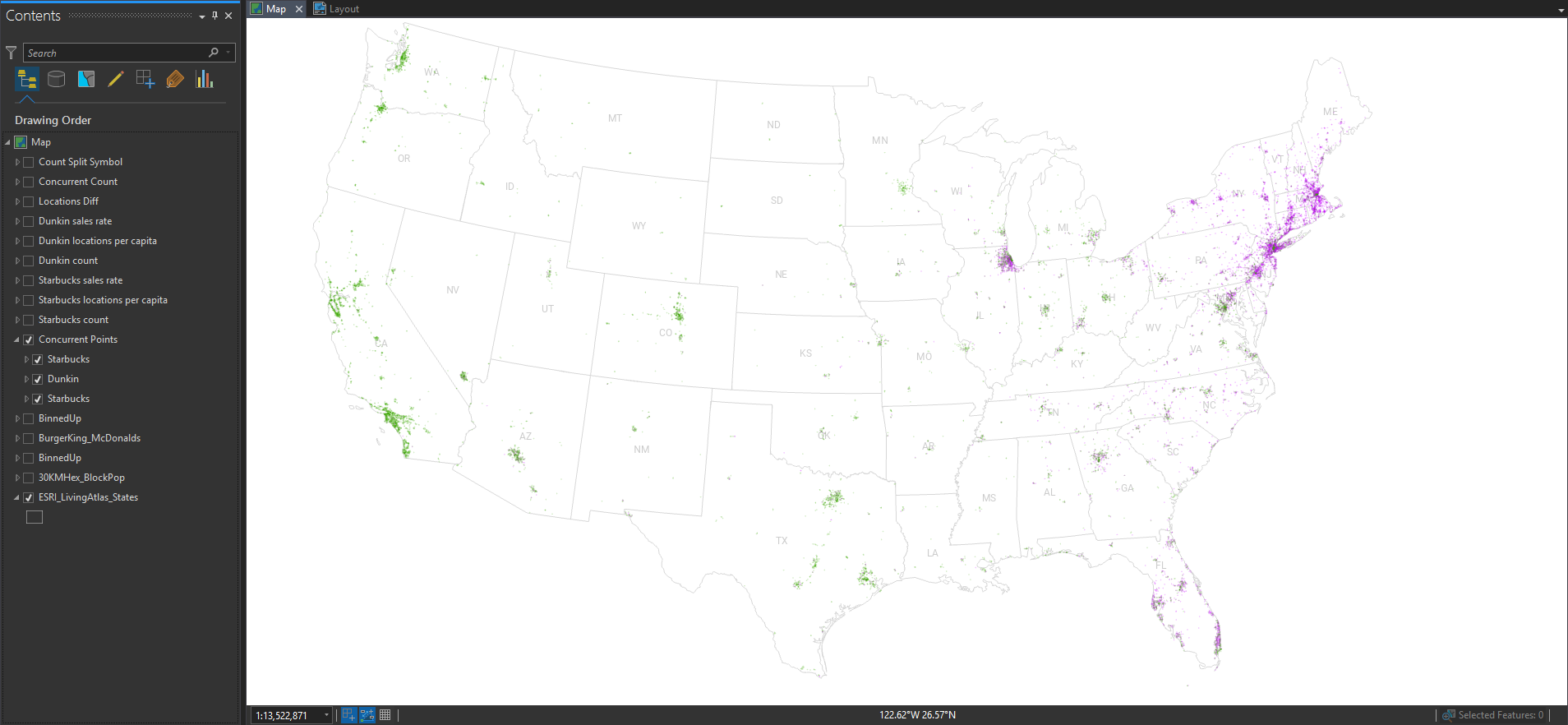
The geographic distribution of all the locations is essentially a population map, since humans are the ones consuming coffee and pastries. But, if you paint the Starbucks locations green and the Dunkin’ locations purple, then you can squint your eyes and get a pretty good picture of their wildly varying regional distributions.
Pro Tip: If you have two overlapping dense point layers they will inevitably overlap each other. But if you take the bottom layer, and paste a copy of it on top at 50% opacity, then you get a better, fairer, visualization of the mixing.
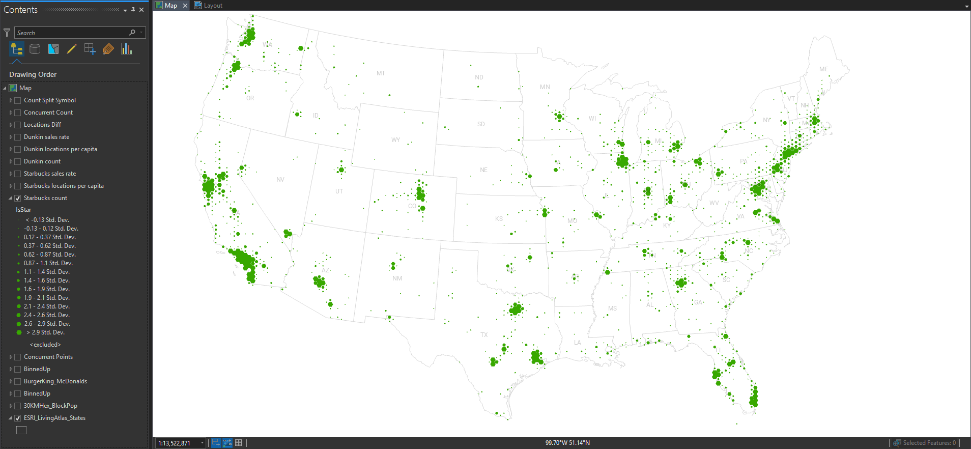
Dense point layers are cool, but you can’t quantify it very well until you bin them up into areas. Then you can calculate all manner of rates and ratios. I, of course, have chosen the noble hexagon in which to aggregate these locations.
Here is a graduated hex map of Starbucks locations.
And here it is showing Dunkin’ locations.
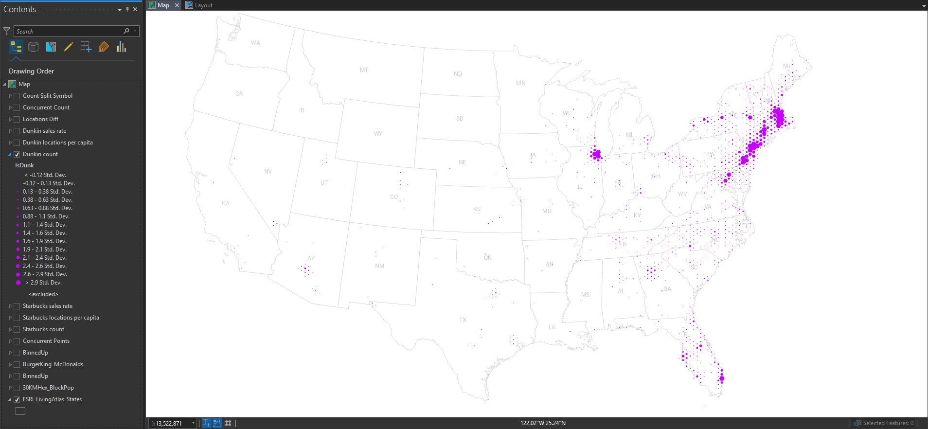
Still, pretty much population maps. But we can obviously discern the different origins and growth strategies of the two franchises.
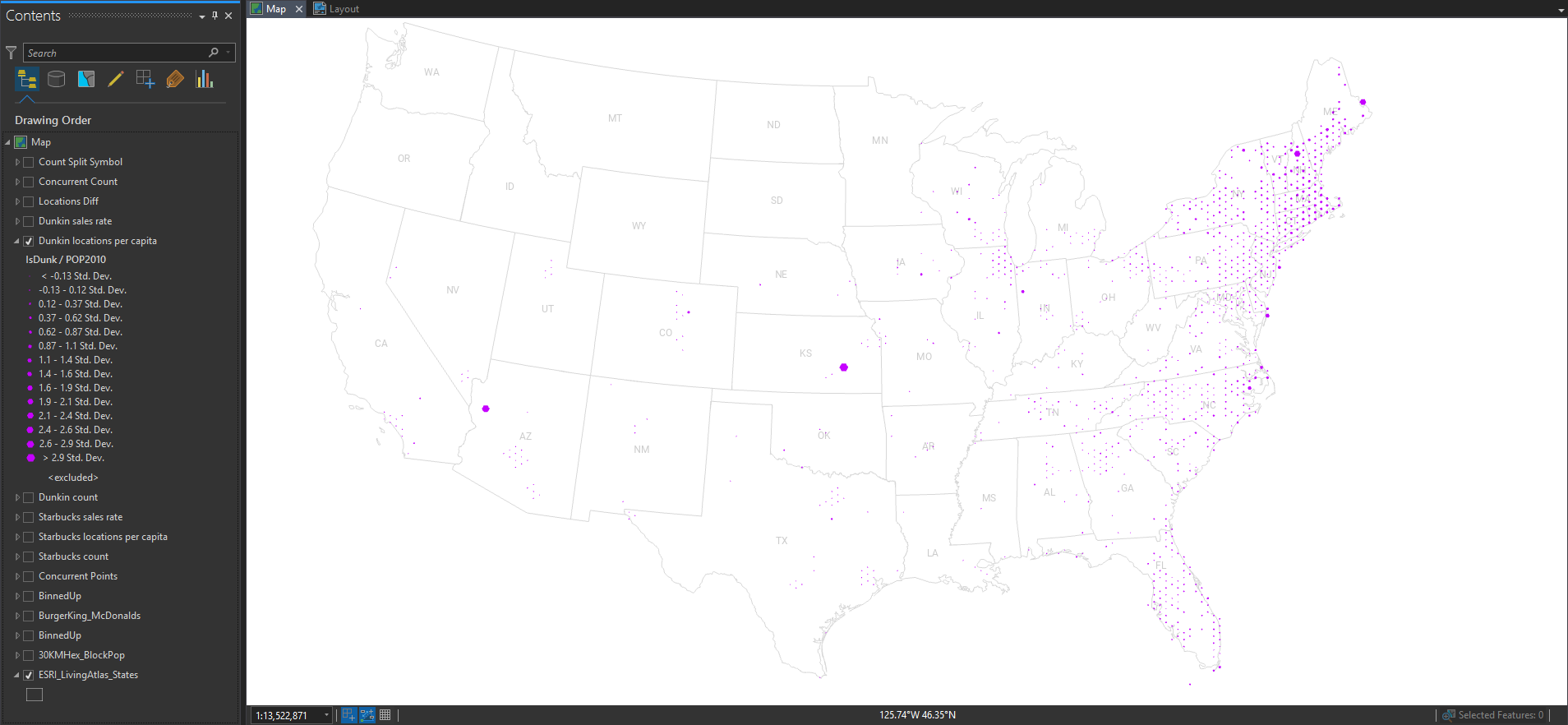
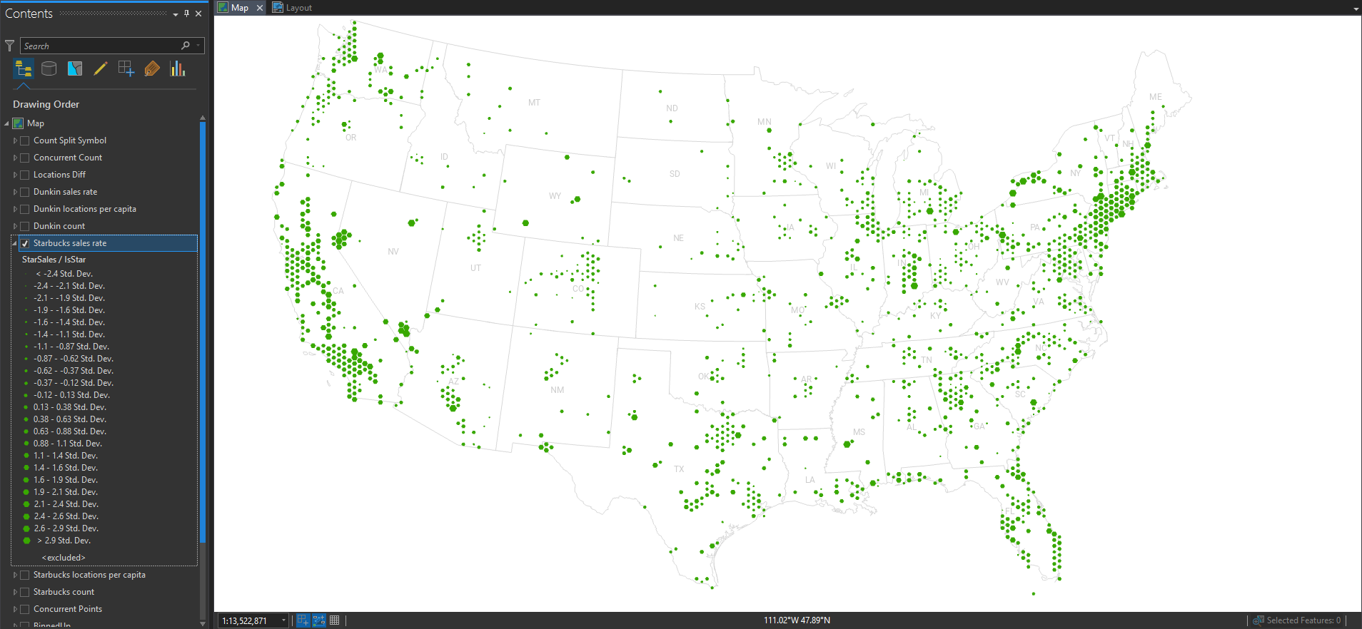
So let’s normalize these locations by the underlying population, to get a truer sense of where there is more or less. Here’s Starbucks per capita…
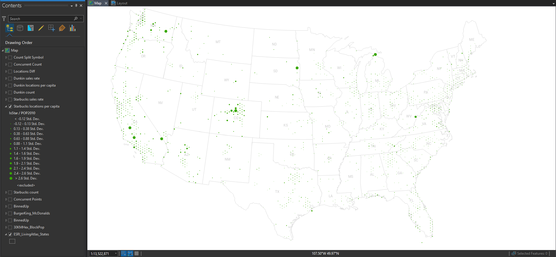
Pretty even distribution, with the occasional location with a low population contributing to some unstable ratios. What about Dunkin’?
Similarly well-distributed considering the underlying population, and the occasional blip of huge “rates” in low-population areas. The east/west divide is still mega-distinct.
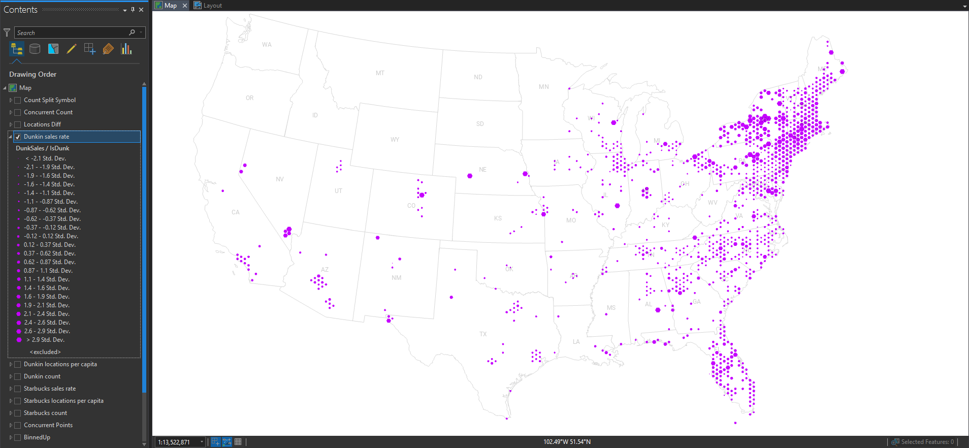
So we normalized by the underlying population. What about other ratios? Follow the money! Here, I’ve mapped the combined sales volumes of Starbucks and normalized it by the number of Starbucks locations. This gives us a map of their sales rates. Larger hexes are higher performing.
Scintillating! How about Dunkin’?
But I want to see them both on the same map at the same time. Ok, here’s a version where all hexagons are color-coded by the majority franchise, and scaled by how strongly it favors Starbucks or Dunkin’.
Nice. But I lost some nuance for the overall population, since it only shows me the comparative difference in franchises.
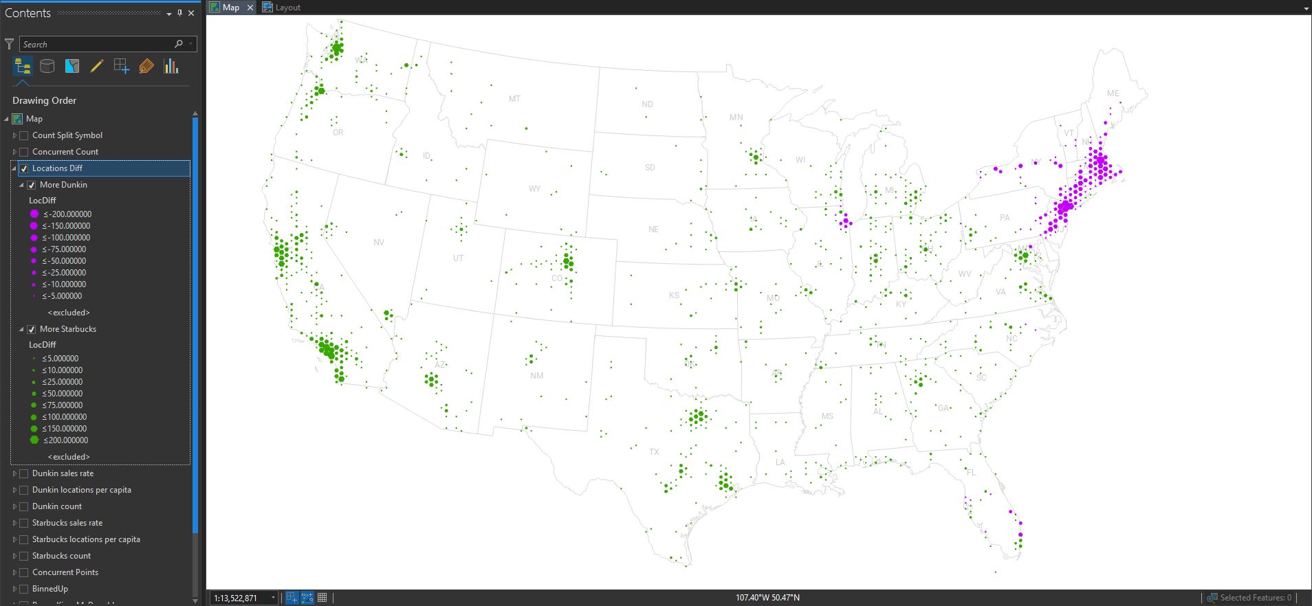
So here is a version where I show the overall locations of Starbucks and Dunkin’ at the same time. The majority franchise is rendered behind the minority franchise so it’s not fully covered up.
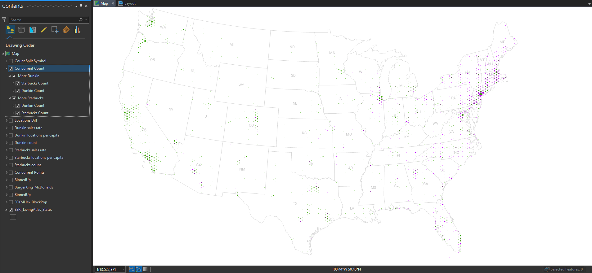
Hmmm. That’s interesting, but areas where it’s almost a tie are way biased visually in favor of the majority franchise (even if it’s by a tiny amount). How can we get around this problem of occlusion?
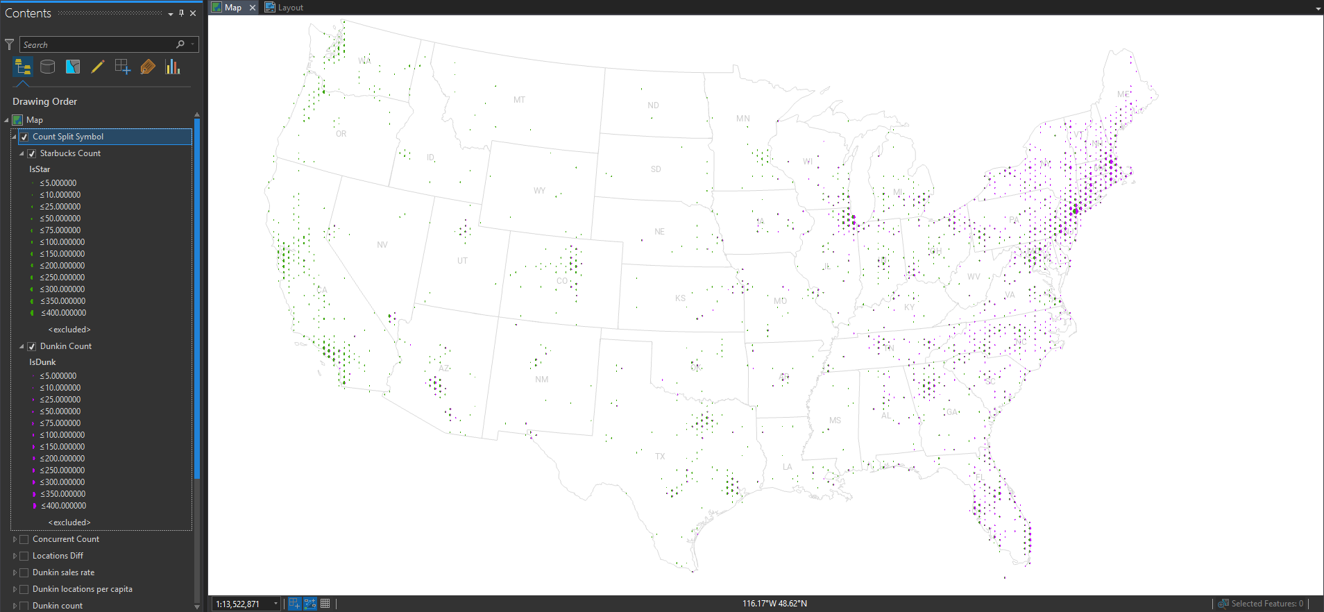
On it! Here is a version that uses a graphic that is scaled just like the previous map, but instead of a full hexagon graphic, I can just use a half-hexagon image. No overlap. I get the benefit of concurrent visualization without the bummer of occlusion. Here is that dueling hex map…
See? All this fun happens before a cartographer even shares a produced map. We live in a golden age, and we are fortunate to have found the best field available. Maps are just the best. But making maps is even better!
Happy Mapping, John


Article Discussion: