Please do not read this blog post about how to create woodcut bathymetric maps.

Here’s a close-up…
You’re still reading?!
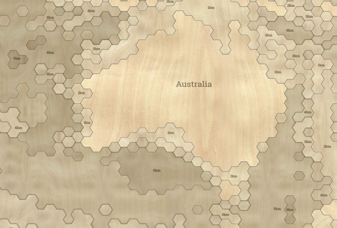
Ok, I tried. So, this is an intricately machined woodcut map of oceanic bathymetry. Each 1,000 meter depth layer is painstakingly CNC laser-cut out of 1/8″ birch stock, branded with depth labels, then stacked by corresponding depth and glued carefully into place. Or, at least, made to look that way using ArcGIS Pro.
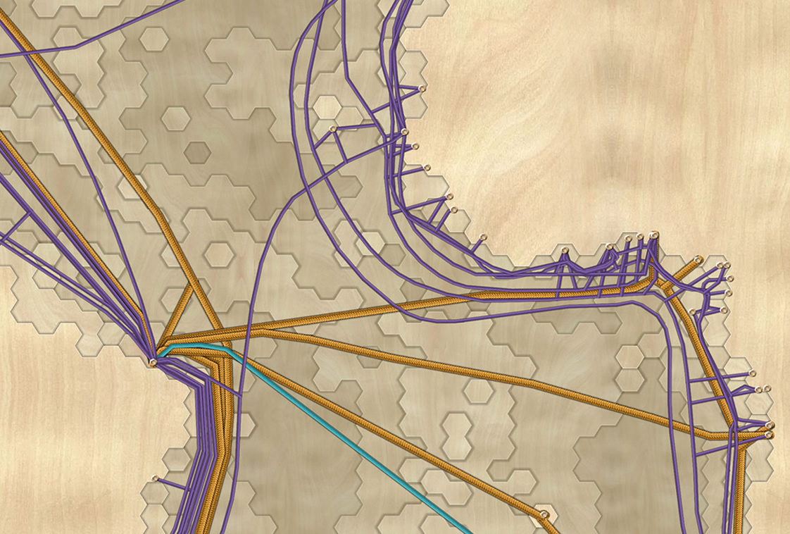
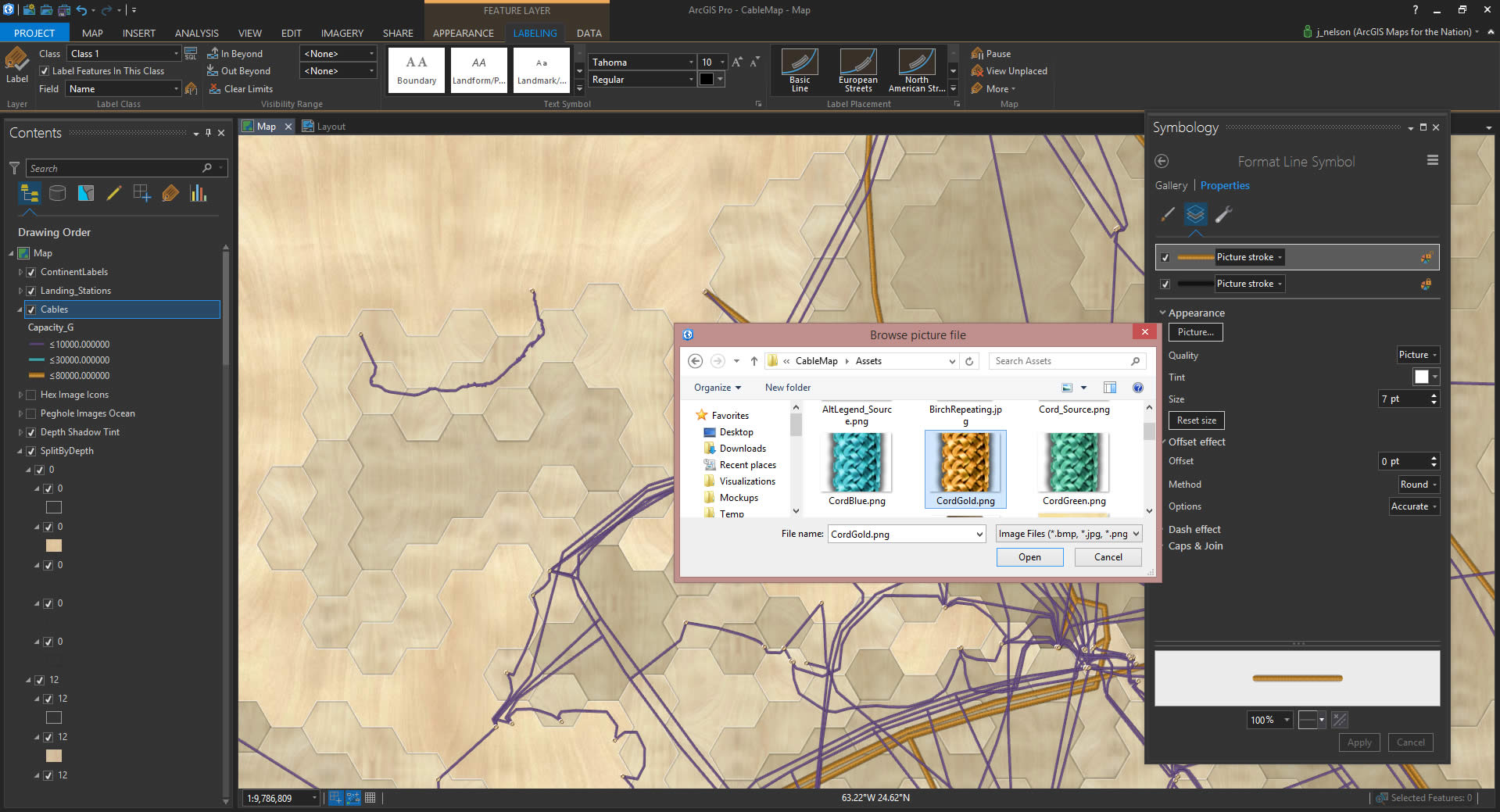
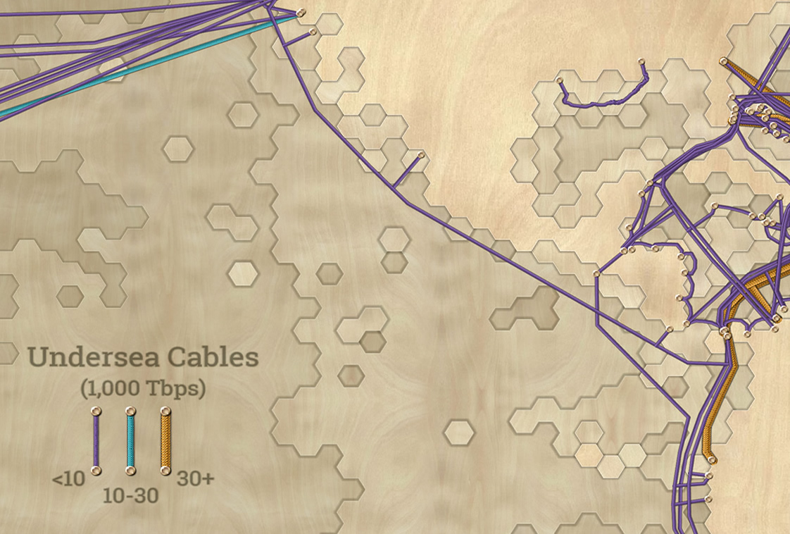
Here’s a version with undersea cables shown as varying gauges of cord, pinned to their coastal landing stations.

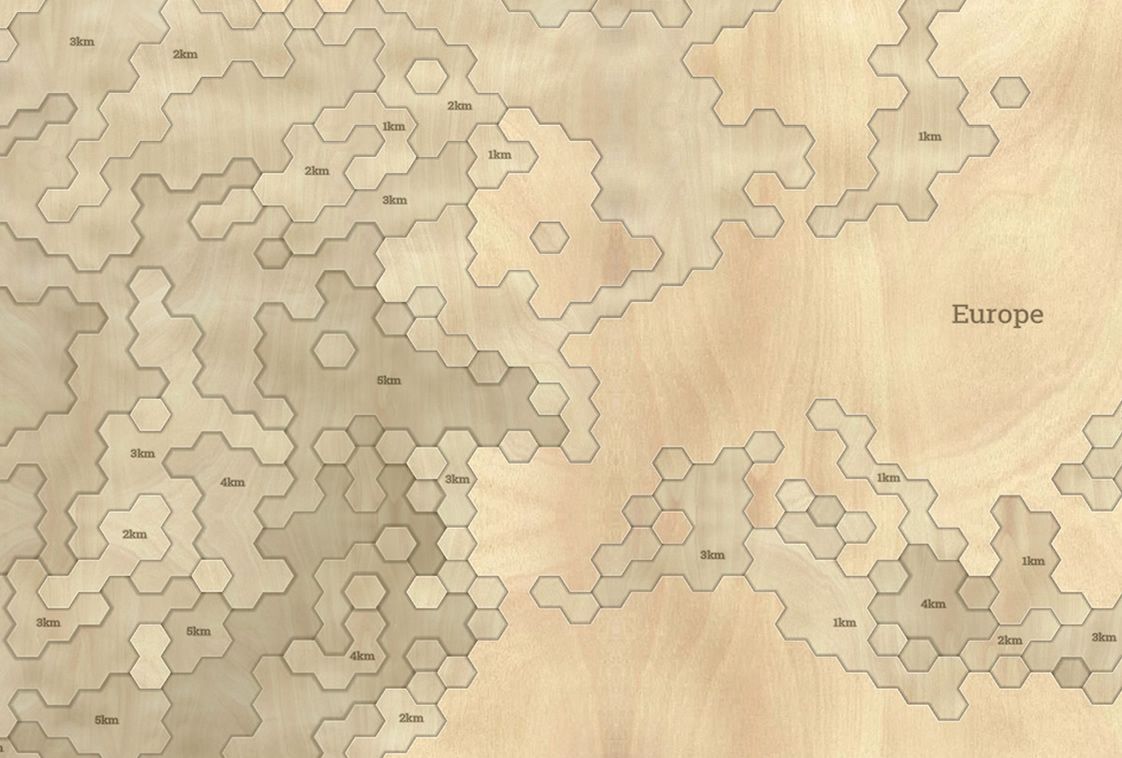
And a close-up…
What’s going on here? These maps just make use of images for icons, lines, and fills. Mega easy. Here’s how!
ArcGIS Pro How-To
Data Smooshing
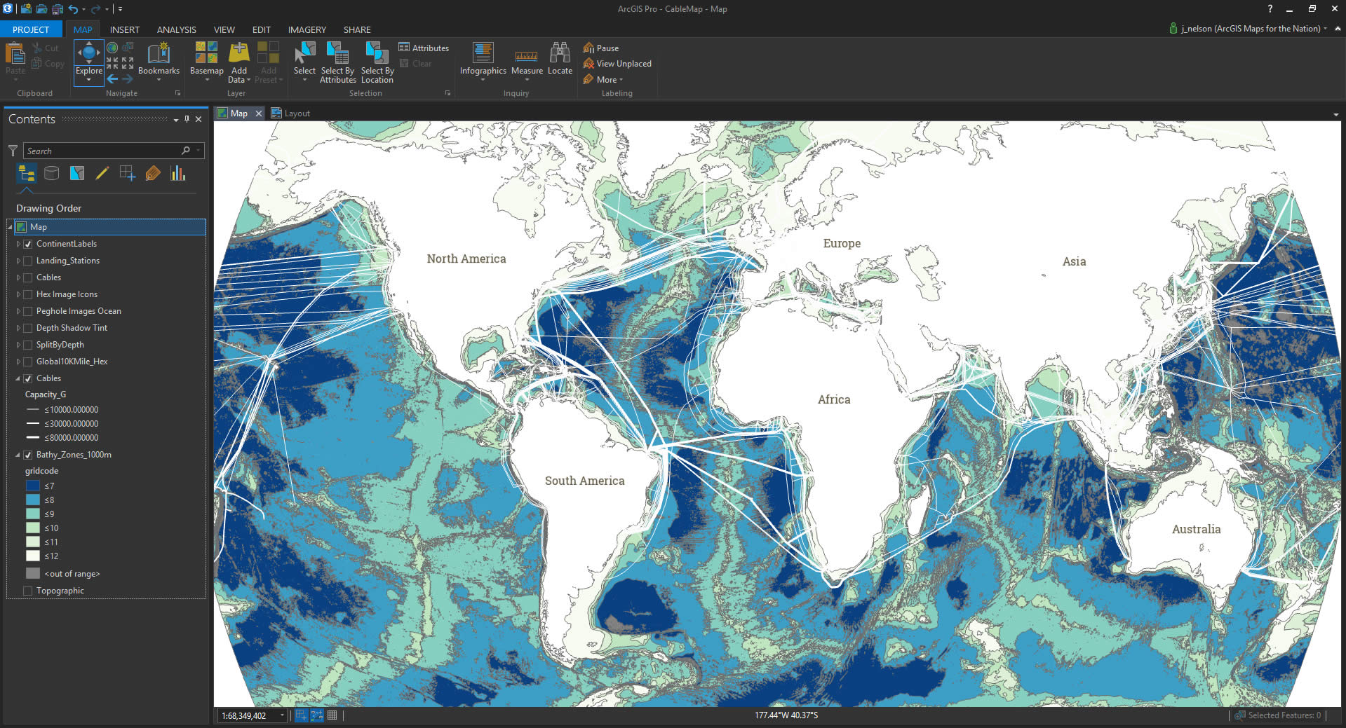
The esteemed oceanographer Keith VanGraafeiland handed me some bathymetric vectors and undersea cable lines. The bathymetric vectors were generated at 1,000 meter intervals that he coaxed from a bathymetric data source available at the Living Atlas. The cables came from Greg’s Cable Map.
That bathymetry is awfully precise. Normally that would be a great thing. But woodcut maps of water depth aren’t all that precise. I thought it would be cool to add a twist to the typical woodcut depth map by giving the depths a hexagonal geometry. Because why not?
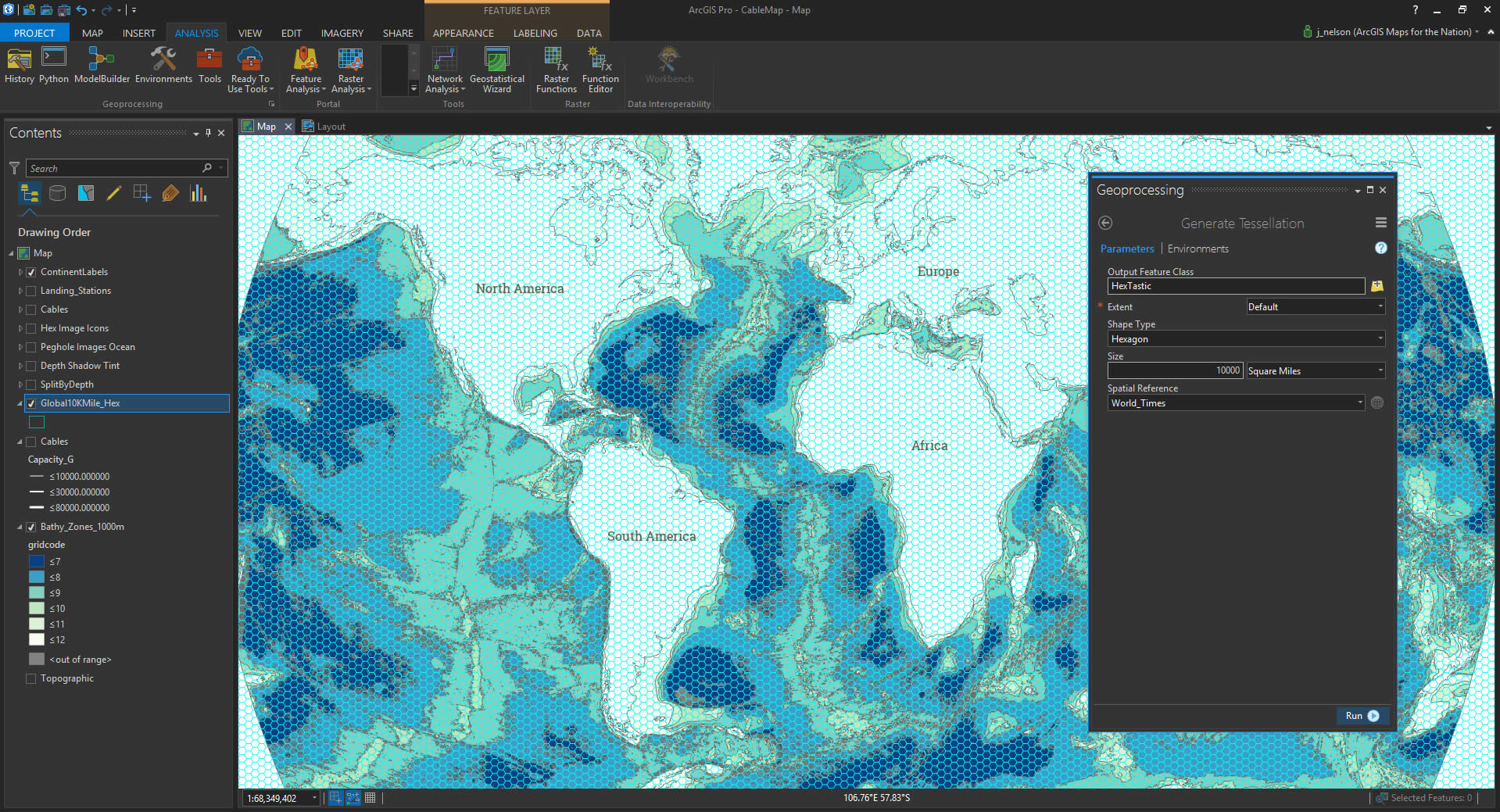
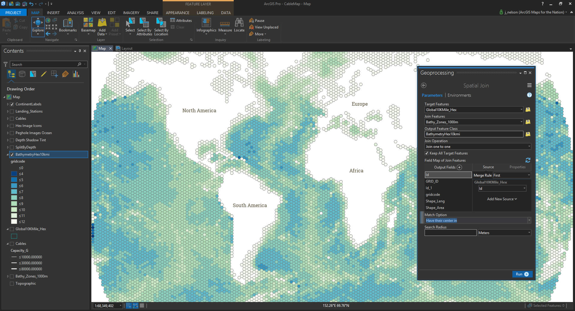
So, I opened the Geoprocessing toolbox and created a hexagonal tessellation (each hex is about 10,000 square miles, but since this isn’t an equal area projection, nobody’s counting) covering my map.
Then I had a mesh of otherwise-dumb hexagons on top of the bathymetry data. Time to steal the bathymetry information and put it into the hexagons. I did that by using the “Join by Location” feature, which swipes the depth attribute from the bathymetry layer at the center of each hexagon. I love this feature.
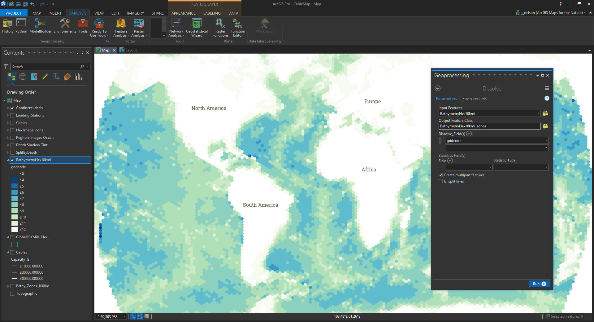
Now that I had a hexagonal bathymetric layer, the next step was to dissolve all the hexes into groups of equal depth. Using the Dissolve function, you can erase all the boundaries between shapes that have the same attribute. In my case, I dissolved all the hexes by depth and the result was hex-ish blobs of equal depth. Yeah!
Symbol Effects
I was having so much fun that it was easy to try out all sorts of other weird map things. But I had to re-group and remember my goal of a woodcut map. Focus, Nelson.
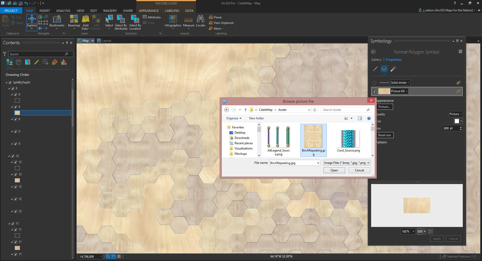
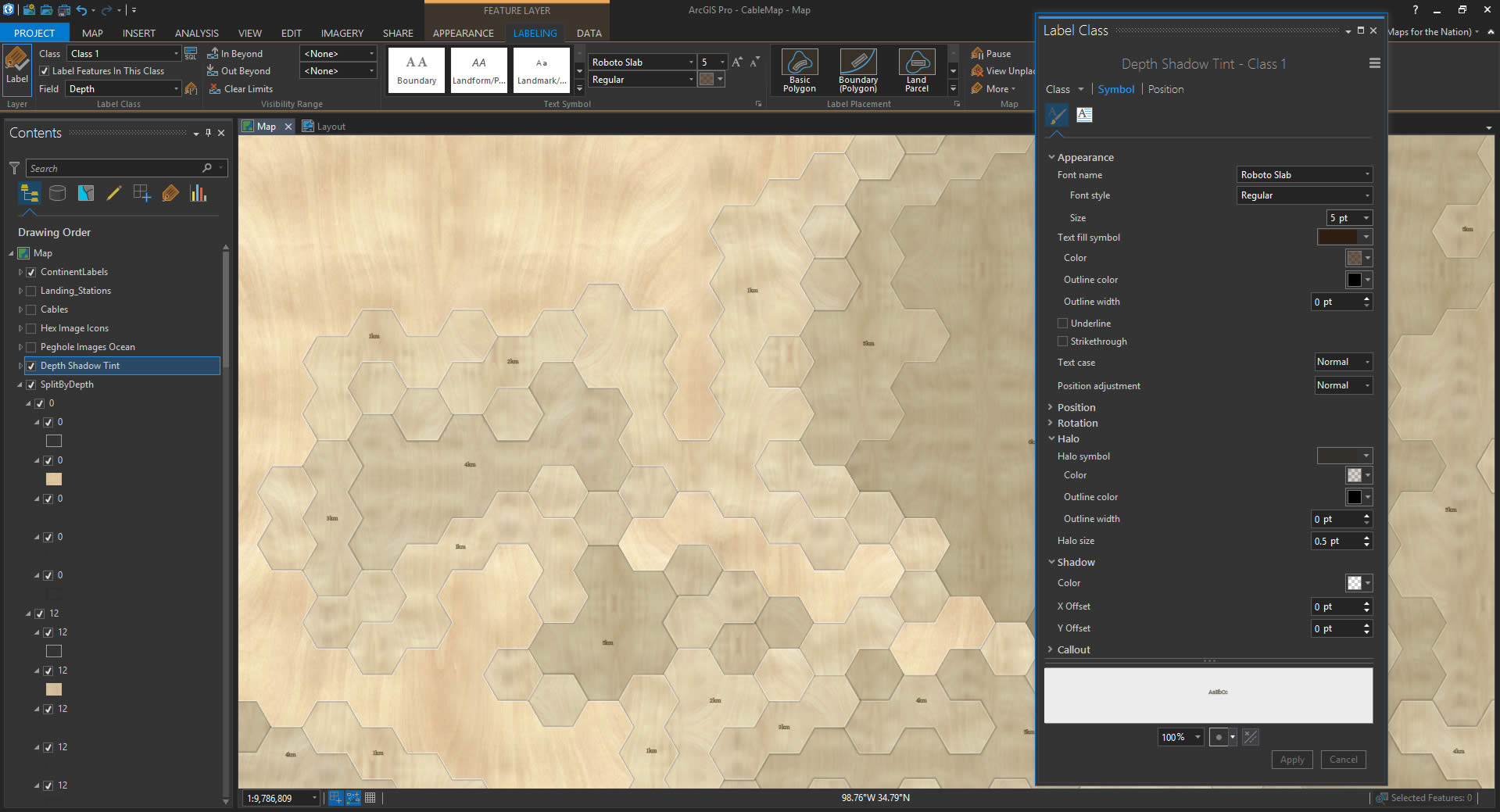
I split out each of those depth layers into their own distinct layers. This way, I can have several stacked versions of each depth layer, altogether ordered by depth. Why? So I can give each depth a wood fill texture with a faint highlight layer and a few shadow layers.
Not many people make use of the picture fill capability of ArcGIS Pro. Probably for good reason. But the goal of a woodcut map is a noble pursuit so I plowed ahead. I used this image of birch that I found on a flooring wholesaler’s website then edited it in PhotoShop so that it would repeat without abrupt borders (a trick for another day).
Notice above the image fill version of the layer there is a copy that is a faint white stroke. That helps define the depth shelf and gives it a somewhat realistic edge-lighting effect. And beneath the image layer I pasted a few versions of the layer with increasing (semitransparent) stroke thickness, to make it look like it is casting a faint shadow. I applied a super faint blue tint to each layer’s image fill, increasing with depth, to help define the vertical effect.
These are the tricks, people!
Next, I turned labeling on for the depth layers. It seemed cool to try out a woodburned label effect, like they use on actual woodcut maps. I gave the labels a dark amber, semitransparent, color and a 0.5 pixel halo of the same color to replicate the scorch-bleed effect around branded wood.
And that’s it. I added a title in the same style, and exported the image.
Undersea Cables
Wait, what’s up with those undersea cables? Well, in the making of this map I was super pumped to learn that ArcGIS Pro also supports the use of images for line features. Right? It even orients the image along the path so it appears to be a continuous texture. I love that. So, I categorized the undersea cable data by capacity, and assigned a cord graphic to each, with varying color and thickness.
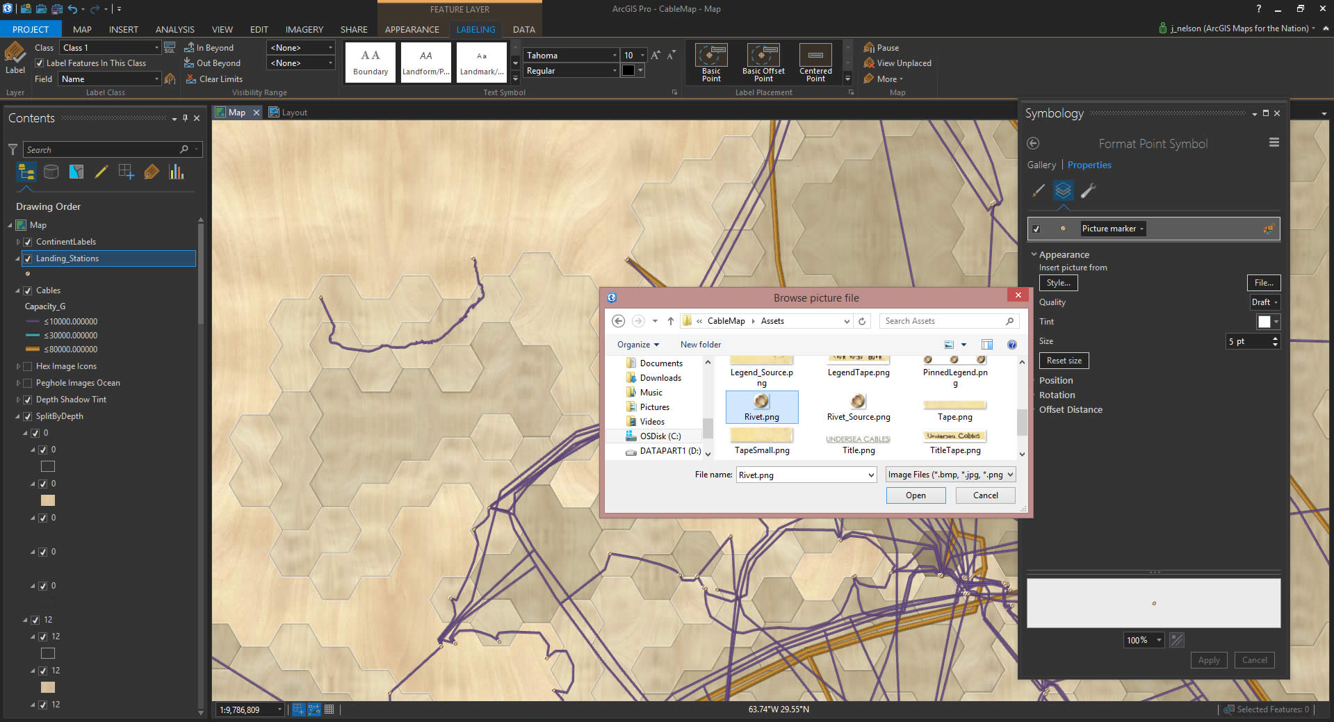
Of course you can use images for point features, too. I did this for the coastal landing stations of the undersea cables. I drew a rivet graphic and used that. It seemed like the right thing to do.
And here’s a legend. It’s an inserted image in the ArcGIS Pro layout.
Well, that’s that. Thanks for checking it out. Have fun trying out textures in Pro!
Happy Mapping, John

Article Discussion: