World Happiness Report
Every year, the United Nations Sustainable Development Solutions Network releases a measure of happiness for surveyed countries, then performs a statistical regression to estimate what factors might drive a sense of happiness up or down. It’s called the World Happiness Report.
It’s just amazing data. But amazing data is potentially amazinger when seen as a map!
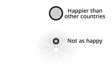
When I look at the survey results I’m struck by the incredible disparity between Europe’s and Africa’s sense of well being. Change in latitude, change in attitude.
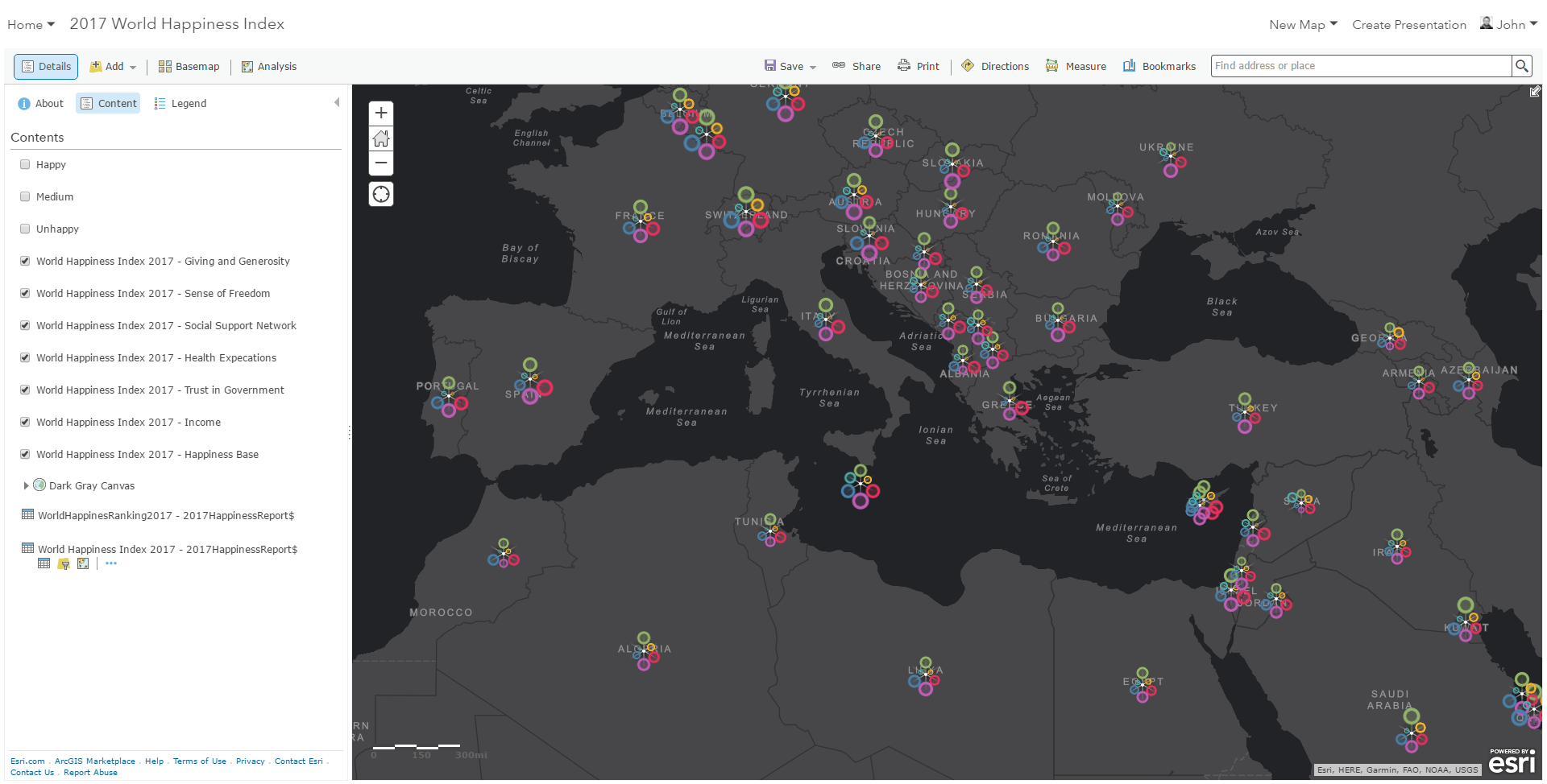
Here’s is a subset of the 2017 World Happiness Map, focusing on that narrow stretch of earth where the invisible equator bisects a stark contrast in happiness.
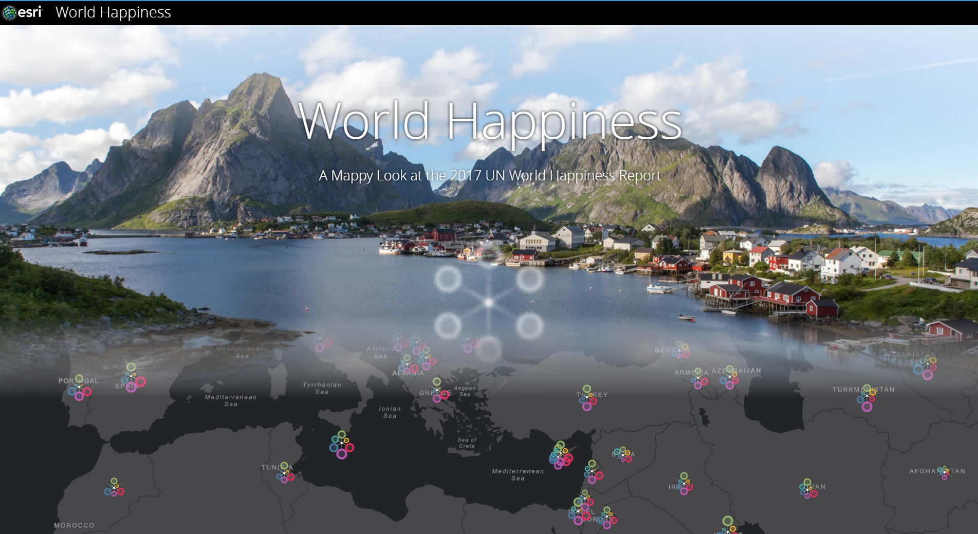
But what about the rest of the world? Here is a Story Map wherein you might gain all sorts of enspatialized happiness understanding…
False Starts / Choropleth Rut
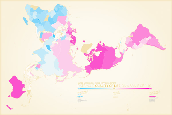
For the past two years I’ve struggled with how to make a map of this data, which is just begging to be mapped. But it was a tough nut to crack because I was stuck in a choropleth rut -and as a result easy prey for the ravenous MAUP monster. Countries are wildly differently sized. And some really interesting places are essentially invisible at a global scale. Here’s an example of one of my false starts…
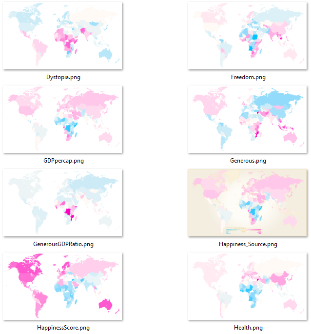
What’s more, the Happiness Report has not just the single country happiness value to map, they also provide all sorts of insightful categories of possible drivers of happiness. Again, in my choropleth rut, all I could think to do was make a bunch of maps…
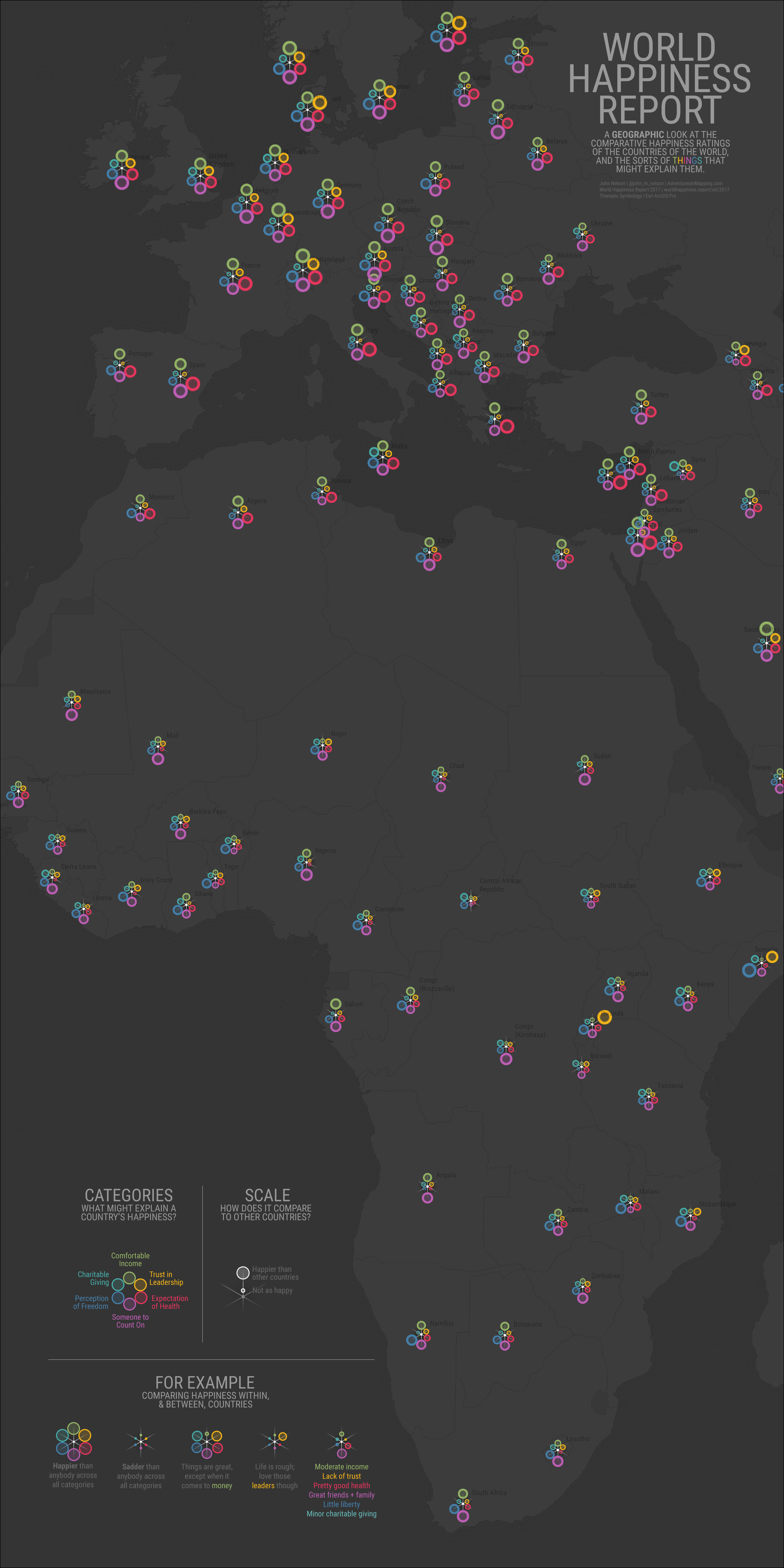
I was flailing. And then on the day of the release of the 2017 report, the sweet sweet Muse of Multivariate Symbology descended down to my shoulder, stepping lightly, and whispered…use graduated symbols, you doofus.
Multi-part Graduated Symbology
Ok, don’t know why that took me two years to realize, but finally I was on to something. I love the combination of benefits that graduated symbology maps offer: spatial patterns remain in-tact, it leverages our intrinsic cognitive horsepower of mapping magnitude to visual size, and it avoids the pitfalls of MAUP-heavy country size.
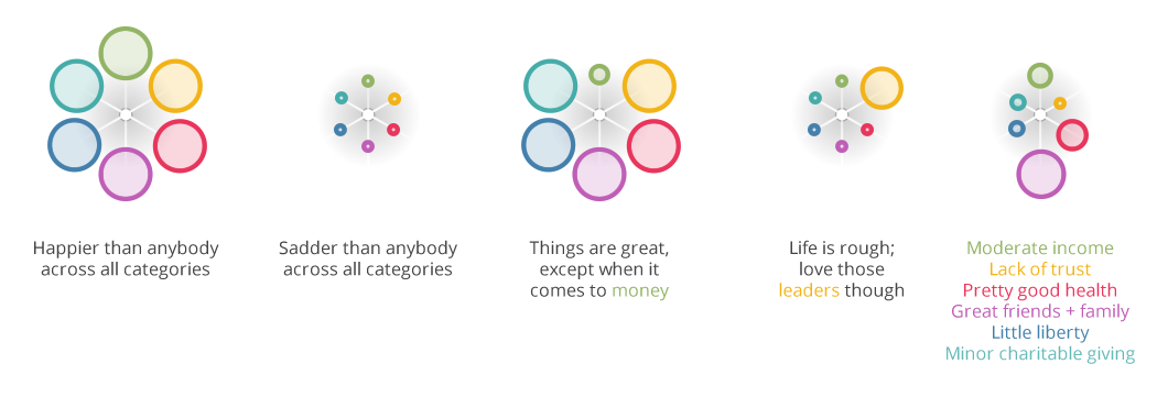
Rather than making a set of companion graduated symbol maps, one for each happiness-factor, I wondered if I could show them all the same time in some sort of chimera abomination symbol map…
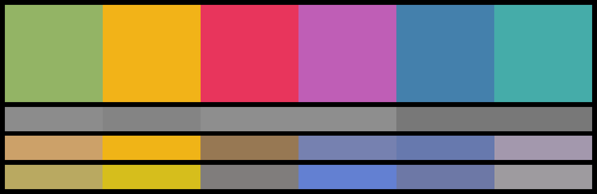
Promising. Now to pick some colors. There are all sorts of innate and cultural meanings tied up with color so it can be risky to apply a handful them directly to social data (seriously, hit the brakes and go check out Rob Simmon’s tour de force on color on data visualization; I’ll wait). But, I felt like six variables was too many just to rely on an angular offset. Color would help map readers key-in to the variables. So I made some culturally-informed (I winged it) distinct hue choices.
Here is the palette I came up with for the six happiness factors. For reference, they are (left to right) Income, Trust, Health, Support, Freedom, and Giving. I like to compare the gray-scale values of visualization colors to ensure that some don’t vary too much in brightness, and I also run them through the Coblis colorblindness simulator. They sort of check out.
Here’s how they key to my symbol:
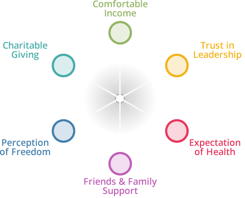
The graduated symbology would drive the visualization of how much each factor is thought to influence a country’s perception of happiness, relative to all the other countries:
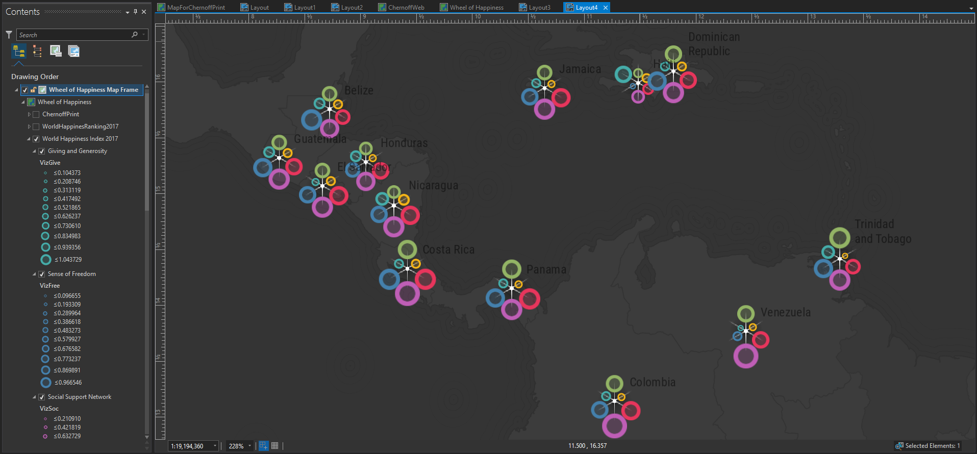
All together, you get a wacky beast that combines to illustrate patterns of happiness:
I love it when a plan comes together.
How to Make This in ArcGIS Pro
This is just six graduated symbol map layers shown all at once -each layer is given graduated symbology tied to one of the happiness factors.
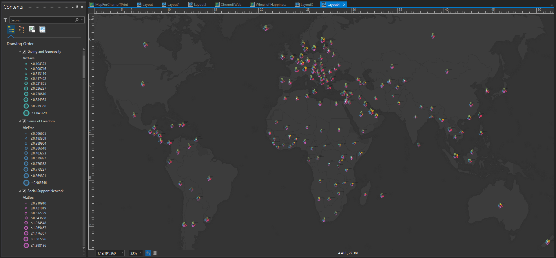
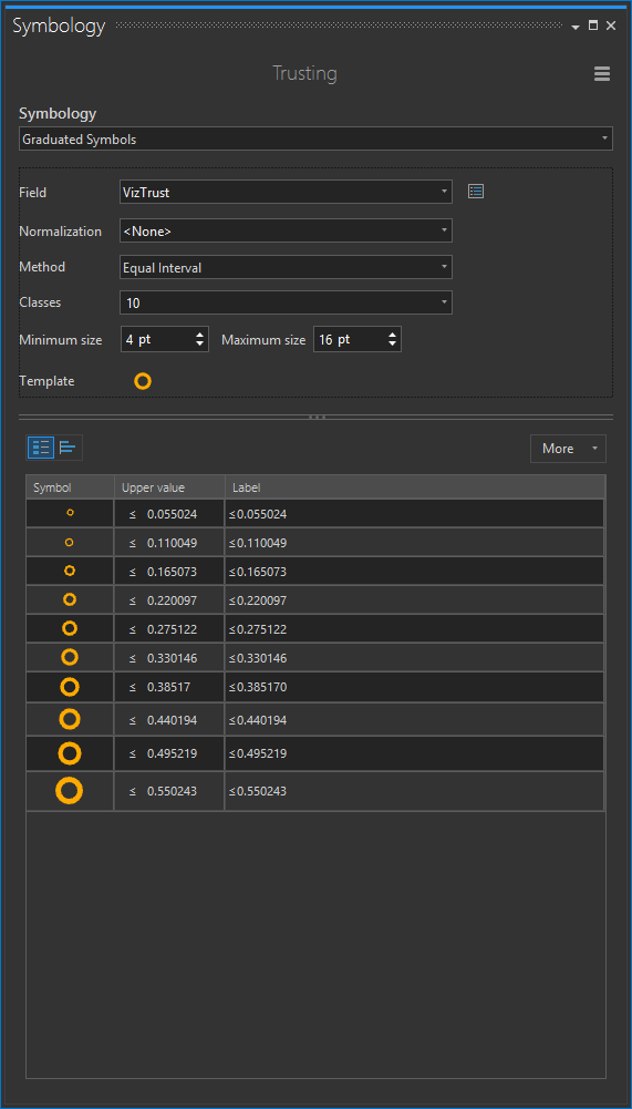
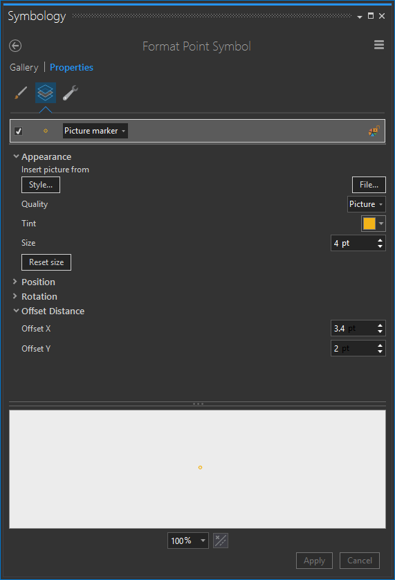
Each layer is symbolized via a graduated symbol method, with equal interval range breaks. This way, each countries color ring (representing some happiness factor) can be compared to other countries. Rather than using a circle symbol, I point to a circle PNG image (this is important -otherwise the offsets won’t be maintained when you upload the layers to ArcGIS Online). You can color an image using the “Tint” property in the symbol formatter (image below).
![]() (right-click this image and save it to use as your symbol)
(right-click this image and save it to use as your symbol)
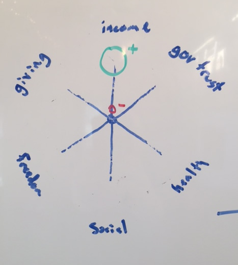
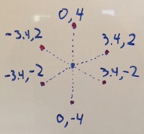
In order to avoid stacking, each layer is given an X and Y offset. I did this manually, pushing each layer in one of six directions. Note the “Offset Distance” section of the point symbol panel.
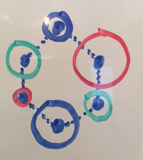
In order to get the offset spacing right, I relied on the alarmingly analog combination of 9th grade geometry memories and a whiteboard.
Then I dropped in a little hub-and-spokes graphic, and I was off to the happiness races!
ArcGIS Online Web Map
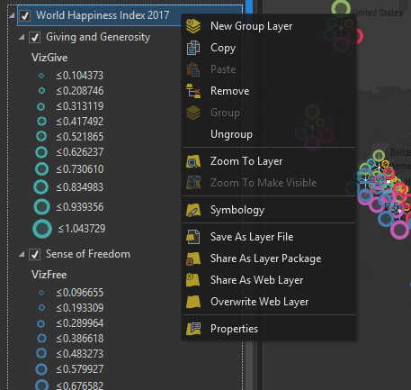
Now to blast this thing over to the internet. Back in the “Map” tab, I grouped all six layers and the hub and spoke graphic, then right-clicked the group and chose “Share As Web Layer.” This bundles it up and stores it to an ArcGIS Online account.
Then I just added it to a map with the trusty Dark Gray canvas vector basemap. I added a couple layers that show the happiness ranking at broad scales (since my mega-symbols start overlapping pretty fiercely at that scale) and played with their zoom-level visibilities.
Story Mapification
This map is fun, but it definitely bears some explanation. Story Maps are the universe’s single best method to wrap a map up into a guided narrative. Because the World Happiness Report is so interesting, and potentially complex, I felt like this map deserved to tell a story. So, I created a Cascade story map to introduce the concept, describe the happiness survey and factors, and guide readers through a tour of a global phenomenon. What could be more fun? I hope you check it out.
What’s more, I hope you try out a method like this, or, try something new if you are feeling like I was -in a choropleth rut. There are lots of different cartographic techniques to explore, and lots of fun to be had in the exploration.
Thoughts on Happiness
I wonder about the word “happiness” and the many dimensions of satisfaction and well-being it encompasses. I wonder about the cultural connotations of imagining myself being higher or lower on a ladder. I asked myself how high I imagine myself of a 10-rung ladder of my best possible life. I put myself at an 8. Life is terribly beautiful; I’m so happy -but I don’t want to estimate too high so as to assume I’m at a limit. I happened to show this map to my dad, as I am wont to do. He also put himself on the 8th rung. That made me even happier.
But, regarding the state of happiness, with an optimistic outlook…I wonder if imagining a ladder, and where we are on it, really translates to something like happiness or something even harder to know, like expectations of improvement or contentment. Many of the apparently happiest people I’ve ever met come from Sub-Saharan countries that rate themselves quite low on that ladder. Happiness is hard to pin down. But I am glad the teams at the United Nations are trying to understand it at a global scale, and what factors might influence it.
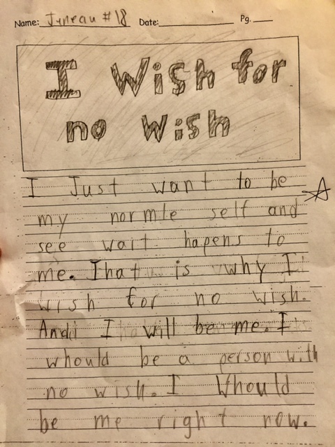
Recently I was moved to near tears when I read a short essay by my young son, Juneau. His sentiment of contentedness and satisfaction, primed with his inherent optimism and joyful energy, is a fantastic example for me.
Happy Mapping!
John


Commenting is not enabled for this article.