Wildfires, which started in the Great Smoky Mountains National Park in the end of November, recently spread north into Gatlinburg, TN. Normally, prescribed burns, to reduce the forest understory’s accumulating fire fuel and maintain the natural cycle of fire in the ecosystem, are actually difficult due to the pervasive moisture of the area. But a prolonged drought has made the park ripe for fire.
Here is a look at the ongoing drought that has been hovering over the American Southeast since spring of this year. It shows six months of aggregated drought zones (drought perimeters of varying intensity, released weekly, collected from June – November of 2016), binned up into 100-square-mile hexagonal zones.
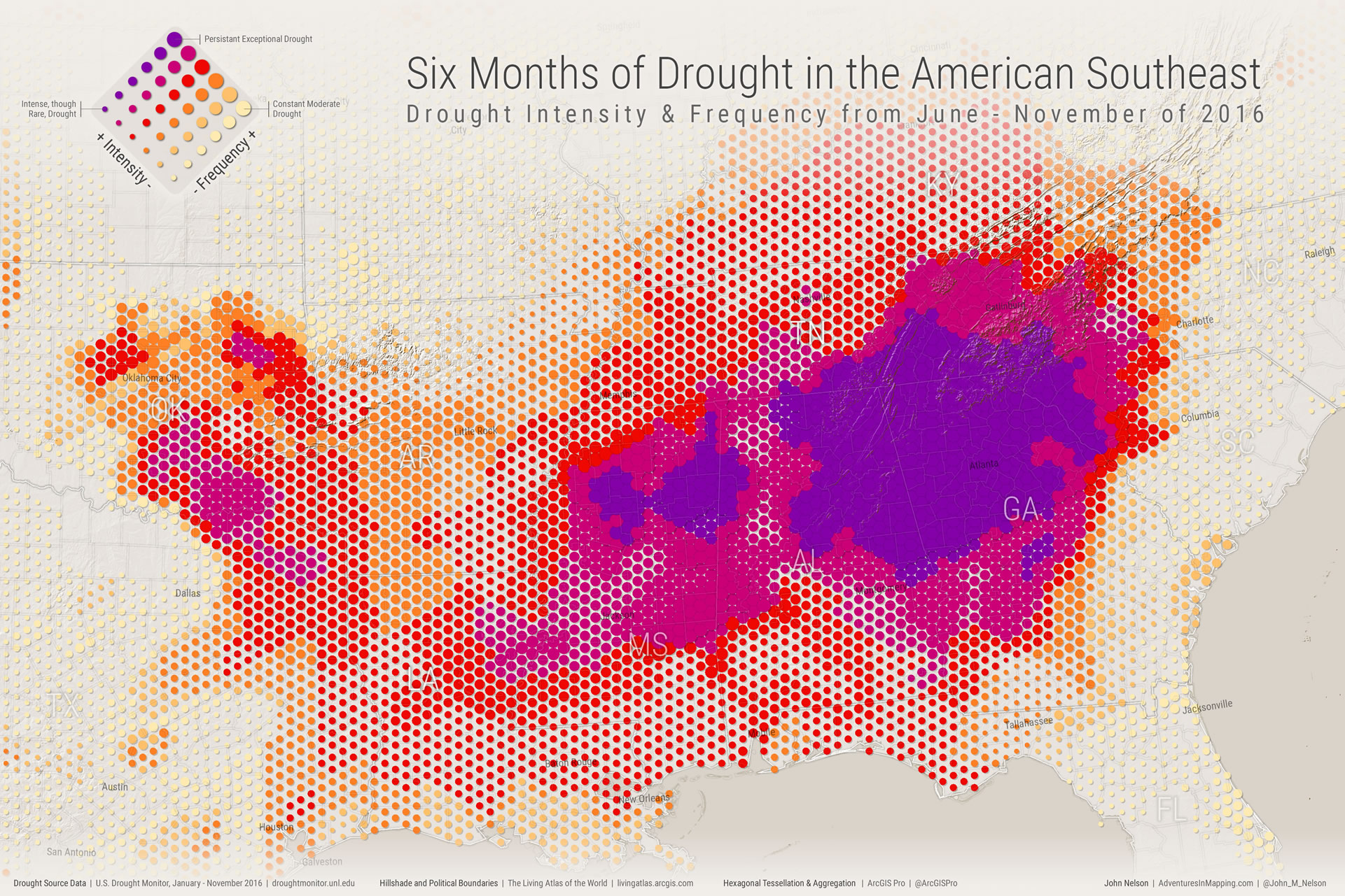
These zones are scaled by the proportion of the past six months spent in drought. The fully-scaled zones have experienced drought 100% of the past six months.
The scaled zones are then colored by the aggregate local intensity of the drought. The darkest areas have experienced “exceptional” drought -the most severe category- for most or all of the past six months.
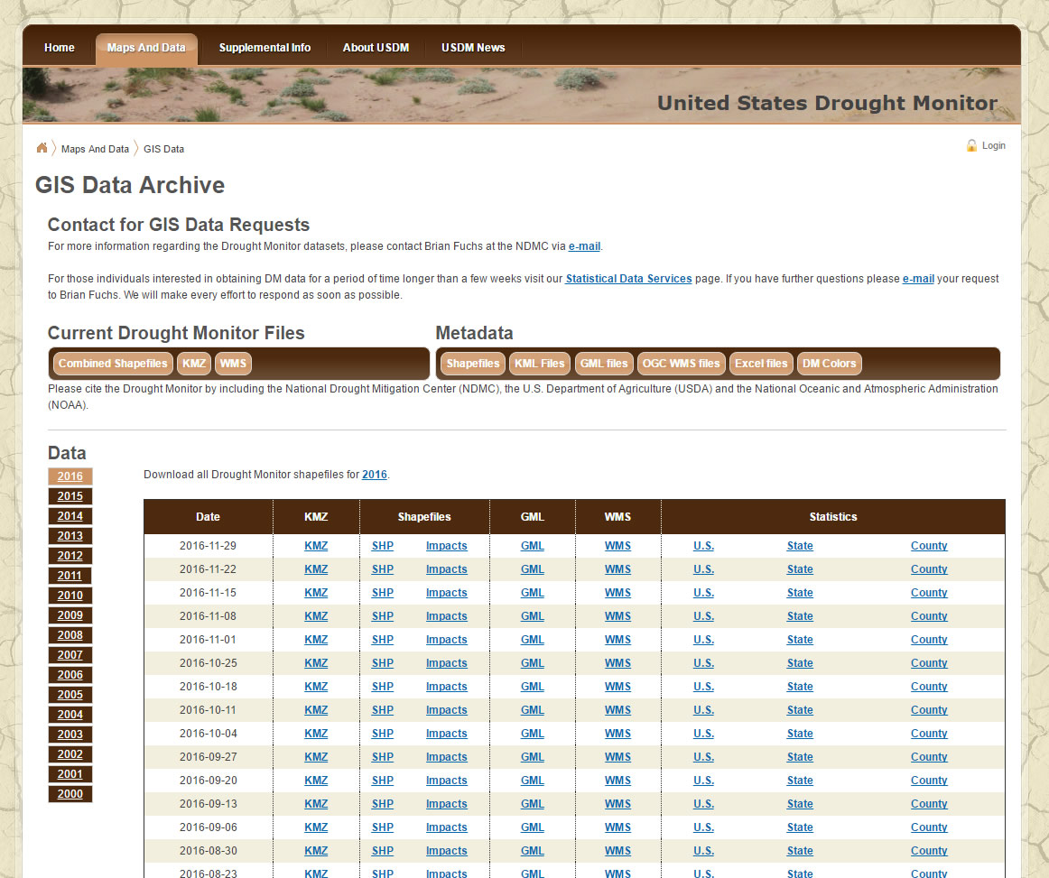
The data comes from the good work of the folks at the United States Drought Monitor. Weekly archived drought shapes are available for download for analysis.
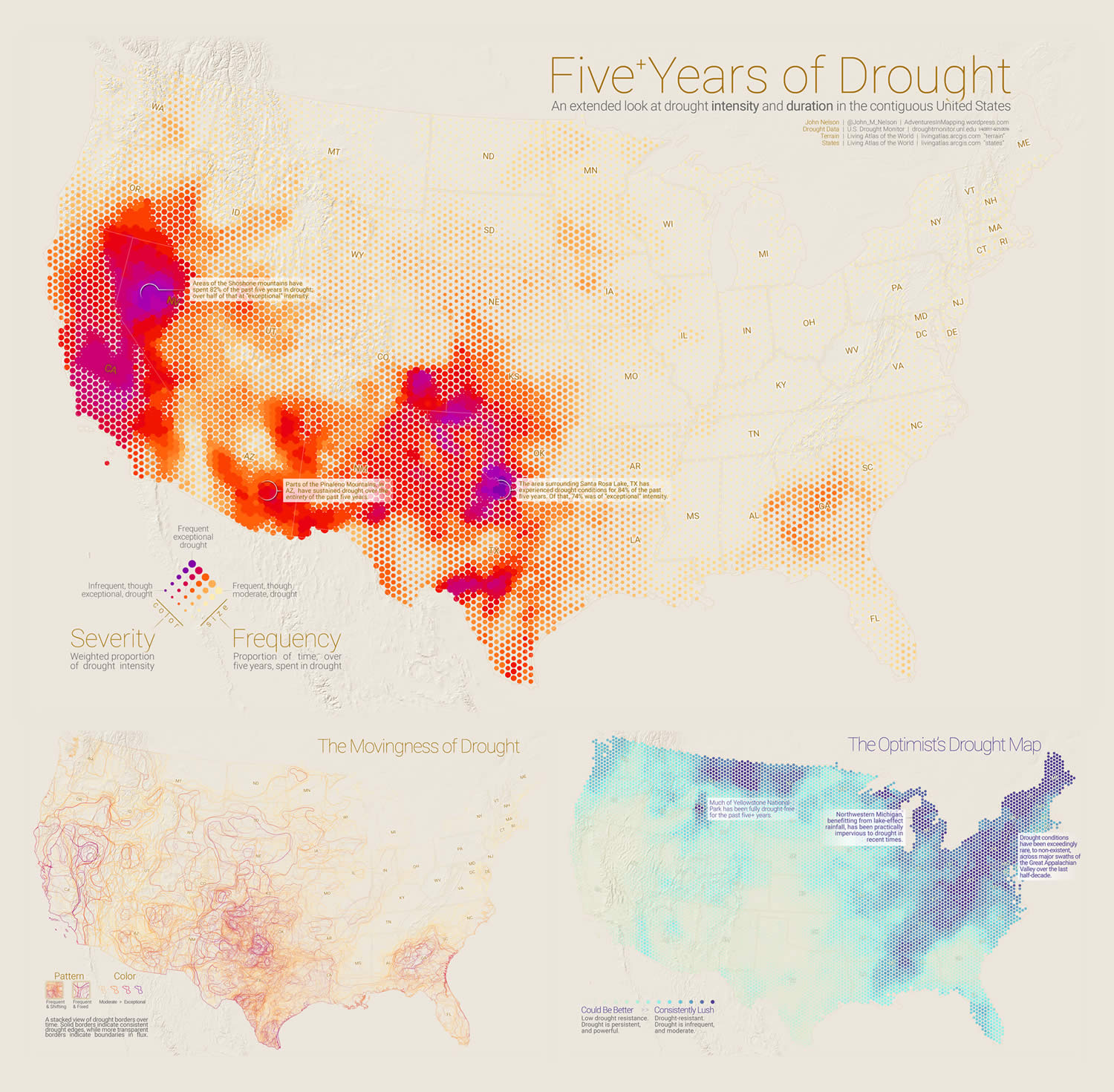
This map picks up where the Five Years of Drought map series’ time span ends. In the previous five years, drought was exceptionally rare in the area.
How to Make This Map in ArcGIS Pro
Drought Data Download
The US Drought Monitor website is incredibly accommodating of GIS analysts. Weekly drought perimeter shapefiles are archived, going back years. Weeks can be downloaded individually, or in bulk per year. I downloaded the full 2016 packet, then investigated the data to see when the drought began in earnest in the Southeast.
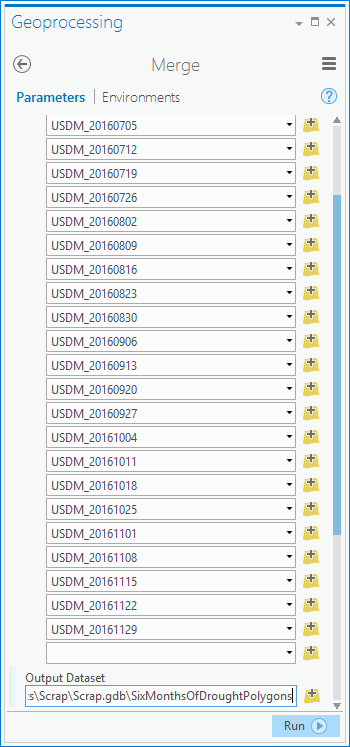
After a bulk un-zip job (I used 7-Zip to extract all of the weeks in one go), I opened them up in ArcGIS Pro. I clicked the “Analysis” tab, and opened the Geoprocessing pane (a feast of spatial goodness). I opened the “Merge” tool and combined all those weekly (June – November of 2016) shapefiles into a single awesome shapefile.
Surveying the Aggregated Data
Here they are all glommed together into a single shapefile. Already, the heavily-overlapping nature of all these weeks poses a visualization challenge.
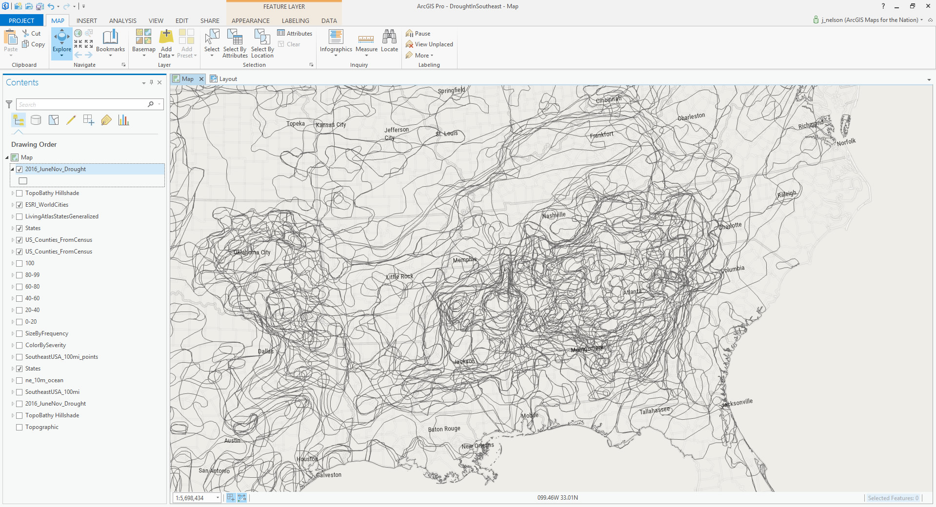
Each polygon has a severity attribute, ranging from 0 (abnormally dry) to 4 (exceptional drought). So we can thematically shade them by that severity, and set the transparency of each polygon to 90% (ten polygons would have to stack up on each other to get full opacity), just to create a quick and dirty heatmap type of thing.
![]()
This is a start, but it only provides a general visual sense of drought accumulation and severity. Ideally, you could interrogate regions to get some tangible statistics about how frequently and how severely drought has presented itself.
This is a job for binning!
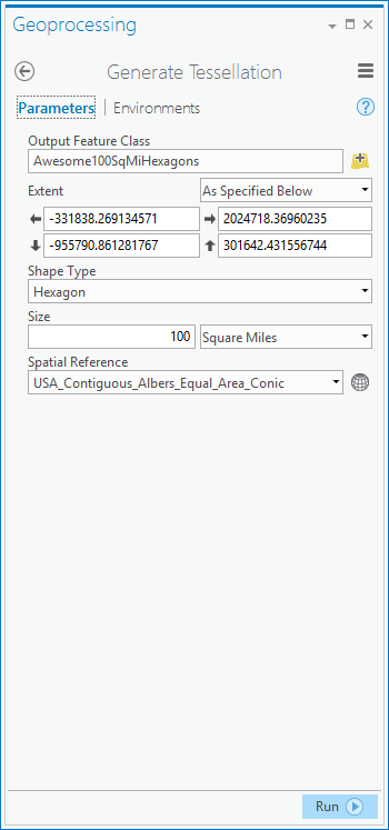
Hexagon Tessellation
I want to grid-up this area, and aggregate any drought polygons that happen to coincide into each cell. Of course I chose a hexagonal tessellation, because hexagons are awesome.
From the Geoprocessing pane, I opened the “Generate Tessellation” tool, which is a fantastic resource. I carved up the Southeast into roughly 100 square-mile hexagonal cells. Did you notice the equal area projection? That’s a pretty big deal if you are making roughly equally-sized zones, so make sure your project is using an equal area projection.
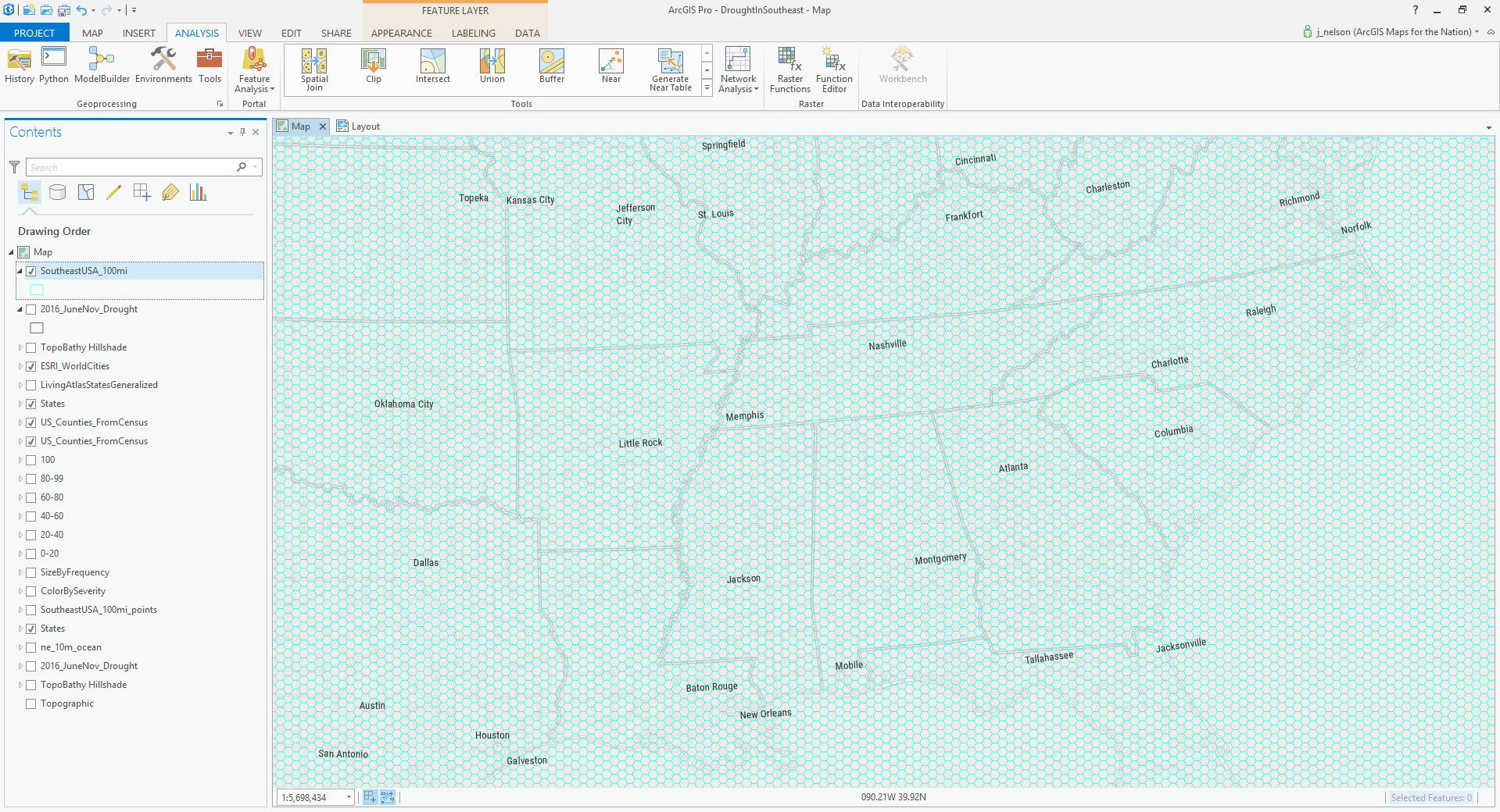
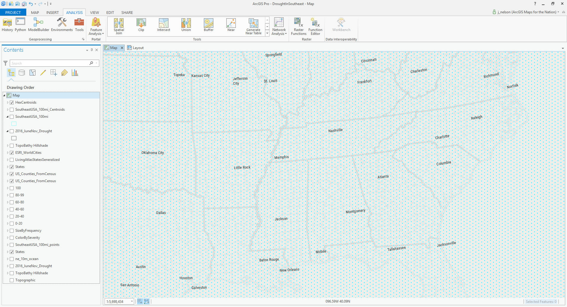
Here are the resulting hexagons, rendered over the map. You may have to squint. 100 square miles is pretty small at this scale.
Binning
Ok, now we have a huge pile of heavily-overlapping weekly drought polygons, and a beautiful mesh of hexagons. How to add up the intersection of drought into these things? There are probably all sorts of ways to do this, but here is one…
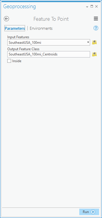
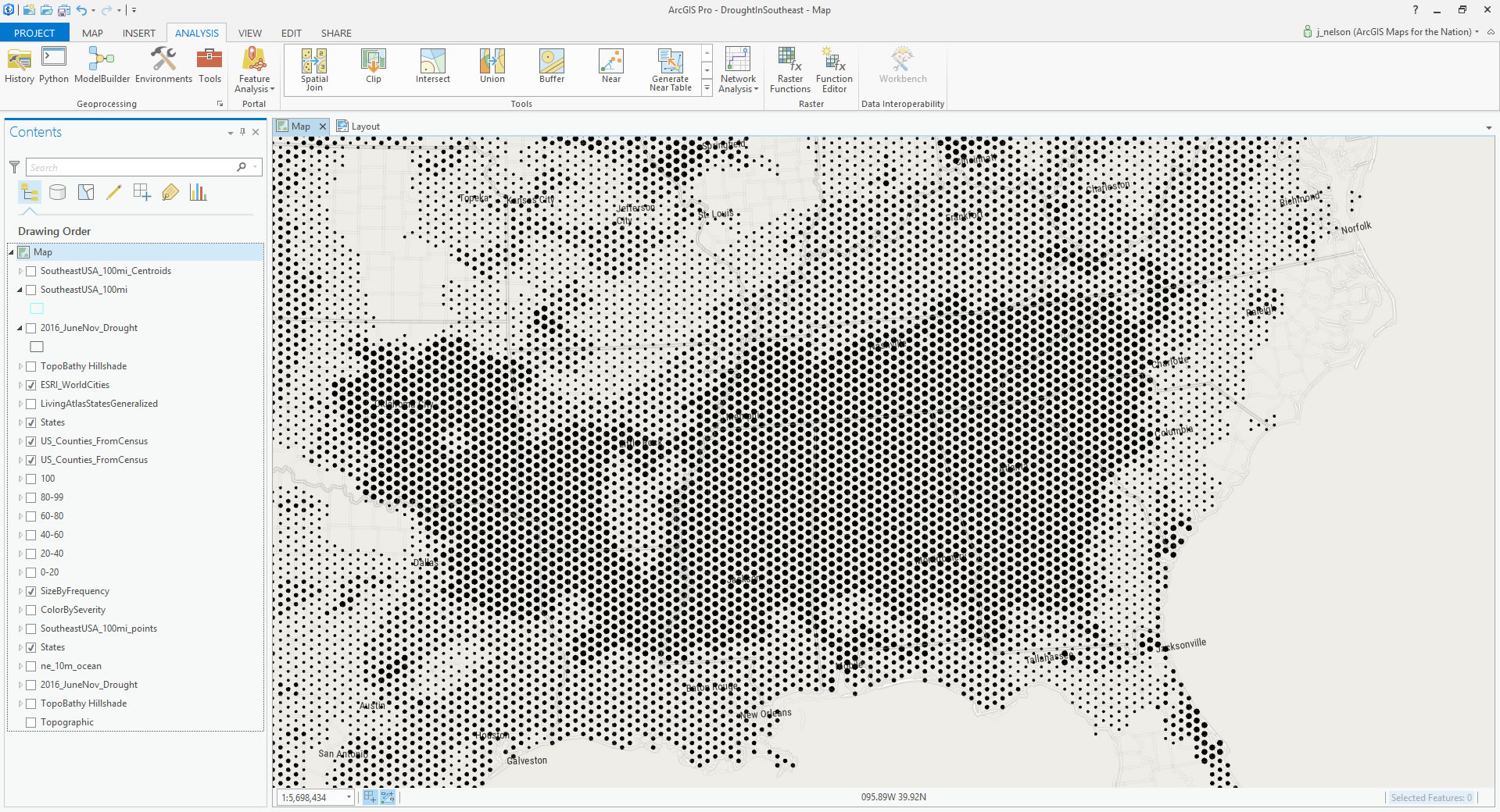
If we did a simple intersection of drought polygons into the hexagon polygons, we would get a double-counting of hexagons that spanned a boundary between neighboring drought severity polygons, and the aggregation would be an incorrect mess. So, first convert the hexagon polygon layer into point centroids (this has a dual benefit, allowing for visual scaling, described later on). Now, only the infinitely precise center point of the hexagon will look for overlapping drought polygons.
In the Geoprocessing pane, I opened the “Feature to Point” tool, to generate a centroid version of my hexagon mesh.
And there they are. At this point I’m done with the hexagon polygon layer; it was just an intermediate layer, bravely giving of itself for the greater geospatial good.
In the Geoprocessing pane, I opened the “Spatial Join” tool. This doodad really is a bit of magic. It’s like the “Join by Attributes” function that we all learned in our first GIS class, but instead uses geographic proximity to join attributes to features, instead of a simple keyed attribute. I just love it.
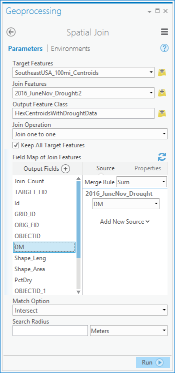
With this function, I am doing two things. I am counting up all the drought polygons that touch each hex point -like a little census at each location. But not all drought polygons are equal -some are much more severe than others. This severity lives in the “DM” attribute of the drought polygons (DM stands for Drought Monitor), which, as mentioned earlier, ranges from 0 (abnormally dry) to 4 (exceptional drought). While this is a categorical scale, not intended as a quantifiable value, I’ll still use it to weight the aggregation. I set the “Merge Rule” for the DM attribute to “Sum”. If you wanted a more complex weighting system you could make a separate attribute that that. But this simple summing yields an alright-by-me approximation of less-to-more severe.
Now we have two values in the resulting hex point file: The raw count of weeks when dry conditions existed at a location (which I turn into a percentage using the Field Calculator, based on the total number of weeks in the six month period), and a unit-less weighing of that location’s overall drought severity. Both are interesting to me.
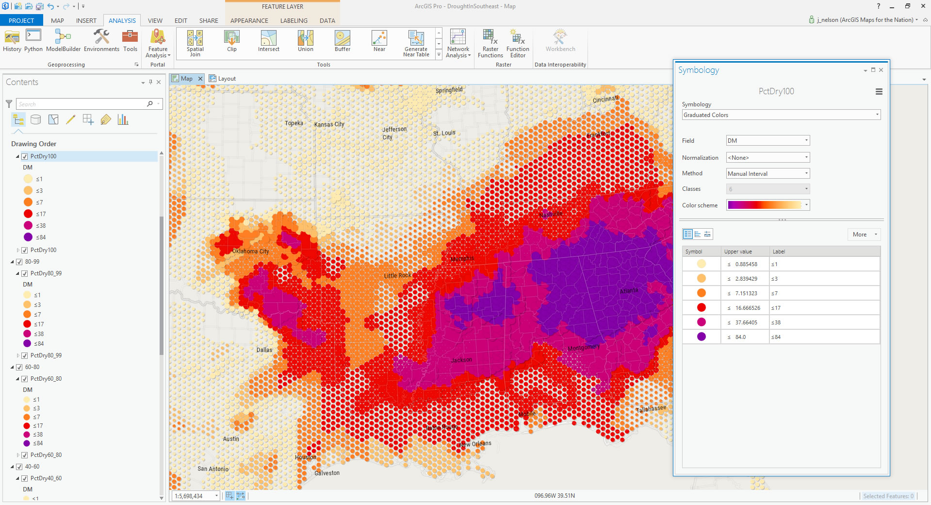
Bi-Variate Mapping
I broke the points out into six groups, by the frequency of drought, saving each range as a separate shapefile and scaling their point size accordingly.
And for each of these separate “frequency” layers, I applied the same symbology rule -coloring the points by the weighted “DM” severity attribute.
Other Cartographic Stuff
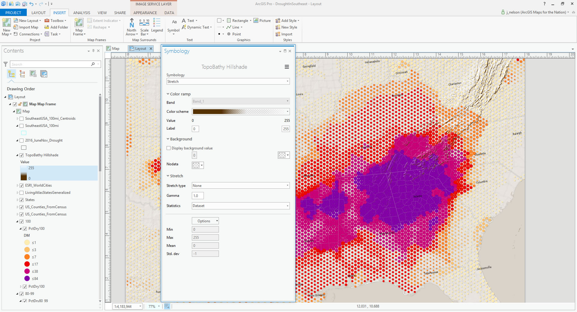
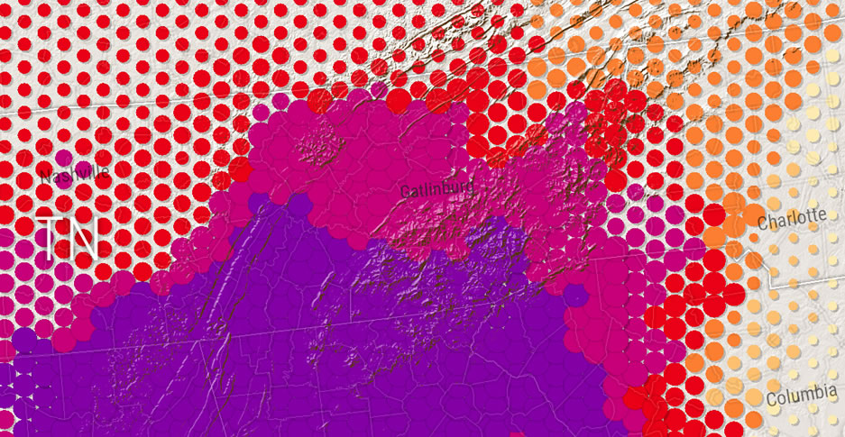
Because the topography of an area can have an influence on drought conditions, and because it can provide a helpful visual context of a region, I added the TopoBathy Hillshade layer, from the Living Atlas, and applied a transparency color to the gradient’s mid-tones to retain only highlights and shadows. You can read more about that devious technique here.
Here’s a closer look at the hillshade overlay effect:
In ArcGIS Pro’s Layout view, there are options for overlaying gradient rectangles, helpful for reducing the visual noise behind a title or legend. I encourage you to check that feature out.
Anyway, that’s that. In this blog post, you may have learned how to…
- Dive into the amazing data of the U.S. Drought Monitor
- Generate a hexagonal tessellation
- Aggregate intersecting polygons via spatial join
- Whip up a bi-variate map with layer splitting and symbology
Thanks again to the folks who contribute to, and manage, the U.S. Drought Monitor resource. You are doing good work well. And my sincere wishes for a strong recovery to the folks in and around the Gatlinburg area who have been affected by the terrible fires there.
Happy mapping. John

Article Discussion: