Smart Mapping is an exciting capability that can help you create beautiful and informative maps, quickly. It’s never been easier to craft visually stunning maps that tell the stories you want to tell. This guide will help you familiarize yourself with smart mapping and its overall workflow, so that you can get started making your own mapping masterpieces! To follow the same guide interactively, visit this story map.
In its simplest form, smart mapping is a solution custom created for your map and your data, which is why we call it “smart”! With just a few clicks, you can create a clear story about your data.
Not a cartographer? Don’t worry! Smart defaults take the guesswork out of your map-making process, and help you get to a clear map more quickly. Smart mapping is designed to make your maps beautiful, while showcasing your data’s important values.
Do you have a background in cartography? Awesome! Smart mapping provides new and existing cartographic techniques to help you create stunning online maps.
Smart mapping will suggest cartographic options by recognizing the type of attribute you choose to map (ex: categorical, numerical, etc). The initial settings immediately show significant values within your data in order to help you explore and showcase important patterns. The choices you make using smart mapping will immediately show within the map, but are not applied until you specify that you are done. This makes smart mapping a powerful tool for data exploration, and also makes it fun to use!
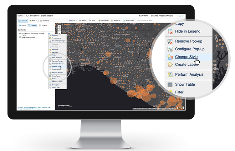
Available in ArcGIS Online and ArcGIS Server, smart mapping appears when working with your hosted data. See the full list of compatible layer types here. To get started, select the Change Style option for your layer. This brings you to into the smart mapping interface.
Smart mapping can be broken down into three simple steps:
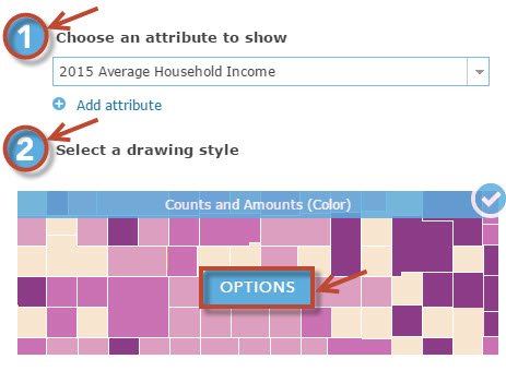
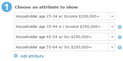
- Choose an attribute to show
- Select a drawing style
- Explore the options
1: Choose Attribute(s)
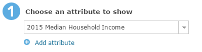
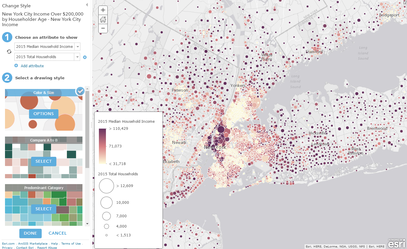
To start, choose an attribute (or multiple attributes) and you’re smart mapping! Once you choose an attribute, smart mapping provides drawing styles based on the type of attribute. For example, selecting a numeric field such as Median Household Income provides options known as Counts and Amounts.
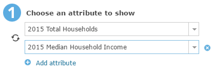
If you want to explore relationships between two or more attributes—for example, is there any connection between housing prices and life expectancy–you can add a second attribute using the Add attribute button. This technique shows both attributes on the map at the same time.
You can also choose up to five related attributes to compare their values. For example, you might want to represent multiple infrastructure projects by the output of each project. Smart mapping will display the project with the largest value within the map, which is technique known as predominance.
2: Select a Drawing Style
Once you have chosen a single attribute or attributes, smart mapping will recognize your data and attribute types to offer drawing styles.
To choose a drawing style you would like to try, click the SELECT button on the drawing style. The current drawing style appears with a blue heading and a blue check-mark. Smart mapping immediately provides a preview of your selection within Map Viewer. This allows you to dynamically see the map and the Legend as you make changes. It also means you can use the CANCEL button if you want to go back or try different drawing styles.
When selecting a drawing style, this quick reference provides helpful tips about what kinds of questions are answered by each style. Your map is a powerful tool of communication, and the different drawing styles can help you tell your story in the clearest way.
3: Explore the Options
Once you have chosen a drawing style, it contains its own set of options for customizing your map. Click the OPTIONS button to explore your data and make additional cartographic changes. Depending on your attribute and data type, you can change things such as:
– The data classification method
– The symbol size
– The symbol color and shape
– The transparency of the features
– The rotation of the symbols
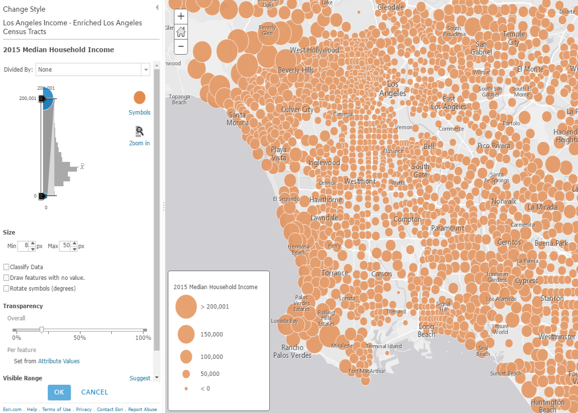
Notice that there is also a histogram graph to help you understand how your data is distributed. The x̄ symbol allows you to quickly see the average value within the attribute you are using. By default, the map is set to highlight statistically significant high and low values. Drag the handles or type in a specific value to change the representation of the data values. You can also change the classification to use common methods: Natural Breaks, Equal Interval, Quantile, and Standard Deviation.
Smart mapping will help make suggestions as you edit your map. For example, if you change the basemap, it will automatically adjust the available color ramp options so that your data will contrast well with the map’s background.
Smart mapping will always suggest options that work with your specific combination of data and attribute choices. So feel free to try out different combinations and options, because your map will go back to its previous cartography until you use the DONE button.
Don’t be afraid to try different options and combine different variables. Smart mapping is a great way to explore patterns in your data that you may not have found otherwise.
Want to learn more? Check out some of the links below, which can help get you started.
ArcGIS Online Change Style Help Page
6 Easy Ways to Improve Your Maps

Article Discussion: