ArcGIS allows you to explore your data and make useful maps of it. When you choose “Change Style” in ArcGIS Online or ArcGIS Enterprise Map Viewer, smart mapping analyzes your data, and provides suggestions based on the fields and values within your data. These defaults can help you produce an effective map quickly, but if you have a few more minutes to adjust, you can make some subtle changes that reveal and enhance the story hidden within your data.
Here are some tips and tricks for getting the most out of your smart mapping experience:
2) Find Signal within the Noise
1) Think About Color
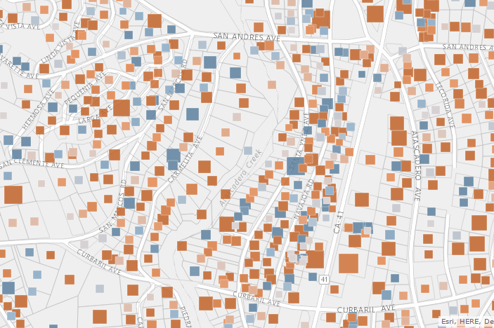
ArcGIS contains many basemap-specific color ramps to help showcase your data, many of which are color-blind friendly. When switching the basemap, smart mapping automatically suggests a color ramp suitable for the basemap you select. Designed to draw focus to your data, the Light and Dark Gray Canvas basemaps are a good place to start. To enhance your story, choose an alternative color ramp that matches the context of your data. For example, the following map shows change in water usage in Atascadero, CA after the California governor proclaimed a 25% necessary reduction in water usage. Areas in blue used more water after a year, while the areas in brown used less water. In this case, we are using colors directly associated with the story we are trying to tell.
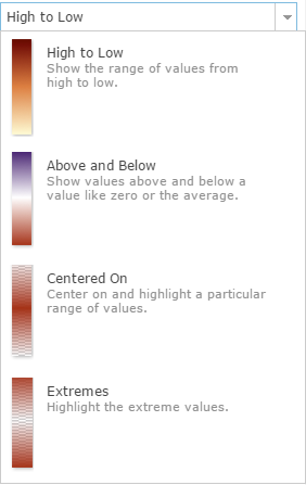
Tip: When mapping thematically, try changing the theme to see your data in a new way. Try using Above and Below or Centered On options. Mapping something with important high or low values? Try High to Low or Extremes. Each theme has color ramps designed for use with that theme and current basemap on your screen. Click on a color ramp to see how it looks. Then think about your audience- do the map’s colors give the first impression you want them to have?
2) Find Signal within the Noise
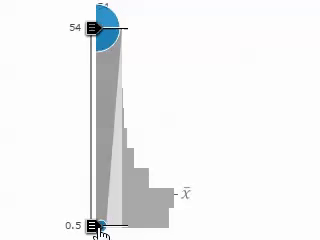
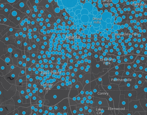
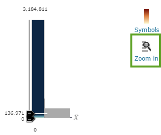
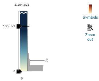
The patterns within your data need to be revealed. Whether you classify your data or use an unclassified approach, be deliberate in how you assign color or symbol size to the data. Choose values that make things clear. To find patterns in your data, use the handles within the histogram to adjust the map quickly. When using size to represent your data, an easy way to discover and show patterns is to drag the lower handle to the average value (seen in the graphic below). This will emphasize any values that are above-average. To get the average value, hover over the x bar value to the right of the histogram. You can also type the exact value into the lower handle by clicking on the number near the handle.
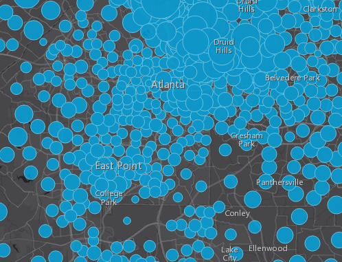
The following maps show the average household income for Atlanta, GA. The first image uses a continuous ramp through all values of the data, while the second map starts showing larger circles only once a value is above average (the technique just described). In comparison, the second map shows a more definitive pattern of above-average incomes in the Druid Hills area.
Tip: Have an outlier in your data? Zoom in to see the values closest to the mean in the histogram. Pull the handle away from the outlier value to see how it affects your map.
3) Adjust Outlines
Outlines on points and polygons sometimes become distracting and tear your audience away from the focus of your map. An easy way to maintain their importance while drawing attention to the map topic, is to play around with color and transparency on your boundaries/outlines. For example, change your boundaries or circle outlines to a slightly transparent value or a color similar to your basemap. You can even try full transparency if the boundaries or outlines don’t help support your story.
The first map below shows an example of overbearing boundaries and outlines, while the second map uses transparent circle outlines and boundaries with a color similar to the basemap. The patterns within the data become more distinct and comprehensive. You can see how strong outlines actually interfere with the pattern the map wants to reveal.
4) Utilize Transparency
Transparency can add emphasis to the patterns in your data. Whether you want to highlight a pattern or a statistically significant value, transparency makes patterns more understandable. Choose an attribute field from your data to control the transparency, then adjust the transparency range.
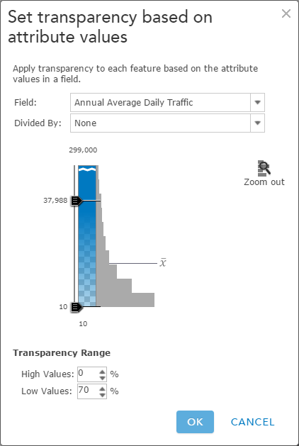
Tip: widen the gap between the highest and lowest value to get a more intense transparent effect.
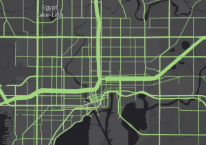
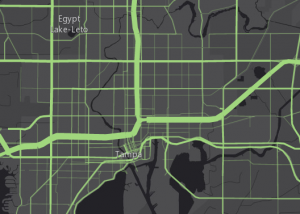
The following maps show the subtle difference achieved by using transparency. The second map uses the same attribute for size and transparency, revealing the busiest highways in Tampa, FL by letting less busy roads “recede” into the map (due to data-driven transparency).
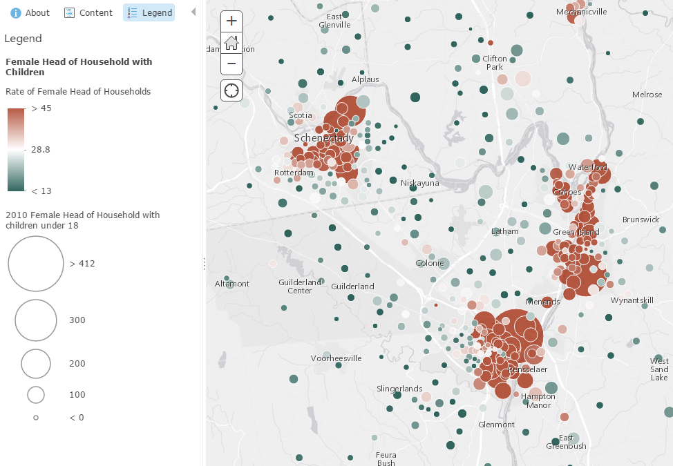
5) Use Size and Color
In the past, showing two topics in the same map could be a challenging task. With smart mapping in ArcGIS, now you can easily show patterns using both color and size. Simply select the variables you want to view, and smart mapping will provide an option to show color and size.
For example, if you want to explore the pattern of single-parent households, size can show the total numbers, while the color can highlight where the highest percentage exist. This technique pinpoints areas that have a high count and percentage of single parent households.
Tip: When starting a multi-variate map, use a count attribute for the size, and a normalized attribute for the color. This will help you see patterns more quickly. An example of a normalized field would be a ratio, average, or percentage. You can select a field to normalize your data once within the options interface.
6) Find the Largest Value
Smart mapping has a built-in interface to help you pinpoint the largest value between multiple attributes. This predominance option allows you to quickly visualize predominant values without needing to calculate any fields within your dataset. In the interface, choose up to five numeric attributes that share a common subject of measurement.
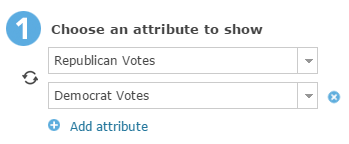
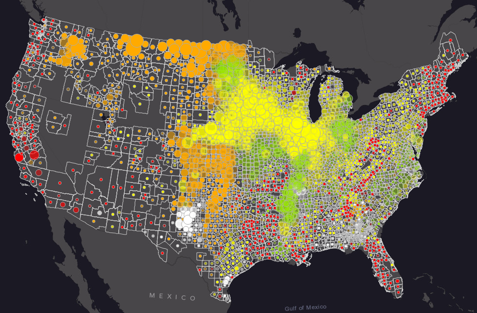
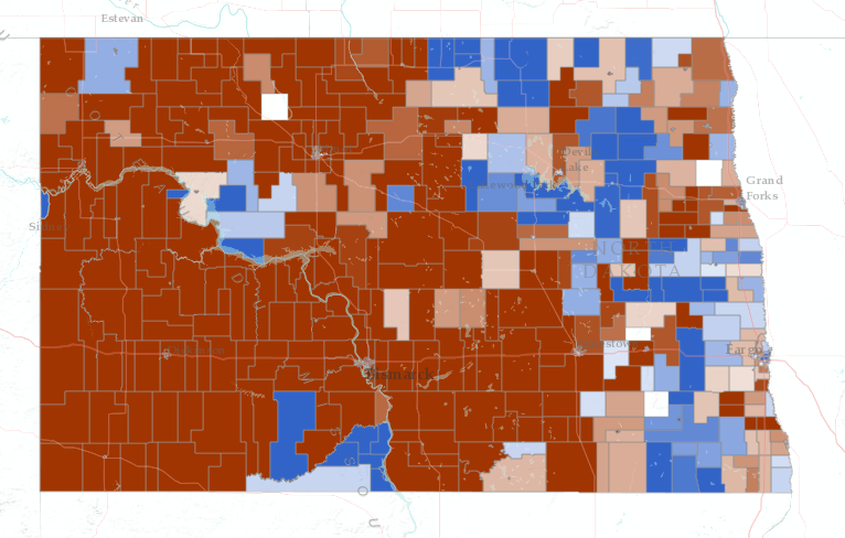
An election map is an example of a predominance map. An election map simply tells you which of two or more candidates has the highest total vote count. For example, this map shows the predominant count of votes for President in North Dakota voting precincts from the 2008 election. Darker colors indicate a higher predominant vote for that party. Lighter colors indicate that party barely won the precinct. White represents an exact tie.
A campaign manager can instantly see in this map which precincts have a strong base for each party, and which precincts were more contested.
For help getting started with smart mapping in ArcGIS, visit the help pages or the following quick videos for more information:


Article Discussion: