This is the second post in a three-part series exploring 3D data visualization in web applications using the ArcGIS API for JavaScript version 4.0.
1. Working with icons, lines, and fill symbols
2. Working with objects, paths, and extrusion
3. Using attributes to represent real-world sizes of features
Last week we discussed considerations of working with “flat” symbol layers in a 3D SceneView. These include IconSymbol3DLayer, LineSymbol3DLayer, and FillSymbol3DLayer. Apart from color, size, and shape of the symbols, one must decide whether to drape the symbols or billboard them.
In this post, we’ll review visualizations with volumetric symbol layers: ObjectSymbol3DLayer, PathSymbol3DLayer, and ExtrudeSymbol3DLayer.
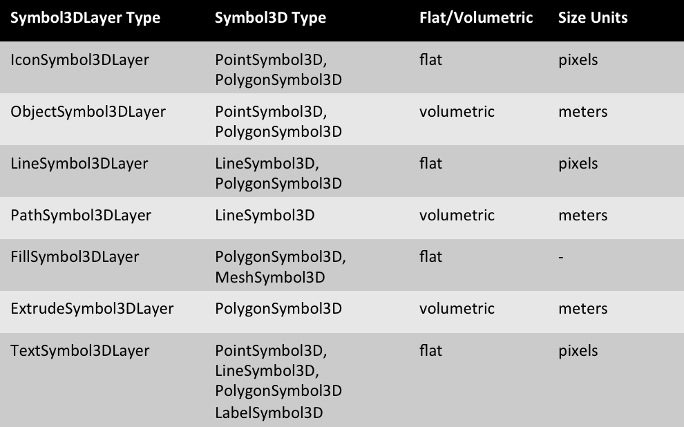
The following table summarizes each symbol layer type and which 3D symbols they may be applied to.
Creating a volumetric symbol layer is fundamentally the same as creating a flat symbol layer with two major exceptions.
1. When defining the primitive or shape of an ObjectSymbol3DLayer, the possible shapes in 3D are “sphere”, “cylinder”, “cube”, “cone”, “diamond”, or “tetrahedron”, as opposed to those listed in IconSymbol3DLayer.
2. The size of volumetric symbols is always defined in meters, not points or pixels.
Defining size
The three volumetric symbol layer types are always defined in 3D real-world space, not in screen space as is the case with their flat symbol layer counterparts. Therefore, unlike billboarded flat icons, the size of 3D objects, paths, and extrusions appear either larger or smaller based on their distance from the camera.
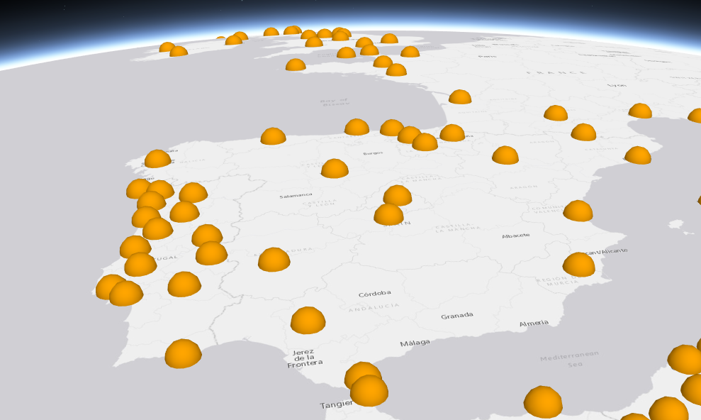
In the following sample, we use a sphere primitive in an ObjectSymbol3DLayer to symbolize world cities. Notice the size is set to a value of 50,000 (m).
var renderer = new SimpleRenderer({
  symbol: new PointSymbol3D({
    symbolLayers: [new ObjectSymbol3DLayer({
      resource: { primitive: "sphere" },
      material: { color: "orange" },
      width: 50000
    })]
  })
});
CLICK HERE TO VIEW THE LIVE SAMPLE
Visual Variables
As discussed in previous posts, we can use visual variables to vary the size of the symbols based on one or more attributes. This can be done to improve the above sample by varying the size of the spheres based on the population of each city.
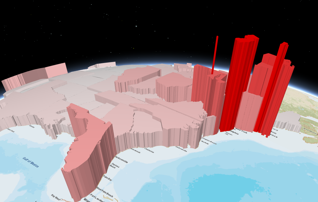
The same principles for defining visual variables in 2D apply to defining them in 3D. Just remember: the sizes in 3D should reflect meters, not points/pixels. In the following sample, we use ExtrudeSymbol3DLayer in a PolygonSymbol3D to create a 3D visualization for population density by U.S. state.
var extrudePolygonRenderer = new SimpleRenderer({
  symbol: new PolygonSymbol3D({
    symbolLayers: [new ExtrudeSymbol3DLayer()]
  }),
  visualVariables: [{
    type: "size",
    field: "POP07_SQMI",  // pop per square mile
    stops: [
      { value: 1, size: 40000 },  // 40km in height
      { value: 1000, size: 1000000 }  // 1,000km in height
    ]
  }, {
    type: "color",
    field: "POP07_SQMI",  // pop per square mile
    stops: [
      { value: 1, color: "white" },
      { value: 1000, color: "red" }
    ]
  }]
});
CLICK HERE TO VIEW THE LIVE SAMPLE
In traditional cartography, one wouldn’t typically visualize the same attribute twice with both color and size. In 3D, however, the perception of size can be problematic. Because of perspective, it is difficult to process spatial size differences between features. For example, suppose you are looking at two buildings that are both 200 feet tall. One is about 100 yards in front of you and the other is one mile away. The building located a mile away will appear much smaller than the one only 200 feet away even though both are the same size.
The same principle makes it difficult to judge sizes in 3D rendering. Adding a color ramp for the same attribute helps us more easily identify the spatial patterns that would otherwise be difficult to understand. Of course you have the liberty to use color for a second attribute instead of the same one used for size, but that is ultimately up to you as the developer and cartographer.
Working with the axis property in size visual variables
Setting a single size value on an ExtrudeSymbol3DLayer and a PathSymbol3DLayer suffices since the extrusion on polygons only impacts height, and paths use a single size for setting the diameter of a tube.
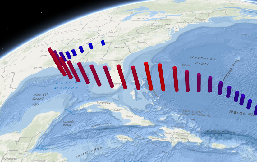
But working with 3D objects can be more complex. Objects like cylinders and pyramids have three axes to consider: height, width (diameter from east to west), and depth (diameter from north to south). The axis property on the size visual variable allows us to define each of these values. In the hurricane sample below, we set a constant size on the width and depth axes to make all cylinder diameters the same size (50km). The height axis is used to set the height of each feature between 60km and 450km based on the value of the WIND_KTS field.
var renderer = new SimpleRenderer({
  symbol: new PointSymbol3D({
    symbolLayers: [ new ObjectSymbol3DLayer({
      resource: { primitive: "cone" },
      width: 50000  // width of the symol in meters
    }) ]
  }),
  visualVariables: [{
    type: "color",
    field: "PRESSURE",
    stops: [
      { value: 950, color: "red" },
      { value: 1020, color: "blue" }
    ]
  }, {
    type: "size",
    field: "WINDSPEED",
    stops: [
      { value: 20, size: 60000 },
      { value: 150, size: 500000 }
    ],
    axis: "height"
  }, {
    type: "size",
    axis: "width-and-depth",
    useSymbolValue: true  // uses the width value defined in the symbol layer (50,000)
  }]
});
CLICK HERE TO VIEW THE LIVE SAMPLE
Because we have three axes to work with, we can visualize two or more variables with size. In the following sample two attributes are mapped with size on different axes: height (and color) indicates the percentage of the population affiliated with the Democratic party and width indicates the percentage of people who self-identify as conservative.
var renderer = new SimpleRenderer({
  symbol: new PointSymbol3D({
    symbolLayers: [new ObjectSymbol3DLayer({
      resource: { primitive: "cylinder" }
    })]
  }),
  visualVariables: [
    {
      type: "size",
      field: "MP06024a_B",  // Affiliated with Democratic Party
      normalizationField: "TOTPOP_CY",
      axis: "height",
      valueUnit: "unknown",
      stops: [
        { value: 0.15, size: 10000 },
        { value: 0.25, size: 2000000 }
      ]
    }, {
      type: "size",
      field: "CONSERVATIVE",  // Identify as conservative
      normalizationField: "TOTPOP_CY",
      axis: "width-and-depth",
      valueUnit: "unknown",
      stops: [
        { value: 0.21, size: 10000 },
        { value: 0.26, size: 100000 }
      ]
    }, {
      type: "color",
      field: "MP06024a_B",  // Affiliated with Democratic Party
      normalizationField: "TOTPOP_CY",
      stops: [
        { value: 0.15, color: "#FF3030" },
        { value: 0.20, color: "blue" }
      ]
    }
  ]
});
CLICK HERE TO VIEW THE LIVE SAMPLE

In this sample we’re looking at two variables: the percentage of the population that are democrats and the percentage of the population that are conservative. Based on the way the visual variables are defined, we would expect areas with a high percentage of democrats to have tall, deep blue, skinny cylinders since conservatives tend to favor the Republican party. That certainly appears to be the case in areas like San Francisco and New York. Interestingly, we see a few pockets of low population areas where there appears to be a higher percentage of conservatives and democrats. We shouldn’t assume that most people in these areas identify as conservative democrats, but looking at the numbers (via the popup) in each of these counties, it is reasonable to conclude there are a fair number of people who could identify as such.
Limitations
While using the axis in size to depict more than one attribute can pave the way for some complex and fascinating visualizations, it can also create very complicated, misleading, and confusing scenes. As is the case when working with other visual variables for thematic purposes, it is best to stay as simple as possible. While the possibilities appear to be endless, a general rule of thumb is maps that visualize more than two or three attributes at once become very difficult to interpret. Therefore, while visual variables can be powerful, be sure to use them with caution in thematic mapping.
Because 3D symbol layers use meters to render the width, depth, and height of features, you can use visual variables to map the sizes of features as they exist in the real world. This is where the axis property on the sizeInfo object becomes particularly powerful. In the final post of this blog series, I’ll discuss how to take advantage of visual variables when mapping the locations and real-world sizes of your features.

Commenting is not enabled for this article.