In the United States, one in four Americans lives with a disability that affects their way of life, according to the Pew Research Center. Using the internet is a fundamental piece of most people’s lives – and we should strive to make an internet experience that tries to work for everyone. To that end, the W3C has authored Web Content Accessibility Guidelines (WCAG.) This is an international standard that helps keep technologies available to those with disabilities. The most recent version is WCAG 2.0. WCAG 2.0 AA is considered to be the new equivalent of Section 508 for those working with the United States government.
Frequently, as able-bodied web developers, designers, and content editors, we forget to add in the extra layer of accessibility that will help people navigate our apps because it’s low on our priority list, the documentation is overwhelming, and/or we’re just don’t know how. In this short series of posts, I will try to tackle the top five criteria that each of these roles should be considering. In this first post, I am approaching WCAG 2.0 AA from the mindset of a developer and offering the top criteria that will make the most difference to incorporate into your work now.
1. Info and Relationships [1.3.1]
One of the best things you can do is write semantic code. Not just because a shiny validation through the W3C will also help you pass the criterion for Parsing 4.1.1, but also because for assistive technologies (ATs) and keyboard navigation to work properly, the ATs rely on your page being coded correctly in order to guide their users’ interactions. If your button isn’t really a button, but instead is a <div>, it doesn’t matter that Javascript makes it act like a button and CSS makes it look like a button, a non-sighted user is not going to know that div is clickable.
See the CodePen Faking Buttons by Klara Schmitt (@FelFly) for an example.
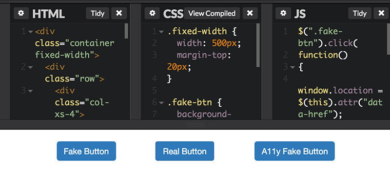
In the charade of the not-a-button-div, it is possible to continue going down this path and just add more trickery to assist keyboard and AT users. By adding tabindex=“0” to the <div>, the <div> will then surface in the DOM in its current position, thus making it focusable by keyboard tabbing. Tabbing allows users a way to navigate between links and form elements on a page by giving only those elements a focus state and ignoring all the content in between.
The next step in faking buttons is to add the role=“button” to the <div>. This will indicate to screen readers that it should be announced button. However, adding role=“button” does not automatically make your <div> behave as a button. A native HTML button is expected to work with both the spacebar and enter keyboard strokes. Simply adding role=“button” does not guarantee that behavior. It may be necessary to further modify your Javascript controlling this <div>. Visit the W3C website for information about aria states.
2. Keyboard Understanding [1.3.3]
 As a developer, this criterion is probably going to require the most work, especially if you are retrofitting web applications to meet accessibility guidelines. The purpose of this guideline is to assist non-sighted and low-vision users and those with motor control difficulties. Basically, all functionality of your webpage or application should be available by keyboard – there are very few exceptions based on the W3C’s documentation. For instance, a free-hand drawing app that used a mouse may be an exception; however, an app for creating process flow diagrams would be less likely to be considered an exclusion as adding elements and positioning them could be done via keyboard since there is standard logic to setting up such diagrams.
It should be noted that there are two primary types of keyboard interactions. There is the sighted keyboard-only user who should be able to read the page themselves, but instead of using a mouse, will most likely be navigating by Tab (forward) and Shift+Tab (backward) to hop between links and form elements on a page. There is also a non-sighted or low-vision user who will be using the keyboard, but may be using it in conjunction with screen reading software. Tabbing is not the native means of navigation with screen readers. For example, in VoiceOver (the OS screen reader) navigation keys are Ctrl+Option+[arrow keys] and VoiceOver does read content such as headings, paragraphs, and images. This is why it is important to test functionality for both types of users.
Keyboard usage should include support for functions such as clicking, selecting, moving, and sizing, but also behaviors such as properly hiding off-canvas content and giving focus to interactive elements on the page are also relevant. If you don’t use display:hidden (CSS) or aria-hidden=“true” (HTML) on features that are off-canvas, but still exist in your DOM, the keyboard user may end up tabbing through all those things that they can’t even see or a non-sighted user will hear things that you didn’t even want on the page yet.
3. Bypass Blocks [2.4.1]
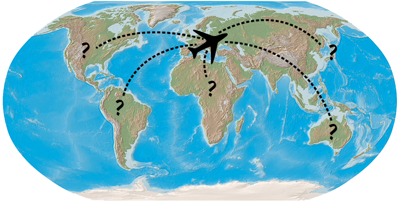
Imagine you had a map, except that nobody labeled the continents. But you can’t book airfare to visit any of these place until you know what they are called. Now imagine your application is that map. If you use ARIA landmark roles to label the sections of your application (navigation, search, main, complementary, etc), screen readers will be able to jump their users to that region quickly by way of a keyboard hotkey. If not, the user might have to listen through the whole page every time they want to get anywhere. You wouldn’t want to have to walk someplace if you had the option to fly.
4. Error Suggestion [3.3.3]
Imagine you just spent five minutes filling out a form for an order. You hit the submit button, but you left some fields blank because they don’t seem relevant and nothing says they are required. Imagine that the form does not submit. Unbeknownst to you your password failed validation. How would you know there was an error?
Generally, when a sighted-user encounters a form error, there is some kind of visual indicator. Error text may show up inline. Sometimes it’s red. Sometimes the border on the input is red. You realize, Oh, that field is required. Maybe there were asterisks to indicate the required fields and you just missed one. Imagine those asterisks were invisible. Sometimes they are. NVDA (a screen reader) does not always read asterisks out loud.
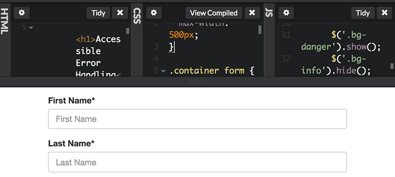
The key components to making a form accessible are making sure inputs have associated labels that describe what needs to be filled out and, if the field is required, it should indicate so within the code. But equally as important is how you handle errors. In terms of a best practice, you want to indicate that the form failed and you want to indicate, specifically, what caused the form to fail, in text.
See the CodePen Accessible Form by Klara Schmitt (@FelFly) for an example.
For general form validation, you want to make sure that you don’t just populate inline errors and leave the non-sighted user sitting with their keyboard focus still on the submit button wondering why your form is broken. The W3C lists out techniques that can help you indicate to them that errors are present. One way is to add a error alert to the top of the page, change keyboard focus to that message, and either link to the inline errors or explain that the form failed and to please correct those errors in order to proceed.
For inline errors, you’ll want to put the message above the affected field input is so that a non-sighted user can hear the error before they enter into the field they need to fix. A sighted user can understand an error by it’s proximity to the affected form field, but a non-sighted user may rely more on reading order.
5. On Input [3.2.2]
You might love surprises. But not everyone does. The goal of this guideline is to prevent unexpected behavior as the user inputs form information or selects a form control, such as launching a pop-up. It can be very jarring for keyboard users, especially if they lose their place in the page.
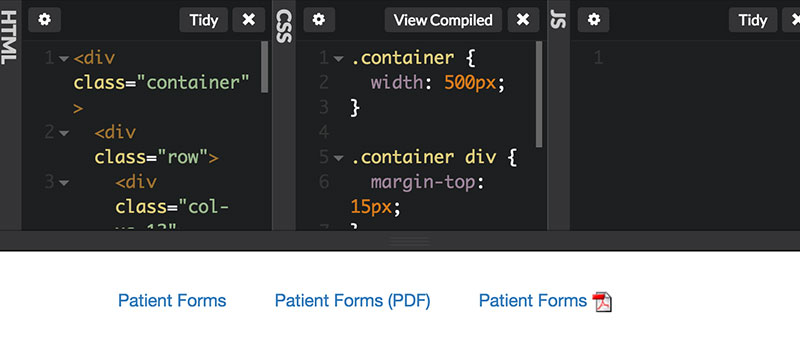
Imagine you were told you could fill out new patient paperwork for your new doctor online or you can download the forms. You’d like to do it online so you can use your screen reader since your eyesight isn’t so good. You’re browsing the site and hear a link titled New Patient Form. You select it. Surprise PDF! It immediately starts to download and interrupts your thought process. You’d be peeved, right? You wanted to fill out the forms online where you’d be able to hear the labels, not download the paperwork. This is why it’s best to never link directly to downloads without warning and also why it’s best to indicate a link as PDF or a document within the link text. If you opt for an icon instead, remember to give that icon a descriptive alt attribute such as “PDF download.”
See the CodePen Avoiding Link Surprises by Klara Schmitt (@FelFly) for an example.
Just a Summary
There are, of course, other relevant criteria for web developers; however, by incorporating even just these five into your work, you are already starting strong in making an accessible product. It is significantly easier to build this functionality in as you go, rather than trying to retrofit an application, and it is becoming a more important goal across government websites to have them fully accessible. In a October 2015 PDF document for the (US) Open Government Partnership, it was written that “Developing and adopting accessible, universally designed programs and websites is critical to making sure every American has access to public services.” In promoting a consistent and accessible online experience for everyone, 18F and the U.S. Digital Service have published a U.S. Web Design Standards Guide, which is also a good resource, and in this article they explain how it was put together.
About the author


Article Discussion: