 One of the main benefits of redesigning a software package from the ground up is you can reflect on some of the limitations of what went before and deal with them head on. Most people who have a long history with ArcMap have at one time or another wanted to apply a little transparency to their symbols and have been frustrated to find the options limited (I’m one of these people!). This is something of which we’ve been acutely aware as we began the process of designing and building ArcGIS Pro. The completely redesigned graphics engine in ArcGIS Pro supports a rich array of possibilities for improved control over your graphics which has major benefits for your mapping. Let’s take a quick look at how modifying transparency for your map layers and symbols can begin to extend your cartographic possibilities.
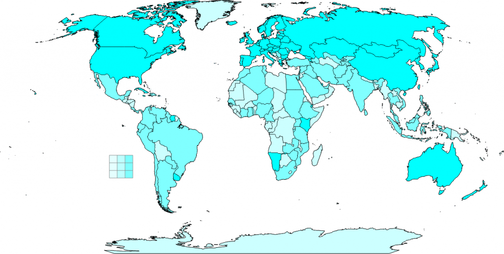
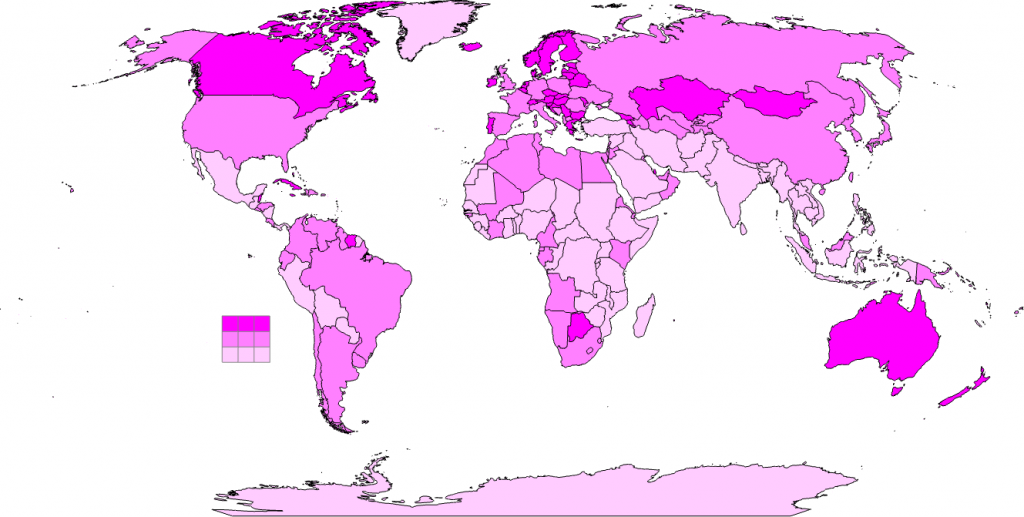
Let’s say we’re interested in creating a bivariate choropleth map, which is essentially the graphical combination of two choropleth maps. Simply position one layer on top of the other in the Table of Contents and then apply 50% transparency to the top layer using the transparency tool on the Appearance ribbon…hey presto, the colors blend and create a bivariate map.
Breaking it down, the following two maps show different attributes, each classified into three quantiles showing the high, medium and low distribution of each variable. The small 9 x 9 grid is added to act as a legend so you can see what’s going on when the colors are combined. On the cyan colored map the legend shows the increasingly saturated color going left to right and on the magenta colored map the increasingly saturated color goes from bottom to top.
By setting the layer transparency of the top layer to 50% using the slider on the Appearance ribbon you end up with a map where the layer colors are properly combined. Because of the new way in which transparency is controlled (which directly uses your graphics card to do the processing) the result appears on-the-fly and fast!
![]()
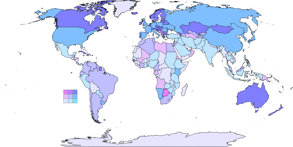
As an aside, when creating a bivariate choropleth it’s important to limit the number of classes for each of the input layers. Here, we used 3 classes per layer. If we’d have used 4 then we’d get a 4 x 4 bivariate grid with 16 separate colors and it starts to get a little tricky to differentiate them. As a way to quickly see the relationship between two variables a bivariate choropleth is useful. We can very quickly see which countries are in the highest class on both variables, the lowest on both variables or perhaps where anomalies occur where countries are high on one variable and low on another. It’s an interesting way to visualize the relationship between variables…and it’s possible to take this concept further to create a trivariate choropleth, again simply by changing the layer’s transparency settings.
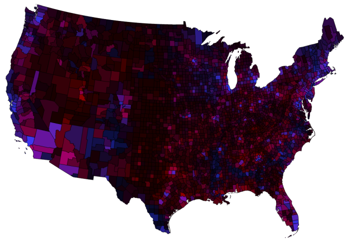
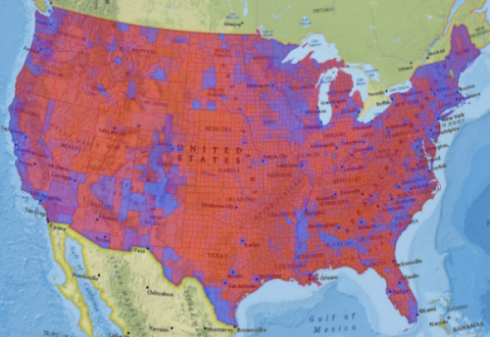
Another way to use transparency to represent more than one variable on a thematic map is to create a value by alpha map. It uses the same principles as the bivariate choropleth by combining two layers. In this case, though, the bottom layer contains the choropleth and the top layer contains a layer that represents some characteristic such as uncertainty. For instance, in the following map of the 2012 Presidential election we can see how the share of votes goes from a rich blue for counties that are predominantly Democrat to a vibrant red for those that are predominantly Republican. The marginal counties are those that occupy the merged purple colorspace. It’s a diverging color scheme that varies away from 50% equal share of votes by using colors that make sense as you go further towards a strong majority.
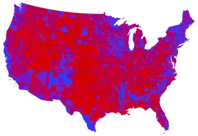
But this isn’t the full picture because it’s not just the majority share (as a percentage) that is important…it’s also the population density and, consequently, the voter density. As we know, different counties have very different numbers of voters. A value by alpha map uses a layer that represents the population density of voters as a way to subdue areas that have relatively fewer voters and focus our attention on the areas that have relatively more voters, and therefore more of an impact in the final tally.
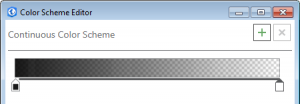
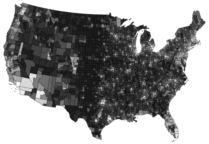
Using the Color Scheme Editor we can easily create a Continuous Color Scheme that goes from near black to fully transparent by simply defining two endpoints of the color scheme. We’ll then apply it to a copy of the counties data so that areas with relatively low voter population density are shaded in the darker colors and counties with relatively high levels of voter population density are increasingly transparent.
We end up with a layer that looks like this with the transparent areas showing white because that’s the background color of the map:
When placed above our election results layer in the Table of Contents we can see how the transparent layer works:
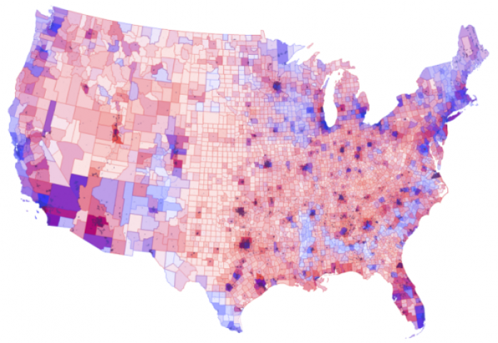
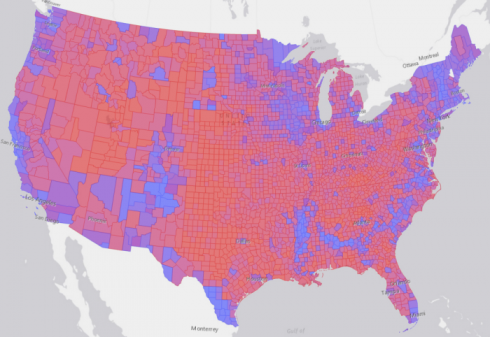
Now, the counties that have the higher relative voter population densities shine more than those that don’t and begin to show us how voter population density has an impact on the outcome. The original map has a lot of vibrant red but the Republicans didn’t win the election. The reason is clear when you see the value by alpha map…most of those strong Republican counties have relatively few people. In fact, most of the counties with strong Democrat support are also those with higher populations which are brought into focus using the value by alpha approach.
With a slight modification we can also create a value by alpha map that symbolizes the population density layer from white to transparent which has the effect of making the counties with low population densities much lighter. It’s a different aesthetic but the same idea as above.
You may notice a few other things about this version where we’ve experimented with transparency in other ways. We added county boundaries in red for those that are predominantly Republican and blue for those that are predominantly Democrat. We added 50% layer transparency to just bring them into the same visual gamut and so they don’t dominate the map. They add a subtle extra way to recognize the distribution of voting by county and it makes for a more interesting map that using some default neutral colour like dark grey. We also used data for the location of cities, again colored these to denote a predominant Republican or Democrat voting pattern and added these into the map, again with 50% transparency. This has the effect of picking out the main populated places which adds a touch of emphasis to the cities as distinct from the counties they are in. It’s a graphical highlight
You can read more on the Value by Alpha technique in a paper published in The Cartographic Journal by Robert Roth, Andy Woodruff and Zach Johnson.
The examples so far have shown how you can use transparency at a layer level but in ArcGIS Pro, you can also apply transparency at a symbol level which can produce some great cartographic effects. Let’s see how it works on a map of global air routes. There’s currently about 60,000 regularly flown global air traffic routes between civilian airports. Putting 60,000 lines on a small scale map will only result in a mess of overlapping lines such as:
![]()
There’s not much that’s pleasant about this map (actually it’s just a visual data dump) but if we apply some transparency to the blue lines; well, actually quite a lot of transparency – 98% – then we get a totally different version:
![]()
All that we’ve modified is the transparency of the symbol’s color but it brings a whole new dimension as well as a pleasing aesthetic to the same data dump. In one step we’ve turned the data dump into an abstract map but one that reveals some structure about the density of air traffic corridors. This sort of technique has been used plenty of times before in maps of social media connections and also for this flights dataset but it’s worth demonstrating because it’s so simple to create in ArcGIS Pro.
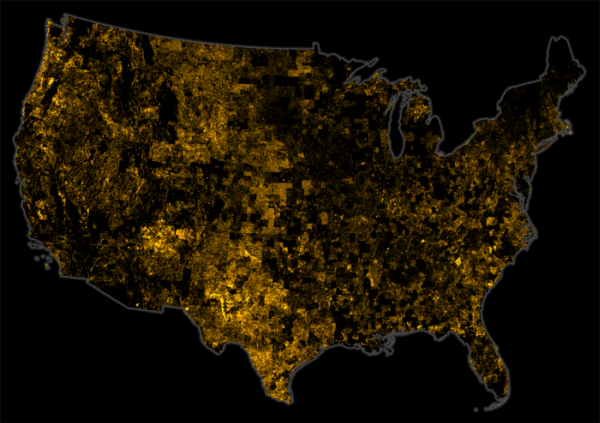
The map allows us to begin to pick out densities of flight paths, particularly over Europe. The shape of the continents also begins to be seen as do the locations of key transport hubs and major cities despite no coastline or cities data being used. It’s also an abstract work of art and using transparency in different ways gives us flexibility to bring a touch of elegance and visual eloquence to our cartography. Here’s the same approach used to symbolize the U.S. street network to identify ‘Where the Streets Have No Name’.
Here we’ve demonstrated just a few ways that you can begin to use transparency in your work to create both useful maps and interesting effects. The possibilities for combining layers and symbols that have different transparency are endless. For instance…what about using transparent halos behind text instead of a solid color? That way you don’t lose any of the detail of your map, the background still appears but the use of transparency in the halo means the typographic elements get a visual lift.
One word of cartographic warning…overdoing transparency can happen. We’ve focused on thematics here and there is a temptation to use layer transparency on a thematic operational layer atop a topographic basemap. What you end up with is a map that instead of having a few easily interpreted colours, instead has thousands of convoluted color blends. Look at the following election map atop the National Geographic basemap. The use of the basemap adds visual noise, over-complicates the interplay with the basemap and the overlay as well as causing cognitive overload. Quite simply, it’s harder for us to ‘see’ the colors relative to one another and therefore harder for us to understand what’s going on.
If you want a basemap under your thematic overlay, you’re better off with something neutral like the Light Gray basemap. That way, if you apply transparency to your overlay then each color is modified in relation to the background in the same way.
Remember, thematic maps and topographic maps are different for a reason. Making them work together is more complicated than simply using transparency. Even with the use of transparency on a layer atop the Light Gray canvas basemap we lose a lot of definition. Top tip: if you’re creating choropleth (Graduated Color) maps, the map is its own basemap. Consider leaving it as it is rather than trying to tie it into a basemap.
With ArcGIS Pro you can change transparency of a layer on the ribbon, as part of a layer’s color scheme in the Color Scheme Editor and also at an individual symbol element level using the Color Editor. Any color can be transparent in ArcGIS Pro and making use of the new transparency tools can bring a real professional finish to your maps.
The possibilities are endless and we’re excited that ArcGIS Pro brings this huge improvement to the way in which maps can be styled. Next in our series of blogs on the new and improved capabilities for cartography in ArcGIS Pro…typography.

Commenting is not enabled for this article.