E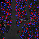 very time an election occurs, maps become a key component in telling the story, but what type of map best tells the story of the winners and losers? Red/blue choropleths? Areas shaded in an array of purples? Value by alpha maps? Dot density by County? Ultimately, the areas used (e.g. Counties) are arbitrary, exhaust space and dictate the visual pattern we see. We can warp them into cartograms but these sometimes distort geography too much for them to make much sense. The patterns we see are as much a product of the boundaries as the voting patterns of real people in real places. This blog entry explores different ways to map election results and describes a different type of map we made to show the 2012 Presidential election results…it’s a multiscale dasymetric dot density web map (viewable on ArcGIS Online).
Debate about how best to represent election results is nothing new, fuelled principally by the default two-colour map commonly used to show red vs blue States (Figure 1).
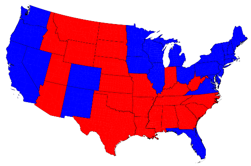
Figure 1: 2012 US Election result at state level as a unique values map (source: Mark Newman 2012)
You only have to look at the map and ask the question ‘who won the election?’ to see the problem. There is more red than blue which suggests a win for the Republicans when the opposite was the case. The electoral college voting system means that a state will be mapped as either red or blue. Large states become visually dominant and while they might not contribute many electoral college votes to the total they appear visually prominent. The other problem here is that the different sized areas alters the visual prominence of some States relative to others, regardless of how many people or voters live there. The data should be normalized to take account of the population distribution because it doesn’t allow for the fact that the large red states generally have smaller populations. At least Figure 1 used an Albers equal area conic projection…the key part being ‘equal area’ so it ensures that each of the states is in its correct proportion compared to all the others.
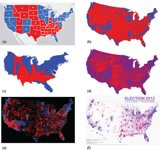
Figure 2: 2012 US Election results mapped using different techniques (sources: Newman, 2012; Axis Maps, 2012; Nelson, 2012)
The use of a Mercator projection (or Web Mercator on a web map) further distorts the areas of the states and compounds the visual problems seen in Figure 1 (Figure 2a). Figure 2b shows how at County level, the red/blue approach seems to magnify the wrong visual message even further. A population density equalizing cartogram can be used to modify the sizes of the states by rescaling according to the number of electoral votes (Figure 2c). This accommodates the visual problem of red dominating the map but modifies the map shape and can cause difficulty for readers unfamiliar with this map type.
Figure 2d shows the percentage of vote with vivid red showing areas of strong Republican support, vivid blues showing strong Democrat support and shades of purple for areas with a strong balance between voting. Because the map shows percentages of votes by total vote, the data is normalised using a consistent denominator and the map becomes a true choropleth allowing for visual comparisons to be accurately made across the map. The value by alpha approach is shown in Figure 2e which uses saturation of colour so areas of low population fade to black. A dot density approach is illustrated in Figure 2f which goes some way to showing the mix of vote per county. Each blue or red dot represents 1,000 votes. Density of voter turnout is reflected in the different dot densities seen in each county. If we consider voter turnout a proxy for population then we can see where the more densely populated counties are and vice versa. We can also see counties with predominantly blue or red dots and those where the dots are mixed (giving rise to the illusion of purple hues because of the close proximity of dots), showing a more balanced vote between the candidates.
However, a drawback of all the above examples is that they use States or Counties as a basic unit in which to represent the data visually. With much of the US unpopulated, large Counties with sparse populations are not easily compared to small counties with densely populated areas and vice versa.
An alternative approach is to create a dasymetric map; a map popularised by the American geographer John Kirtland Wright in the 1940s (who incidentally also coined the term ‘choropleth’ in 1938). A dasymetric map is a type of thematic map that attempts to correct the errors we’ve seen that result from mapping population data using choropleths. It is a form of spatial classification of data where ancillary data is used to reapportion data captured in one geographic area to another geographic area. In terms of our map of election votes, if we think of a county as the area used as the original container for the data, a better way to map the data might be to display it using boundaries that reflect the distribution of the population within that area. This overcomes the visual assumption of choropleths that the population is evenly distributed within each area.
Take, for example, San Bernardino County in California. The county covers approximately 20,000 sq miles in Southern California yet the proportion of urbanised area is extremely small. These areas are where virtually all of the 450,000 voters live (Figure 3a).
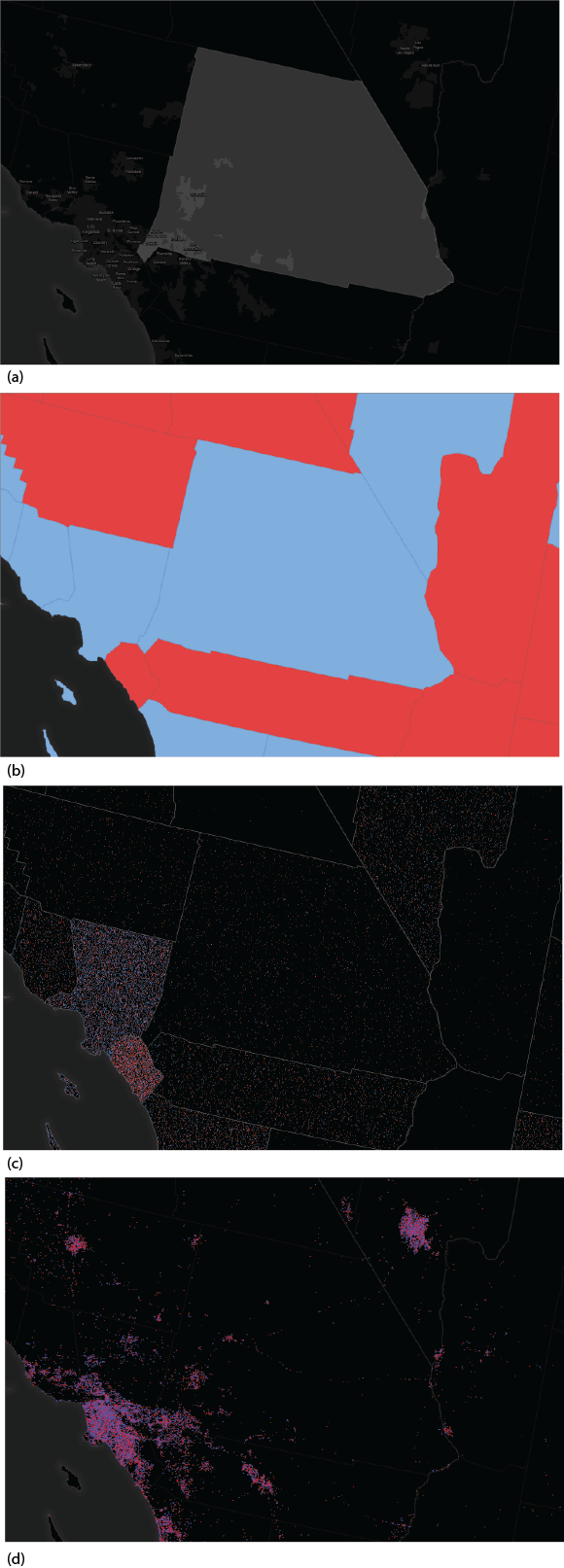
Figure 3. San Bernardino county in Southern California
The entire area would be coloured blue in the traditional red/blue map since the Democrats won the County with 51% of the vote…a narrow margin (Figure 3b). If we used a dot density approach (with 1 dot = 200 votes) then the voting pattern would be distributed throughout the sparsely populated County which contrasts with the adjacent Los Angeles County and Orange County (Figure 3c). However, a dasymetric map reapportions the data into the populated areas. In Figure 3d, the vote count data has been reapportioned into different urban categories to reflect high density, low density and non-urban (inhabited) areas. Certain other land uses such as airports and parks are masked out to avoid areas where we know people do not live and the data rendered as a dot density. This approach has several advantages over the alternatives namely:
- the arbitrary County boundaries no longer give abrupt ‘data cliffs’ between adjacent areas;
- data is no longer distributed randomly and evenly within an area;
- data is now more sensibly distributed according to the object density of the real distribution;
- densities of dots can be compared based on a uniform object density mapping;
- the density of one city can be compared to another more easily;
- the shape of the map becomes more recognisable since we can more easily relate to real places; and
- the map overcomes the problem of false interpretation based on non-normalised data densities.
Figure 4 shows the dasymetric dot density map for the contiguous United States at 1:18million and the web map can be viewed at ArcGIS Online.
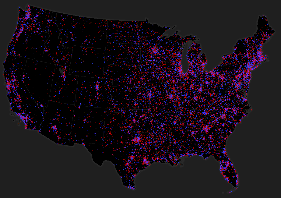
Figure 4. Dasymetric dot density map for the continuous United States at 1:18million
So how did we create a dasymetric dot density map using ArcGIS?
We used a new suite of Area Weighting Models available for download from ArcGIS Online. The tools implement three different methods for moving data between different geographies. In the case we here, we used the mask area weighting tool. Full details of how the tools work are included in the documentation for the tools.
The source zones we used are the US counties feature class with the vote count data held as attributes in two fields (Democrat and Republican). The target zones are polygonal feature classes derived from the USGS 30m raster National Land Cover Dataset. We processed the NLCD to extract the high density urban areas, low and medium density urban areas and nonurban inhabited areas as well as a background mask (all other land cover types plus a mask of known non-populated urban areas such as airports and parks). The raster datasets were converted to polygon feature classes and we ran the mask area weighting tool to transfer our votes to the new features. We then used the Field Calculator to weight the votes in each of the three target zone feature classes so that 60% of votes were allocated to the high density polygons, 30% to the low density polygons and 10% to the non-urban (inhabited) polygons. Using the dot density renderer we then mapped the two fields, symbolising republican votes as red dots and democrat as blue. We removed the outline and fill symbols for the areas to leave just the dots across our custom built dark grey basemap.
The dot density renderer requires you to determine a dot value and a dot size which is a function of the scale of your map and your data. Ideally you should seek a suitable balance between dot size and value to give a good distribution across your map making both the areas with sparse data densities visible as well as not overcrowding those areas with high densities.
The map isn’t finished though…
A single scale dasymetric dot density map will restrict us to a single dot density specification. By using the multiscale web map pattern in ArcGIS Online we can create different versions of the map to suit different scales. We created a multiscale web map from 1:18million through the ten larger scales to 1:36,000. We changed the dot density of 1 dot = 1,000 votes at 1:18 million to 1 dot = 10 votes at 1:36,000 and built map services for each of the scales for the finished map. This provides us with flexibility to be able to show overall patterns at a national and regional scale but which adds detail at each successively larger scale.
We maintained the Albers equal area projection online as described in a previous blog entry using alternative thematic basemaps with the ArcGIS.com map viewer to overcome the limitations of Web Mercator for this data type. The detail of the basemap was also modified for each zoom level to ensure it was appropriate for each scale and supported the thematic detail effectively. We also added a popup at all but the smallest scale to allow users to mine the county data and reveal the vote data itself as well as some topographic detail to orient map users, particularly at larger scales.
Summary
The use of a dasymetric mapping technique supports the redistribution of thematic data from one geographic area to other areas using ancillary data. The resulting map reflects a truer picture of population distribution that accounts for the large swathes of uninhabited land and shows the true distribution of voting patterns in the US. It overcomes the limitations of the choropleth map and the dot density map that use standard geographic areas used for data aggregation. It also provides a more realistic map image rather than having to resort to a cartogram approach to account for differences in the size of areas and the magnitude and distribution of the population within. We do have to be careful to ensure we don’t ascribe too much significance to the precise location of each dot though…they have been redistributed within new boundaries and do not reflect the actual position of a particular group of voters. We could have made a map that shows 1 dot = 1 vote but that would support some gross misinterpretations which are referred to as the ecological fallacy – something we should always try and avoid in mapping statistical data)
References
Axis Maps 2012. Shedding Light on Election Demographics – 2012, http://axismaps.com/election2012/
Nelson, J. 2012 Election 2012, UX Blog http://uxblog.idvsolutions.com/2012/11/election-2012.html
Newman, M. 2012 Maps of the 2012 US presidential election results, http://www-personal.umich.edu/~mejn/election/2012/


Commenting is not enabled for this article.