By Aileen Buckley, Mapping Center Lead
There are a number of design principles that are very useful to map makers. These can help your map readers to recognize the symbols on your map and understand what they mean — the very basis for map use. One of these is called figure-ground organization. Your mind and eye work together to organize what you see into two contrasting perceptual impressions: the figure on which your eye settles, and the amorphous ground below or behind it. This spontaneous separation of a visual array is one of the things you can promote to add visual hierarchy to the various features on your map and elements on your page. In fact, Dent et al. (1999, p. 215) state:
“There is probably no perceptual tendency more important to cartography design than figure and ground organization.”
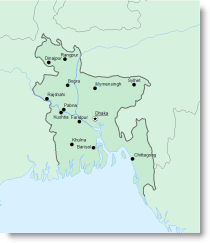
Without figure-ground organization, your map will appear flat and your readers will find it hard to focus on the more important things. In the figure below, can you tell what part of the map is the focus?
There are a number of ways you can promote figure-ground organization. In this blog entry, I illustrate a few of the easiest and perhaps most intuitive methods. In subsequent blog entries, I’ll describe three more advanced techniques using a whitewash, feathering, and a drop shadow. For now, let’s see how you can quickly and easily create this spontaneous visual organization of your map.
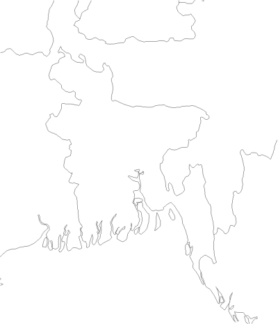
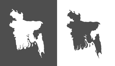
Closed form
If your area of focus is a closed form (a polygon) then one way you can promote figure-ground organization is simply to show only the enclosed area. Using a color for the figure that contrasts well with the ground will force the eye to focus on the closed form. You will often see maps that use this technique (country, state, county, or city maps, for example.)
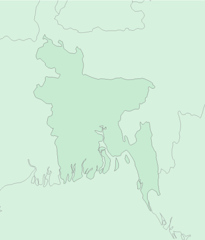
Color Value
If you are mapping an area that is not a closed form or you want to show the geographic context for your area of focus, then you can use a variation in value (lightness-darkness of color) to help promote figure-ground organization. As with the example above, this will work whether you darken the figure or the ground, as long as the difference in color value is easily distinguished.
TIP: You can do this a couple of ways in ArcMap. Either use the Categories renderer with an attribute that will allow you to distinguish what all of the polygons are — assign all polygons the same color except the figure polygon which you can make distinguishably darker or lighter than the others. Or add two copies of the feature class to the Table of Contents and for the layer on top, use a Definitiion Query to draw only the figure — assign this layer a different color from the features in the background.
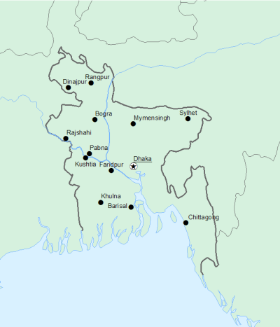
Land-Water Differentiation
If your mapped area includes both land and water areas, then you can use this to help your map readers as well. If color is an option, blue fills are familiar as water symbols on maps. In most cases, the land will be seen as figure and the water will be seen as the ground. Of course, certain maps, such as charts for marine navigation, will promote the water as figure and the land as ground.
TIP: A simple way to do this is to set the background of the data frame to blue so that any area with no land polygon appears blue.
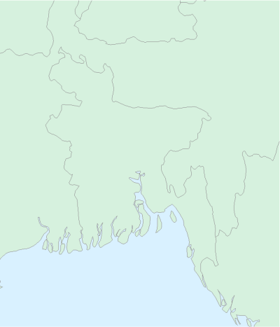
To further aid with this distinction, you can use blue for shorelines and black or gray for boundary lines.
TIP: On the Esri Data and Maps DVD you will often find a companion line feature class for polygonal administrative areas. The type (or similar) attribute for the lines can be used with the Categories renderer to assign different symbols to different types of lines.
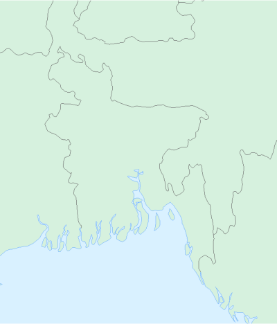
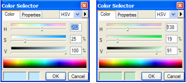
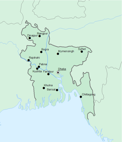
To enhance the visual hierarchy even more, you could make the water either lighter or darker than the land. In this example, they have about the same amount of color saturation (intensity of pigment). You can check this if you click on the color patch and check the color definition using the Hue-Saturation-Value (HSV) color model. Note that the blue and the green have very similar Saturation (S) values and that the Value (V) values are also pretty similar. Setting one or the other color to be more saturated and/or darker helps with the figure-ground issue.
I’ll leave the colors as is for now so that you can see additional technique for enhancing figure-ground relative to the examples shown so far.
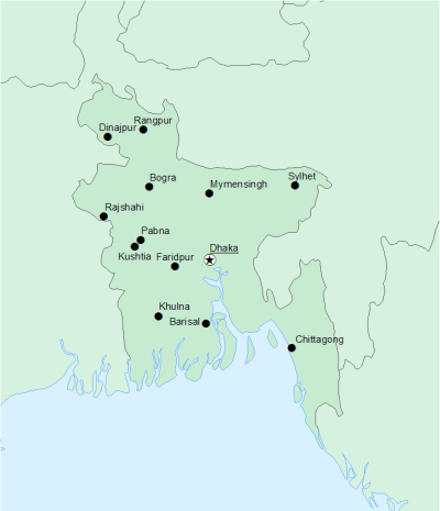
Detail
Another thing you can do to differentiate the figure from the ground is to add detail to the area of focus. In the example below, simply adding the cities and their labels helps to focus the eye on the center of the map. Note that the dark color of the point symbols and text also “darken” the figure, and we already know that color value is one way to promote figure-ground organization.
TIP: to draw only the cities within the figure, use a Definition Query. Since only those features are being drawn, only they will be labeled.
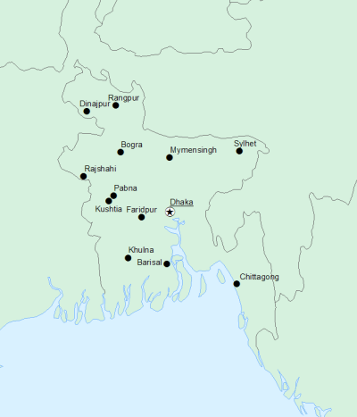
And you can also use many of the techniques together!
A slightly more advanced technique is to vary the line width within or around the figure. You will sometimes see this technique used on maps of urban areas to reduce the amount of space for road symbols within this congested area.
To do this, you need an attribute that distinguishes the lines within or around the figure from the rest of the lines.
TIP: For the river features, use the Identity tool to assign the polygon attributes to the lines., The lines will be split at the polygon boundaries where the attributes change. Then use a Definition Query to draw only the line features the figure. Copy this layer to the Table of Contents and switch the Definition Query to show only those features the figure. Assign this layer different symblogy from the other.
For the boundary features, use the Selection tools to select those lines that make up the boundary of the figure. Add an attribute to note which lines make up the boundary of the figure (e.g., a short integer field in which 0 = “not figure boundary” and 1 = “figure boundary”). Then use a Definition Query to draw only the line boundaries the figure. Copy this layer to the Table of Contents and switch the Definition Query to show only those features the figure. Assign this layer different symblogy from the other.
In the example below, the figure is darker than the background, blue is used for the water fill and the shorelines, the cities are shown and labeled, the lines symbol for rivers is wider within the figure, and the line symbol for boundaries is wider around it.
You may already have used one or more of these techniques on your maps. Now that you understand the graphic design principles behind them, other ways to promote figure-ground may also come to mind!
Watch for a future blog entry on the whitewash effect to learn more about adding visual hierarchy to your map!
Further reading
Dent, Borden D., Jeffrey S. Torguson, and Thomas H. Hodler, 1999. Cartography: Thematic Map Design, Sixth Edition. New York, NY: McGraw-Hill, 336 pp.
Thanks to David Barnes for his help with this blog entry!


Article Discussion: