By Aileen Buckley, Mapping Center Lead
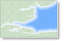
From time to time we are challenged by our users to try and re-create a cartographic effect that is seen on a map that you saw somewhere. In a recent Ask a Cartographer question we were asked how you could recreate the effect shown below in the excerpt from a historical map. In this blog entry, we describe how you can do that and we also recap some of the other methods we have used for symbolizing shorelines. We review methods that use both raster and vector data.
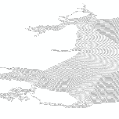
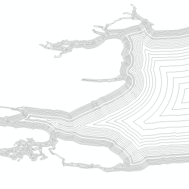
The rasters and vectors can be symbolized with graded colors as shown in the example at the left below. The vectors can also be symbolized with dashed line fill patterns and dotted lines – these yield a look that you will sometimes see on historical maps. Let’s start with the raster method as shown in the examples in the middle and at the right below.
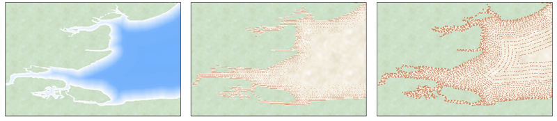
Let’s start with the raster method…
Raster Method
Create the raster: This approach involves the use of a Euclidean Distance raster – note that you have to have Spatial Analyst to use this method. Create this raster using the Euclidean Distance tool in ArcToolbox (Spatial Analyst Tools – > Distance ToolSet – > Euclidean Distance.) The input is the polygon feature class that represents your shoreline. (If you don’t use a polygon, then the Euclidean distance will be computed on both sides of the shoreline. Simply cover your land area with some other layer, such as a hillshade.)
Symbolize the raster: Symbolize the Euclidean distance raster with a white to blue color ramp with the white near the shoreline so it looks like waves lapping the beach areas. Offshore, the darker the blue, the deeper the water. You can modify the histogram to specify the amount of white along the shore:
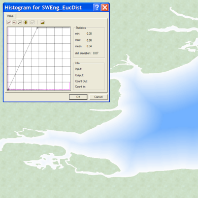
This is the Histogram with no edits made – note the straight line on the histogram.
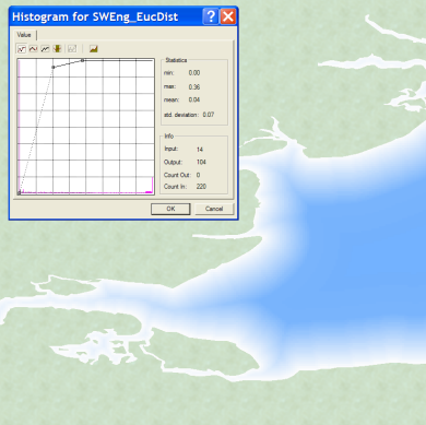
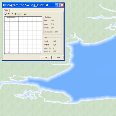
These are examples of the results after editing the histogram. Note that the closer you move the added vertex to the upper left corner, the less white is shown.
Vector Method
Create the buffers: This approach involves the use of buffers. The buffers can either be uniform with or variable width. The advantage of uniform width buffers is that they are easier to create (use the Buffer Wizard), while the advantage of variable width buffers is that you can make the buffers nearer shore closer together and those farther from shore wider apart. To make variable width buffers, use the Multiple Ring Buffer script in ArcToolbox (Analysis Tools -> Proximity Toolset -> Multiple Ring Buffer.)
Uniform width buffers are very easy to make when you use the Buffer Wizard; but they do not allow you to vary the width of buffers like the Multiple Ring Buffer tool in ArcToobox does.
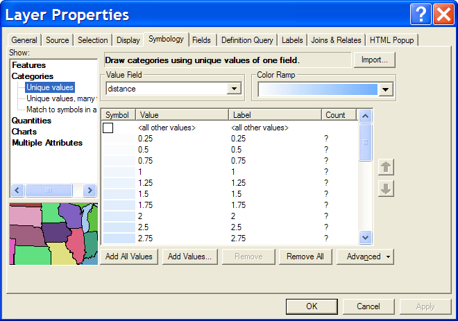
Symbolize the buffers: This is where you get to make the changes to achieve the different looks. You could recreate the raster look above using graded colors. To do this, use a white to blue color ramp with no outline color to symbolize Categories of Unique values based on the “distance” field in the buffer feature class:
To help, you can download this Try it Yourself .zip file which contains the poster (tabloid size) on the various effects (shown below), as well as some test data, an .mxd, and a style that you can use to try out the methods for yourself.
For more information about how these effects can be achieved, take a look at these resources:
- HowTo: Use the ArcMap Buffer Wizard to create cartographic vignettes
- FAQ: What are coastal vignettes and how can I create them?
- Esri White Paper: Vector and Raster Methods for Creating Coastal Vignettes


Article Discussion: