By Aileen Buckley, Mapping Center Lead
There are some general guidelines you can follow regarding the size of text and symbols on a map. The key is legibility – that is, ability to be seen AND recognized. Legibility can be affected by:
- Size of symbols and type
- Contrasting colors and shapes
- Familiarity
- Perfect vision and perfect viewing conditions
In relation to size in particular, the ability of an object to been seen from a distance relates to what is called the visual angle – or “a size that subtends one minute of angle (1/60th of a degree) at the eye”. This is the angle between the light rays from the two ends of the viewed object as they hit the eye, as shown in the figure below. It is usually measured in degrees.
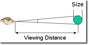
For example, if you look at a one-inch object at a distance of one foot and a two-inch object at a distance of two feet, both have the same visual angle and their images on your retina are the same size. So, when we talk about viewing something from a distance, it makes sense to talk about visual angle instead of the absolute size of an object.
A simple way to test visual angle is to hold one’s index finger at arm’s length. At this distance, the width of your index finger subtends approximately one degree and the width of your thumb subtends about two degrees (O’Shea, 1991).
Because this guideline assumes perfect viewing conditions, cartographers often use a higher threshold. So two minutes is probably more realistic.
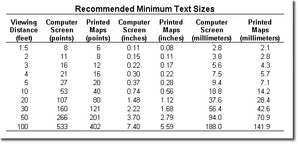
The values in the tables apply the method described above (using 1/30th of a degree) and conservatively round the results (to preserve legibility). The general idea is that the minimum sizes for symbols are about two thirds of the recommended text sizes. The text sizes are tailored to the guidance for minimum sizes given below.
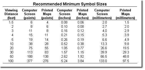
Because letter forms are more complex, a general rule of thumb is that any type on a printed map should not be smaller than 5 pts. You will often want to use size to show differences in attribute values (for example, larger labels to show larger cities). Based on cartographic research, we know that you should try to use one font style (e.g., Ariel) and form (i.e., upper or lowercase) in several size to differentiate a maximum of three categories. For sizes between 5 and 15 points, there should be at least a 2 point difference for the size to be recognizable. For sizes over 15 points, differences should be at least 15%, but 25% is more desirable. Often the default choices in the software reflect these basic graphic guidelines.
If you are making a wall map or a map that will be projected (e.g., a PowerPoint presentation), remember that you have to make the map for viewing at normal viewing distance – the distance between the audience and the screen is not the same as the distance between you and your computer screen. So 8 pt type at normal reading distance is the same as 144 point type at about 10 m. You need to consider whether the person in the back of a 10 meter (33 foot) long room could see your type? A general rule that cartographers use is called the “Rule of 32” – which states that at 32 feet (10 m), type should be at least one inch high to be legible.
For maps on the web, type should be at least 10 pixels high (capital height). Because there is a difference between Macs and PC, these are the minimum type sizes to use:
Windows minimum type size = 7 pt.
Macintosh minimum type size = 9 pt.
Check out these resources if you’d like more details about design for the web and visual angle:
Patrick J. Lynch and Sarah Horton. Web Style Guide: Basic Design Principles for Creating Web Sites. http://info.med.yale.edu/caim/manual/contents.html.
Web Cartography. 2001. Edited by Menno-Jan Kraak and Allan Brown. London: Taylor & Francis. http://kartoweb.itc.nl/webcartography/webbook/.
O’Shea, R. P. (1991). Thumb’s rule tested: visual angle of thumb’s width is about 2 deg. Perception, 20, 415 – 418.

Article Discussion: