Using GIS to Identify Gaps in Care, Increase Food Security, Combat Big Tobacco, and Much More
Complex health data is no longer restricted to static forms and tables. Today’s health and human services professionals interpret facts and figures in a geographic context. Interactive maps and spatial analysis help them prioritize spending, site service locations, identify vulnerable populations, and tell their stories.
The following five story maps illustrate some of the ways GIS is modernizing and transforming health throughout the world.
Mapping the Story of Health Disparities
Everyone deserves to be healthy. Unfortunately, factors such as race/ethnicity, gender, socioeconomic status, and geographic location can prevent people from getting the care and resources they need. Unequal differences in health status and gaps in care, known as health disparities, put vulnerable populations at a higher risk for preventable diseases and health conditions.
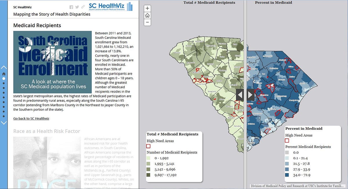
This map highlights the geographic disparities in health status among South Carolina Medicaid enrollees. It shows the spatial association between unequal access to life-enhancing resources and poor health outcomes among state Medicaid participants.
A Day in the Life: Snapshots from 24 Hours in the Life of Community Health Workers
In dozens of countries, tens of thousands of individuals rise each morning; travel miles over rough terrain; and provide primary health care in some of the world’s most remote, vulnerable, and hard-to-reach places. At any given moment, these real-life heroes, known as Community Health Workers (CHWs), are monitoring Ebola virus contacts, counseling an HIV-positive person, surveying basic health needs, or helping a newborn at risk for pneumonia.

“A Day in the Life: Snapshots from 24 Hours in the Life of Community Health Workers” is the latest story map in the One Million Community Health Workerscampaign. This map provides a guided, 24-hour tour of 29 CHWs in action across 13 countries in sub-Saharan Africa. Navigate this story map to discover the significance of CHWs’ missions and the lives they improve.
The Key to Saving Energy and Food Security
Earth’s growing population means more mouths to feed and greater demands on the planet’s limited resources. But by going back to basics, farmers can produce traditional foods with less energy use–and boost global food security at the same time.

“Traditional Food Can Save Energy, Boost Food Security” is an interactive story map from National Geographicthat takes you on a world tour of the origins of traditional foods. From corn to coffee, learn about the history of today’s dietary staples and how they can be produced more efficiently, enhancing food security for all populations.
Preventing Tobacco Use in Montana
Big tobacco can’t advertise on TV. Or billboards. Or newspapers. Or magazines. Instead, tobacco companies spend $7.8 billion in the retail environment. The Tobacco Use and Prevention Program of the Montana Department of Public Health and Human Services developed the Montana Tobacco Retail Mapper story map to show what’s in store for the state’s youth.

This interactive map explores retail point-of-sale issues relating to youth, demonstrates the relationship between tobacco retailers and K–12 schools, and exposes the density of tobacco sales in political jurisdictions.
From Measles to Mumps — Where Does Our Nation Stand?
The recent outbreak of measles in California sparked a national debate, prompting lawmakers to reexamine bills on immunization and the purported reasons to claim exemption to immunization.

The State of Vaccinations story map reviews details about each state’s vaccination rate, potential changes to legislation, and more.
Tell Your Story
Do you have a story to tell about the health in your community? Learn how you can harness the power of maps to tell yours.