Our friends at GISi recently published a great post about how one of their non-GIS people created a story map. One of our writers had just created a Halloween-themed story map and we thought it would be interesting to learn more about his experience.
Guest Post by Robby Deming
As a writer, I never thought I would create a story map. I have some technical knowledge, but the artistry and rich functionality behind some of our story maps just seemed way out of my reach. After creating The Geography of Horror story map, I’m now proud to say that I couldn’t have been more wrong. Not only is it easy to create a story map, but it’s also relatively easy to put your own unique touch on one.

Getting Started
My initial goal was to create a fun map related to Halloween that we could share on social media. After going through a few different ideas, I finally settled on a map showing where some of the most well-known horror films took place. I found a great list on IMDB and I decided to use the Storytelling Shortlist Template since there was going to be a lot of information to show on this map.
Following the steps outlined in Bernie’s walk-through for the Shortlist, I set up several different CSV files (one for each tab in my map) and began digging through IMDB and Wikipedia to collect data and images. With some help from my colleagues (thanks Araceli, Stacey, Amanda, and Cassidy!), and a lot of perseverance, we eventually catalogued some 249 films spanning nearly 100 years.
Building the Map and App
I now turned to ArcGIS Online to start building my map. After logging in and looking at the default basemaps, I realized that none of them really fit the Halloween theme of the map. I started searching through ArcGIS Online for different ideas and I eventually found this elegant, yet spooky, dark gray basemap. I simply saved a copy of the map (rather than trying to recreate it myself) and added in each of my CSV files as a Layer from File. The result was a simple web map with seven different layers and a great basemap. With a web map in place, I could move on to the app itself.

One of the best things about the story map templates is just how easy it is to convert a relatively plain web map into a polished mapping application. Once I downloaded and installed the template to my inetpub\wwroot folder (again, following the instructions from Bernie’s walkthrough), I navigated to the index.html file for the template and opened it with a text editor (I highly recommend Notepad++). From there, I found the config section of the file and replaced the default WEBMAP_ID with the ID from my map above, and saved. Voila, a perfectly functional story map.
Customizing the App
I received positive feedback on the concept when I showed it around, but people wanted to know if we could tweak the map in subtle ways to really bring out the Halloween theme. Could we change some of the colors? Was there a way to make the images show up larger in the pop-ups? What about a custom banner?
I wanted to say yes, but I really didn’t know how or even if some of those things were possible. After some encouragement from the story maps team and our designers, I created a backup of the app and started to dig in to the application files.
This next part gets a little technical. Proceed, if you dare. *cue evil Halloween laughter*
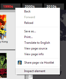
Since the app works great out-of-the-box, most of my “customization” ended up being cosmetic changes to existing values in either the CSS file (located in the template folder under css/style) or the index.html file noted earlier. Both of those files can be daunting, but utilities like Chrome’s built-in “Inspect Element” tool can help you understand the link between different lines of code and the components of your story map. In many cases, when I decided I wanted to change something, I would right-click that area of the app and inspect it. Once I figured out how the app referenced that component (for example, the tabs with the years are simply referenced as “tab”), I found them in the CSS or the HTML file and began changing values to see how the app would respond.
Adding a Custom Banner
Our designers had created an awesome zombie image that I wanted to incorporate in the upper part of the app. Using the Inspect Element tool in Chrome, I determined that I had to edit the header property in the CSS to add the image as a banner. By editing one line of code and adding another (see below), I was able to easily include a custom banner in the app. This same approach should work for your apps, too.

While the default grays for the tabs are nice, I wanted to emphasize the horror factor of the map by incorporating red throughout the app in specific places. I also needed to adjust the default tab size anyway, so I decided to make changes there. Using the Inspect Element tool again, I was directed to the tab portion of the CSS file. And just like the header, changing two lines of code resulted in a big difference. For the tab size, it was a matter of trial-and-error to see what would best fit the tab names. For the colors, a simple web search for “hex colors” returned a variety of sites dedicated to HTML colors.

After hours of data collection, I was disappointed that the images I had found weren’t showing up larger in the popups. Inspect Element again led me back to the CSS file, though there were actually two different elements that related to the image in the pop-ups. The pop-up is referenced as “details” and the elements that related to the size of the image are “details .pictureFrame” and “details img.” Like the tab sizes, it was a matter of trial and error to see what would best fit the images, but I eventually settled on this:

insider