Most Recent in ArcGIS Blog
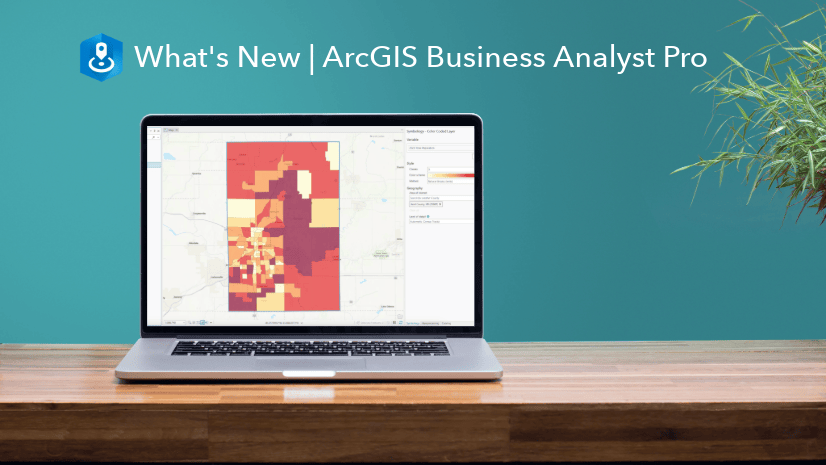
What’s new in ArcGIS Business Analyst Pro | May 2024
Read a summary of the newest features, enhancements, and improvements in the ArcGIS Business Analyst Pro May Release.
Identify the best location for an urgent care center
Multiple Authors | Analytics | April 2, 2024
Use suitability analysis in ArcGIS Business Analyst Web App to locate a site for a new urgent care center in Maverick County, Texas.
Most Recent in ArcGIS Blog
Lauryn Carey | ArcGIS Business Analyst | May 08, 2024
Read a summary of the newest features, enhancements, and improvements in the ArcGIS Business Analyst Pro May Release.

Mark Barker | ArcGIS Drone2Map | May 8, 2024
Learn how inspection workflows are used in ArcGIS Drone2Map to monitor assets and assist in decision making.
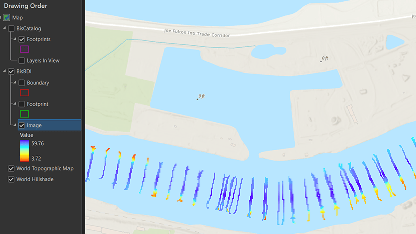
Krista Carlson | ArcGIS Pro | May 7, 2024
ArcGIS Bathymetry introduces three new tools and enhances Compose Surface capabilities in ArcGIS Pro 3.3

Multiple Authors | ArcGIS Utility Network | May 7, 2024
Learn about the new capability of the utility network to use the digitized direction to perform analysis of stormwater and wastewater networks!
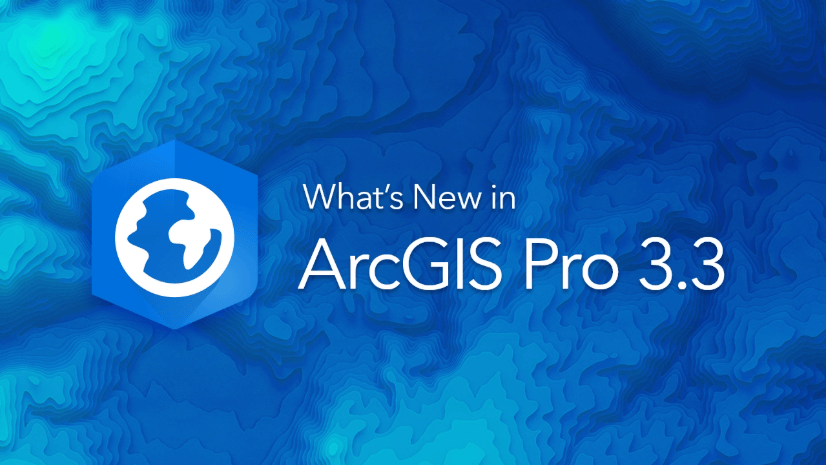
Multiple Authors | ArcGIS Pro | May 7, 2024
Model realistic water flow, share your GIS story, add hyperlinks to your text elements, and so much more with the ArcGIS Pro 3.3 release.

Multiple Authors | ArcGIS Hub | May 7, 2024
Laura Sharp, PhD, shares how to capture residents’ perspectives and unique needs into the City of Tucson's decision-making processes.

William Hackney | ArcGIS StoryMaps | May 7, 2024
Learn about the options available for configuring your web maps and scenes in ArcGIS StoryMaps to make them effective and impactful.

Dejan Parac | ArcGIS IPS | May 7, 2024
Learn what's new in the ArcGIS IPS May 2024 release, explore native GIS support, IPS aware maps and ArcGIS IPS Setup app enhancements.
Multiple Authors | ArcGIS Hub | May 7, 2024
Building local resilience against community challenges means collaborating with your community early.
Multiple Authors | ArcGIS Utility Network | May 6, 2024
2024 Network management release plan for Utilities and Telecom industries

Thomas Coughlin | ArcGIS Experience Builder | May 6, 2024
Group filters are new with the February 2024 update. Available now.

Jon DeRose | ArcGIS Utility Network | May 6, 2024
Learn more about exciting new functionality and improvements made with the recent Network Management Release of the ArcGIS Utility Network

Multiple Authors | ArcGIS Enterprise | May 6, 2024
Discussion with Xander Bakker, Esri Colombia, on his unconventional path to GIS and how he truly loves his work.

Robert Krisher | ArcGIS Utility Network | May 5, 2024
Learn how to model flow and perform analysis with wastewater networks using the ArcGIS Utility Network

Caitlyn North | ArcGIS QuickCapture | May 3, 2024
The answers to questions from the March 2024 ArcGIS QuickCapture Introduction and What's New Webinar.

Multiple Authors | ArcGIS Video Server | May 2, 2024
The 11.3 release of ArcGIS Video Server has various improvements that expand how customers can interact with video in ArcGIS.

Sophia Giebeler | ArcGIS Pro | May 1, 2024
The release of ArcGIS Pro 3.3 for ArcGIS Aviation Airports and ArcGIS Aviation Charting includes new and enhanced tools.
William Hackney | ArcGIS StoryMaps | April 30, 2024
Learn about USDOT's transportation equity initiatives through an interview with Geospatial Information Officer Amy Nelson.

Multiple Authors | ArcGIS Community Analyst | April 30, 2024
ArcGIS Community Analyst is being deprecated entirely, with its final release schedule for October 2024. Read the blog for more information!
Multiple Authors | ArcGIS Hub | April 30, 2024
Sustained collaboration between government and community groups makes big goals attainable.

Stephanie Oliver | ArcGIS Online | April 30, 2024
The Arcade pop-up template is a feature that allows you to customize the content and appearance of pop-up windows in your maps.

Multiple Authors | ArcGIS Solutions | April 30, 2024
Brevard County Fire Rescue improves situation awareness with the Pre-Incident Planning solution.

Kory Kramer | ArcGIS Pro | April 30, 2024
ArcGIS Pro 3.3 requires WebView2 Runtime as an installation prerequisite. Here's how to make sure you have it.
Multiple Authors | ArcGIS Maps SDK for JavaScript | April 29, 2024
Learn how to make your web maps accessible to wider audiences using live regions and descriptions.
Craig McCabe | ArcGIS Living Atlas | April 29, 2024
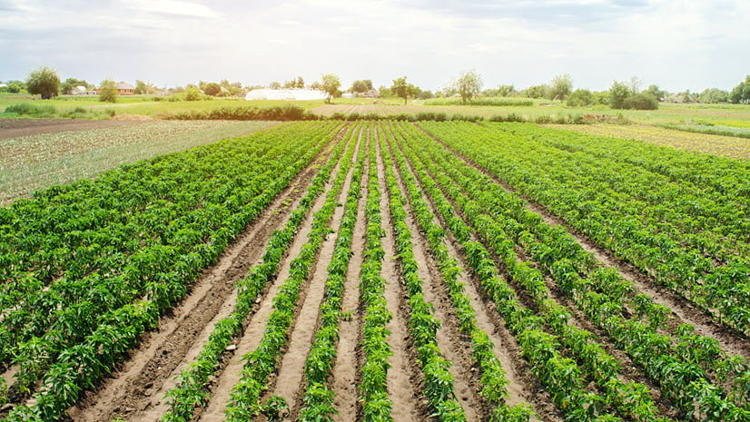
The 2022 release of the USDA's Census of Agriculture is now available in the Living Atlas!

Robert Krisher | ArcGIS Utility Network | April 29, 2024
Learn the key concepts and terminology needed to understand how to manage wastewater data using the ArcGIS Utility Network