
Most Recent in ArcGIS Blog
A Hub for Collaboration and Engagement
Hubs provide a virtual place for collaboration and engagement to happen within communities of all types and sizes.
Identify the best location for an urgent care center
Multiple Authors | Analytics | April 2, 2024
Use suitability analysis in ArcGIS Business Analyst Web App to locate a site for a new urgent care center in Maverick County, Texas.
Most Recent in ArcGIS Blog
Multiple Authors | ArcGIS Hub | Apr 17, 2024
Hubs provide a virtual place for collaboration and engagement to happen within communities of all types and sizes.

Owen Evans | ArcGIS StoryMaps | April 17, 2024
Image gallery has made its way to briefings, and you can highlight a feature in a map by showing its pop-up.
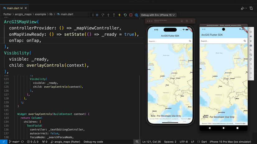
Multiple Authors | Developers | April 17, 2024
We are excited to announce the new ArcGIS Maps SDK for Flutter beta is now available!
Multiple Authors | ArcGIS Indoors | April 17, 2024
Explore questions and answers from our webinar about Indoor GIS: Easy indoor map creation

Jeff Liedtke | ArcGIS Pro | April 16, 2024
Format your metadata for the video multiplexer tool to geoenable video data for the Full Motion Video player.

Multiple Authors | ArcGIS Enterprise | April 15, 2024
From emergency management to utilities, journey with Mark Sanders of Entergy, as he shares his passion for GIS.

Emily Garding | ArcGIS Online | April 12, 2024
Get more precision while editing in ArcGIS Online using interactive tooltips to set your own editing constraints.

John Nelson | ArcGIS Pro | April 12, 2024
How to configure scale-appropriate contour lines and their labels.

Bern Szukalski | ArcGIS Online | April 11, 2024
By default the ArcGIS World Geocoding Service is the locator used across your organization. Here's how to configure and use a locator view.
Multiple Authors | ArcGIS Survey123 | April 11, 2024
Answering regional geographers' favorite question: Where is the Midwest to you?
Rajinder Nagi | ArcGIS Living Atlas | April 11, 2024
In April 2024, elevation layers have been updated with high-res datasets of Wales, New Zealand & German states of Bavaria, Saxony and Brandenburg

Multiple Authors | Developers | April 11, 2024
Version 200.4 of the ArcGIS Maps SDKs for Native Apps includes support for feature forms, snapping, OGC 3D Tiles, and more!

Multiple Authors | ArcGIS Maps SDK for Unreal Engine | April 11, 2024
ArcGIS Maps SDK 1.5 for Unreal Engine adds support for Esri's global OSM 3D Buildings layer, group layers, and more!

Multiple Authors | ArcGIS Maps SDK for Unity | April 11, 2024
ArcGIS Maps SDK 1.5 for Unity adds support for Esri's global OSM 3D Buildings layer, group layers, and more!
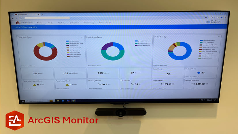
Multiple Authors | ArcGIS Monitor | April 10, 2024
This blog presents six useful indicators that provide insight on Enterprise portal performance metrics.
Multiple Authors | ArcGIS Pro | April 10, 2024
With ArcGIS Pro 3.2 or later, you can export all symbols in your project to a custom style.

Raluca Nicola | ArcGIS Maps SDK for JavaScript | April 10, 2024
A small hack for adding a watercolor basemap to a 3D city visualization

Mindy Longoni | ArcGIS Solutions | April 10, 2024
Maintain a road-closure inventory and share important road information with the public with the Road Closures solution.

Stephanie Umeh | ArcGIS Experience Builder | April 9, 2024
This blog article showcases an inventory of GIS-related web applications and maps built in 2023 using ArcGIS Experience Builder.

Silvia Pichler | ArcGIS IPS | April 9, 2024
Read this customer success story of how ETH Zurich creates a smart campus using indoor GIS on their university premises.
Greg Lehner | ArcGIS Pro | April 8, 2024
In ArcGIS Pro 3.2, you can copy and paste the layer properties of one layer to another layer.
Bern Szukalski | ArcGIS Online | April 8, 2024
Search in maps and apps uses locators configured for your organization, or layers and fields in maps. Here's how to configure them.
Multiple Authors | ArcGIS Business Analyst | April 8, 2024
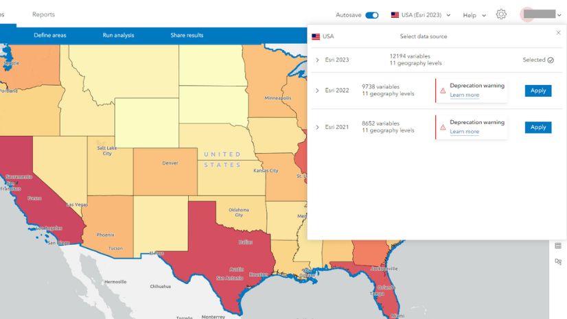
In the June 2024 release, the Esri 2021 and Esri 2022 data sources will be deprecated in ArcGIS Business Analyst Web App.
Multiple Authors | ArcGIS Enterprise | April 8, 2024
Go behind the scenes with one of Esri's most knowledgeable software development engineers and leaders on the Geodata Management Team.
John Nelson | ArcGIS Online | April 5, 2024
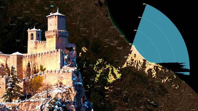
How to make a viewshed and, for bonus points, make it look like it's illuminating the map.
Robert Waterman | ArcGIS Living Atlas | April 4, 2024
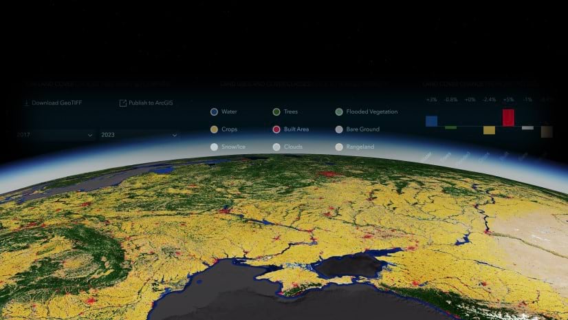
The annual Sentinel-2 land use/land cover time series now includes global coverage from 2017-2023.