Most Recent in ArcGIS Blog
Engaging Volunteers for a Cause
Shawnlei Breeding shares her strategies for engaging volunteers and stakeholders to help protect eagles across The State of Florida.
Identify the best location for an urgent care center
Multiple Authors | Analytics | April 2, 2024
Use suitability analysis in ArcGIS Business Analyst Web App to locate a site for a new urgent care center in Maverick County, Texas.
Most Recent in ArcGIS Blog
Multiple Authors | ArcGIS Hub | Apr 18, 2024
Shawnlei Breeding shares her strategies for engaging volunteers and stakeholders to help protect eagles across The State of Florida.

Shane Matthews | ArcGIS Online | April 18, 2024
Esri's Basemaps continue to improve with over 300 new and updated communities, spanning 4 continents.

Multiple Authors | ArcGIS Hub | April 17, 2024
Hubs provide a virtual place for collaboration and engagement to happen within communities of all types and sizes.

Owen Evans | ArcGIS StoryMaps | April 17, 2024
Image gallery has made its way to briefings, and you can highlight a feature in a map by showing its pop-up.
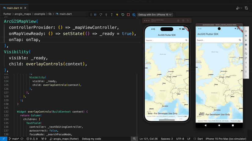
Multiple Authors | Developers | April 17, 2024
We are excited to announce the new ArcGIS Maps SDK for Flutter beta is now available!
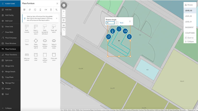
Multiple Authors | ArcGIS Indoors | April 17, 2024
Explore questions and answers from our webinar about Indoor GIS: Easy indoor map creation

Jeff Liedtke | ArcGIS Pro | April 16, 2024
Format your metadata for the video multiplexer tool to geoenable video data for the Full Motion Video player.

Multiple Authors | ArcGIS Enterprise | April 15, 2024
From emergency management to utilities, journey with Mark Sanders of Entergy, as he shares his passion for GIS.

Emily Garding | ArcGIS Online | April 12, 2024
Get more precision while editing in ArcGIS Online using interactive tooltips to set your own editing constraints.

John Nelson | ArcGIS Pro | April 12, 2024
How to configure scale-appropriate contour lines and their labels.

Bern Szukalski | ArcGIS Online | April 11, 2024
By default the ArcGIS World Geocoding Service is the locator used across your organization. Here's how to configure and use a locator view.
Multiple Authors | ArcGIS Survey123 | April 11, 2024
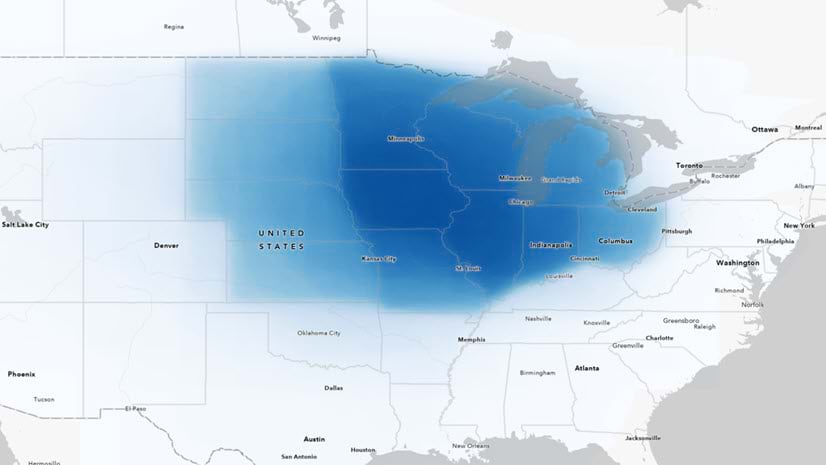
Answering regional geographers' favorite question: Where is the Midwest to you?
Rajinder Nagi | ArcGIS Living Atlas | April 11, 2024
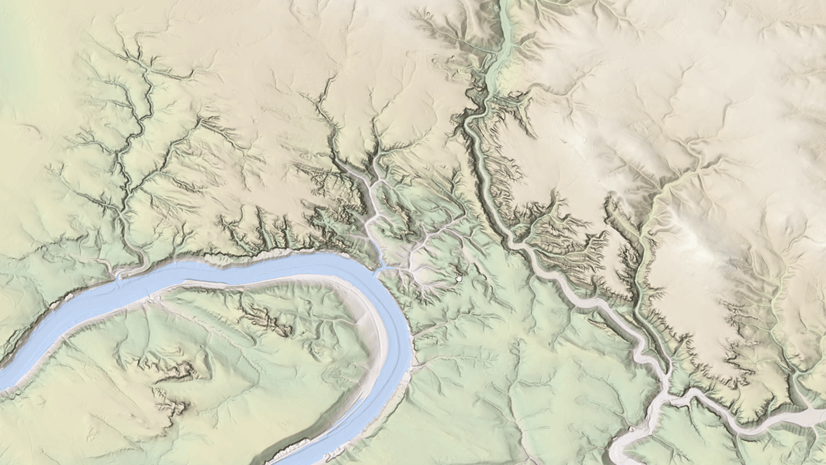
In April 2024, elevation layers have been updated with high-res datasets of Wales, New Zealand & German states of Bavaria, Saxony and Brandenburg

Multiple Authors | Developers | April 11, 2024
Version 200.4 of the ArcGIS Maps SDKs for Native Apps includes support for feature forms, snapping, OGC 3D Tiles, and more!

Multiple Authors | ArcGIS Maps SDK for Unreal Engine | April 11, 2024
ArcGIS Maps SDK 1.5 for Unreal Engine adds support for Esri's global OSM 3D Buildings layer, group layers, and more!

Multiple Authors | ArcGIS Maps SDK for Unity | April 11, 2024
ArcGIS Maps SDK 1.5 for Unity adds support for Esri's global OSM 3D Buildings layer, group layers, and more!
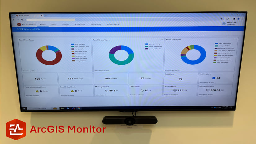
Multiple Authors | ArcGIS Monitor | April 10, 2024
This blog presents six useful indicators that provide insight on Enterprise portal performance metrics.
Multiple Authors | ArcGIS Pro | April 10, 2024
With ArcGIS Pro 3.2 or later, you can export all symbols in your project to a custom style.

Raluca Nicola | ArcGIS Maps SDK for JavaScript | April 10, 2024
A small hack for adding a watercolor basemap to a 3D city visualization

Mindy Longoni | ArcGIS Solutions | April 10, 2024
Maintain a road-closure inventory and share important road information with the public with the Road Closures solution.

Stephanie Umeh | ArcGIS Experience Builder | April 9, 2024
This blog article showcases an inventory of GIS-related web applications and maps built in 2023 using ArcGIS Experience Builder.

Silvia Pichler | ArcGIS IPS | April 9, 2024
Read this customer success story of how ETH Zurich creates a smart campus using indoor GIS on their university premises.
Greg Lehner | ArcGIS Pro | April 8, 2024
In ArcGIS Pro 3.2, you can copy and paste the layer properties of one layer to another layer.
Bern Szukalski | ArcGIS Online | April 8, 2024
Search in maps and apps uses locators configured for your organization, or layers and fields in maps. Here's how to configure them.
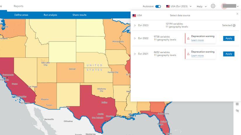
Multiple Authors | ArcGIS Business Analyst | April 8, 2024
In the June 2024 release, the Esri 2021 and Esri 2022 data sources will be deprecated in ArcGIS Business Analyst Web App.
Multiple Authors | ArcGIS Enterprise | April 8, 2024
Go behind the scenes with one of Esri's most knowledgeable software development engineers and leaders on the Geodata Management Team.