displaying
Use # to search tags and @ for authors

By Multiple Authors | ArcGIS Configurable Apps |
This article discusses the upcoming ArcGIS Configurable Apps retirement and provides migration resources for users.
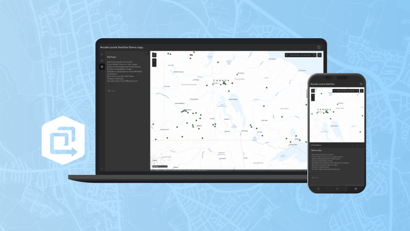
By Multiple Authors | ArcGIS Instant Apps |
This article walks through Arcade scripts that allow users to translate map pop-up content within Map Viewer for use in the ArcGIS Instant Apps.
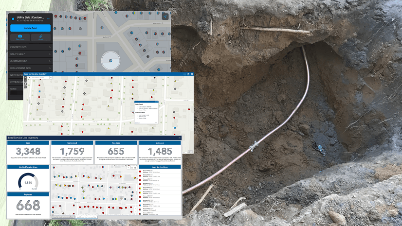
By Christa Campbell | ArcGIS Field Maps |
Water utilities with authoritative data, analytics, and technology solutions are going to successfully navigate improvements to the LCRR.

By Multiple Authors | ArcGIS CityEngine |
Introducing ArcGIS CityEngine Project Collaboration for designing urban Masterplans, coding procedural buildings, and digital production.

By Multiple Authors | ArcGIS StoryMaps |
Share your briefing slides with an interactive image gallery and more with the latest update to the ArcGIS StoryMaps Briefings app.

By Multiple Authors | Developers |
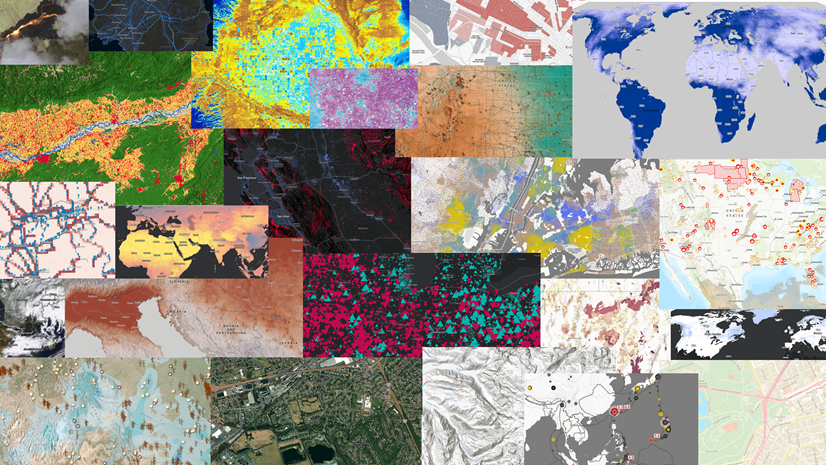
A Developer approach to imagery.
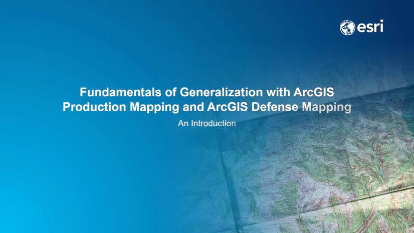
By Shree Rajagopalan | ArcGIS Pro |
Learn how to dynamically produce output data and information products at any scale from a single best-scale data source.

By Field Notes Podcast |
Learn how Napa County's pest management program protects agriculture and contributes to food security throughout the country.
By Lisa Berry | ArcGIS Living Atlas |
Do you have questions about how to access, use, or nominate content within ArcGIS Living Atlas of the World? Check out this blog for answers.

By Multiple Authors | ArcGIS Hub |
Open data provides a foundation for collaboration and community engagement. It helps build trust and focuses discussions on fact.