What time is it? It's map time!
What time is it? It's map time!
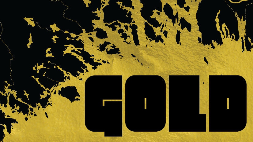
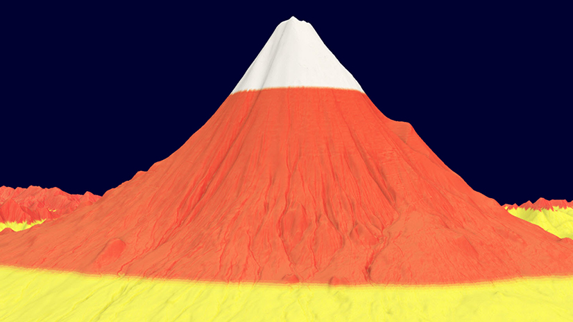
Golden rivers. Golden roads. Turn your map Gold!
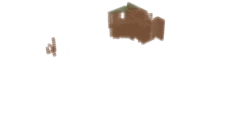
Take any location and make it look like a Minecraft world!
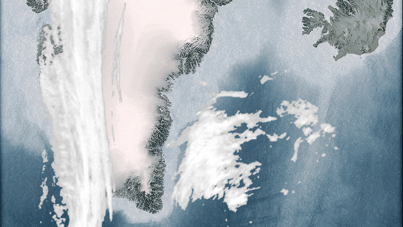
Do you want clouds on your map? Should they be static or animated? Why not try both?
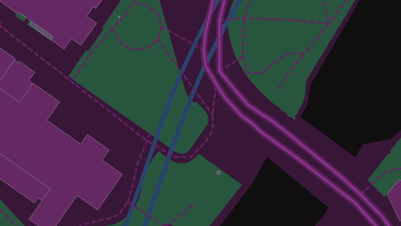
Say you want to add some movement to a map. You want animated traffic. What would you think about when adding that animation? Is simpler, better?
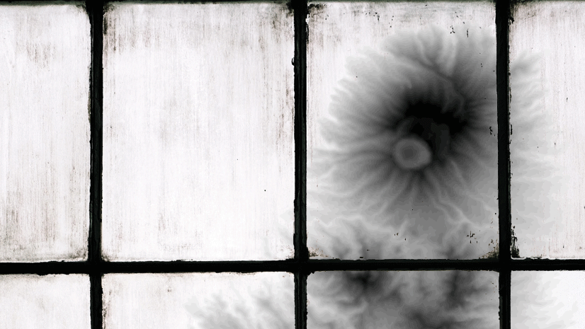
Create your very own DEMentor
This Halloween create some sweet relief!
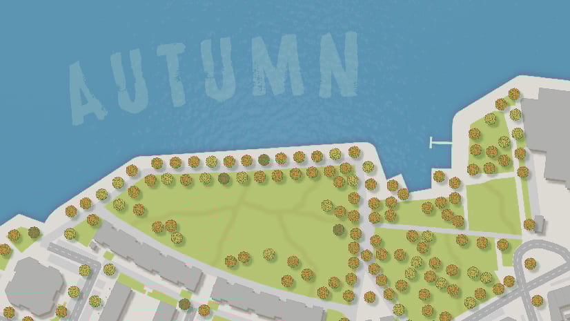
Have you ever considered the season and what your map should look like?
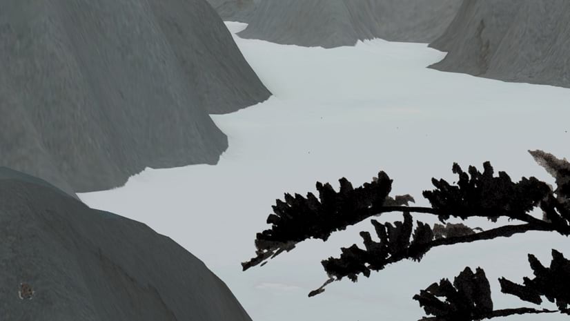
Mimic an ink landscape painting in ArcGIS Pro
Solve spatial problems with the Locator Team as they go on an adventure in South America.