Whenever possible, Smart Mapping aims to offload work from the map author to the machine. The goal is not to take control away from the author, but rather, make informed, intelligent choices and partner with the map author so we can all work faster.
Here are some tips and tricks to get the most out of Smart Mapping.
Tip #1: Decide what range of your data to emphasize
When working with numerical data mapped as Counts and Amounts (Size) or (Color) explore how moving the handles beside the histogram can dramatically change the look of the map. Use this to emphasize certain ranges of the data, or to uncover subtle details.
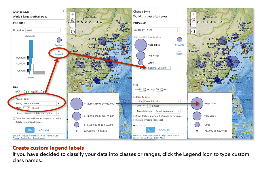
Tip #2: Classifying your data? Create custom class names!
Whenever you deliberately put observations into classes (or bins) the map can be more memorable and meaningful if the classes have names such as “Very High” “High” “Medium”, especially if the raw numeric values might not resonate with the audience. On the other hand, experts may want both names and numbers since they are familiar with the concepts or data, so keep the audience in mind when selecting class labels.
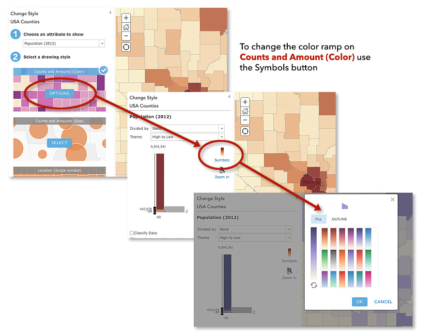
Tip #3: Choose the right color ramp
When mapping numeric data using Counts and Amounts (Color) there are many attractive color schemes (“ramps”) to use under the Symbols button. Don’t forget to also explore the different ways to use color in the Themes pulldown.
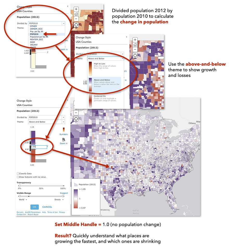
Tip #4: How to map change (over time)
If you have data for multiple time periods you might want to understand how things are changing over time. In the example below, you can see which US counties grew and shrank in population, and which ones are changing the fastest. Rather than make 2 maps, for the 2 time periods, and expect your readers to do the math themselves (an almost impossible task), why not create a ratio of the two years using the “Divided By” pulldown to normalize the data.
In this case, Population 2012 was divided by Population 2010. A value of 1.0 means there was no change, numbers bigger than 1 mean growth, and less than 1.0 means population loss. This approach works for any numerical data from two time periods, not just population data. The ratio approach also work to compare two variables from the same time period, such as number of males to females, or one political party versus another.
Hint: These kinds of change maps are perfect for the Above-and-Below theme.
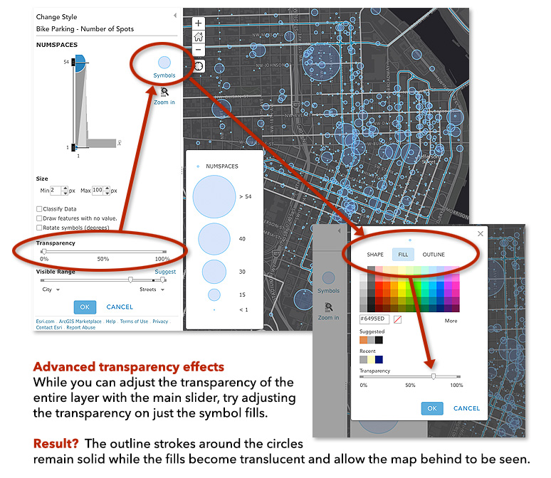
Tip #5: Explore advanced transparency effects
Sometimes you might want finer control over the transparency of your map symbols, more than can be achieved with just the layer transparency, since it applies to everything in the layer. A favorite technique of cartographers is to apply semi-transparent fills and solid strokes to Counts and Amounts (Size) maps.
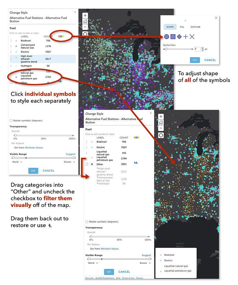
Tip #6: Change All Symbols versus Change One Symbol
Categorical data is best mapped as Unique Value maps. Categorical data includes things like tree species, fuel types, and political parties: they’re different categories of things. To change the look of a single category/symbol (e.g., change the shape, color, size) click the symbol right beside the class name. To change the look of all symbols (e.g., change all classes from circles to squares) click the Symbols button (the three color boxes).
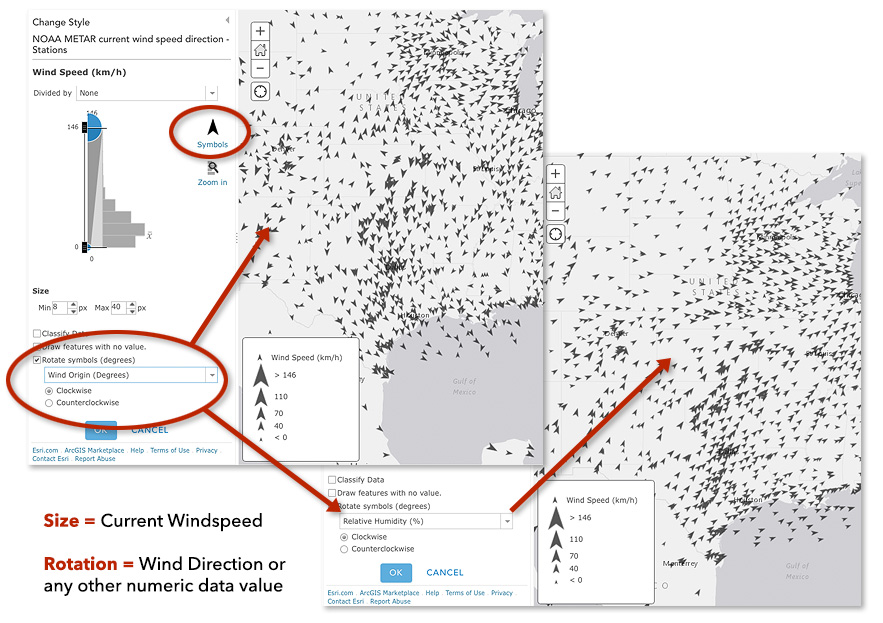
Tip #7: Advanced Feature – Rotating Point Symbols
When working with point features that have numeric information, it is quite easy to map the size of the symbol using one attribute (say, wind speed) and then rotate those symbols proportional to some other attribute (say, wind direction). When combined with the position of the symbol, each point of the map communicates three pieces of information.
Hint: Make sure to use point symbols that look different when rotated, like arrows!


Commenting is not enabled for this article.