The first post in this series explained why it’s not typically a great idea to try to plot huge amounts of data on a map. When a map layer contains a very large number of point features (10,000+), displaying each point makes the map almost illegible—symbols on the map overlap each other and get bunched up, making it nearly impossible to identify patterns or extract useful information from the map.
In this post, we’ll explore how to cluster point data to create a map that’s easier to understand at a glance and provides deeper meaning as users zoom in. It’s important to remember that clustering will not solve performance problems caused by plotting too many points on your map, but it does provide a more meaningful map by displaying points in more discernable patterns.
When you apply clustering, the Esri Maps application groups points within a specified distance of one another on the map into a single symbol. This allows you to quickly visualize a greater number of points at a high level and get a better overall picture of how your point features are dispersed.
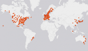
The first image below shows data on the map displayed as individual points; in the second image, points are clustered. The number in the center of the cluster represents the number of point features included in that cluster.
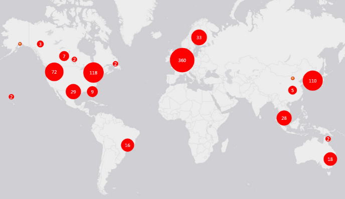
The cluster radius is defined in pixels; points within the specified distance are grouped into a single symbol that represents the number of points in that area. The cluster size is dependent on the map scale—as you zoom out on the map, more points are combined into fewer groups, creating larger clusters. As you zoom in, clusters are divided into a greater number of smaller groups, until the zoom level is close enough to display individual points.
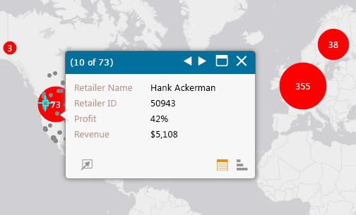 Clusters are interactive: when you click on a cluster, each individual point included in that group appears on the map. If pop-ups are configured, the pop-up displayed contains a separate window for each point feature contained within the selected cluster; use the forward and back arrows in the pop-up’s title bar to scroll through information for each point’s pop-up.
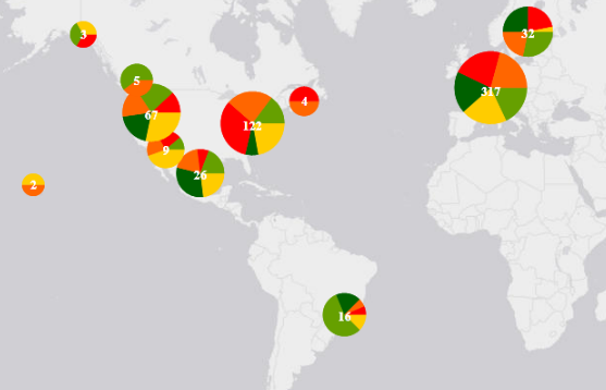
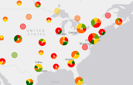
To make your data even more readable, try styling point features using shapes and group them by category, such as revenue, then apply clustering to the layer. The clusters display as pie charts, showing the ratio of different categories within the cluster. As you zoom in, the cluster is divided into smaller groups and the pie chart changes to reflect the information in the new cluster.
 Again, remember that clustering definitely won’t solve performance issues caused by rendering too much data—you still have to actually add all those points to your map before you apply clustering. But you can greatly improve your end users’ experience by enabling clustering on your map before you publish the dashboard or report; the points are already rendered and clustered when users open the report, so there’s no lag time waiting for individual points to be drawn.
In general, you should always enable clustering on layers that contain more than a few hundred points; this way, you generate a better overall picture of the data, and let users decide whether they want to zoom in to see a more detailed view. Layers that contain more than 10,000 points will definitely impact performance, so you might want to try a different approach, such as filtering or aggregating your data. We’ll discuss these options in upcoming posts in this series.

Article Discussion: