It’s easy to get bogged down in details when you have tons of data that you’re trying to display on a map. Plotting too many features on a map can lead to frustration and doesn’t provide valuable insight. This series of posts will help you learn techniques for streamlining your maps to achieve better performance and provide a clear picture of your business data.
Here’s a scenario that occurs all too often in business organizations that understand data systems, but are new to GIS and mapping.
Let’s say you’re the manager of a busy department. You’ve just seen a demo of mapping capabilities that opens up a whole new world of possibilities in your business intelligence (BI) system. Using Esri Maps and the underlying ArcGIS platform, you’ll be able to see what matters to you on a map, in the context of the business applications you already have in place. You’ll be able to analyze your sales results and marketing spending visually—on a map—at any level. You’ll be able to see and analyze performance metrics for all your branches, manufacturing facilities, sales reps, customers, and even physical assets like cell towers. And you’ll be able to do all this in the context of valuable regional data, like demographics and spending potentials.
So great! You install and configure the Esri Maps plug-in for your BI system, and your BI group starts building your first map-enabled report.
Too much data makes it hard to see patterns
Soon, you hit what you see as a major stumbling block. Someone on the project has mandated that the application must plot tens of thousands—or even hundreds of thousands—of individual features on a map. These features might represent cell towers, sales outlets, customers, Twitter feeds—any entity that you want to analyze in the context of location.
Now, visualizing data on a map is different from viewing it in charts and lists typically used in BI applications. Those unfamiliar with GIS often feel that a map should be able to display any number of features, with no limitations. But look at it this way: the data used to plot 100,000 features on a map comes from a table that contains 100,000 records. If you were to display all those features in a chart on your dashboard, how would you use that data? How would you derive any useful meaning from it? The sheer volume of information displayed would make it impossible to discern patterns or trends without some type of filter to narrow your search.
The same concept applies to a map. The map below, created using ArcMap, shows approximately 100,000 points across the United States, representing customer purchases styled according to sales revenue.
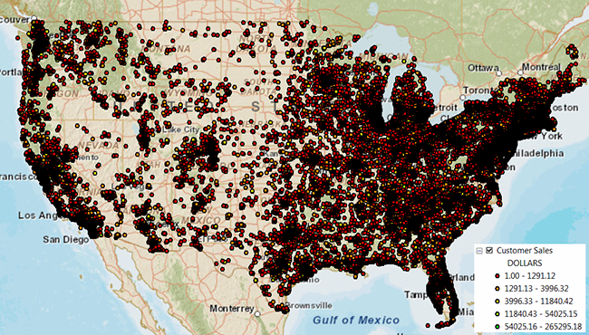
Looking at this map, it’s really difficult to identify any relevant patterns. Although there seems to be a strong concentration of points in the North-East, the points appear so bunched up that you can’t quickly locate the most loyal customers or those who made the most purchases. You can’t even differentiate between the different colors listed in the legend. The map doesn’t impart any useful information.
Just because you may technically be able to show hundreds of thousands of points on a map doesn’t mean that you should.
Too much overhead causes the map to render too slowly
In addition to creating a virtually illegible map, plotting large numbers of points on a map exacts a huge toll on performance. The Esri Maps plug-in is a browser-based application. In a web browser, data for each point on the map must be converted to a format supported by the map; this includes column values for each row, for each record.
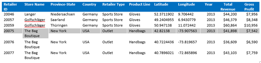
For example, a single retailer record might include information about the retailer, such as the store ID, the store name, location information (latitude and longitude coordinates, province or state, and country), sales information such as the total revenue and gross profit for a specific year, and other information about the products.
When you add this data to your map, the information is transformed into a format that the map can read before it can render the points, and each record requires several bytes of memory. The converted data for the single record shown above represents approximately 200 characters, which translates to about 800 bytes. If you multiply that by 100,000 records, you end up with roughly 80 MB of data to render in memory. That’s a lot of data for a browser to display, which means users with standard laptops and memory capacity will spend a lot of time waiting for points to appear on the map. And that doesn’t even cover the amount of memory needed to retrieve map service layers, or memory used by the underlying business application. This all adds up to a whole lot of memory required just to view the map!
Keep in mind that, in addition to the number of points, the number of attributes related to each point also increases the memory requirements. You choose the number of details to include in the pop-ups for feature points by selecting them from the columns in your data. So, even though your data may contain a relatively small number of rows (feature points), if each row contains many columns (attributes) and you include them all when you add your data to the map, performance will be affected.
Right-size your visualization
Thankfully, there are several ways to avoid too-much-data issues, some of which involve very little effort on your part.
In the coming weeks, we’ll explore each of the following approaches in greater detail:
- Cluster points to streamline maps: Clustering represents the simplest and most obvious approach to displaying large numbers of points on a map. When you apply clustering, the Esri Maps application groups features within a specified distance of one another on the map into a single symbol, allowing you to quickly visualize a greater number of points at a high level and get a better overall picture of how your features are dispersed. Keep in mind, however, that you still have to add all those points to your map before you apply the clustering; adding layers containing more than 10,000 points will definitely impact performance.
- Apply filters to limit the amount of data displayed on the map: Every BI system provides ways to filter data that you display in a report or on a dashboard. If you’re working with data that contains tens of thousands of records, use filters to limit the amount of data to a reasonable level that can be easily interpreted. Most business systems have a built-in mechanism to apply prompts and filters when reports are executed.
- Leverage “built-in” aggregation: Instead of trying to view hundreds of thousands of features on a map at once, consider displaying the features in aggregate form at a level that makes sense for your application. For example, if you have 150,000 customers, try aggregating data to analyze sales performance by administrative boundary, such as Zip code, city, or state. When you see an interesting pattern develop, you can easily drill down to view the underlying customer records. Because most business systems already have attributes related to entities such as city or state, this is the most straightforward approach.
- Enhance your solution with ArcGIS tools: If the aggregation levels recommended above are too coarse for your application, consider using ArcGIS tools to do the heavy lifting, then share your map to your organization. You can then add the data to your map through ArcGIS, avoiding lengthy processing times. This won’t work for dynamic data, but can help when you’re trying to display large amounts of information.
Stay tuned for more! Keep checking for additions to this series.

Article Discussion: