Incorporating maps into your BI dashboard can greatly enhance the effectiveness and usability of the dashboard for consumers. But without proper up-front planning, you’re likely to create a map-enabled dashboard that’s confusing, misleading, or difficult for consumers to read and use.
An effective dashboard tells a story, and to do so, your dashboard must have a clear purpose. What message or theme are you trying to convey? What is the target audience? What scope and level of detail are required? What metrics, dashboard components, and interactive functionality will most effectively convey the theme of the dashboard?
Theme and audience
Before you start designing your dashboard, decide on a theme. What are the main questions you want to answer with the dashboard? Think about what your users need to know and what action they would take once they have this information. What do you want them to remember most? Don’t try to answer too many questions—dashboards are meant to answer a few related and focused questions, typically to communicate where some aspect of performance is being met or not met.
The theme of your dashboard should be supported by the map. An example of a theme might be: “Deliver operational awareness for the national sales team, including overall sales revenue, year-over-year change, trends over time, and revenue by product mix.” The map helps the dashboard tell the story, allowing users to ask location-based questions that contribute to their understanding of the theme. Your map should make it easy to spot and understand patterns and clearly associate them with other dashboard components.
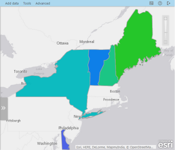
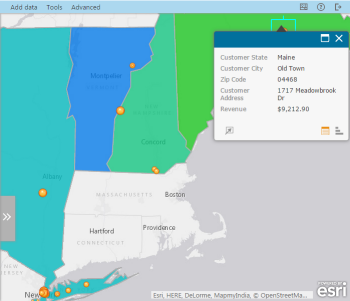
As users explore the map, additional information will emerge. For example, a dashboard showing performance metrics by state in the north-eastern United States might have a map that focuses on the top-performing states in the north-eastern sales region, but that also allows users to explore more details such as customer locations and revenue as they zoom into the map.
To help you choose a theme for your dashboard, identify your target audience. What do consumers need to know? What decisions do they need to make? What questions do they need answered? What do they already know? How much technical knowledge do they have?
For example, your audience might want answers to some of these questions:
- Has revenue been increasing or decreasing over time in specific locations/areas?
- Have sales of different products been concentrated in specific areas?
- Are key performance indicators being met or missed in specific locations/areas?
- Are there any factors that could put your assets at risk (severe weather, road closures, increased competition, and so on)?
By determining who will use the dashboard and what questions it will provide, you ensure that target users get the answers they are seeking. For example, will the dashboard help management make decisions about a direction for the organization? Will it communicate progress or success in a particular area? Will it show trends over time or patterns in the data? Create a dashboard that answers a few specific, focused business questions for your target users.
Scope and level of detail
Another important element to consider is the scope. Do you need to convey specific information (for example, information about a particular product line or sales region) or is a high-level overview covering the entire organization more appropriate? The scope is related to your target audience. If you’re targeting executives, a high-level overview makes the most sense. If your audience is a sales team focused on a particular product or sales region, a more detailed scope is appropriate.
A big part of scope is understanding how much is too much for any given dashboard. Large organizations have large data, and you should strive to make the map as clear as possible by displaying data aggregated at the appropriate level. A map of revenue bubbles for 20,000 distinct sales outlets is likely meaningless and unusable. That same data, with outlet sales aggregated to sales territories, tells a sales director exactly where things are going well versus where they are not.
Choose the right metrics
Once you’ve chosen a theme, identified the target audience, and determined the correct scope and level of detail, choose the key metrics that you want to display. Does your audience need a map that shows where the organization’s physical assets are located? Are they measured by revenue or profit? Do they track and analyze costs across multiple regions and projects? Does the data for this exist, or will you have to source it from somewhere before you can build the dashboard? Engage with your target audience to identify what key metrics are required, what they mean, and how they’re used. Choosing organizational metrics that convey the theme of the dashboard and help consumers gain the insight needed to take appropriate action is key to delivering value.
Be selective
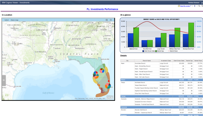
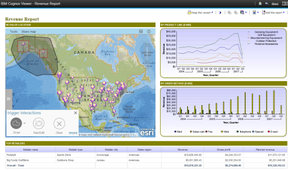
When planning your dashboard, be selective about the dashboard components that you use to convey your message. Be sure to pair the map with the right charts and tabular displays to reinforce the meaning of the map data.
Make it interactive
When adding interactivity to the dashboard, make sure the interactions support the theme of the dashboard and are clear and useful to the target audience. Set up interactivity between the map and other dashboard components to help the dashboard tell a story. For example, selecting a group of store locations on a map might update a table of store locations to show revenue, profit, and other information about only the selected stores.
Enhance the map with smart filters or prompts from the business system to slice and dice aspects of the data that help answer the main questions. The dashboard should provide an intuitive path that walks users through the story.
Make it attractive
Many people using maps in dashboards for the first time are new to the process of map design and cartography. Create an optimal experience for your users by choosing styling options—for example, color schemes and palettes, symbols, scale-dependent map layers, layer transparency, and so on—that reinforce the map’s patterns and quickly communicate the theme. As you progress, the map will reveal its patterns to you before you deliver it to end users.
Learn more
To learn more about dashboard design, try a book by Stephen Few, such as Information Dashboard Design: Displaying Data for At-a-Glance Monitoring.

Article Discussion: