By Kenneth Field, Senior Cartographic Product Engineer
 The latest release of ArcGIS Online included a major new update that brought 3D scenes to your browser. This extends the capabilities for visualization of ArcGIS Online content by giving you the option of displaying it on a responsive WebGL virtual globe. I’ve been experimenting with different ways of displaying global flight data from openflights.org and this blog describes how I built a 3D version called Airflow Globe.
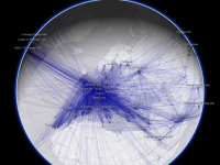
Data from openflights.org includes a global dataset of airports complete with latitude and longitude. It also includes a list of all air traffic routes (between two airports). I’ve used this data in a previous blog post to illustrate how the new transparency tools in ArcGIS Pro can be harnessed to better represent 60,000 overlapping routes. By setting transparency to 98% we get a beautiful illustration of global interconnectivity that reveals the shape of the world’s continents without any other data.
![]()
But what about all those curved lines? Surely airplanes fly in a straight line? If, like me, you often sit on an airplane listening to the conversations around you, you’ll no doubt have heard someone ask the question “why are those lines curved?” when looking at the in-flight map. I’ve had to answer that question on more than one occasion but oddly enough most people aren’t that interested in taking a class on map projections at 36,000 feet. How do you make those apparently curved lines straight? Using a globe does the job and shows those curvy looking lines on a cylindrical projection do turn out as straight lines of constant bearing on a globe. So how is it built?
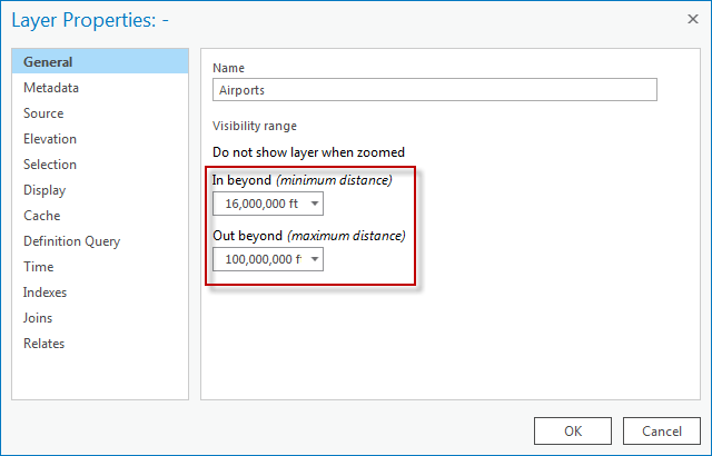
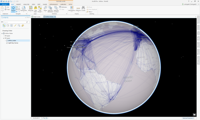
ArcGIS Pro provides capabilities to author maps in either 2D or 3D (or both). I built a 2D version in ArcGIS Pro earlier this year (in ArcGIS Online here). Beginning with my 2D map, I inserted a new 3D scene in my ArcGIS Pro Project and then copied my flight routes data from the 2D map to the 3D scene. It is automatically rendered onto a virtual globe in ArcGIS Pro where I can also specify the basemap (I chose light gray to ensure the routes were legible). The routes were shared to my ArcGIS Online account as a Web Tile Layer meaning they are cached at a range of scales. I then added the airport locations data to the Scene in ArcGIS Pro and set the symbol to a simple pushpin and defined the appearance of the labels. There are over 7,500 airports so I used definition queries coupled with the data on number of active take-offs and landings to create several copies of the airport location data in the scene, each of which showing progressively more airports (based on number of take offs and landings) which I want to set to reveal at different elevations.
In the same way as you’re familiar with setting the visibility range for layers on 2D maps, you can also do the same for layers in 3D scenes, except you use elevation instead of scale as the unit of measurement. I set my airport location layers so that only the world’s busiest airports are displayed at high altitudes (when the view shows the whole globe) and as you zoom in, additional airports are added to the scene.
The position of the labels was set to ‘Top of Point’ which is rendered as a rotating billboard label in a scene in ArcGIS Pro and ArcGIS Online.
The end result is a scaleable virtual globe where content is revealed as you zoom in. This avoids the clutter you often get by displaying all your data at once at all scales (or elevations) and creates a much better user experience. Progressively revealing detail as you zoom in also invites the user of your map to explore.
I also configured my popups for the airports in ArcGIS Pro so they delivered the salient information about each airport.
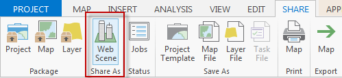
The final step is sharing this scene to my ArcGIS Online account which is as simple as using the Share As Web Scene button on the Share tab. ArcGIS Pro packages up your scene and publishes it to ArcGIS Online as a 3D web scene.
All that remains is for you to log in to your ArcGIS Online account and do some simple configuration to get the web scene ready for use.
As the author and owner of the web scene you get access to the tools to modify the scene via a pane on the left of the window. The web scene itself is visible to the right, showing the additional tools available to the user.
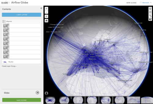
You can add other layers (from your content or from other ArcGIS Online content). You can also create a Layer Group which I did to group my different airport location layers into a single layer (Airports) to simplify the appearance for the map user. Finally, I created some Slides in the same pane which appear as thumbnails across the bottom of the scene. These are effectively bookmarks to allow your map user to navigate to a preset position, perhaps a key location or a place that is important in your data. Once you’ve done some basic configuration, just share your web scene so it becomes visible on the web.
Users of your web scene can load it directly into their WebGL compliant browser. They can zoom, pan and rotate the globe and see your data brought to life across it. They can switch layers on or off, change the basemap if they wish (though the flight routes data in my example is specifically designed for the light gray basemap so won’t look as good across, say, imagery), and modify the environment settings to change lighting and shadows. Popups work like any other web map so clicking on the airports reveal the information I configured earlier in ArcGIS Pro.
3D web scenes are a great way to show your data in a different way. This example shows how you can make sense of flight route data in a different way when you view it on a globe, rather than a 2D map. Of course, not every dataset is going to work in a cognitive sense in 3D but web scenes open the door for further expermintation with visualization.
What’s next? 3D web scenes will develop further with new releases of ArcGIS Online to improve performance and support different needs. Currently, 60,000+ routes is too much for the browser to handle as features but it would be nice to have the flight paths arc above the surface at their actual flight elevation. Airports could also be positioned at their true elevation. All this is actually currently supported in a web scene but building a map to function is as important as just using all the technology available.
You can view the Airflow Globe web scene here.

Article Discussion: