 Some maps require a ton of research. Some maps require a lifetime of study. Some maps require a boatload of data. Some maps tell a story. Some maps tell an even better story. And some maps are about zombies.
This blog happens to be about a couple of maps that are about zombies – or a potential zombie apocalypse, to be precise.
The maps try to identify regions most at risk for a zombie awakening. It is a well-known fact that zombies suffer from some sort of infliction of the mind. It is also well documented that zombies are incredibly unlawful. This research uses the bulletproof reasoning that migraine headaches can, and should be, correlated with crime to predict areas with the highest potential for a zombie outbreak. In the maps, the areas that are the darkest red are the spots with the highest crime rate index and highest migraine prescription drug use index; thus showing places that are most at risk.
Maybe the nation’s only hope lies in the bowels of research lab facilities like the Centers for Disease Control and Prevention (CDC). These facilities have the best chance of finding a cure before the outbreak becomes a pandemic. It is important that these centers be located in the likely zombie hotspots.
These maps show the current location of eleven such centers in the contiguous US. As you will see, there are a few gaping holes in the existing network. Zombie awareness is very important, so perhaps it is time we increase our disease control and prevention funding in order to avert disaster.
The maps are pretty simple. They average the crime index and market potential data for migraine prescription drugs index to calculate a Potential Zombie Outbreak Index. The maps make the absurd conclusion that crime and migraines should be correlated, and that by finding areas of high crime and migraine prescription drug usage, one can ascertain areas where a zombie apocalypse could happen. This could be way too simple a conclusion. Maybe narcolepsy should be factored in too…
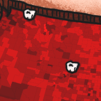 The static map was built in ArcMap using the above mentioned derived Potential Zombie Outbreak Index. This index was broken down into five categories and then symbolized. The map was then exported into a drawing package and the surrounds were refined there.
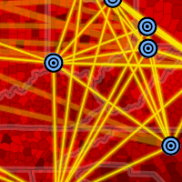 The webmap was again built in ArcMap, but taken in a different direction with ArcGIS Online to focus more on the CDC “safe zone network”. It also uses a spider diagram tool to create a connection from every point, to every point.
The crime data came from AGS, and the migraine data came from GfK MRI. The CDC locations were ascertained from Wikipedia.
The map is meant to be taken as serious as the threat itself. So enjoy.


Commenting is not enabled for this article.