
Most Recent in ArcGIS Blog
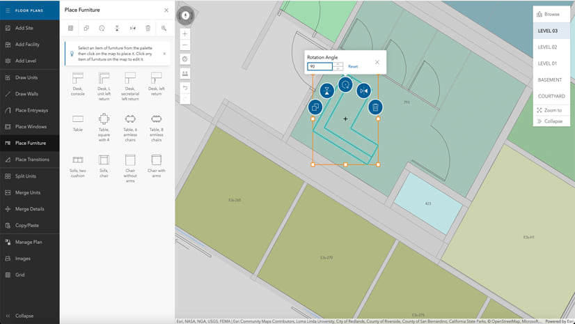
What’s New in the ArcGIS StoryMaps Briefings App (April 2024)
Share your briefing slides with an interactive image gallery and more with the latest update to the ArcGIS StoryMaps Briefings app.
Identify the best location for an urgent care center
Multiple Authors | Analytics | April 2, 2024
Use suitability analysis in ArcGIS Business Analyst Web App to locate a site for a new urgent care center in Maverick County, Texas.
Most Recent in ArcGIS Blog
Multiple Authors | ArcGIS StoryMaps | Apr 25, 2024
Share your briefing slides with an interactive image gallery and more with the latest update to the ArcGIS StoryMaps Briefings app.

Multiple Authors | Developers | April 24, 2024
A Developer approach to imagery.

Shree Rajagopalan | ArcGIS Pro | April 24, 2024
Learn how to dynamically produce output data and information products at any scale from a single best-scale data source.
Lisa Berry | ArcGIS Living Atlas | April 23, 2024
Do you have questions about how to access, use, or nominate content within ArcGIS Living Atlas of the World? Check out this blog for answers.

Multiple Authors | ArcGIS Hub | April 23, 2024
Open data provides a foundation for collaboration and community engagement. It helps build trust and focuses discussions on fact.

Katie Thompson | ArcGIS Urban | April 23, 2024
ArcGIS Urban will soon be available with ArcGIS Enterprise, providing planners with a new way to leverage their city's GIS data for planning.

Multiple Authors | ArcGIS Mission | April 22, 2024
ArcGIS Mission 11.3 is coming soon. New features and enhancements bring analyst notes, new admin and user settings, and more!

Multiple Authors | ArcGIS StoryMaps | April 22, 2024
Get storytelling advice and conservation inspiration from the winners of the 2023 ArcGIS StoryMaps Competition.
Greg Lehner | ArcGIS Pro | April 22, 2024
If you receive a notification saying there's a drawing alert: don't panic! Let's solve it together.

Kerri Rasmussen | ArcGIS Field Maps | April 22, 2024
Start using Arcade in the Field Maps Designer.

Multiple Authors | ArcGIS Enterprise | April 22, 2024
Representing the user experience during Utility Network design, Mohan Punnam details the importance of keeping users at the forefront.
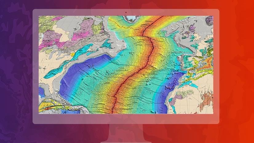
Multiple Authors | ArcGIS Living Atlas | April 19, 2024
Esri joins Overture Maps Foundation, supporting its mission to create reliable, easy-to-use, and interoperable map data for the globe.
Multiple Authors | ArcGIS Hub | April 18, 2024
Shawnlei Breeding shares her strategies for engaging volunteers and stakeholders to help protect eagles across The State of Florida.

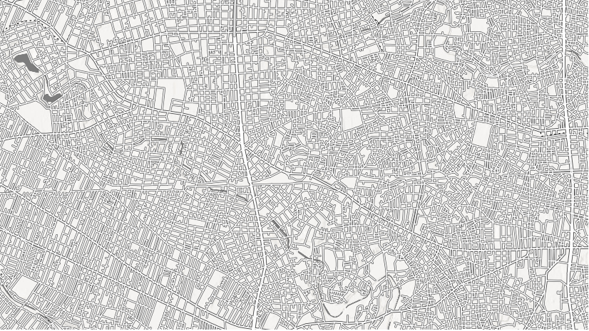
Shane Matthews | ArcGIS Online | April 18, 2024
Esri's Basemaps continue to improve with over 300 new and updated communities, spanning 4 continents.
Multiple Authors | ArcGIS Hub | April 17, 2024
Hubs provide a virtual place for collaboration and engagement to happen within communities of all types and sizes.

Owen Evans | ArcGIS StoryMaps | April 17, 2024
Image gallery has made its way to briefings, and you can highlight a feature in a map by showing its pop-up.
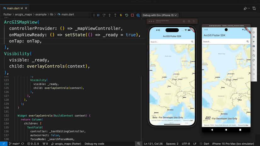
Multiple Authors | Developers | April 17, 2024
We are excited to announce the new ArcGIS Maps SDK for Flutter beta is now available!
Multiple Authors | ArcGIS Indoors | April 17, 2024
Explore questions and answers from our webinar about Indoor GIS: Easy indoor map creation

Jeff Liedtke | ArcGIS Pro | April 16, 2024
Format your metadata for the video multiplexer tool to geoenable video data for the Full Motion Video player.
Multiple Authors | ArcGIS Enterprise | April 15, 2024
From emergency management to utilities, journey with Mark Sanders of Entergy, as he shares his passion for GIS.

Emily Garding | ArcGIS Online | April 12, 2024
Get more precision while editing in ArcGIS Online using interactive tooltips to set your own editing constraints.

John Nelson | ArcGIS Pro | April 12, 2024
How to configure scale-appropriate contour lines and their labels.

Bern Szukalski | ArcGIS Online | April 11, 2024
By default the ArcGIS World Geocoding Service is the locator used across your organization. Here's how to configure and use a locator view.
Multiple Authors | ArcGIS Survey123 | April 11, 2024
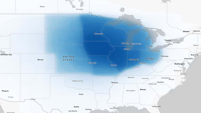
Answering regional geographers' favorite question: Where is the Midwest to you?
Rajinder Nagi | ArcGIS Living Atlas | April 11, 2024
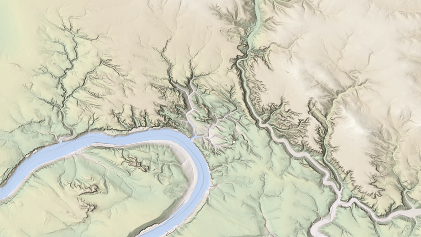
In April 2024, elevation layers have been updated with high-res datasets of Wales, New Zealand & German states of Bavaria, Saxony and Brandenburg

Multiple Authors | Developers | April 11, 2024
Version 200.4 of the ArcGIS Maps SDKs for Native Apps includes support for feature forms, snapping, OGC 3D Tiles, and more!