 Most of us understand the hydrologic cycle in terms of the visible paths that water can take: rainstorms, rivers, waterfalls, swamps, etc. However, an even larger volume of water flows through the air all around us in two invisible paths: evaporation and transpiration. They claim 61% of all terrestrial precipitation, and together are referred to as evapotranpsiration. In order to better understand this important process, Esri’s Mapping Center has produced a web map showing the world’s average annual evapotranspiration.
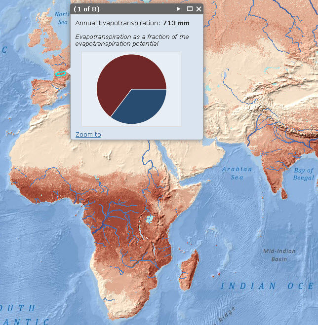
This map was built using the MOD16 Global Evapotranspiration Product, which is derived from satellite imagery by researchers at the University of Montana. The imagery is from the Moderate Resolution Imaging Spectroradiometer (MODIS), an instrument with 1-km resolution carried by two NASA satellites. The MOD16 algorithm derives from raw imagery a number of secondary data products like land surface temperature, leaf area index, and net solar radiation. These intermediate data are used to solve the Penman-Monteith equation for total daily evapotranspiration. MODIS was first launched aboard the Terra satellite in 2000, and the full 11-year evapotranspiration time series is available as 8-day, monthly, and annual averages. A toolbox for downloading monthly MODIS data is available in the ArcGIS Resource Center. We calculated the average annual evapotranspiration for the period of record, which we display along with an elevation hillshadeusing the No Alteration of Grayscale or Intensity (NAGI) method.
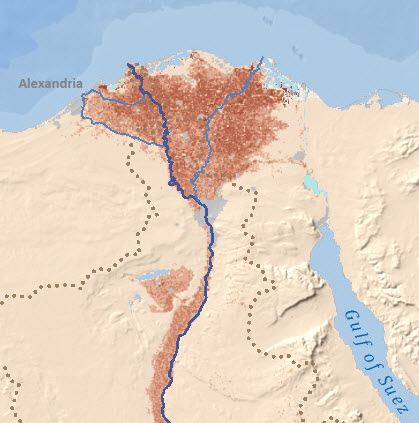
Click anywhere on the map, and a pop-up window shows evapotranspiration as a fraction of the evapotranspiration potential. For example, Scotland and Norway have a lower rate of evapotranspiration than the Congo, despite receiving just as much rain, because potential evapotranspiration is lower, which means that there is not enough solar energy to vaporize all the water. The Sahara Desert has high potential evapotranspiration, but receives little rain, and the unused solar energy heats the sand to over 170 degrees Fahrenheit. In the Congo River Basin, there is high potential evapotranspiration and ample precipitation, so less of the potential goes unused. The result is a much cooler, more humid climate with abundant plant life. Also, look for irrigation projects, which show up as bright red splotches in otherwise barren regions.
If you want to use this map as a canvas for your own observational data, find it here. You can also access any of the individual services that make up the web map:
- Average Annual Evapotranspiration with Hillshade
- Evapotranspiration Pop-up Windows
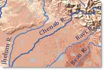
- World Hydro Reference Overlay
- World Terrain Basemap

Commenting is not enabled for this article.