 Presenting point-based data on a web map is challenging because of the problem of overlapping symbology, particularly as you zoom out of the map to view data at smaller scales. So-called push-pin web maps are very easy to make with ArcGIS Online but making the map make visual sense at the smaller scales requires a little more work. In this blog entry we illustrate how data binning can be used to aggregate large point-based datasets into hexagonal polygons to overcome the problem and improve the web map across all scales.
To illustrate the problem (and solution), we’ll make a web map to show how different schools in England are performing through an assessment of the examination results of their pupils. There are 4365 Secondary schools in England that educate pupils age 11-16. The culmination of this compulsory education are General Certificate of Education (GCSE) exams in a wide range of subjects. Minimum standards set by the Government are for pupils to attain 5 GCSEs with a grade A*-E including English and Maths. If a school has less than 35% of its pupils reaching the target it is deemed to be ‘failing’ and targeted for a range of improvement measures. A good map will help identify geographical patterns across the country and is a useful as part of the analysis of school standards more generally. However, mapping attainment levels as individual points will make the map illegible at all but the very largest, street-level, scales. While we want to retain the detail and allow interrogation of individual schools at larger scales, we need to modify the representation of the data in order to explore patterns at a national or regional scale. The objective here is to make a web map that makes sense across a range of scales and to avoid the sort of mashup smashup we would otherwise see (figure 1).
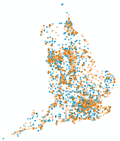
Figure 1: Mapping English Secondary School GCSE attainment levels as points.
The challenge, then, is to modify the way we represent the data at smaller scales. One way of modifying point data is to create an interpolated surface though this calculates predicted data values for areas where points do not exist, converts data to a raster surface and can modify the data to a greater extent than desired. For web mapping we want to maintain our data as features so we can create a pop-up that allows users to interrogate the data further.
Data binning is a great alternative for mapping large point-based data sets which allows us to tell a better story without interpolation. Binning is a way of converting point-based data into a regular grid of polygons so that each polygon represents the aggregation of points that fall within it. It first requires the creation of some form of regular grid as a feature class that you then use as an overlay on your map. This could be any shape that exhausts space. In ArcGIS for Desktop, the Create Fishnet tool allows you to easily create a rectangular grid. While the technique described here works equally well for rectangles, the result would look a little like a raster layer and so we might prefer something more aesthetically pleasing in cartographic terms. Instead we’ll use the Hexagonal Polygon tool to create hexagon shaped data bins. The tool can be downloaded from Arcscripts and creates a hexagonal feature class fishnet based on the extent of an input feature class.
We begin the process in ArcGIS for Desktop by simply mapping the data as points at the minimum scale we’d expect the web map to be viewed at. For England, a scale of 1:4,632,845 will show the country within a standard monitor resolution and we wouldn’t expect the map to need to be viewed at scales smaller than this. We then determine an appropriate size for the hexagonal data bins that in themselves are legible at this scale. Running the Hexagonal Polygon tool using the school point dataset as an input and with a diameter of 40,000m (in map units) creates a new hexagonal polygon feature class that provides a good size at 1:4,632,845 (figure 2).
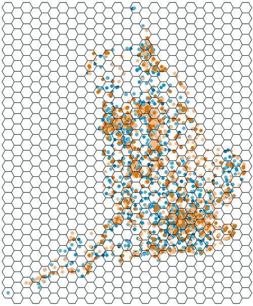
Figure 2: 40km resolution hexagonal polygon feature class at 1:4,632,845.
The next step is to attribute the hexagonal polygon feature class. Performing an Identity overlay analysis between the hexagonal polygon feature class and the schools point feature class adds the hexagon Object ID to the point feature class for each of our input points. Next, use the Summary Statistics tool on the schools point feature class. Specify the schools point feature class as the input table, hexagon Object ID as the case field (used to calculate statistics separately for each unique attribute value) and add each of the schools data attributes to summarize as statistics fields. We can also specify the precise summary to perform for each attribute. For this example, data for GCSE grade attainment levels were added and a Mean summary specified since we want to eventually map the average attainment levels of schools per hexagon. The output geodatabase table includes a single row for each hexagon ID with a summary statistic for each attribute. Finally, we Join the newly created table to the hexagonal polygon feature class using the hexagon ID and the summary statistics can then be mapped using the hexagonal data bins.
We’re not quite finished with data processing just yet. Since our web map will be viewed at multiple scales we need to determine if further data bins are required at larger scales before we can view the schools data as individual points. For this dataset, points become individually discernable at 1:288,895 which means there are three other zoom scales a user will step through from 1:4,632,845 before they see the data mapped as individual points. To deal with these intermediate scales we repeat the process of creating hexagonal polygon feature classes and summarizing statistics a further three times using diameters of 20,000m, 10,000m and 5,000m for the hexagons.
We end up with four separate resolutions of binned data plus our individual point data, each of which will be used to represent the schools attainment data at different scales on the web map. Individually, each scale will make sense and users will step through increasingly detailed representations until they reach 1:288,895 when the individual points are legible.
Before publishing the data as a feature service we set minimum and maximum scales in the Layer Properties (see Displaying layers at certain scales) according to how we want the different layers to match viewing scales in the web map. Each hexagonal polygon feature class is also symbolized with the same classification scheme and colour scheme to show the percentage of pupils who had attained the minimum standard of 5 GCSEs at grade A*-E. Because we want the map to identify failing schools we set the lowest class to be 0-35. We set the next class to 36-58 which represents those schools that are not failing but which fall below the national average for minimun GCSE attainment. The remaining categories classify schools above the national average and a diverging colour scheme was used to visually differentiate schools above (blue) and below (orange) the national average. The individual point data for schools was symbolized using small hexagon marker symbols using the same classification and colour scheme as the hexagonal polygons. The final Map Document contains 4 hexagonal polygon feature classes and a point feature class all classified and symbolised in the same way which were then published to ArcGIS Online.
Publishing a hosted feature service using an ArcMap Document to an ArcGIS Organizational account allows us to rapidly build a web map in ArcGIS Online (see What are ArcGIS Online hosted services? for more details). The Failing schools web map app (figure 3) summarizes the key data for each secondary school, aggregated into hexagonal data bins at smaller scales to provide a broad view of the geographical differences across the country. The Light Grey Canvas basemap is used as a neutral background to promote the thematic data as the most important visual component of the web map and the web map is published using the Storytelling Sidepanel map template to give a cleaner UI experience.
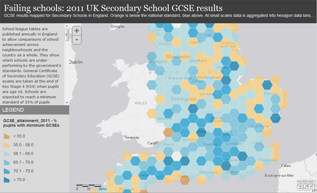
Figure 3. Failing schools web map app
Figure 4a-e illustrates how the different resolutions of hexagonal data bins works across the scales.
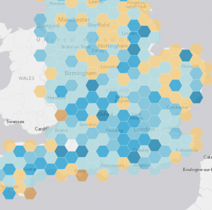
Figure 4a. Hexagonal data bins at 1:4,622,324.
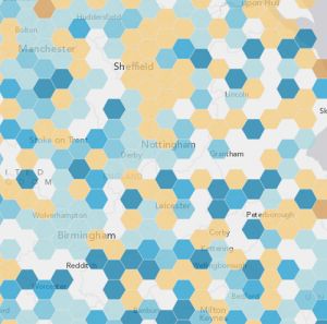
Figure 4b. Hexagonal data bins at 1:2,311,162.
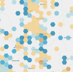
Figure 4c. Hexagonal data bins at 1:1,155,581.
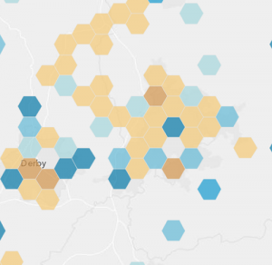
Figure 4d. Hexagonal data bins at 1:577,791.
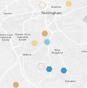
Figure 4e. Individual point markers at 1:288,895.
Pop-ups are also used to allow users to interrogate the data for each hexagonal data bin as well as the individual schools at 1:288,895 (figure 5). By showing contextual information alongside a column graph illustrating average attainment levels for English, Maths and the percentage of pupils achieving the minimum standard of 5 GCSEs, users can begin to explore the detail beyond the map itself.
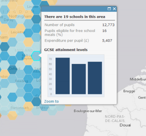
Figure 5. Hexagonal data bins display information for schools through symbolisation and pop-ups.
Web maps provide a great opportunity to visualize data and give users access to rich information at a variety of scales. Making sensible judgments about how you represent your data at different scales will help your web map tell the right story. This might mean you need to do some pre-processing of data, such as the binning process described here, to take advantage of the multiscale web map environment. By taking the time to thinking carefully and plan the way to represent, classify and symbolize your data for each scale you can create a web map that works across all scales.

Commenting is not enabled for this article.