Introduction
One of the most common problems we have when attempting to interpolate data using kriging is the presence of outliers in the data. An outlier is a data value that is either very large or very small compared to the rest of the data. Outliers often result from malfunctions in the monitoring equipment or typos during data entry, such as accidentally removing a decimal. These erroneous data points should be manually corrected or removed before attempting to interpolate. However, not all outliers are the result of machine or human error. Some outliers are valid values, and this blog will demonstrate how to deal with this kind of outlier.
Description of the data
The data used in this blog comes from measurements of heavy metal concentrations of mosses in Austria in 1995. Various heavy metals were measured in milligrams of heavy metal per kilogram of moss, and here we will focus on molybdenum. As the following graphic shows, lower molybdenum concentrations were found in the north and higher concentrations in the south. However, note that two locations had molybdenum concentrations that were much higher than the rest of the data (7.66 and 1.81 mg/kg).

Molybdenum concentrations in Austria, 1995
While the large concentrations appear to be outliers, other heavy metals were also found in high concentrations at these locations, so they are unlikely to be from machine or human error. To create an accurate prediction map for molybdenum concentrations, the measurements at these two locations cannot simply be deleted or ignored.
The problem with outliers
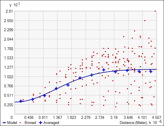
It is very difficult to build a valid kriging model when some values are several times larger than all other values, and this is where many people typically get stuck. They try to find a semivariogram to fit all their data, but the outliers exert so much influence on the estimated semivariogram that no combination of semivariogram parameters seems to fit the data. For example, with this molybdenum data, the Geostatistical Wizard suggests using the semivariogram pictured below. Notice that the semivariogram (dark blue curve) is nearly flat, and the empirical semivariances (blue crosses) go up and down erratically. This indicates that the semivariogram is not acceptable for any serious analysis.

This semivariogram does not fit the data.
A possible solution
While there is no single method that is guaranteed to work, a potential solution is to split the kriging process into two steps. To understand how this works, you need to understand that the kriging process already implicitly has two steps:
- Modeling – Build a semivariogram to model the spatial relationships between points. This step quantifies the correlation between data points based on their distance apart.
- Prediction – Use the semivariogram and a dataset to make predictions at new locations.
Almost always, the same dataset is used for both modeling and prediction, but the trick for dealing with outliers is that they do not have to be the same. When you’re confronted with a dataset that has outliers that you cannot ignore (as with these molybdenum concentrations), a common approach is to explicitly remove the outliers for the modeling, then use the whole dataset (outliers included) in the prediction. This workflow is effective because the modeling is not corrupted by the outliers, but the prediction surface still accounts for the extreme values.
Modeling steps
-
- Select all points in the dataset except the outliers. For this demonstration, I selected all data except the two outliers described above.
- Use the Geostatistical Wizard to build a semivariogram to model the spatial relationships between the non-outliers. I chose the semivariogram pictured below. Compare this semivariogram to the one pictured above. The removal of only two points stabilizes the semivariogram such that it passes through the empirical semivariances almost perfectly.
This semivariogram fits the data very well.
- Click Finish, then click OK on the Method Report window. The geostatistical layer is added to ArcMap’s Table of Contents, and I’ve given it the name “Model Step”. This geostatistical layer can also be persisted to disk with the Save to Layer File geoprocessing tool.
- This completes the workflow for the modeling step.
Prediction steps
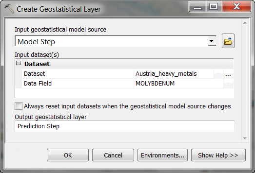
- Use the Create Geostatistical Layer geoprocessing tool to use the model above to make predictions using the entire dataset (outliers included). As shown in the graphic below, use the “Model Step” geostatistical layer as the Input geostatistical model source (if you persisted the geostatistical layer to a layer file, you can also specify this layer file as input). For Input dataset(s), specify the feature class and field of all the molybdenum measurements (outliers included). Give the Output geostatistical layer a name (I’ve named it “Prediction Step”), and press OK to run the tool.
Create Geostatistical Layer geoprocessing tool
- The “Prediction Step” geostatistical layer is added to ArcMap’s Table of Contents. Again, this geostatistical layer can be persisted to disk using the Save to Layer File geoprocessing tool.
- This completes the workflow for creating a prediction surface for molybdenum concentrations in Austrian mosses.
Results
The prediction surface for molybdenum concentrations in Austrian mosses is shown below. As expected, low molybdenum concentrations are predicted in the north and high concentrations in the south. The largest predicted values are in the area around the outliers.
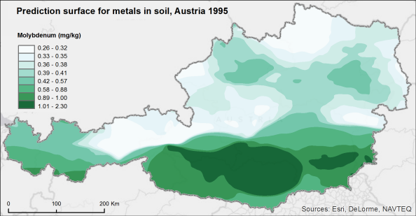
Predicted molybdenum concentrations
Comparison
As a final sanity check, we can compare the predicted molybdenum concentrations that include the outliers (Prediction Step) to the predictions that do not include the outliers (Model Step). Recall that both surfaces were created with the same semivariogram that did not include the outliers.
The graphic below shows the percent difference between these two surfaces. In order to calculate the percent difference, both geostatistical layers must be converted to raster in order to perform the required map algebra. Notice that the predictions are identical in all areas except around the two outliers. This shows that the predictions in areas far from the outliers were not influenced by the extreme values, and it also shows that including the outliers elicits significantly higher predictions near the areas with the large molybdenum concentrations. This is exactly what we were hoping to see, and it provides us with confidence that our predictions accurately represent molybdenum concentrations in Austrian mosses.
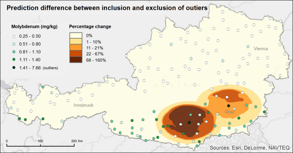
Percent difference in predicted molybdenum concentrations
Data reference
Krivoruchko K. (2011) Spatial Statistical Data Analysis for GIS Users. Esri Press, 928 p.
This post was contributed by Eric Krause, a product engineer on the analysis and geoprocessing team.


Commenting is not enabled for this article.