By Aileen Buckley, Mapping Center Lead
In ArcGIS, symbols are used not only to draw and label geographic features, but also to display various map elements, such as legends, scale bars and north arrows. They are also used to display any graphics you may add to the map, such as bounding boxes, logos, and text.
Because they are used so extensively, you may sometimes want to create your own symbols. Before you do this, it would be helpful to understand the basic building blocks of symbols.
There are three primary building blocks—fonts, colors, and pictures. To help you gain a deeper understanding of these basic building blocks and how they are used in ArcGIS symbols, we have written a series of three blog posts, each of which is dedicated to one of the building blocks.
????Note that we are talking here about 2D symbols—things are a little different for 3D symbols, and cartographic representations treat symbols a little differently as well.
In these blog entries, our goal is to explain how symbols and styles work so that you have greater control over map design and gain more efficiency in map production. We explain how symbols are created and managed in ArcGIS, and we offer tips that can be used to work with symbols more efficiently. The proper management of symbols and styles can help you make what we call “well-behaved maps”.
Here, we’ll share a few basics about the symbols used in mapmaking. Symbols are signs on maps that carry geographical meaning to the map reader. They are assigned to what cartographers call “graphic marks.” A GIS user will think of these as the basic points, lines and polygons on the map to apply symbology to. Text is a symbol on a map as well, and rasters can also be symbolized.
Dr. Cynthia Brewer shares some really nice graphic examples of the visual variables in her book, Designing Better Maps: A Guide for GIS Users (figure 1). She also explains these in detail so I don’t need to address them here.
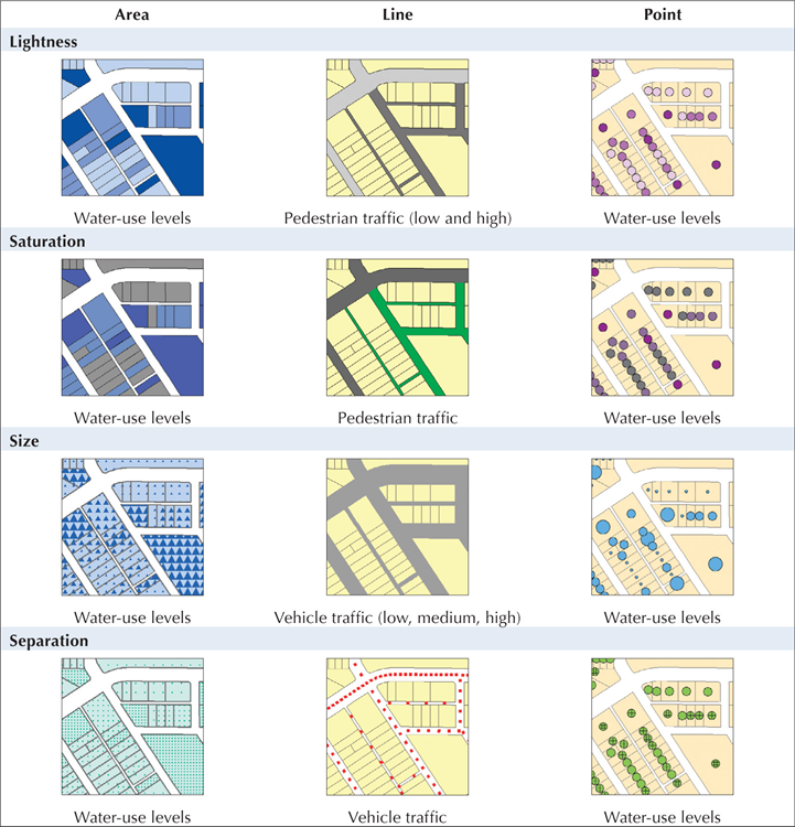
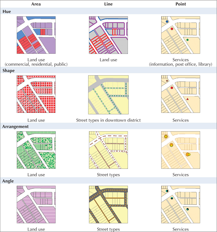
Figure 1. A couple of pages out of Brewer’s Designing Better Maps book
To illustrate how symbols are used on maps, we can look at some examples of how geographic data is symbolized on a map made by David Barnes, Esri Product Engineer (figure 2). This map of the Caribbean Sea was compiled to look like a historical map.
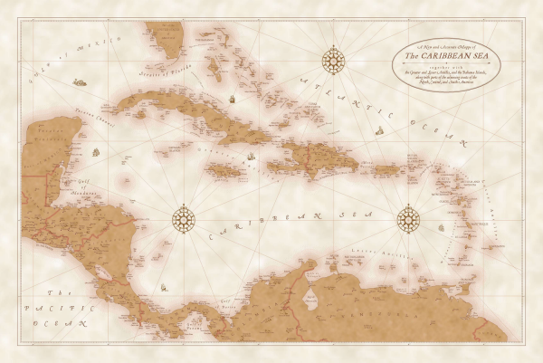
Figure 2. The Caribbean Sea map (Click on the image to see a PDF of the map at full size)
On this map there are some special point, line, and polygon symbols, along with some wonderful text.
Hillsigns: The hills are symbolized using what cartographers call “hillsigns”—pictographic symbols that look a bit like the features they symbolize (figure 3). These are actually marker symbols that have been applied to different classes of physiographic features, such as hills, mountains, and mountain ranges.
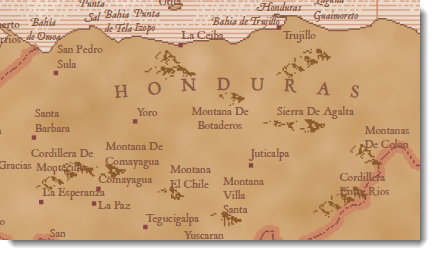
Figure 3. Hillsigns
Rhumb lines: “Rhumb lines”, or lines of constant direction, were digitized using the compass roses to connect lines that have the same bearing (figure 4). The beautiful compass roses were added to the map as north arrow symbols.
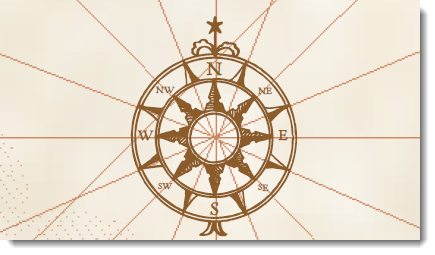
Figure 4. Rhumb lines
Coastal rakes: David used some special line pattern fills to emphasize the land-water interface along the coasts (figure 5). This technique is a variation on the coastal (or shoreline) vignettes that we have blogged about in the past. These coastal rakes were created by assigning the buffers with different line pattern fills.
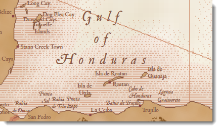
Figure 5. Coastal rakes
Ocean art: David also did some clever things with marker symbols to add ocean art to the map by placing marker symbols illustrating ships and sea serpents in the water areas (figure 6).
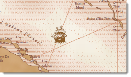
Figure 6. Ocean art
Type: And finally, note some of the wonderful things that he did with type—like labels for the Caribbean Sea and other water bodies (figure 7), as well as the information in the map’s cartouche (see the thumbnail for this blog entry) .
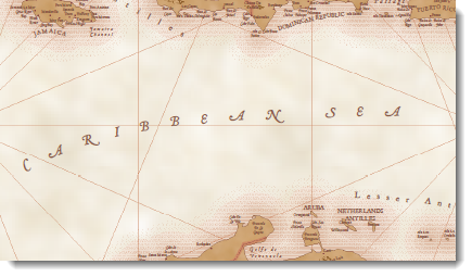
Figure 7. Type
So, you can see that you can achieve some great symbology with ArcGIS. But to really take advantage of the symbol design interface where you can create and modify symbols, it helps to know the fundamentals about symbology in ArcGIS. To learn more, read about the three building blocks of ArcGIS symbols: fonts, colors, and pictures.
To learn more about the Caribbean Sea map and how it was made, download the “Historical Map Effects with ArcGIS” presentation from Mapping Center’s Other Resources > Presentations (2008 and older) page. In the bottom notes for the slides, you will find step-by-step instructions for using ArcGIS to make these and other symbols on the map.
You can also download the Historical style, which contains the symbology for this and other beautiful maps that look historical from Mapping Center’s ArcGIS Resources > Styles page.
Thanks to David Barnes, Esri Product Engineer, for his Caribbean Sea map.

Article Discussion: