Park analysis and design – Measuring access to parks (part 1)
Have you ever wondered how far you are from a park? In this post, I’ll examine the placement of parks in Redlands, California, and determine which areas are best and worst served by a park. In future posts, I’ll discuss siting a new park using binary suitability analysis, web-based tools for evaluating and increasing park access, and the design of a new park using ArcMap and feature template-based editing.
Over the last year, I’ve been attending various urban planning conferences and have discussed with several urban planners the need to design healthier communities, and I have heard this notion echoing throughout the planning community.
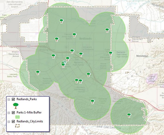
One concern is to figure out how well areas are served by parks. In my analysis, I want to determine which areas are within one mile of a park and visualize the results in a way that is easy to understand. I chose one mile, assuming most people can visualize how long it would take them to walk a mile, but this analysis could certainly be easily altered to measure any distance and present the results in a similar manner.
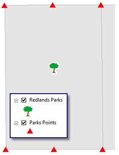
To do this, I could use a simple one-mile buffer around the parks, as the first map shows. However, a map created that way does not consider modes of travel. I want to measure pedestrian access to parks, so the best route is to travel along a road, preferably on the sidewalk.
The more accurate way to measure park access is to determine areas around the parks that fall within a specified distance from the parks along the road network. Using network analysis, we call this a service area analysis, or drive time, but this uses the road network only.
There are tools within the Spatial Analyst toolbox to run a cost-distance analysis: essentially a distance map calculated against a surface describing how difficult it is to travel across a landscape. This gives me the ability to rank our landscape by how easy it is to travel, road or not.
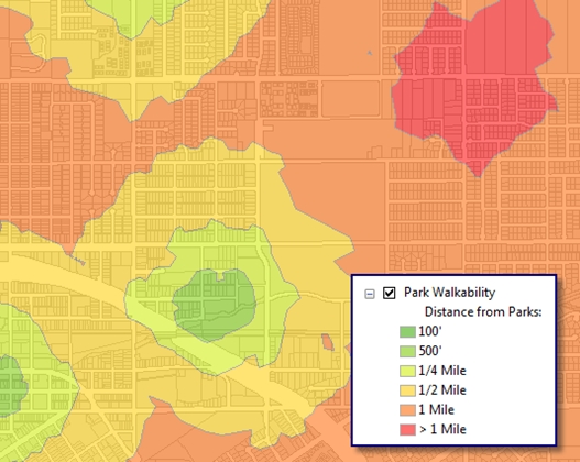
I want to then create a map showing areas that are ¼, ½, 1 mile, and greater than 1 mile from a park along the road network and show the distances on the map as well as on a graph.
Creating a travel cost surface
For my analysis, I am first going to create a cost surface that describes ease of travel through Redlands, with areas along roads being easier (cheaper) to travel through, and areas farther from roads more difficult (expensive) to travel.
To do this, I start by creating a raster surface where every cell has a value for the distance it is from itself to the nearest walkable road segment; that is, I don’t have to drive a car to get to a park and can even get exercise on the way.
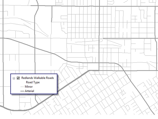
First, I’ll need to map the road network. From the City of Redlands roads dataset, I can simplify all the roads into three main types: minor, major (arterial), and highway.

Since pedestrians cannot safely or legally walk on the highways, I can remove them from the analysis. The first tool in the model will be the Select tool, which allows a set of features to be removed for analysis by an SQL statement. In this case, I’ll use Road Type not equal to Highway to remove the highways from the analysis and create a walkable road dataset.
Of course, this would be a good place for a better road dataset in which each street had an attribute for whether or not it is walkable. I have heard of a few communities and organizations starting to capture this data, and it would be most useful for this application.
Once I have extracted the walkable roads, I’ll run the Euclidean Distance tool to create a surface in which each raster cell holds a value for the distance between itself and the nearest road.
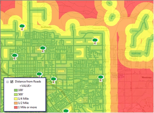
The Euclidean Distance tool creates a surface where every part of the study area is broken down into a square (cell), and every square is assigned the distance to the nearest road segment. I’ve adjusted the symbology to group cells into distance bands.
Creating a cost surface
I’ll now borrow a concept from a weighted overlay (suitability) model and reclassify the road distances onto a scale of 1 to 6, where 1 is the cheapest (easiest to travel), and 6 is the most expensive (difficult to travel).To do this, use the Reclassify tool. It allows me to define the number of classes into which I want to reclassify the data. The Old Values column describes the distances from the Euclidean distance raster. The New Values column is the breakdown of the new values for the ranges of the old distance values.
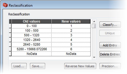
Notice I’m going to reclassify the distances using the same distance bands I used earlier to describe how far each part of town is from the nearest road. Each cell in each distance band then gets a new value describing its cost on a scale of 1 to 6.
Here are the new reclassified distances. Notice the values become more expensive when moving away from the roads.

This now becomes the cost surface that I’ll use to measure park access.
Evaluating park data
Because the park data is stored as centroid points, they may not necessarily reflect the true access points to the parks themselves. By creating points at the corners of the park, I can have a more suitable location from which to measure park access.
Borrowing again from the City of Redlands dataset, I’ll simply select the parcels that intersect the park points and run those intersecting parcels through the Feature Vertices To Point tool in the Data Management toolbox.
Depending on the geometry of some of the parcels, I might end up with a little more than just the corners, but this is a much more accurate representation of how to get into the park than just a point in the middle of the parcel.
Calculating cost distance
Next, I’ll run the new park points against the cost surface using the Cost Distance tool in the Spatial Analyst toolbox. Using this tool, I can create a raster surface where each cell has a distance from itself to the nearest park point along the cheapest path—in this case, the cells that are nearest to the roads as described by our cost surface.
The resultant raster gives a picture of how far each location is in the entire city to the nearest park, which is somewhat hard to visualize. I can then reclassify the distances into simple ¼-, ½-, and 1-mile areas.
Visualizing the results
Taking the walkable road network into consideration certainly does give a much better picture of areas served by parks—and notice the areas that now show up as underserved that the buffer didn’t expose. These areas are over a mile from a park, which meets our criteria of underserved.

In addition to mapping, I can also create a graph that visualizes the percentages of the city that are served by parks by their respective distances.
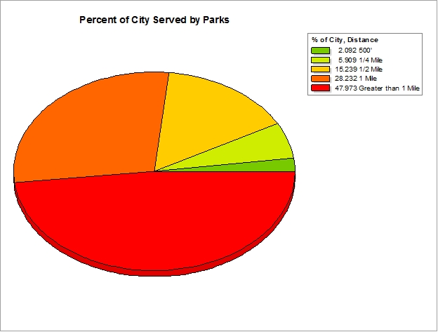
Using the graphing tools in ArcMap, I can create a new field of data to hold the percentage, calculated by using a variable in the model that stored the area of the City, and divide that by the area of each feature in my walkability analysis. I can create a table that stores the values of the output of my reclassification (1,2,3,5,9) and their respective labels (500’, ¼ Mi, ½ Mi, 1 Mi, and More than 1 Mile) and join that table to my walkability output. It’s an extra step, but one that can be repeated if my underlying data changes and I want to run it again.
Now that I have identified that there are areas underserved by parks, the task of my next blog post will be to determine the best location for a new park using a simple binary suitability analysis.
Data credits
Data is provided by the City of Redlands. The data and models for this blog post can be found here
Update
Part 2 – Park analysis and design: Locating a park through suitability analysis
Part 3 – Park analysis and design: Voting on a new park location
Part 4 – Park analysis and design: Sketching the design of a new park
Content for the post from Matthew Baker

Commenting is not enabled for this article.