By Aileen Buckley, Mapping Center Lead
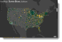
You may have seen the recently released FanMap: SuperBowl Edition.
This Web map is unique in a number of ways, one of which is that it uses as a projection that differs from the vast majority of maps you see online.
Most maps you see on ArcGIS Online, Bing, and Google use the Web Mercator map projection (figure 1).
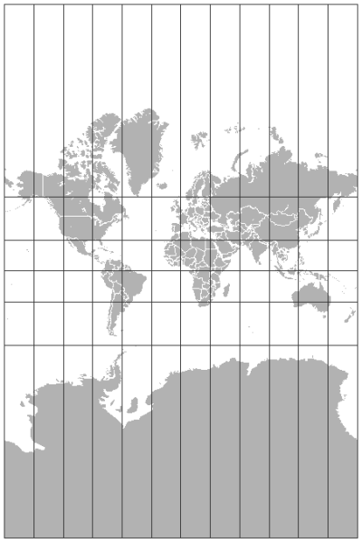
Figure 1. The Web Mercator projection which is commonly used for Web Maps.
For the Fan Map: Super Bowl Edition, we decided to try something different and chose the Winkel tripel projection (figure 2). Why? Because it is a compromise projection that, when modified to center on the United States, does not introduce a lot of curvature along the parallels. OK — what does that mean?
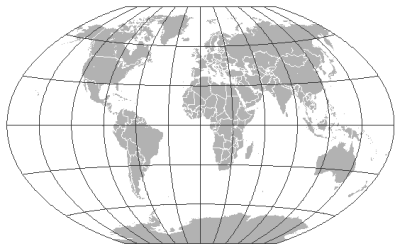
Figure 2. The Winkel tripel world map projection.
Winkel tripel fits into a special class of compromise projections that mitigate extreme distortion of any geometrical property (shape, area, distance, direction) that is a necessary result of projecting the spherical Earth onto a flat surface (such as a piece of paper or computer screen) by “compromising” on all of them. The Winkel tripel world projection is an example. It was constructed in 1921 by a German cartographer named Oswald Winkel (Kimerling et al., 2009). The word “tripel” in the title is German and indicates that the map projection was constructed as a compromise projection that was neither equal area (area-preserving), conformal (shape-preserving) nor equidistant (distance-preserving), but instead minimized all three forms of geometric distortion. For this reason, the National Geographic Society uses it for many of their world thematic maps.
This compromise property of the map projection applies across the map, regardless of where the projection is positioned on the earth, so if we change the central meridian to -96, the map centers on the conterminous United States (figure 3).
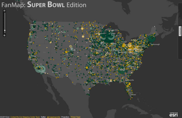
Figure 3. The Winkel tripel map projection centered on the conterminous United States.
Another important aspect of this projection is that the parallels (east-west lines of latitude) are not straight horizontal lines, as on the Robinson projection, which is also a compromise projection (figure 4).
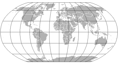
Figure 4. The Robinson world map projection.
Nor are the parallels extremely curved, as on the Lambert conformal conic (figure 5) and Albers equal area projections (figure 6), which are commonly used to map the conterminous United States, as well as other mid-latitude regions.
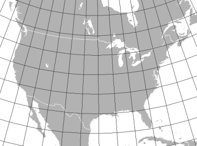
Figure 5. The Lambert conformal conic projection centered on the conterminous United States.
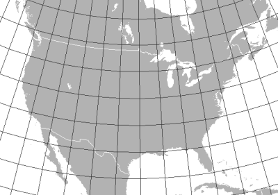
Figure 6. The Albers equal area projection centered on the conterminous United States.
This is an important consideration for Web maps like this one that are designed to be viewed at multiple map scales which relate to the zoom levels on the slider bar in the interface. The FanMap: SuperBowl Edition can be viewed at eight map scales from about 1:36,000,000 to about 1:288,000. At the smaller scales (e.g., 1:36,000,000) the label placement along the graticule is not a big problem because you are viewing a larger geographic extent and the ability to see the central part of the map helps you align the entire visual display as “north-up”. The problem becomes more obvious as you 1) zoom in and 2) pan east or west from the center of the map.
When we aligned the horizontal labels of the cities to the graticule, the results we got using either the Albers or Lambert projections were too skewed, as in the area around Seattle, Washington (figure 7). We felt it would be uncomfortable and inconvenient for readers to have to tilt their heads to read the text when zoomed into these areas.
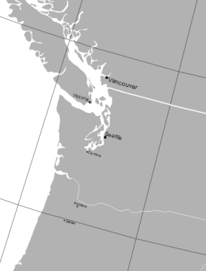
Figure 7. Using the Albers projection, the city labels, when oriented to the graticule are too skewed at the edges of the map causing map users to have to tilt their head to read the text.
With the Winkel tripel projection, this problem was alleviated. Because there is only slight curvature of the parallels, the text legibility is not compromised (figure 8)—no pun intended!
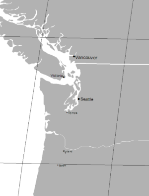
Figure 8. Using the Winkel tripel projection, the label placement oriented to the graticule is not too skewed, even at the edges of the map.
The final map design was well supported by the choice of the Winkel tripel compromise maps projection, even in areas where the geometrical distortion was the greatest (figure 9).
Figure 9. The final map design worked well with the Winkel tripel projection.
So those are the reasons that we chose to try the Winkel tripel projection for this particular Web map. For a different type of map, we might have chosen a different projection. Of course, as I noted at the outset, this is a deviation from the norm. We would be very interested to hear what YOU think about this choice of ours, if you have tried out other solutions, and what your results were. Send us your comments in response to this blog entry, or if you prefer, you can contact us privately.
Further Reading
Kimerling, A. Jon, Aileen R. Buckley, Phillip C. Muehrcke, and Juliana O. Muehrcke. 2009. Map Use: Reading and Analysis, Sixth Edition. Redlands, CA: Esri Press, 493 pages, ISBN: 978-1-58948-190-9.
Thanks to Rob Juergens, Melita Kennedy, and Mamata Akella for their help with this blog entry.


Article Discussion: