By Aileen Buckley, Mapping Center Lead

I went to an animation festival this weekend, and before one of the shows, Disney Animator Chris Sonneburg (he worked on films such as Kung Fu Panda and Enchanted), answered some of the audience’s questions. When asked whether he preferred hand-drawn animation to computer animation, he answered that all great animations have one thing in common – they tell a good story. He went on to say that it didn’t matter to him what kind of animation was used – hand-drawn, claymation, or computer animation – as long as they were used to tell a good story, they were good animation. My friend leaned towards me and whispered, “It’s about the CONTENT!”
It later struck me that the same is true about a good map. Whether it was drawn by hand, made from wood or clay or plastic, or computer-generated, if the map tells a good story, then it is a good map. It is indeed about the content! But I don’t mean that the data are good – I mean that the data are good at telling the story.
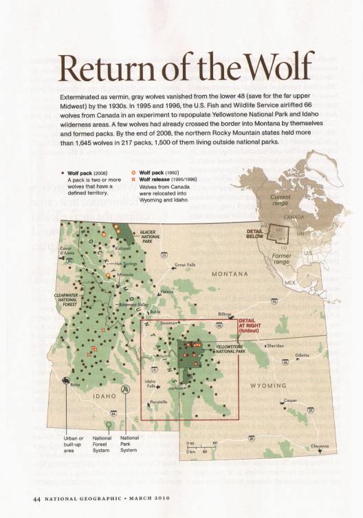
Often, the story, like those in the animation shorts we saw in the festival, is incredibly simple, and the telling is fairly direct. For example, the Wolf Range map (below, upper right) caught my eye when I saw it in the March 2010 National Geographic Society (NGS) magazine. Only about 3 inches high, with three categories of information on it (the current wolf range, former wolf range, areas where wolves are not known to range), it tells a significant and striking tale – the range of the gray wolf has greatly decreased from the 1930s to the present. And part of the reason the map is so good is that the story is told well. The range extents are shown as blurred lines so that you are not quite sure where they are – this is a great technique to use when mapping indistinct boundaries like these. And the map projection is a polyconic, so while we can see the entire North American continent, the relative shapes are still correct. The short narrative on the page reinforces the message of the map and provides additional details to explain the areas shown and labeled on the map.
Here’s another example – for point data. This is another NGS map – this one is from the October 2006 issue, and it shows another simple story in a direct and arresting way. This map uses circles of five different sizes to show how many poultry farms there are in each county of the United States. Values range from less than twenty to over 300. It is easy to see which areas of the country would be affected should bird flu hit the states, or, as the accompanying article notes, even just the suggestion of it. The spatial patterns on this map are immediately discernable, and the simplicity of the map makes the message even more profound. The dark umber color used for the circles matches the only other color image on the page – the chicken with its red comb. The Albers projection retains the relative areas of the states so that we can accurately estimate the areal differences.

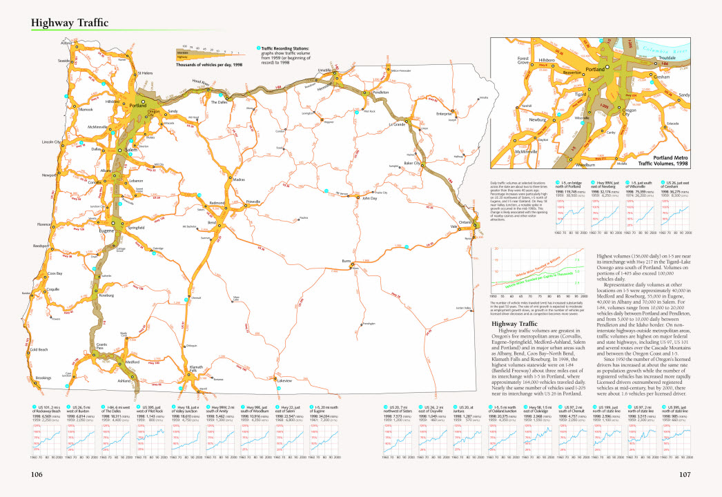
Here’s an example with line data. This is a Highway Traffic map from the Atlas of Oregon, Second Edition (published in 2001). This map shows traffic volume using lines of varying width. It’s simple to understand – intuitive even – and the legend clarifies any ambiguity readers may at first have about the color of the lines (interstate versus highway) and the width of the lines (from 1,000 vehicles to 100,000 vehicles per day). An added attraction of this map is that the actual traffic volume figures are shown for every highway segment, thus reducing any further potential for misinterpretation of the symbology. Again, the page narrative describes the mapped distribution in more detail. We describe in a blog entry here on Mapping Center how this kind of map can be created using ArcGIS.
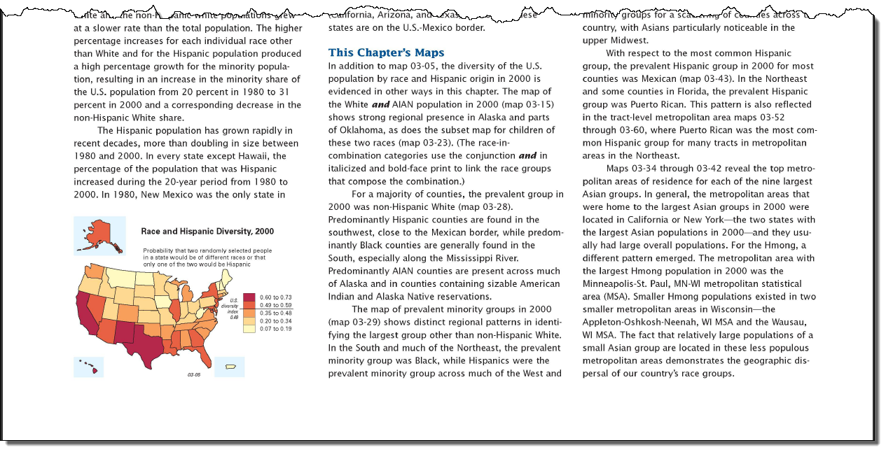
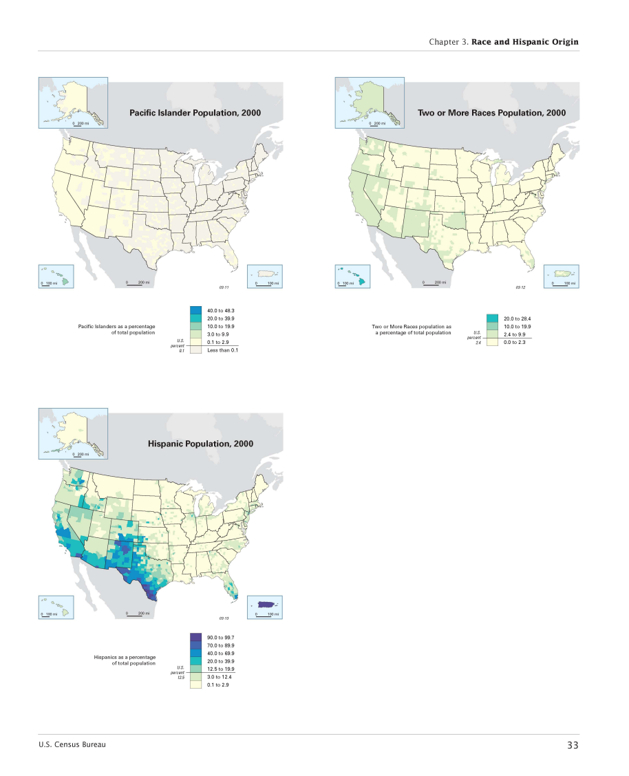
Let’s take a look at one last example – this time for polygon data. The maps of various race and ethnic groups as a percent of the total U.S. population come from the Census Atlas of the United States. The first two pages show map minority groups in 2000. The description of the distributions on these maps is located at the beginning of the chapter in a narrative about the various maps that help us to understand the chapter’s theme, “Race and Hispanic Origin”.
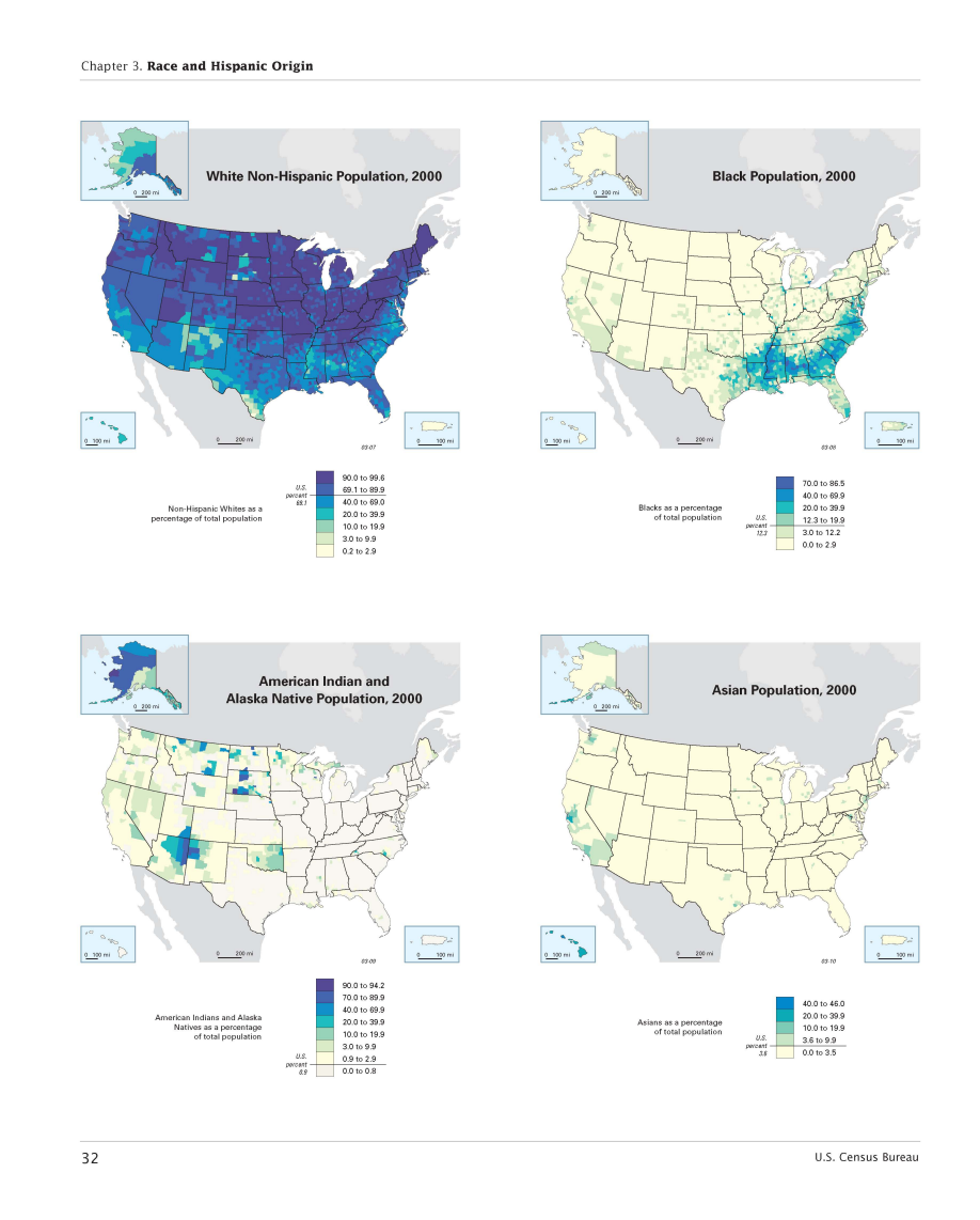
On the maps, distinct regional patterns show us that much of the Black population was in the Southeast and that a large percentage of the Hispanic population was in the Southwest. Smaller pockets of Asian populations were found in the larger metropolitan areas of the Western U.S., in and around Los Angeles, San Francisco, and Seattle. Predictably, American Indian and Alaska Native people lived in Alaska and on Indian reservation lands (if you look at a map of those locations, such as http://www.nps.gov/history/nagpra/DOCUMENTS/ResMAP.HTM), and Pacific Islanders were primarily living in areas in or along the Pacific Ocean. These maps use intuitive color gradations, with darker and more intense colors indicating higher values. The legends on these maps are also telling – the number of people in each minority group as a percentage of the total U.S. population are shown, varying from over 12% (for Blacks and Hispanics) to less than 1% (for American Indian and Alaska Natives and Pacific Islanders).
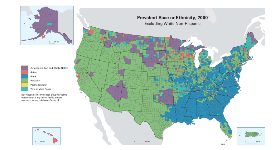
The map of Prevalent Race or Ethnicity, 2000 summarizes this on a single map of the largest minority group (other than non-Hispanic White). But this map also shows us some patterns not evident in the previous maps. Hispanic populations were also prevalent in the Midwest and Northeast, and Black populations were also prevalent in the Northeast. In addition, Asians were the prevalent minority group in a scattering of counties in the upper Midwest. This map uses different hues (red, green, blue) to show the various categories, avoiding shades of a single color so that readers will not misinterpret the data as showing higher or lower values for the categories.
All of the maps described above use simple mapping methods – shaded area, graduated point, graduated line, and choropleth maps. All were appropriately chosen for the mapped data and the map’s message. All of them were appropriately applied (e.g., fuzzy lines to symbolize indistinct boundaries, size to symbolize magnitude, hue to symbolize type). And all of them resulted in easily understood, effective, yet beautiful maps.
One thing to notice about all of these examples is that the author wrote a short story about each of the maps and that this story accompanies the maps. This is evidence that the cartographer knew the story. And because the map reflects the description in the narrative, the map was successful in telling the story.
Before you start your next map, think about the map’s story. In a short paragraph, try writing down what it is that you think the map should show. Then think about the easiest way to show it. The objective is to make a map that is striking in its simplicity. You may be surprised at how attractive and compelling it is! And if you stick to the story, your map will be a success!


Article Discussion: