By Aileen Buckley, Mapping Center Lead
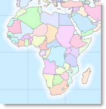
I am working on a small scale map of the world that shows political boundaries over time from about 2000BC to the present. The data I am using came from ThinkQuest. Each polygon with a differnt name gets a unique color. For this map, I want to show the world’s water with a bit of variation along the coasts. This is desirable for a couple of reasons: 1) to better indicate where the islands are, and 2) to provide better figure-ground by separating the land areas visually from the ocean areas.
An easy way to do this is with a coastal vignette, as we have discussed previously (Symbolizing Shorelines). In this blog entry, I demonstrate an easy way to achieve this effect for the ocean waters of the world. There are a couple of things you have to do to “clean things up” if you are working at a global extent — specifically, the vignettes will extend beyond the “edge of the world”!
To demonstrate how you can avoid this, I will use two feature classes that can be found in the data set that you can opt to load when you install the software – cntry92 and world30. Cntry92 has country boundaries and world30 is the graticule in 30 degree increments.
Please note that the map examples in this blog use the native projection of the data sets – WGS84. This is because I want you to be able to recognize the data sets off the DVD and I want you to clearly see the “edge of the world” problem. For our final map, we will instead be using a Robinson projection, and you should use an appropriate projection for your map as well.
The first thing you need to do is to dissolve each of these feature classes. You will use the dissolved cntry92 to determine which areas are land and which are water for your coastal vignettes. You will use the dissolved world30 to determine the global extent.
The next thing to do is create the coastal vignette – you can use the Buffer Tool for this step if you want to create uniform width buffers quickly and easily (you can add this tool to your ArcMap interface by clicking Tools off the top bar menu -> Customize -> Commands tab -> Tools category -> then drag the Buffer Wizard tool to any existing toolbar in your interface). Use cntry92 as the input. Set the number of buffers and the distance relative to your map scale. I am working at a scale of 1:150,000,000 to make a map of the world that will fit on a letter sized (8.5″ x 11″) page, so I used 10 buffers of 50 kilometers to create a 500 kilometer vignette along the coasts.
You should be able to determine the number of buffers by considering how smoothly you want the colors to vary on your map – the more buffers, the smoother the color gradation, but also the slower the processing and drawing time. You can determine the distance in part by evaluating how much more easily you can see the islands.
Tip: You can use the Measure tool (use the sixth button to the right on the toolbar to choose the units you want to measure in) to get an idea of how far out to have the buffers extend.
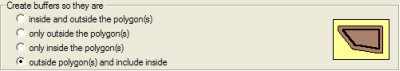
Set the Buffer Wizard tool to create buffers so they are outside the polygons and include the inside.
Now use the Union tool in ArcToolbox (Analysis Tools -> Overlay) to combine the buffers with the extent of the dissolved world30 – the inputs are world30_Dissolve and the buffer tool output. Notice in your results that the buffers extend beyond the “edge of the world”.
To take care of this problem, use the Clip tool (Analysis Tools -> Extract) to clip the union tool results to the extent of the dissolved world30 feature class.
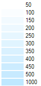
In an edit session, change the ToBufDist value from 0 to 1000 so that it is a larger number than the value for the last buffer. This will make applying the color ramp in the symbology easier.
To symbolize the results use the Categories – Unique Values renderer with ToBufDist as the value field.
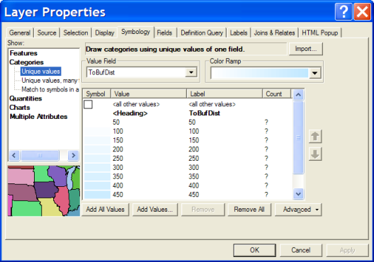
Use a blue to white color ramp with light blue for the smaller numbers.
Right click a symbol to set the properties for all symbols and change the outline to No Color.
If you want, one last step would be to erase the land areas from the water with the vignettes because the each buffer actually includes all the land area that it buffers. To do this, use the Erase tool with the clipped buffer feature class as the input features and cntry92_Dissolve feature class as the erase featrues. If you intend to use any transparency with this layer, you will probably want to complete this last step.
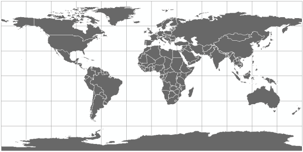
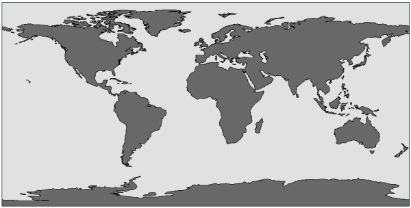
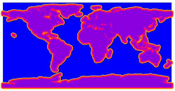
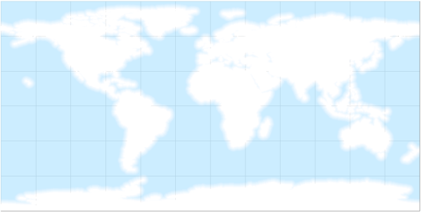
Now you have a world water feature class that is ready to be used to symbolize your water whenever you need it! This is what the results look like without cntry92 displayed.
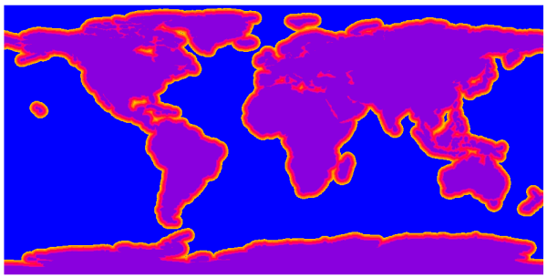
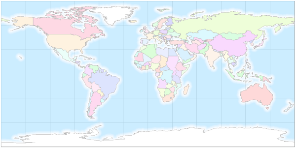
This is what the results look like with cntry92 displayed.
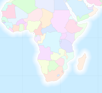
This is a close up of an area with islands.

Article Discussion: