Most Recent in ArcGIS Blog
Making strides in transportation equity through GIS and storytelling
Learn about USDOT's transportation equity initiatives through an interview with Geospatial Information Officer Amy Nelson.
Identify the best location for an urgent care center
Multiple Authors | Analytics | April 2, 2024
Use suitability analysis in ArcGIS Business Analyst Web App to locate a site for a new urgent care center in Maverick County, Texas.
Most Recent in ArcGIS Blog
William Hackney | ArcGIS StoryMaps | Apr 30, 2024
Learn about USDOT's transportation equity initiatives through an interview with Geospatial Information Officer Amy Nelson.

Multiple Authors | ArcGIS Community Analyst | April 30, 2024
ArcGIS Community Analyst is being deprecated entirely, with its final release schedule for October 2024. Read the blog for more information!

Multiple Authors | ArcGIS Hub | April 30, 2024
Sustained collaboration between government and community groups makes big goals attainable.

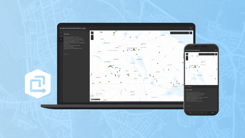
Stephanie Oliver | ArcGIS Online | April 30, 2024
The Arcade pop-up template is a feature that allows you to customize the content and appearance of pop-up windows in your maps.

Multiple Authors | ArcGIS Solutions | April 30, 2024
Brevard County Fire Rescue improves situation awareness with the Pre-Incident Planning solution.

Kory Kramer | ArcGIS Pro | April 30, 2024
ArcGIS Pro 3.3 requires WebView2 Runtime as an installation prerequisite. Here's how to make sure you have it.
Multiple Authors | ArcGIS Maps SDK for JavaScript | April 29, 2024
Learn how to make your web maps accessible to wider audiences using live regions and descriptions.

Craig McCabe | ArcGIS Living Atlas | April 29, 2024
The 2022 release of the USDA's Census of Agriculture is now available in the Living Atlas!

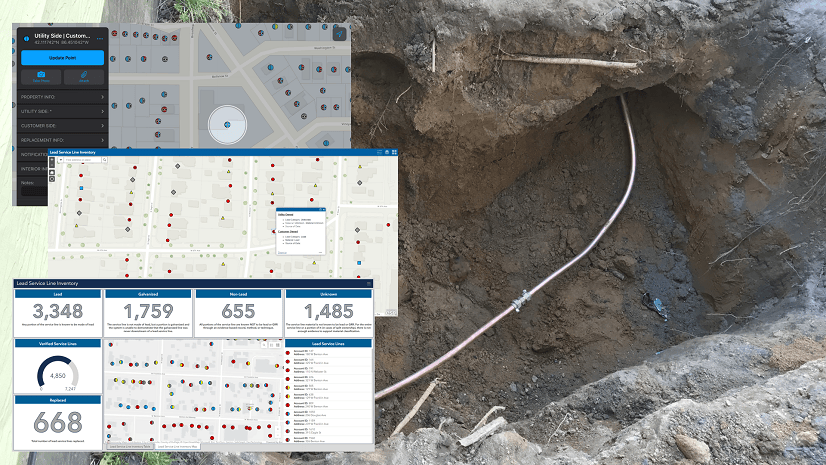
Robert Krisher | ArcGIS Utility Network | April 29, 2024
Learn the key concepts and terminology needed to understand how to manage wastewater data using the ArcGIS Utility Network

Multiple Authors | ArcGIS Enterprise | April 29, 2024
TJ Houle from UDC talks about leadership, strategic thinking, networking, and all things GIS.

Multiple Authors | ArcGIS Configurable Apps | April 26, 2024
This article discusses the upcoming ArcGIS Configurable Apps retirement and provides migration resources for users.
Multiple Authors | ArcGIS Instant Apps | April 26, 2024
This article walks through Arcade scripts that allow users to translate map pop-up content within Map Viewer for use in the ArcGIS Instant Apps.
Christa Campbell | ArcGIS Solutions | April 26, 2024
Water utilities with authoritative data, analytics, and technology solutions are going to successfully navigate improvements to the LCRR.

Multiple Authors | ArcGIS CityEngine | April 26, 2024
Introducing ArcGIS CityEngine Project Collaboration for designing urban Masterplans, coding procedural buildings, and digital production.

Multiple Authors | ArcGIS StoryMaps | April 25, 2024
Share your briefing slides with an interactive image gallery and more with the latest update to the ArcGIS StoryMaps Briefings app.

Multiple Authors | Developers | April 24, 2024
A Developer approach to imagery.

Robert Krisher | ArcGIS Utility Network | April 24, 2024
Learn how to model flow and perform analysis with wastewater networks using the ArcGIS Utility Network

Robert Krisher | ArcGIS Utility Network | April 24, 2024
Learn the key concepts and terminology behind modeling catchments and flow for stormwater data using the ArcGIS Utility Network

Robert Krisher | ArcGIS Utility Network | April 24, 2024
Learn the key concepts and terminology needed to understand how to manage stormwater data using the ArcGIS Utility Network
Shree Rajagopalan | ArcGIS Pro | April 24, 2024
Learn how to dynamically produce output data and information products at any scale from a single best-scale data source.
Lisa Berry | ArcGIS Living Atlas | April 23, 2024
Do you have questions about how to access, use, or nominate content within ArcGIS Living Atlas of the World? Check out this blog for answers.
Multiple Authors | ArcGIS Hub | April 23, 2024
Open data provides a foundation for collaboration and community engagement. It helps build trust and focuses discussions on fact.

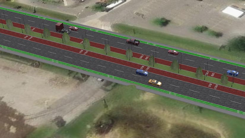
Katie Thompson | ArcGIS Urban | April 23, 2024
ArcGIS Urban will soon be available with ArcGIS Enterprise, providing planners with a new way to leverage their city's GIS data for planning.

Multiple Authors | ArcGIS Mission | April 22, 2024
ArcGIS Mission 11.3 is coming soon. New features and enhancements bring analyst notes, new admin and user settings, and more!

Multiple Authors | ArcGIS StoryMaps | April 22, 2024
Get storytelling advice and conservation inspiration from the winners of the 2023 ArcGIS StoryMaps Competition.

Greg Lehner | ArcGIS Pro | April 22, 2024
If you receive a notification saying there's a drawing alert: don't panic! Let's solve it together.