By Daniel Smith and Alex Quintero, University of Redlands, Masters of Science In GIS Program
In the first dot density mapping blog, we discussed the workflow for creating dot density maps using ArcMap. In that discussion we emphasized the need for using exclusion or inclusion layers. Here is an example of how we set up the inclusion and exclusion choices for mapping population density in San Bernardino County, the county with the largest land area in the conterminous United States. Because of its size and the fact that population is not evenly distributed throughout the county (rather, it is concentrated in the southwest corner, around where Redlands is located), this county exemplifies the limitations of dot density mapping without inclusions/exclusions when mapping population density at the county, the state or even the country level.
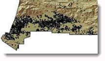
We first created a dot density map for San Bernardino County without any exclusions or inclusions using the county itself as the enumeration unit that the dot density was applied to.
This is what it looked like:
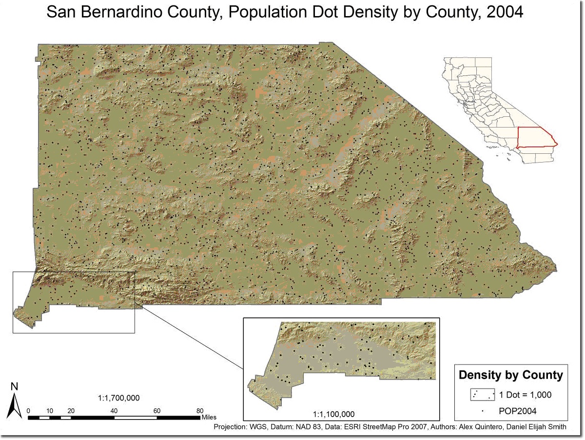
Clearly, this does not represent the population density pattern very realistically. One “fix” is to use smaller enumeration areas, so we first tried census tracts:
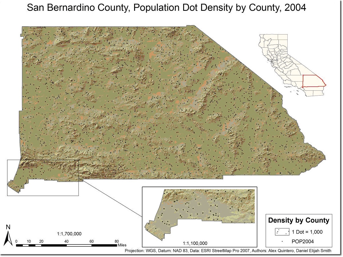
And then we tried block groups:
This was a big improvement over our first two maps, so we decided to do the exclusions and inclusions using these smaller enumeration areas. The next thing we did was to determine areas of exclusion. These included:
- Parks
- Local
- State
- National
- Airports
- Landmarks
- Schools
- Hospitals
- Cemeteries
- Golf Courses
- Shopping Centers
- Stadiums
To create a single layer with these excluded areas we followed these steps:
- Extract areas of exclusion from datasets to fit your study area or map extent and create new layers for them. For example, we used Landmark data clipped to San Bernardino County (available from Esri Data & Maps StreeMap).
- We then created new a new empty layer that we could use to append all the areas of exclusion.
- We batched appended all of the areas of exclusion. (see the list of categories that we excluded above.) Keep in mind that all areas of exclusion or inclusion must be polygons.
- The final step was to visually inspect the final exclusion layer and compared it to other reference information and our data to ensure we did not miss other areas that should have been included in the exclusion layer.
To set the area of exclusion (that is, the masking) for areal feature dot density representation, here are the steps to follow:
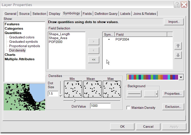
- Right click the layer with the population density for San Bernardino block groups.
- Click Properties.
- Select the Symbology tab.
- In the box on the right, under Show, click Quantities.
- Select Dot Density.
- Set the unit value and dot size.
- To the right of the Background settings, click Properties.
- Check the Use Masking box.
- Select your final exclusion layer as the Control Layer.
- Click the “Exclude dots from these areas” option.
- Click OK.
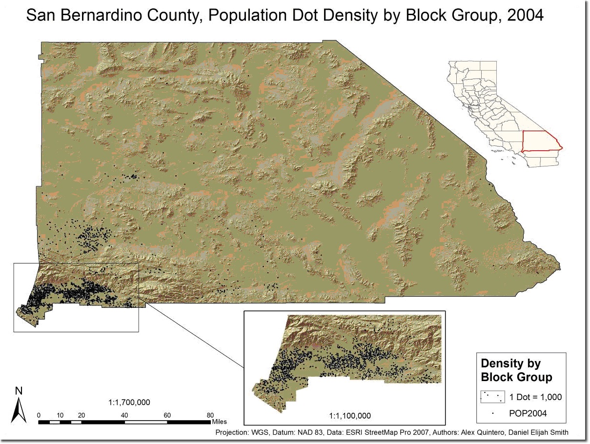
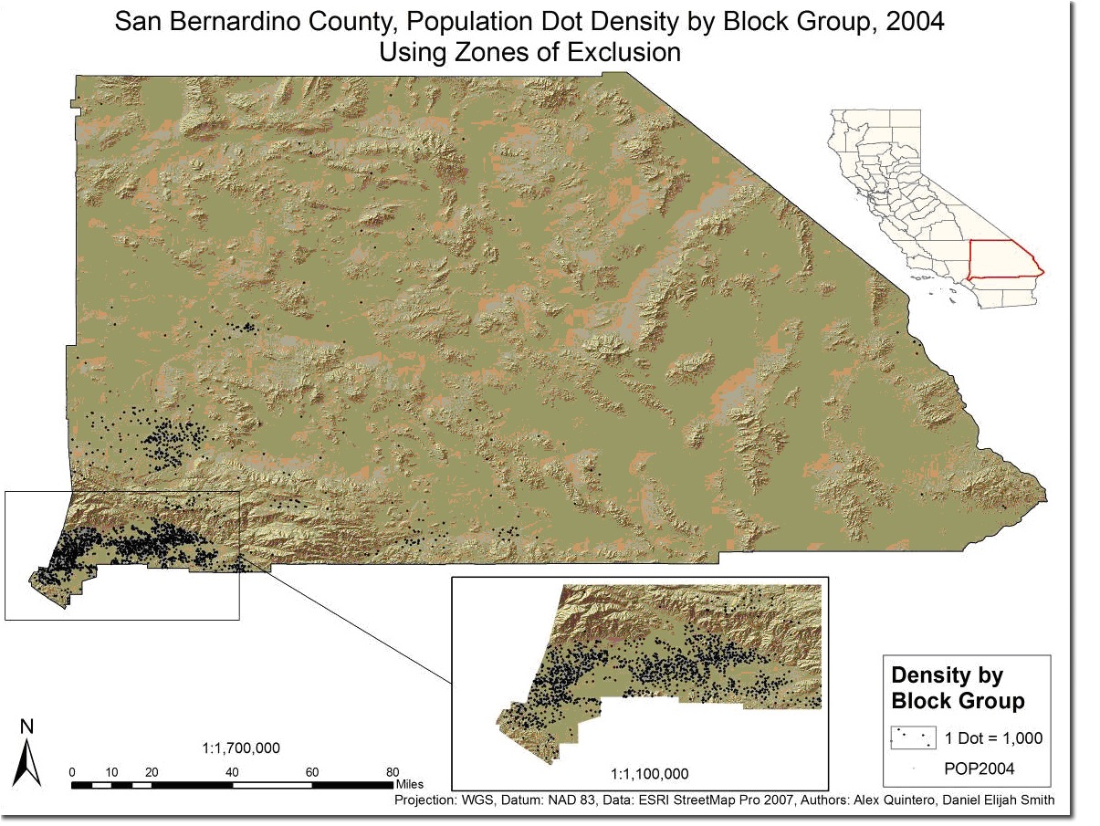
When we included the exclusion layer, we got this result:
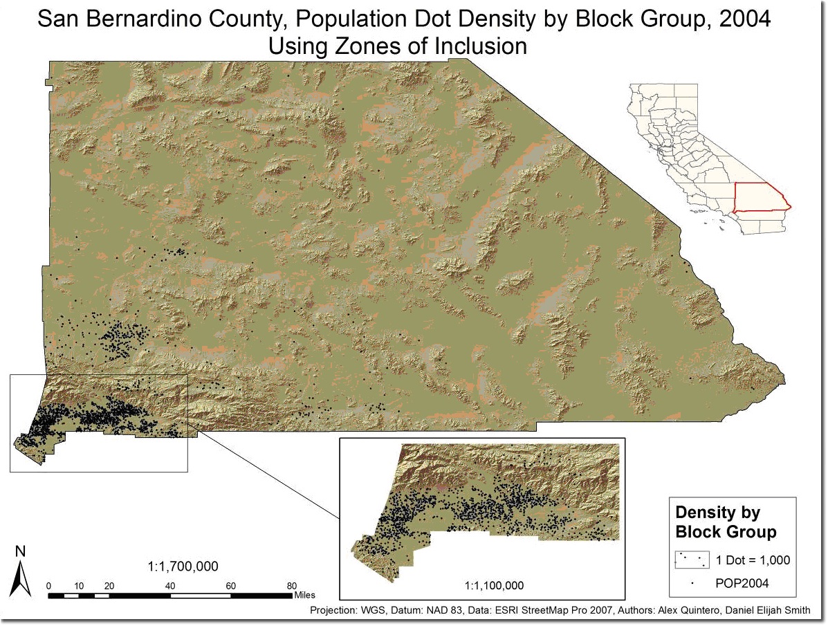
There is one additional step that we wanted to add to this analysis which was to INCLUDE certain areas. We theorized that people would live closer to roads rather than far away from them. To do this, we needed to use two layers – the urban areas and the roads layers (from Esri Data & Maps StreeMap). Here are the steps we followed to include areas near roads in the dot density analysis:
First we buffered the roads to a threshold that we determined made sense for our analysis. These are the steps we followed:
- Select roads within the urban areas (we noted when we did this that dense road networks create problems when buffering).
- Switch the selection (to learn how scroll to the bottom of the linked help topic).
- Export the selection to a new feature class and then add it again to create a new rural roads layer.
- Dissolve the roads based on a universal field (that is, all features having the same value for an attribute).
- Buffer the roads based on:
- Use the Dissolve type All.
- Knowledge and visual analysis of the geographic area (we determined that 5 miles made sense for our study area)
- Select urban areas that the roads where removed from (these areas were used as proxy road buffer for the urban areas in order to avoid the problem of the buffers of dense road networks.)
- Buffer to same user defined threshold as roads (5 miles) and use Dissolve Type All.
- Mergethe areas of inclusion (that is, the road buffers and the urban area buffers) using Dissolve. In order to do this, we:
- Add a field that the Dissolve tool will use to dissolve the features on.
- Calculate all values in the new field to equal one ( = 1)
- Use Dissolve Type All based on added field with identical values.
- Set the area of inclusion using the same steps as setting the area of exclusion (described above) but select the “Place dots only in these area” rather than “Exclude dots from these areas” option.
- Add both the final exclusion and inclusion layers to the map.
- Use the Erase toolto remove any exclusion areas from the inclusion layer:
- Set inclusion as input feature,
- Set exclusion as erase feature, and
- Set the output location.
- Click Run.
- Follow the steps from above to apply this as a mask for areas of inclusion.
Here is the result we got using this inclusion layer:
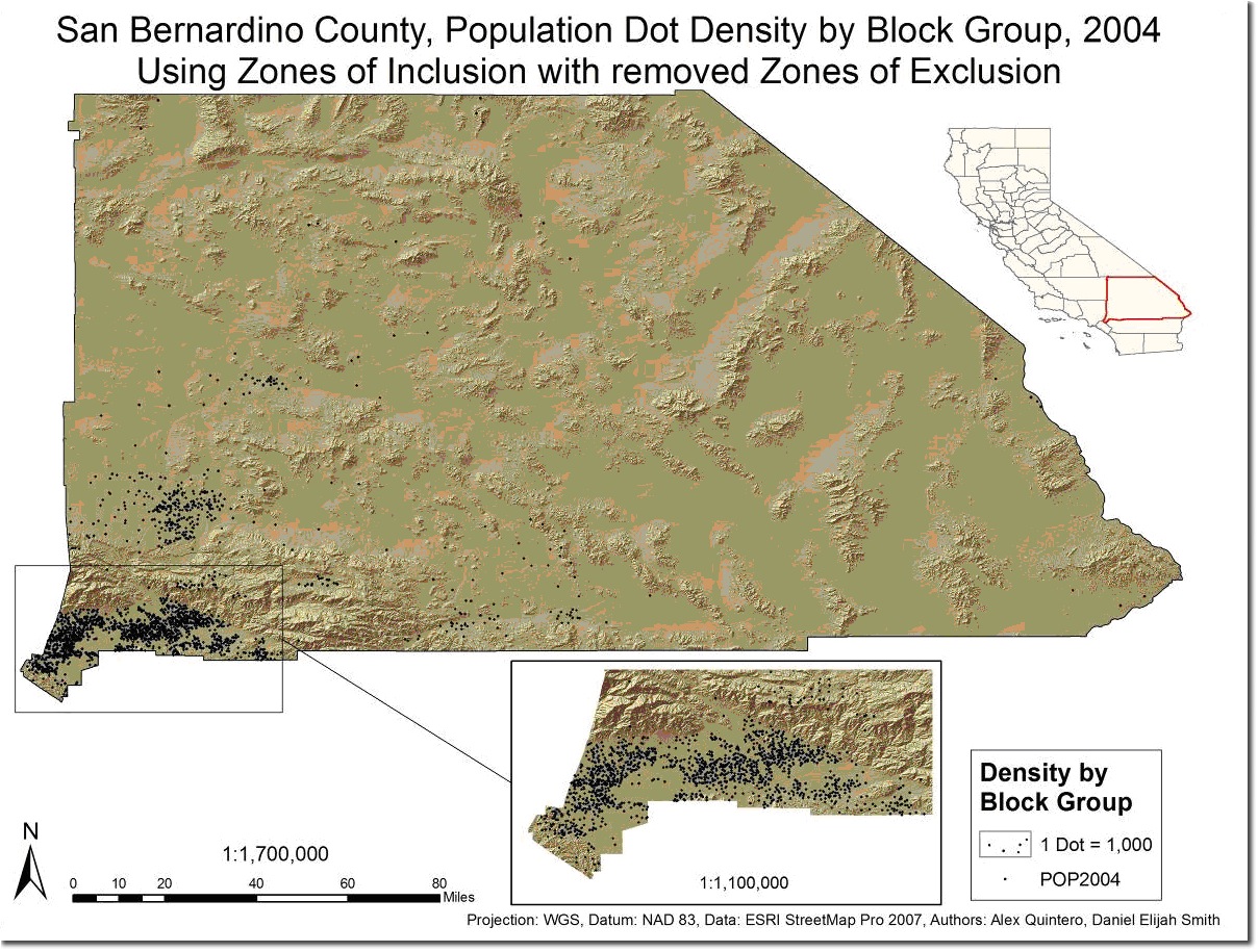
The final step is obviously to combine the exclusion and inclusion layers so we have one final layer to use in dot density mapping that represents the areas we know people NOT to be as well as we theorize more people TO be. To do this we followed these steps:
This was our final result – a vast improvement over the map we started with for San Bernardino county!
by Alex Quintero and Daniel Smith, students at the University of Redlands.

Article Discussion: